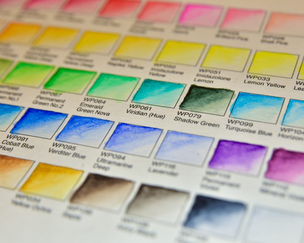
Holbein Watercolour Pencils
Holbein is one of my favourite art supply manufacturers. Their regular gouache is my favourite, their acrylic gouache is incredible, their oil pastels are perfect, and their coloured pencils are unique. It’s become a sort of tradition that I’m gifted a new thing from Holbein for holidays, and these pencils were my New Year’s gift. I’ve had them for a few months, and I’ve tried a few different techniques to make them work for me, but they’re very different from what I’m used to in the realm of watercolour pencils.
For comparison, I like Derwent’s Inktense and Caran d’Ache Supracolor very much, and to state the obvious, watercolour pencils are something I’m still learning. I have a much better grip on them than Neocolor II, that’s for sure.
Things I Noticed
- These are scratchy. Not just one, but most of them in my set. Not just browns, either. I keep something abrasive nearby to scratch them on as I go. This is after sharpening and/or sanding, not only directly from the box.
- They hold decent points, and are quite hard. It’s incredibly easy to burnish the paper when you’re trying to get pigment to lay down. In my opinion, it’s too easy to do so.
- When dipped directly into water, they still lay down very lightly compared to other pencils I’ve tried. If you’re going for wispy drawings, they’re fab.
- Layering looks lovely when it works the way I want it to. When a scratchy bit gets in the way and leads to an unwashable mark, that isn’t ideal.
- Hot press cotton watercolour paper (Etchr sketchbook) sometimes felt a bit too soft for them, but cold press (Hahnemühle sketchbook) has texture that really snags, of course. I did like that texture, but the best paper I’ve found for them so far is Derwent’s watercolour paper which they advertised as being made for watercolour pencils. I feel like other wood-pulp papers might suit my purposes in the same way.
- When playing with them, sanding a bit onto a textured palette and then dipping a wet brush into the shavings gave nice even washes. Of course it did, it always does with watercolour pencils. But it was very difficult to get that same result without the palette. Lightly shading on the paper almost always led to a scratchy bit of the pencil ruining the nice even vibes I had going on.
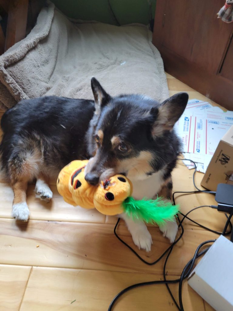
- What I look for in watercolour pencils: super easy portable paint. I started carrying around a smattering long ago for sketching on the go, and enjoy that I can draw with them and either use a waterbrush while I’m out or wait until I get home to add water to an undersketch.
- Regardless of the paper I used, sometimes it was difficult to layer dry pencil on top of activated-but-dry layers. If you watch the videos, you can watch as I reach the pinnacle of frustration during my second attempt with these, dipping the pencil directly into water to try and attain something I wanted.
- Getting darks was very difficult with dry pencil. I ripped the paper apart just trying to get saturation in a shadow. With watercolour pencils, it’s important to note, that generally water is used for saturation, not depth. So, the darkest shadows should be placed down dry at the end of a piece without water activation.
- Though there are 50 colours available, I find that, for my purposes, I’m missing a variation of PR101. Since the pencils are supposed to be equal to their watercolours of the same IDs, I see that it’s totally missing. Shame, because they have nice ones in their watercolour line, including a great mars violet. Better, would be if there was a PR179 pencil. My favourite of the reds, and I think only available in a special edition Supracolor and shaded in a Museum Aquarelle pencil. Instead, we have PR83 and PBr25.
- I’m shocked by the low lightfastness of these pencils. I’m not usually big on ‘everything I create must last forever,’ but it’s noticeable how few are lightfast.
My Attempts
Attempt 1
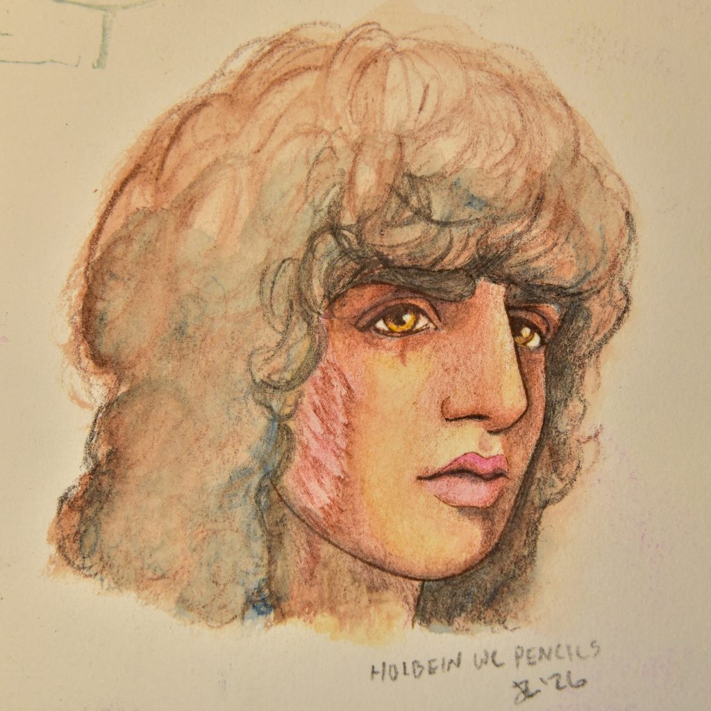
I did this inside of an Etchr sketchbook with Hotpress paper. To start, I did an underlayer with Payne’s Grey, something I like to do with inktense, for example, and then tried to be light about every subsequent layer. There was a level at which nothing else was layering, and that’s when I stopped.
Attempt 2
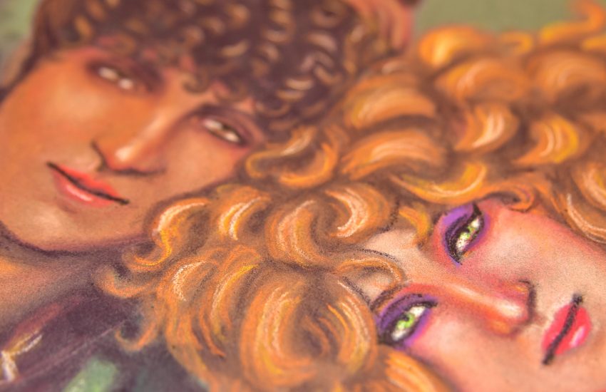
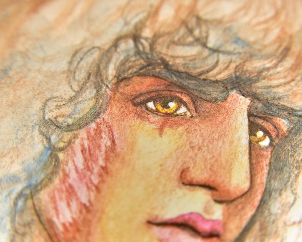
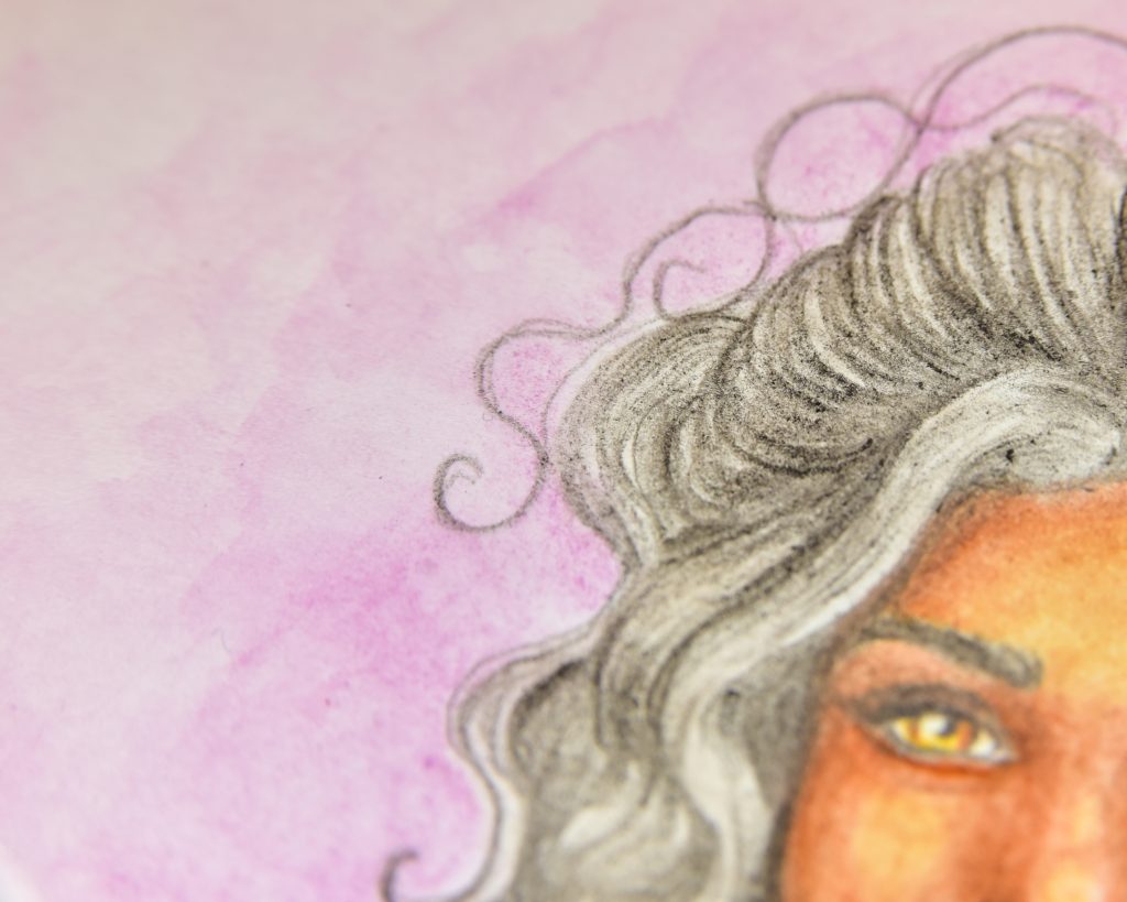
My second attempt was in a coldpress sketchbook by Hahnemüle. The saturation is closer to what I want, and I really do like the texture, but once again my struggle with getting things to the level of darkness or saturation I wanted made it fall flat in my opinion. The nose and eyes especially I feel are awful. Once again, hair is giving me lots of troubles, but this is something I struggle with with most watercolour pencils. Unless it’s defined, I am not sure what to do about it.
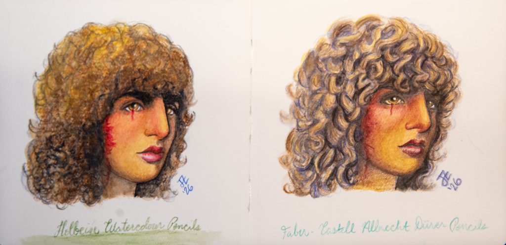
I tried to do something equally quick with Faber-Castell’s Albrecht Dürer pencils, to see if I was misremembering what saturation looks like. Worked out too well in that example.
Attempt 3
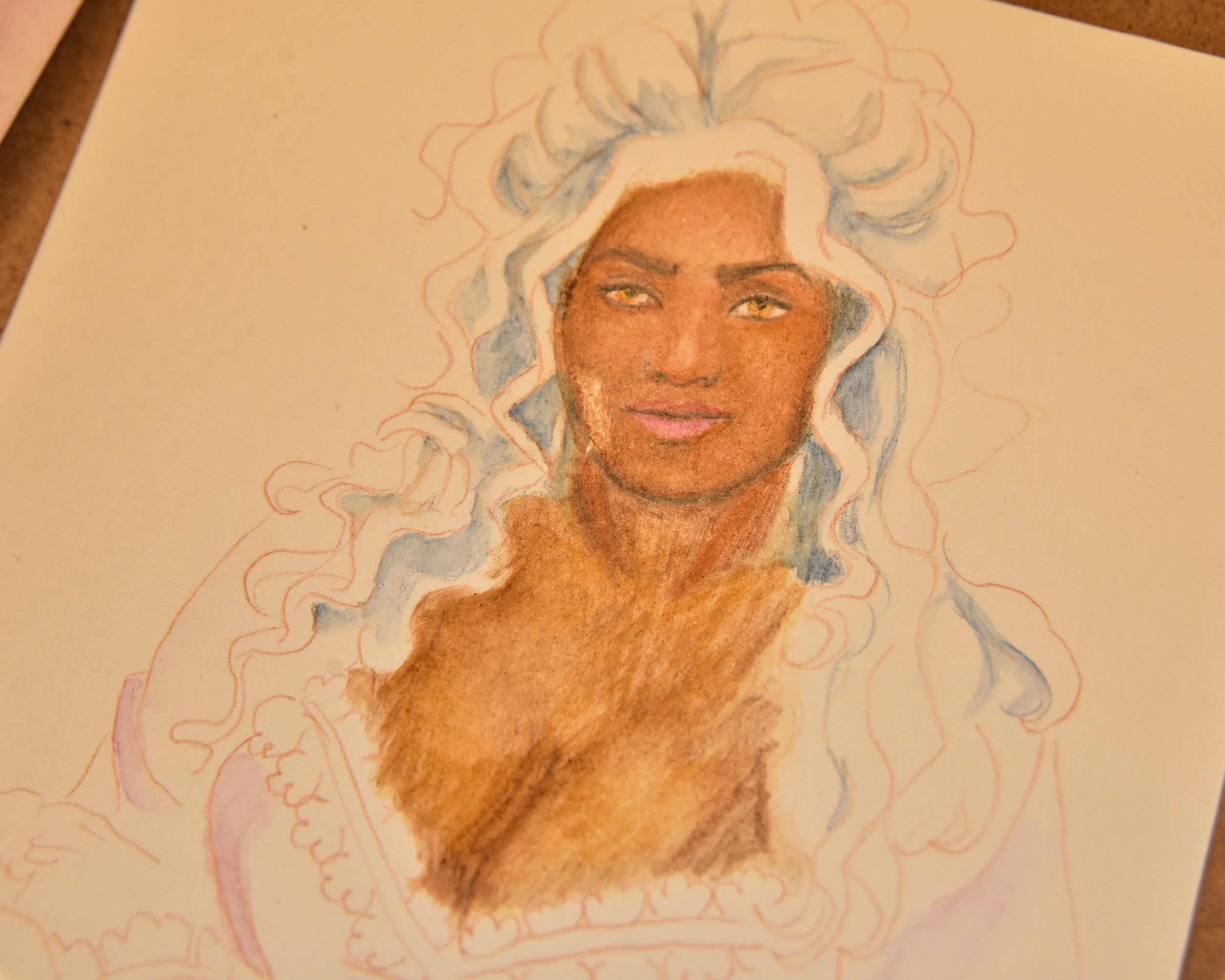
This was done on Derwent watercolour paper. I overworked it to the point of ripping the paper, but I started to see that I was onto something.
My takeaways from this one:
- Start with a highlight colour (I wish there was a yellow-brown darker than Raw Umber for this)
- Do midtones/redtones in two layers: first one water activated, second not.
Attempt 4
I did a short test of this theory with the default sketch again. Things were looking better. But, from this, I gleaned that having something beneath which is NOT watersoluble was incredibly valuable. The only reason the eyes/nose/jaw remain is because they were waterproof before I started. I still have no idea what to do with curly hair if I want to hint at it rather than detail it, though.
Attempt 5
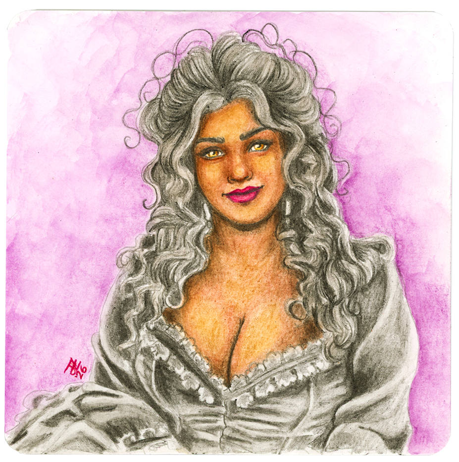
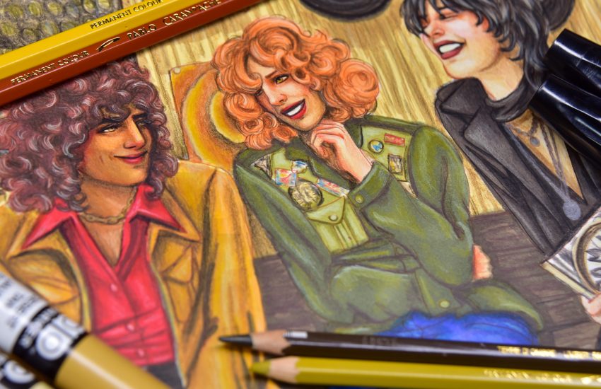
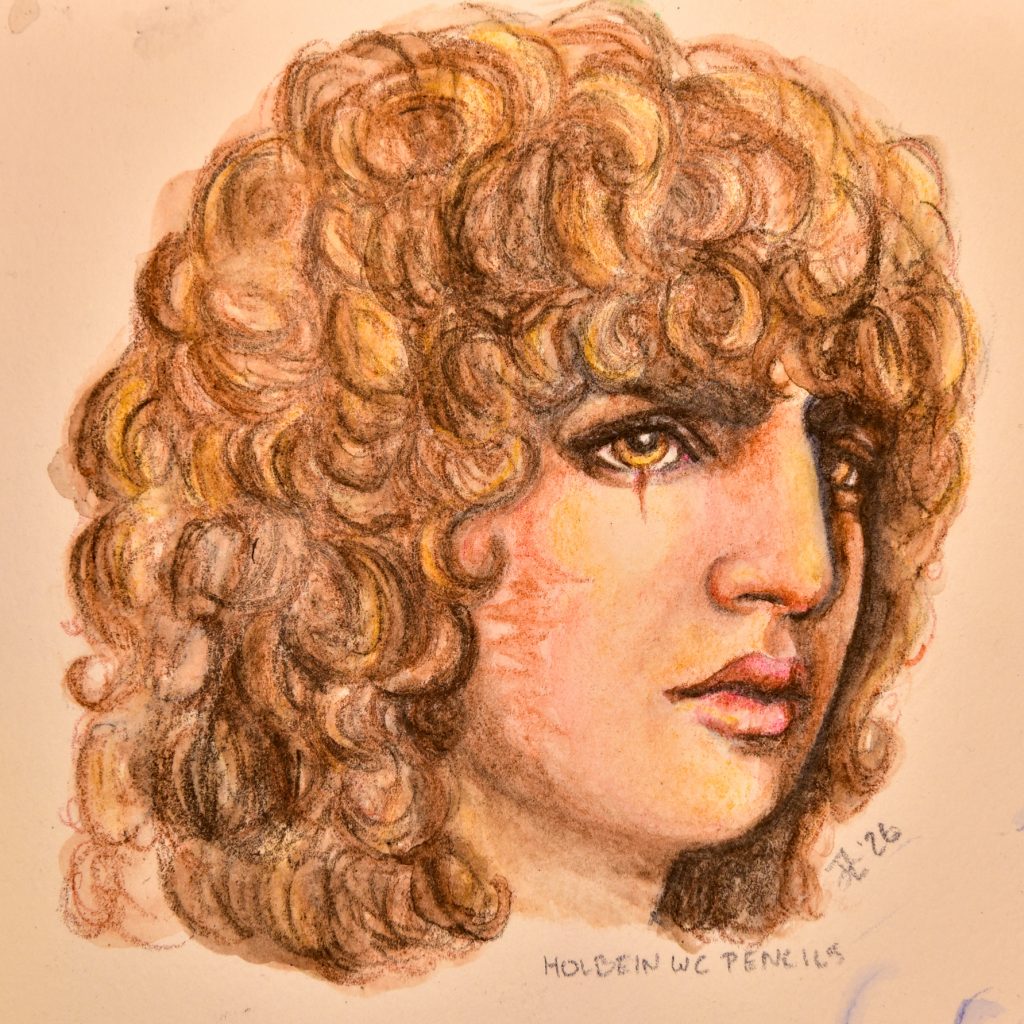
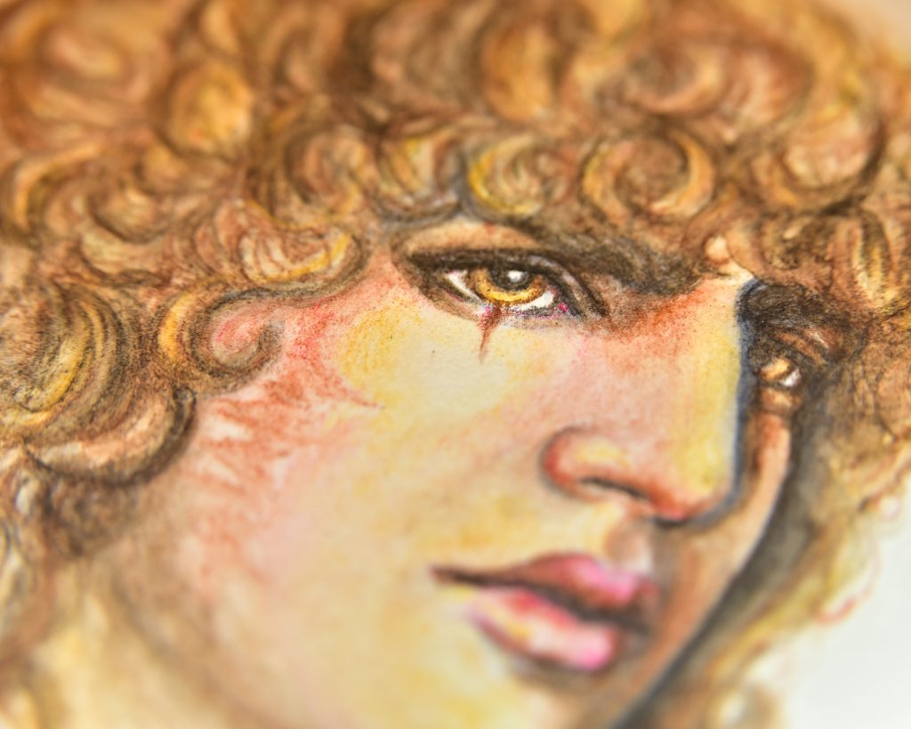
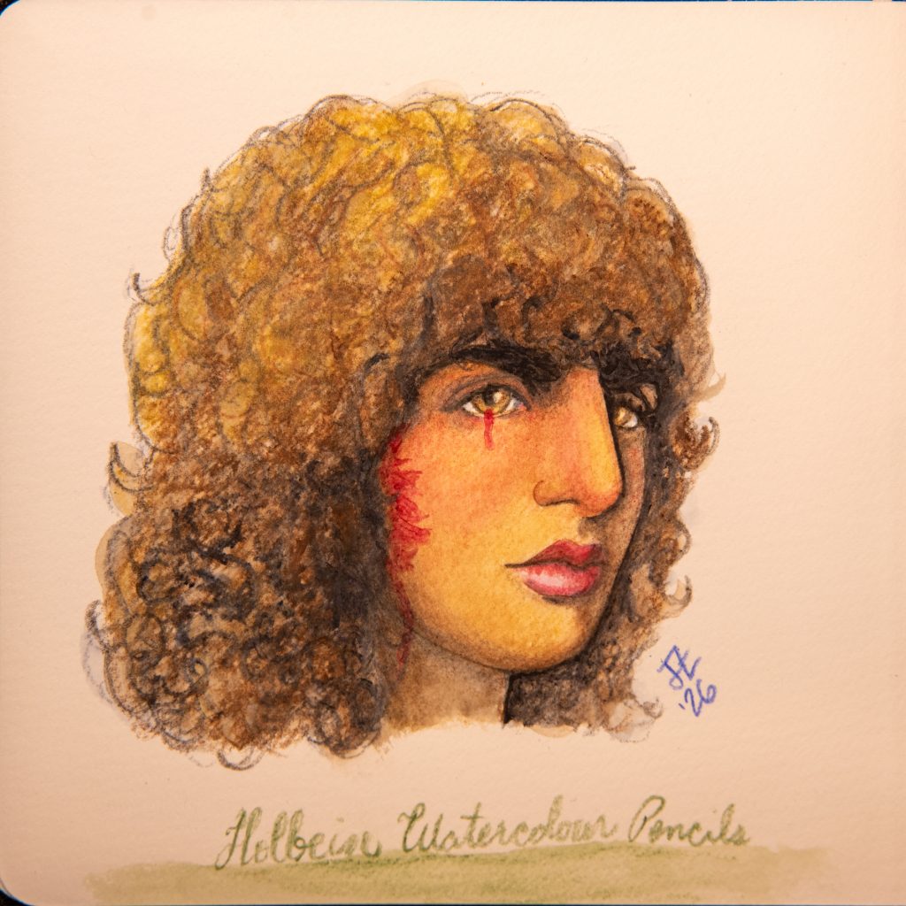
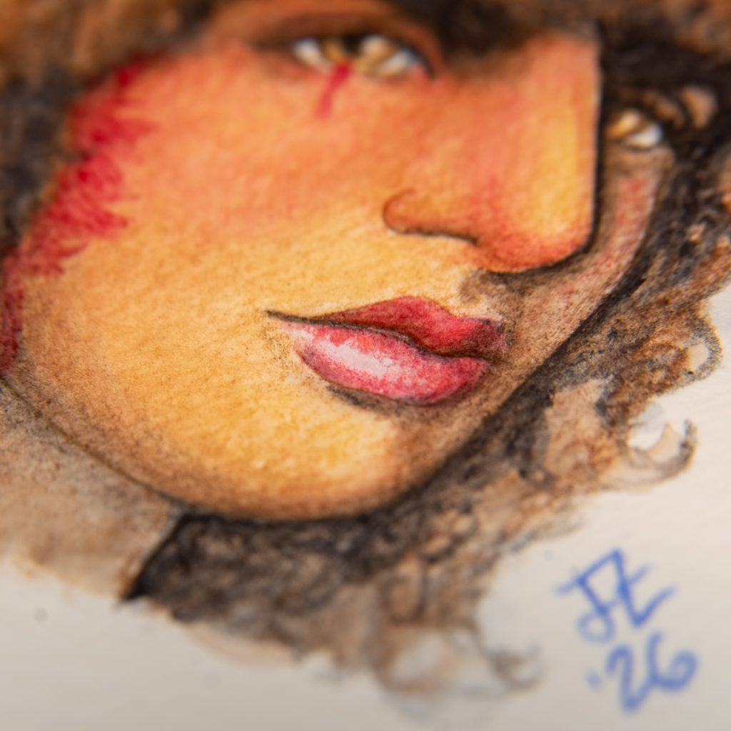
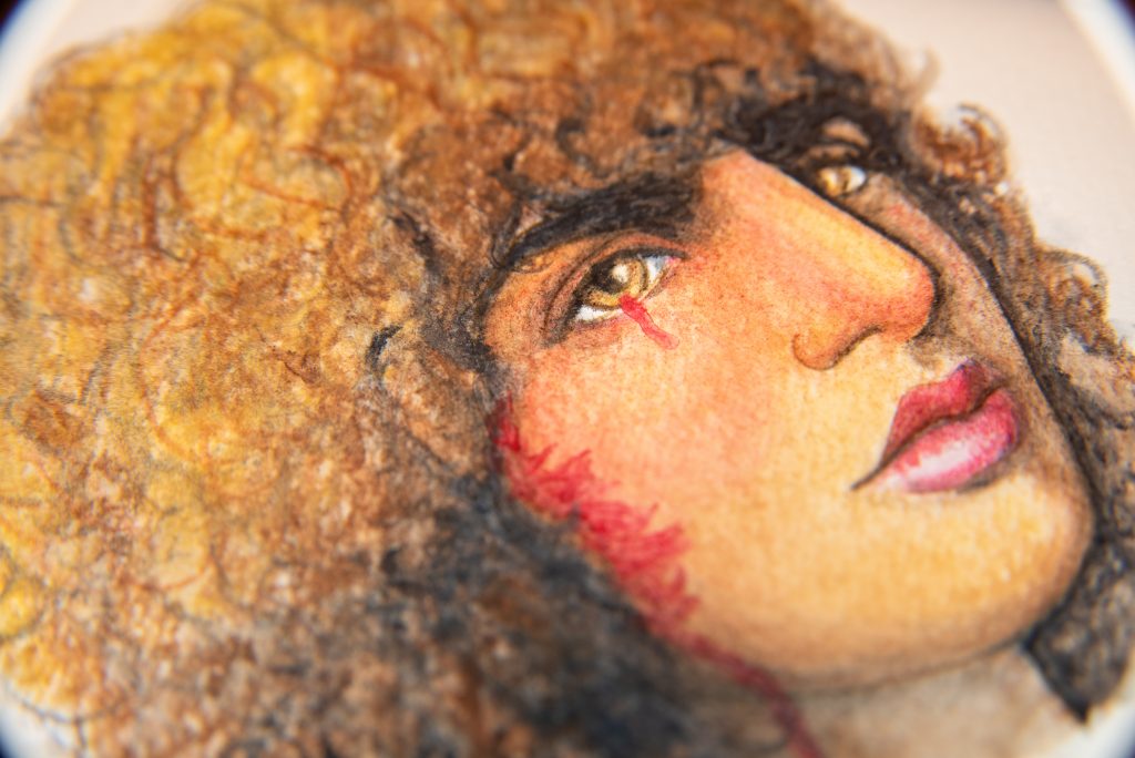
With this one, I did everything in light layers at first, but, in the end, it’s pretty much entirely done with dry pencil. I do not like the gravelly and uneven look that is caused by that method, because I could get smoother blends with a regular coloured pencil if this is what I was going for. But I just could not get depth otherwise.
I think the answer would be, for this image of Sasha, to start with the burnt umber pencil as my light under layer. Maybe? No, because it’s not yellow enough. So mix the raw umber and the burnt umber together! Yeah, that might be the answer for the under layer. Then build over it with the imidazolone brown and sepia? I am not itching to try again with these pencils, if I’m going to be honest.
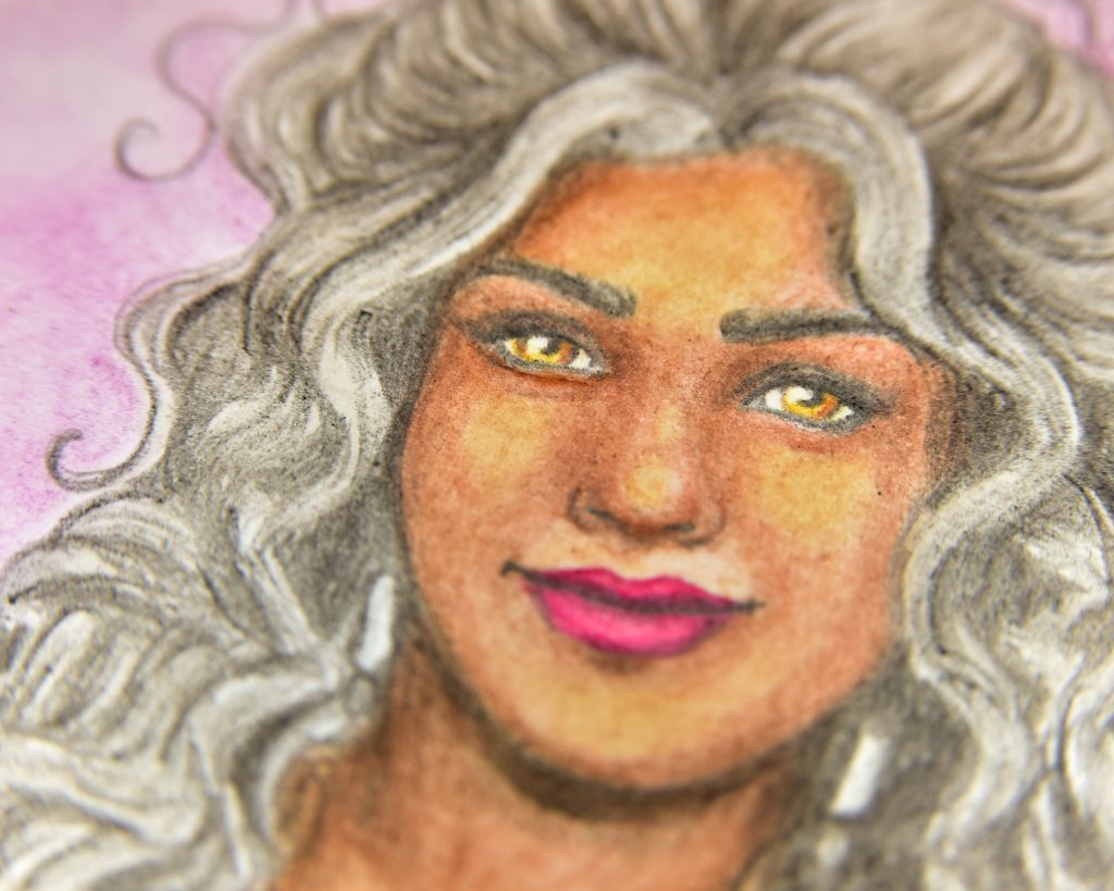
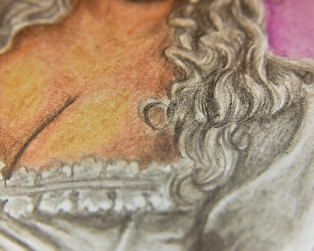
The most important thing about this attempt–which I find is my most successful–are that I did the preliminary sketch with a regular coloured pencil (it was a Polychromos is Dark Sepia) and did not add any water to the shadows at all. The most frustrating part of it was the sometimes, the scratchiness of a pencil would ruin my detail layer.
To Conclude
I am satisfied enough with my 5th attempt to say that I’ve tried them out, but for my current knowledge of watercolour pencils, these will take a lot more practise. Best case scenario, these are made for a type of art creation that I’m just not familiar with yet; worst case, they just aren’t for me.