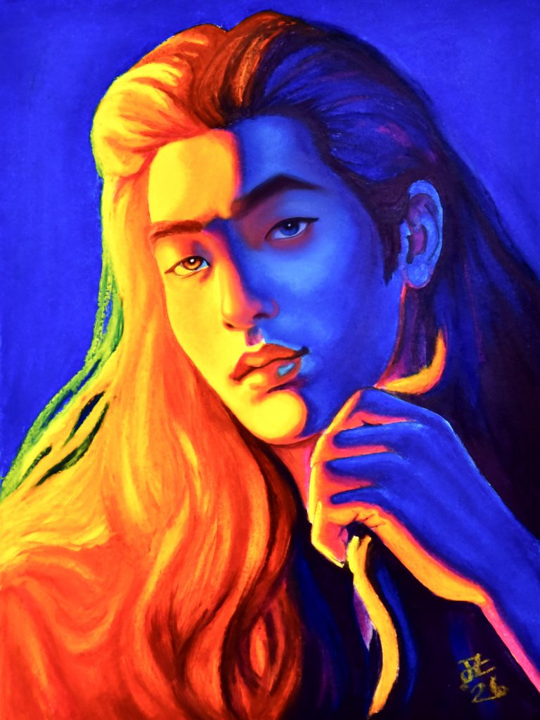
Oil Pastel Portrait With Miracle Medium
Learning About Colour
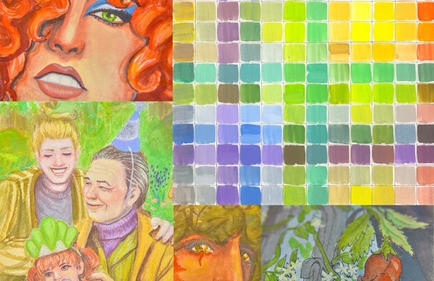
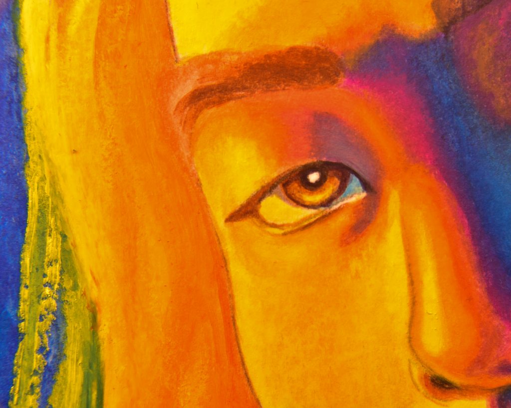
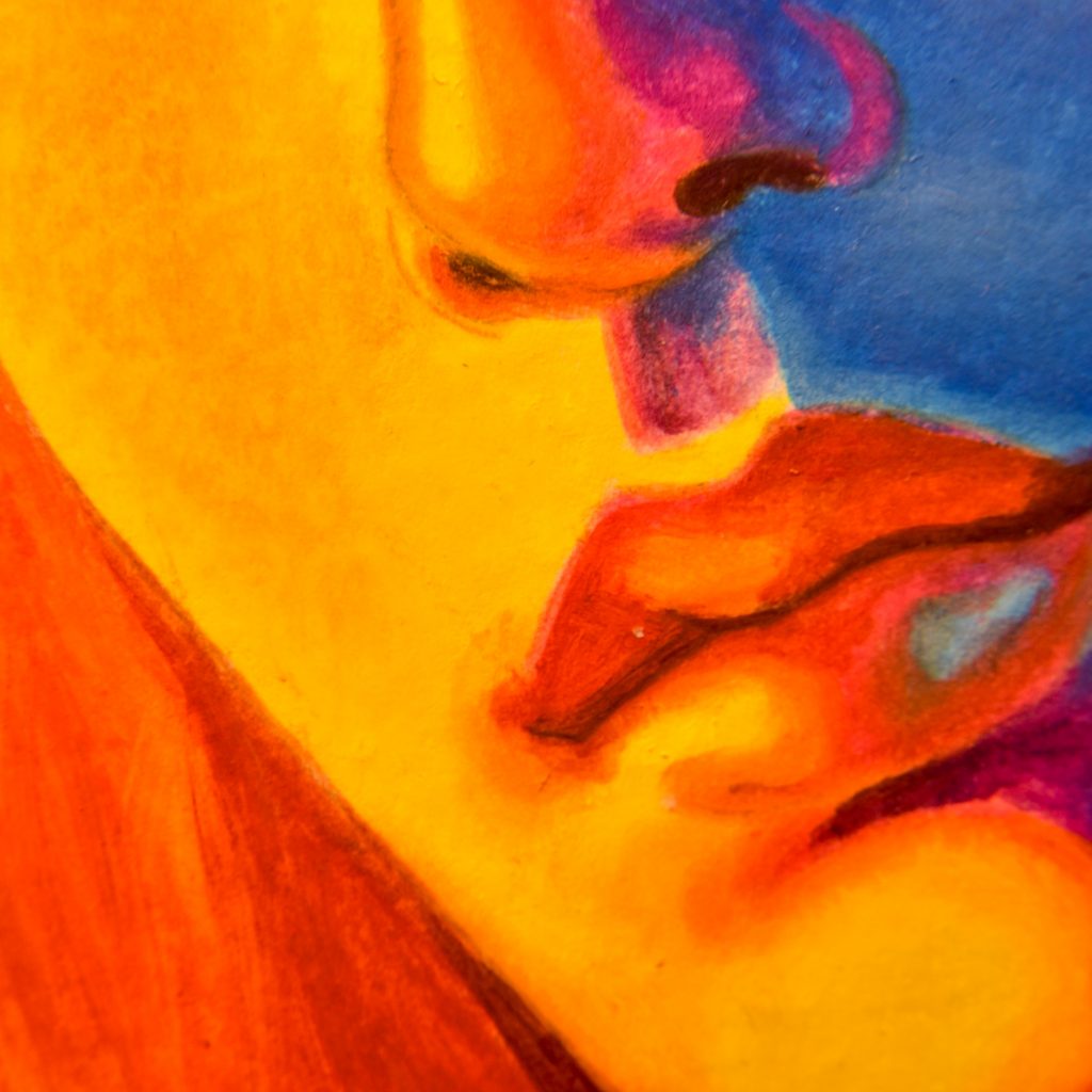
Since I’ve been learning a lot about yellow lighting and blue shadows, I wanted to take the concept to the extremes for a piece to help me better understand how those contrasts work together. It was a great thing to do, since the very first thing I learnt was that the choice of yellow and blue matters quite a bit!
The first thing I did was play about in Procreate to see how I wanted my portrait to be lit with these colours, and the digital version of it came out so well that I was confident I could make a cool looking piece with paints or pencils or something non-digital. But, when it was time to choose colours, my mind went to the other things I’ve been learning, about ‘primary’ colours. I thought that I wanted a warm yellow and a cool blue with oranges and purples in between, so I chose Cadmium Yellow, Cadmium Red, and Cobalt Blue. Three heavy metal pigments that are supposed to be rather classic. I thought my cleverness was all in the choice of Cobalt instead of Ultramarine because Ultramarine is a ‘warm’ blue.
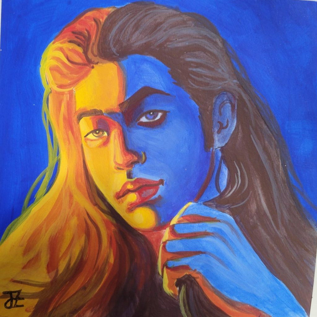
But that wasn’t what I wanted at all. In my small sketchbook mockup with some Golden Soflat paints, I thought it looked absolutely boring. It was flat, not only in sheen, but in everything. Just not dramatic enough.
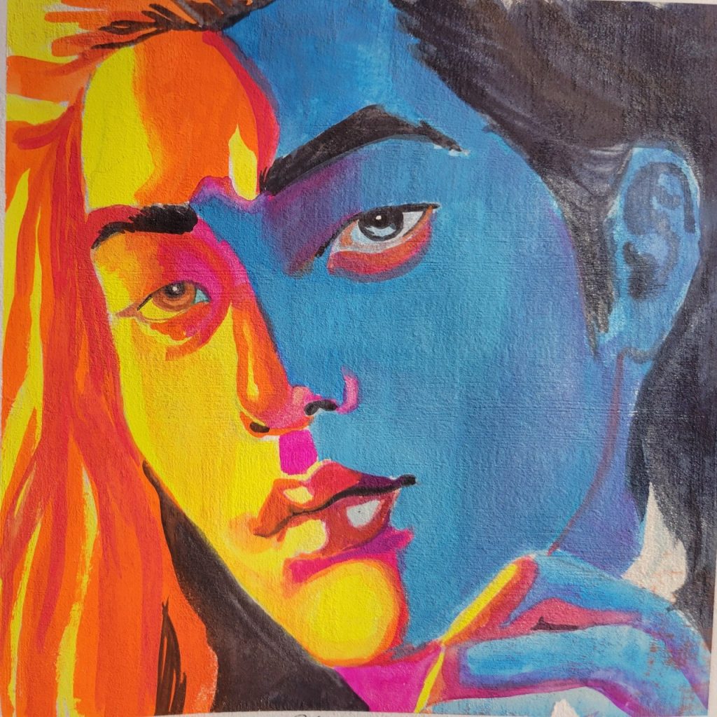
I tried again, even, this time with some fluorescent watercolours, thinking that fluorescence was the answer. I liked this one even less in general, but the colours were at least closer.
When I really thought about why I’d enjoyed the colours I’d picked digitally so much, I realised that the reason digital colours are so bright is because of that CMYK situation. That’s why printers use it and why another concept of the primary spectrum involves colours like PY3, PR122, and PB15:3. So, I thought why don’t I just use those colours. That was exactly what I was going for.
My first thought was to try it in oil paint, but I didn’t have any Phthalo Blue, so I checked my oil pastels and found that Caran d’Ache Neopastel have all those pigments nearly pure as sticks. The only thing was that the colour Lemon Yellow is PY3 and PG7, but it looked pretty good in a swatch, so I got them out and began my painting.
Painting with Oil Pastels
Something I bought a while ago for my oil paintings is Michael Harding’s Miracle Medium. I’ve really enjoyed using it in painting, and there is absolutely no difference in the way it works with paint compared to solvents, so I decided to try it with the pastels. This is something that I find many people don’t know you can do! Oil pastels can be used like paint, as in ‘drawing’ them onto a bit of ceramic or glass and mixing them with solvent/oil/miracle medium/solvent-free gel etc on a brush and painting them on. Unlike oil paints, the pastels will never fully cure and therefore need to be protected with glassine or matted before framing (or done on a canvas, I suppose), but they don’t have to be used only as crayons! Though, using them that way is its own kind of satisfying, for sure.
For this drawing/painting, I used Sennelier’s Oil Pastel Pad, which is a surface I really enjoy for these things. It takes a couple of layers to get to smooth blend level, but once you’re there it’s just fantastic. I think I prefer it to Clairefontaine’s Pastelmat (though I prefer Pastelmat for dry pastel).
I used seven total pastels to do this:
The warm side is Lemon Yellow (PY3, PG7), Fast Orange (PO62), English Red (PR101, PY42)
The transitions are with Purple (PR122)
The cool side is Gentian Blue (PB15:3), Indigo (PB60, PV19, PBk6)
The background is Blue (PB15)
Conclusion
I’m still not completely satisfied with how this came out, and I’m sure I’ll try it again someday with some other media, but there are parts that I absolutely love. For one, the colours are perfect. Aside from some struggles I had with the magenta being lighter than the blue and therefore making my shadows around the left eye look wrong, the colours are just what I wanted. The yellow half of this portrait, I would consider to be top quality as far as my skills go. I think the hair turned out fantastic.