Mort in the Rose Garden
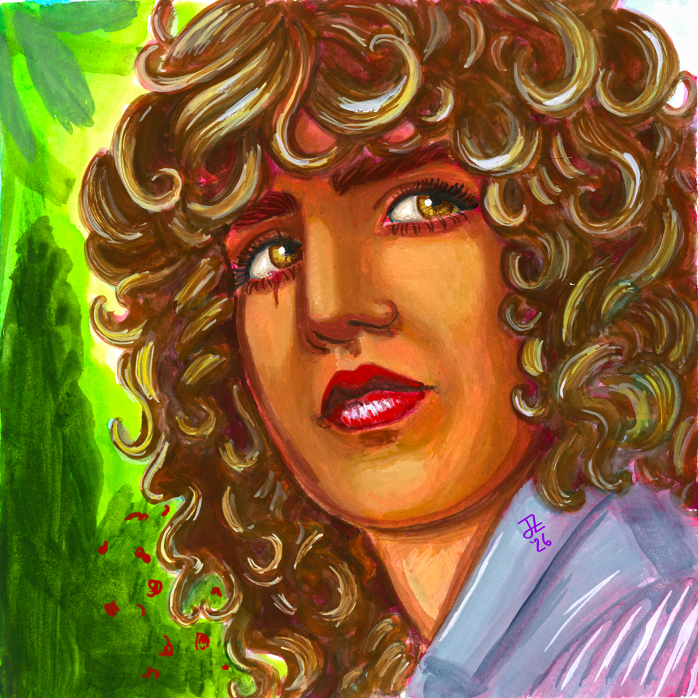
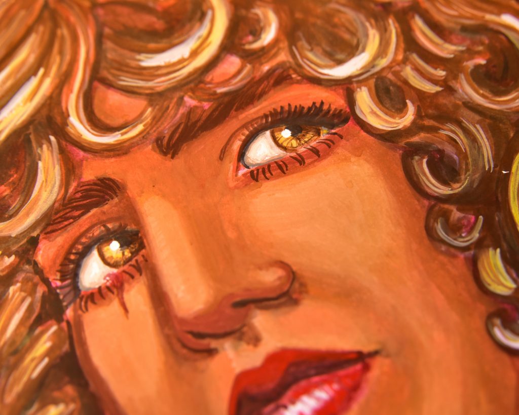
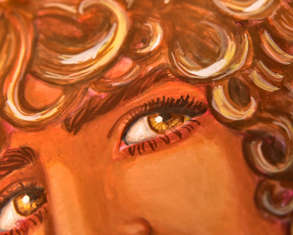
For this underpainting, I used a blue as my ‘white,’ crimson as the midtone, and a purple-brown for the shadows. I was looking to cool tones, which is very unlike my usual warmth, but I like to experiment.
I think this will go much better on actual watercolour paper, rather than the Stillman & Birn Zeta, though I do love this sketchbook. I think I’m making gouache work alright on it. This is a portrait of Mort that I have done quite a few times, and likely will continue to do. I feel that it makes a good official portrait. Any minute now, I’ll get some writing about him up, I’m sure of it.
The video is here (if the player below still isn’t working)