Gelli Plate Monoprint
My newest adventure in printmaking is the elusive Gelli plate. Years ago, I bought a similar version of this plate by Speedball, which can only be used with printing inks and not with acrylic. I forgot about that when I pulled it out and made a terrible mess with it. I’m sure that one is great for marbling or something, but I wanted to try something along the lines of an acrylic portrait, with multiple dried layers. So, I got a Gelli plate, which tout their compatibility with acrylics.
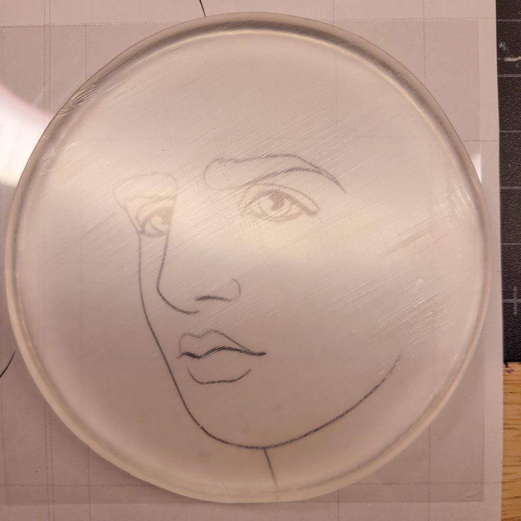
As usual, I used my default sketch of Mort in order to test out the medium. Since the plates are clear, it’s easy enough to have a printed version of the sketch beneath the plate and try and orient the size that way. I don’t recommend using that method for anything you want to copy intricately, though, because lining things up is an effort in hovering, closing one eye, and guessing. I probably should have just gone without it, but I was afraid of my composition being wonky by the time I got to the circular plate.
The First Five Attempts
My first five attempts at this were all completely awful:
This was with acrylic on the Speedball plate. Total mistake in every direction. I was also using gel medium to try and release it from the plate. Fluid medium is better.
This was with the proper plate, but way way wayyy too much water. Oh it’s awful. I mean, cool effect in the hair if that’s what I wanted, but it wasn’t.
This was was slightly better, but it was cracking on the plate before I was even finished. Partly because I kept picking it up to check the opposite side, and partly because I hadn’t ‘primed’ the plate with anything.
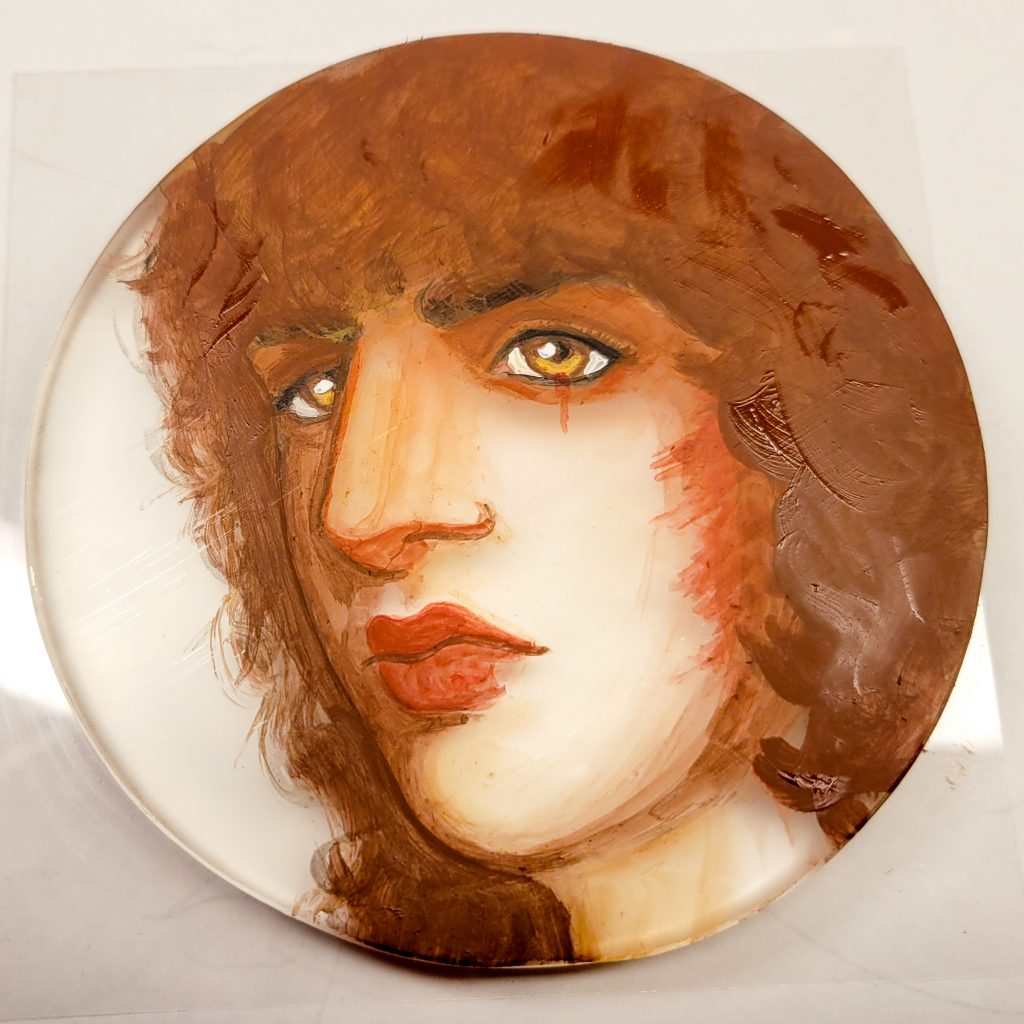
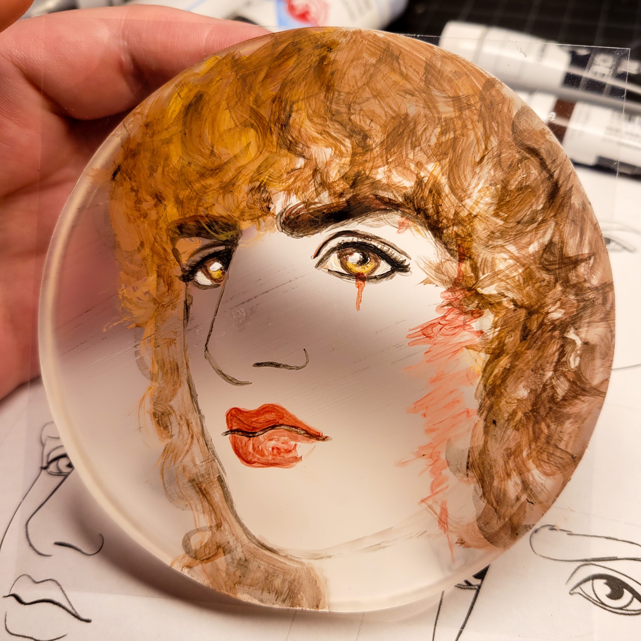
This one looks awful, but it has all the proper ideas! Before I added any paint at all, I put two layers of Golden Fluid Matte Medium over the entire plate. That made it so that the layers of paint would adhere cohesively and not crack. I did not wait for this one to dry fully, that’s the reason it’s missing pieces. I waited like thirty seconds when I needed to wait thirty minutes. Also, I painted everything in the wrong order. Starting with anything white, which makes the whites of the eyes pop out from the eye sockets.
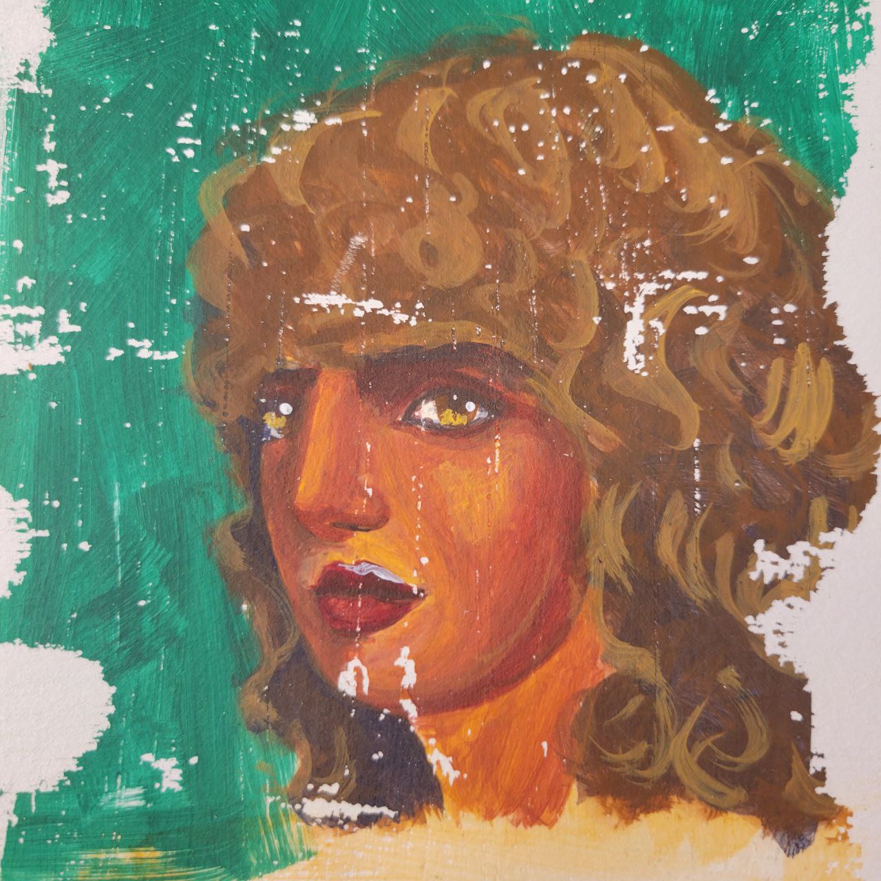
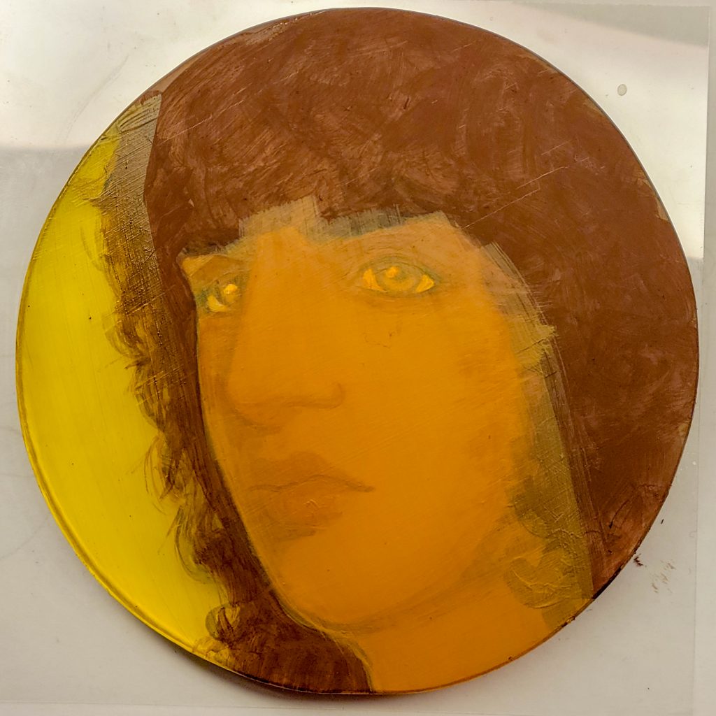
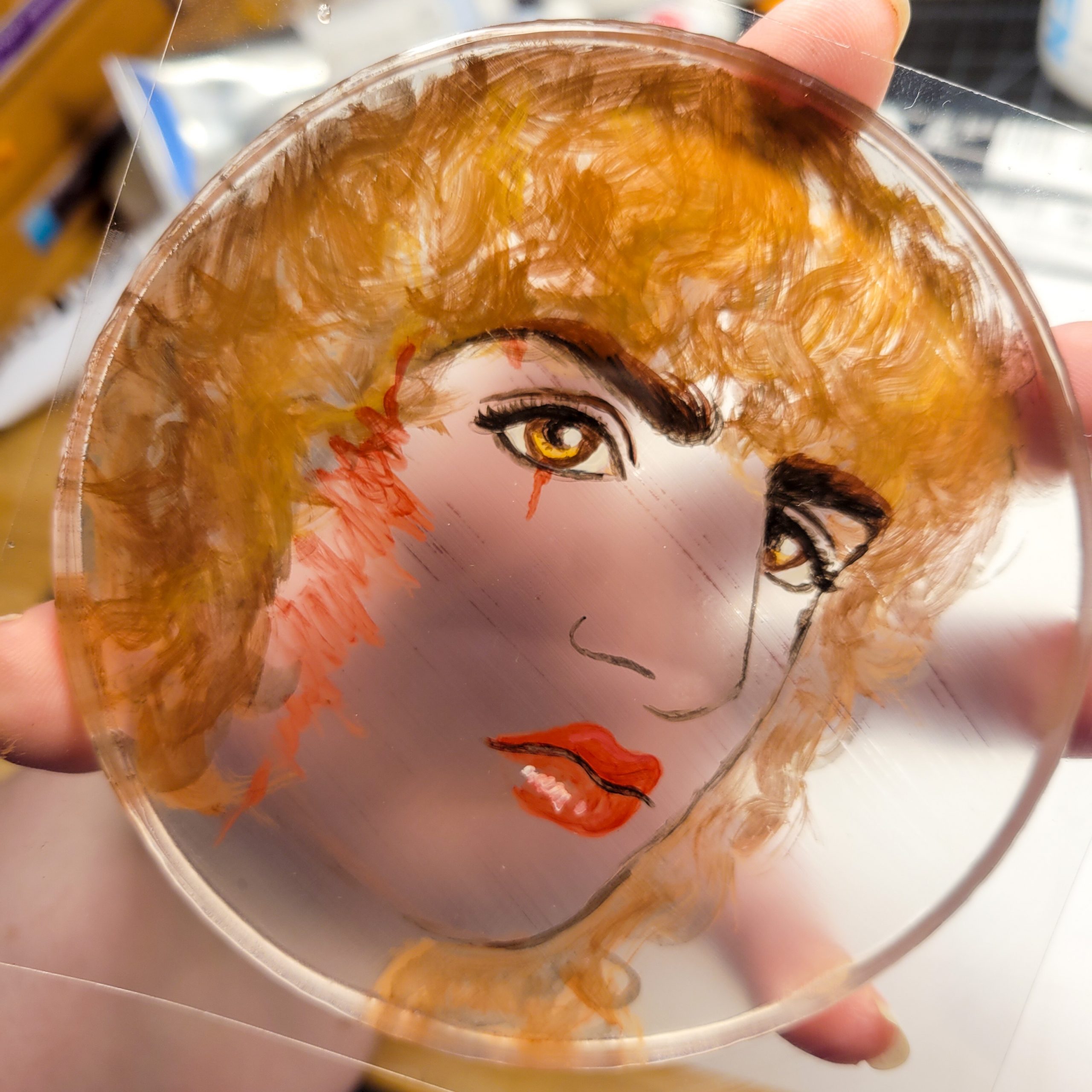
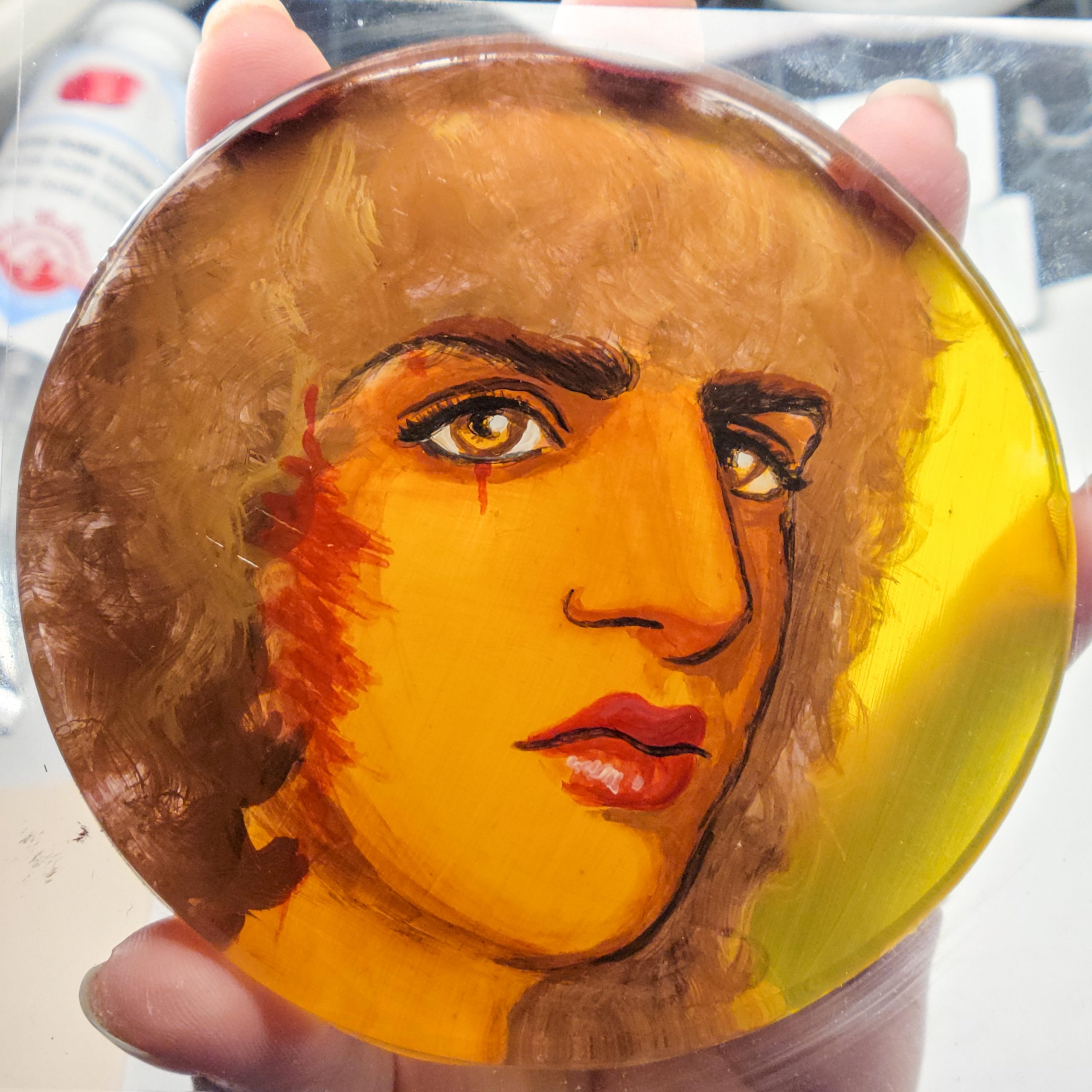
Rather than do an immediate redo of the same portrait, I tried a different one, of Mina Sang. This one has all the potential, but streaks a-plenty because I went light-to-dark and went on way too thick. The hair looks pretty good in this one, though.
The Sixth Attempt, In Detail

To start with, I got a smaller plate. Here it is, over my sketch, with two coats of fluid matte medium.
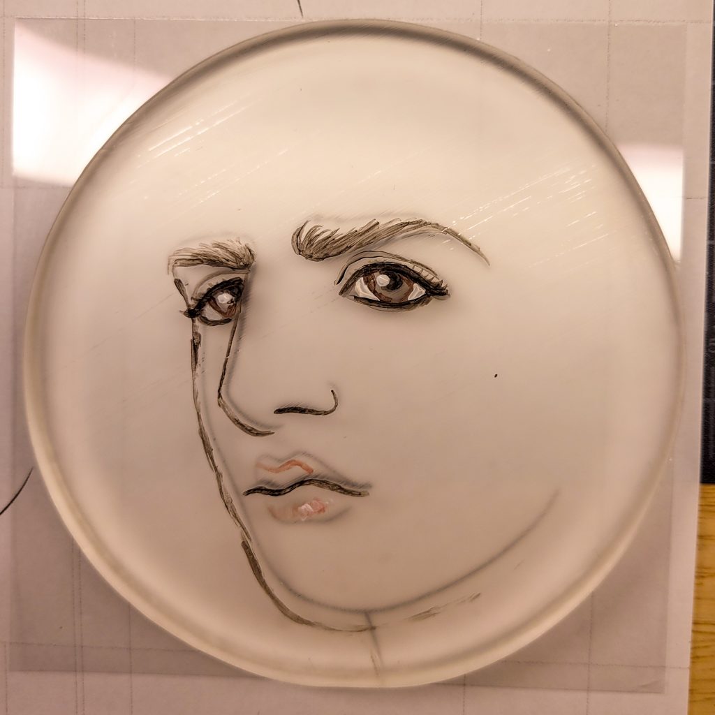
I started with all the places that need to remain black or very dark, like pupils, nostril, and part of the lips. I *should* have started with the white glint in the eyes, but I made the pupils crescents, so it was alright. But, next time, glints are step one, HAIR IS STEP TWO, and then darkest blacks.


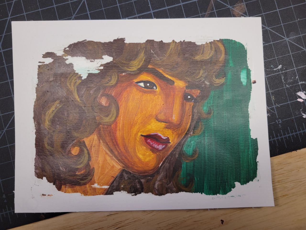
This was dumb, even though I was excited by how well the paint was adhering and totally counted it as a win. Hair. Hair should have been done before this, because hair is in the foreground. So, unfortunately, Mort’s eyebrows are going to be in front of his fringe. But, hey, I’m learning.
After I did the lips and the scars, I finally realised I should have done the hair. So, the scar is also outside of the hair. But, it could have been worse, I could have done all the skin before recalling the hair.

Here’s a brave check of the front. Since this plate is so small, it wasn’t so bad to pick it up.
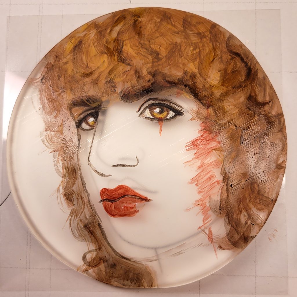
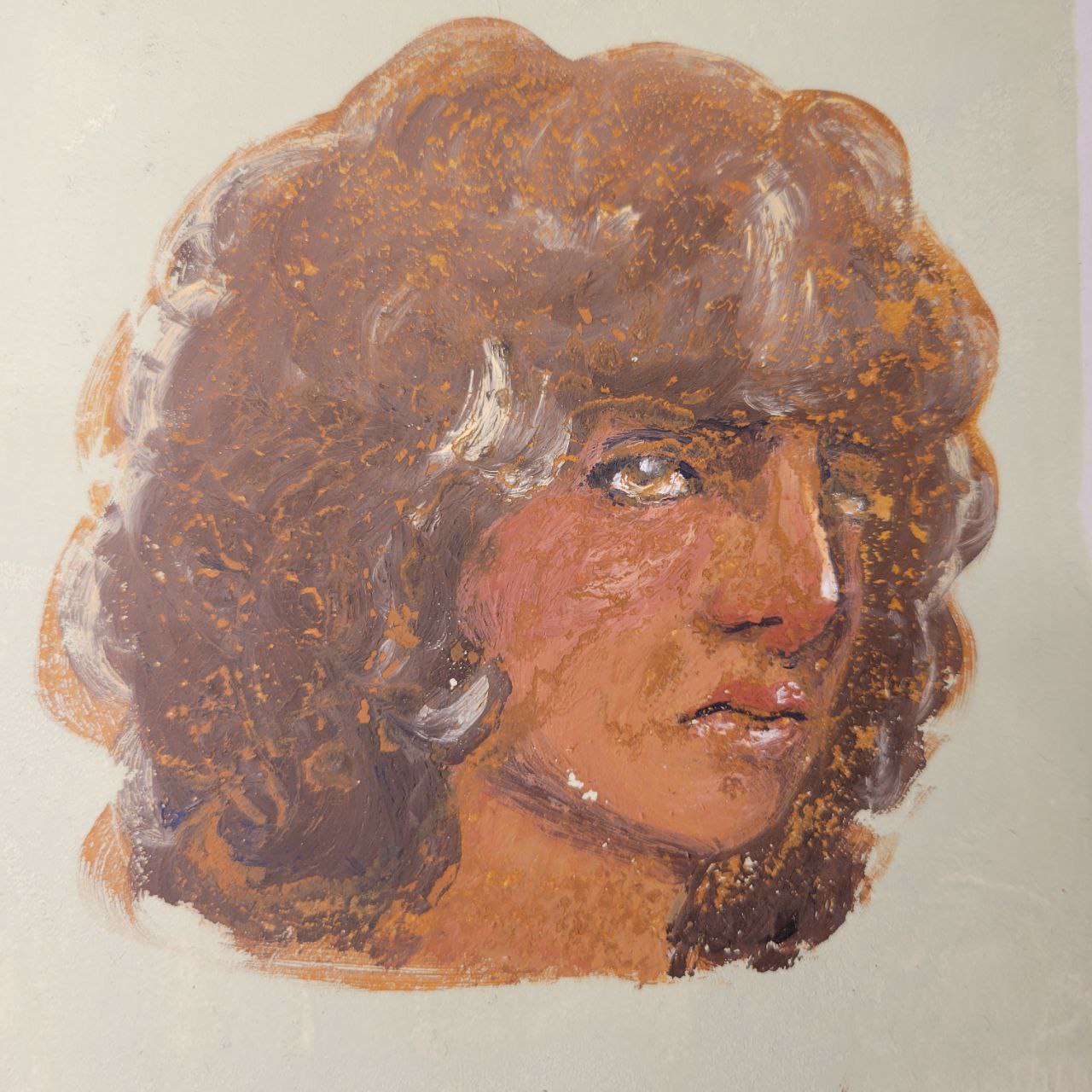
Here, I’ve started adding some shadows. This is a much better idea than starting with highlights, because the blends will work better dark-to-light. Thin layers of paint is crucial here, I’ve learnt.


More shadows and shades of red, added in multiple layers. Probably five or so thin layers of deep shades. More would likely have been even better. I also added a thicker layer of brown throughout the hair. This is the underlayer of the hair, signifying that I’m finished with it. It should have been darker, but that’s alright.

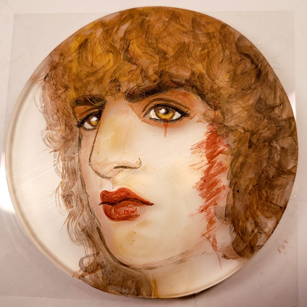
Another check of the front after my main underlayer of skin. I added two or three coats of that underlayer, to really try and get rid of any streaks. At this point I was very surprised that it looked alright.
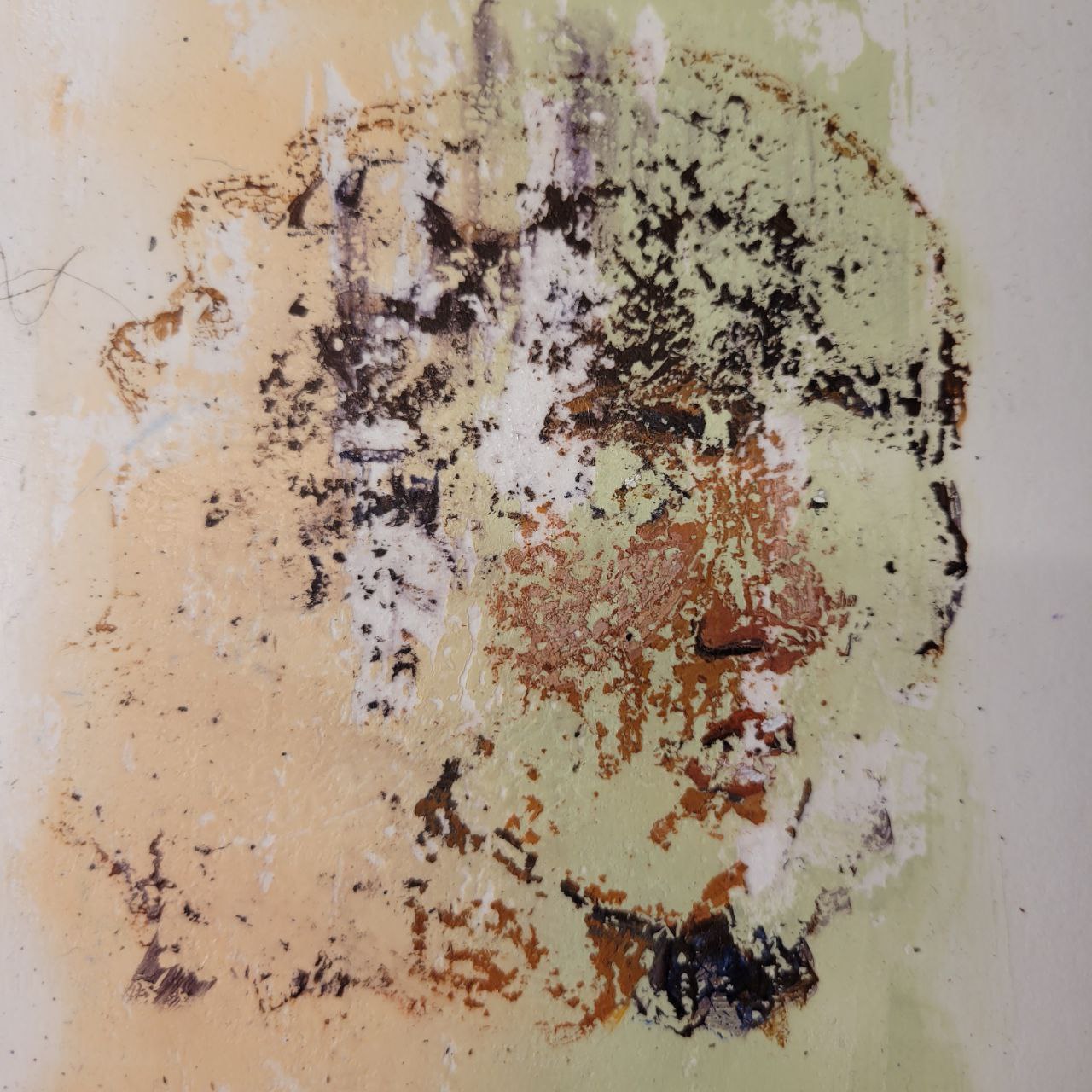
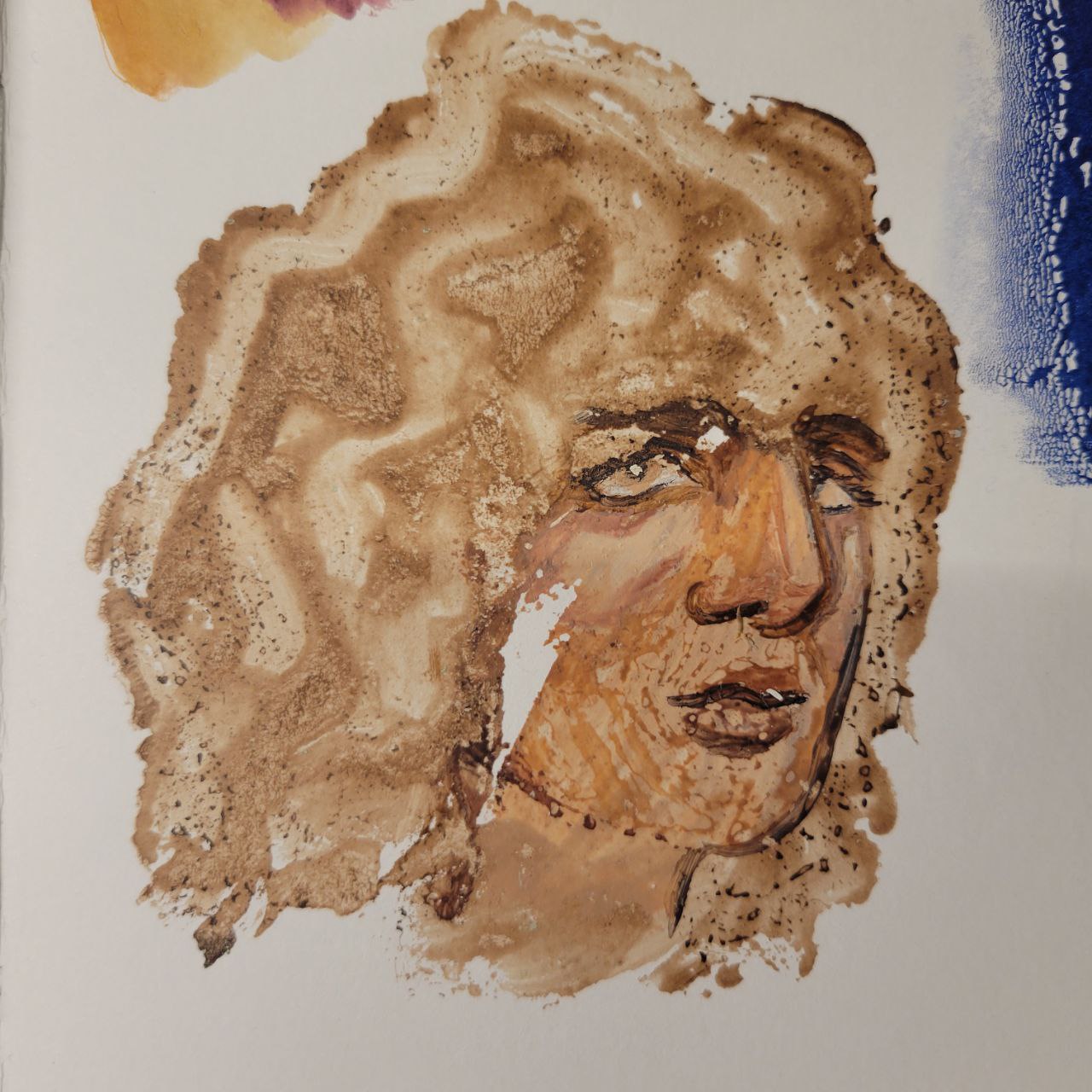
Then, I cut a bit of Fabriano Rosapina which was bigger than the circle (I think the circle is 4×4, so I cut a 5×5 sheet). I knew I’d need to trim it once it was done, because I didn’t have any nice way to line everything up.
So, once the final layers were dry, I coated the whole circle in more fluid matte medium, and quickly pressed the Rosapina paper over the top. I did some brandishing with a bamboo barren, and then left the room. No temptation. I made myself dinner and let this unit dry.
The Final Result
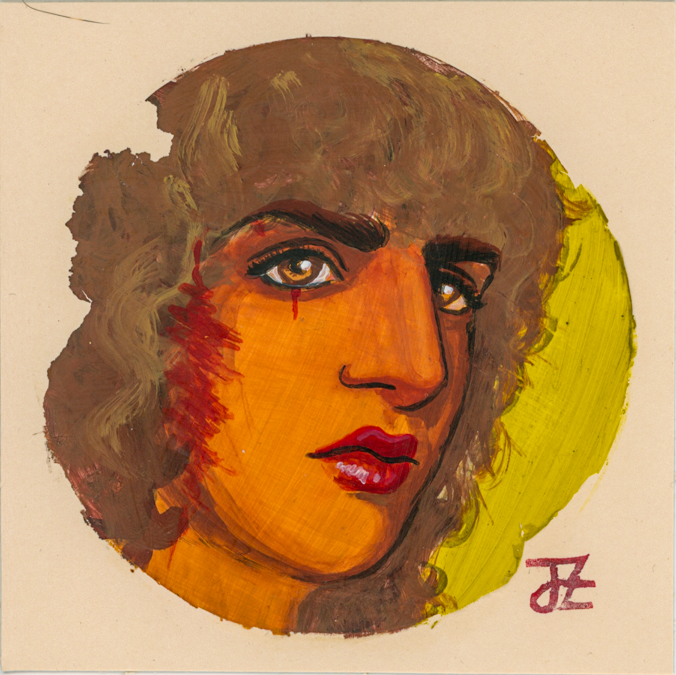
Here’s a video I took of the reveal, mostly to look back on it and analyse what, if anything, went wrong. Not everything released, which is only okay because none of the missing pieces are through the face, I think. Personally, I love the cut-outs around the edges, but I wish I understood why it happened. Did I not let it dry long enough? Did I not add enough medium? Next time I’ll add more medium and wait longer. Oh, and try to get the order of things right.
But, I think this one is good enough to conclude my attempts with the default sketch! I understand the medium well enough and next time, I’ll try something new.