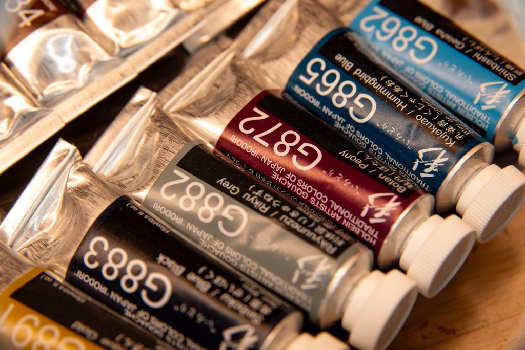
Holbein Irodori Gouache – Winter Set
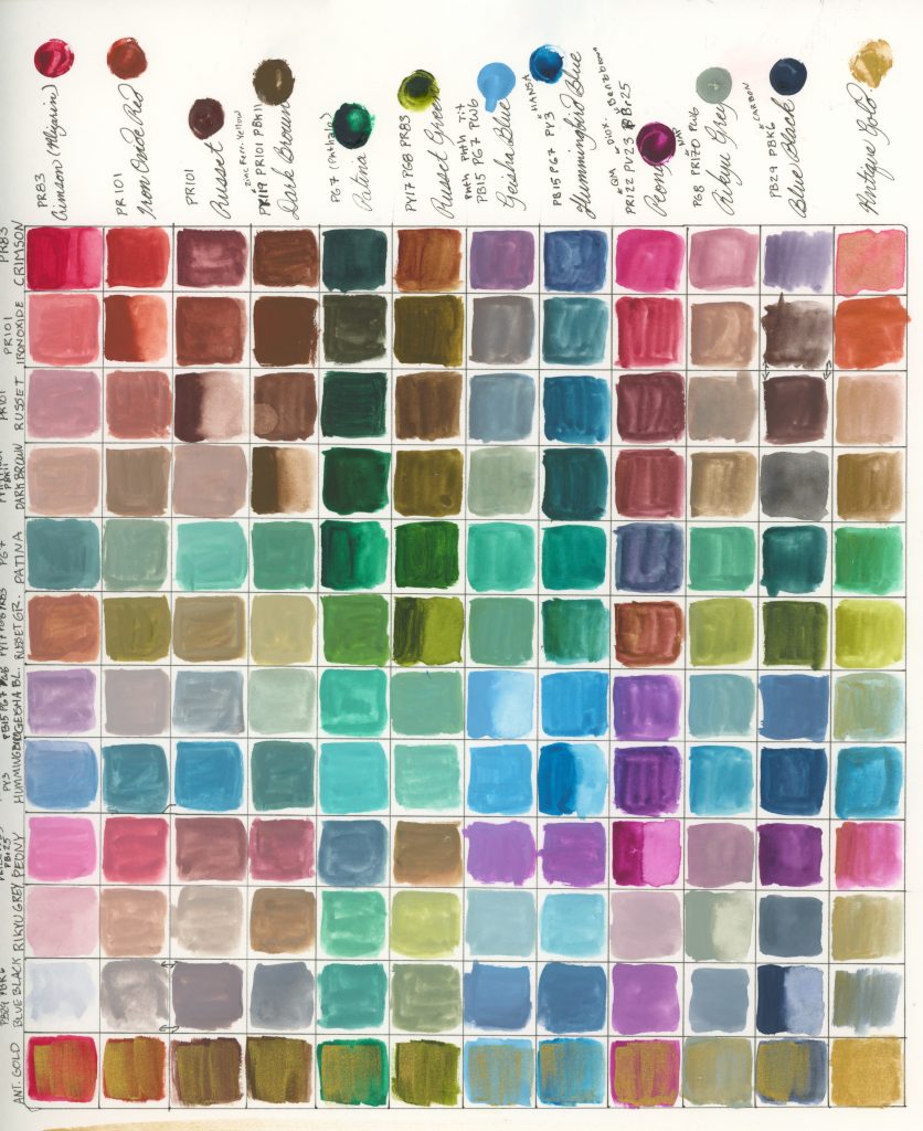
Pigment Contents
4 pure pigments: Crimson PR83, Iron Oxide Red PR101, Russet Brown PR101, Patina PG7
1 pure pigment shaded: Blue Black PB29+PBk6
6 three-pigment mixes (three of which are shades/tints of two-pigment mixes): Dark Brown PY119+PR101+PBk11, Russet Green PY17+PG8+PR83, Geisha Blue PB15+PG7+PW6, Hummingbird Blue PB15+PG7+PY3, Peony PR122+PV23+PBr25, Rikyu Grey PG8+PR170+PW6
1 metallic: Antique Gold
As with the autumn set, I used my own white while painting.
When I tried out the autumn set, I didn’t realise how easy it was to paint with with my current knowledge of colours. Silly me, I’d lightly complained abouth an excess of yellow with that set. Well, joke’s on me because the winter set has no yellow at all!
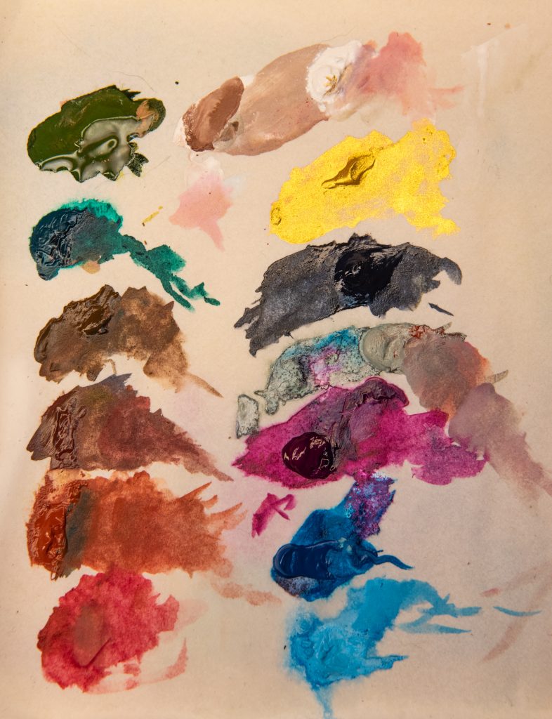
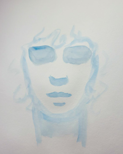
There are three yellow pigments in the paints, yes, PY119 in Dark Brown; PY3 in Hummingbird Blue; and PY17 in Russet Green. But Dark Brown also has PBk11 mixed in there, PY3 is consumed entirely in blue, so PY17 is the one I needed to rely on. It took me a lot of trial and error to get this right, because I like to paint a range of skintones, and I struggled very hard with getting warm brown skin with this palette. Here is the journey I took to get to something I was satisfied with:
Examples

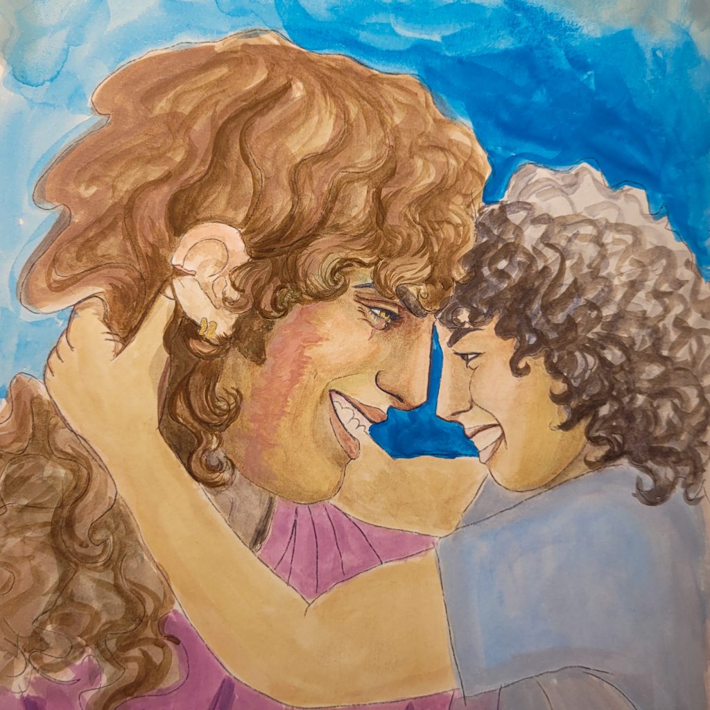

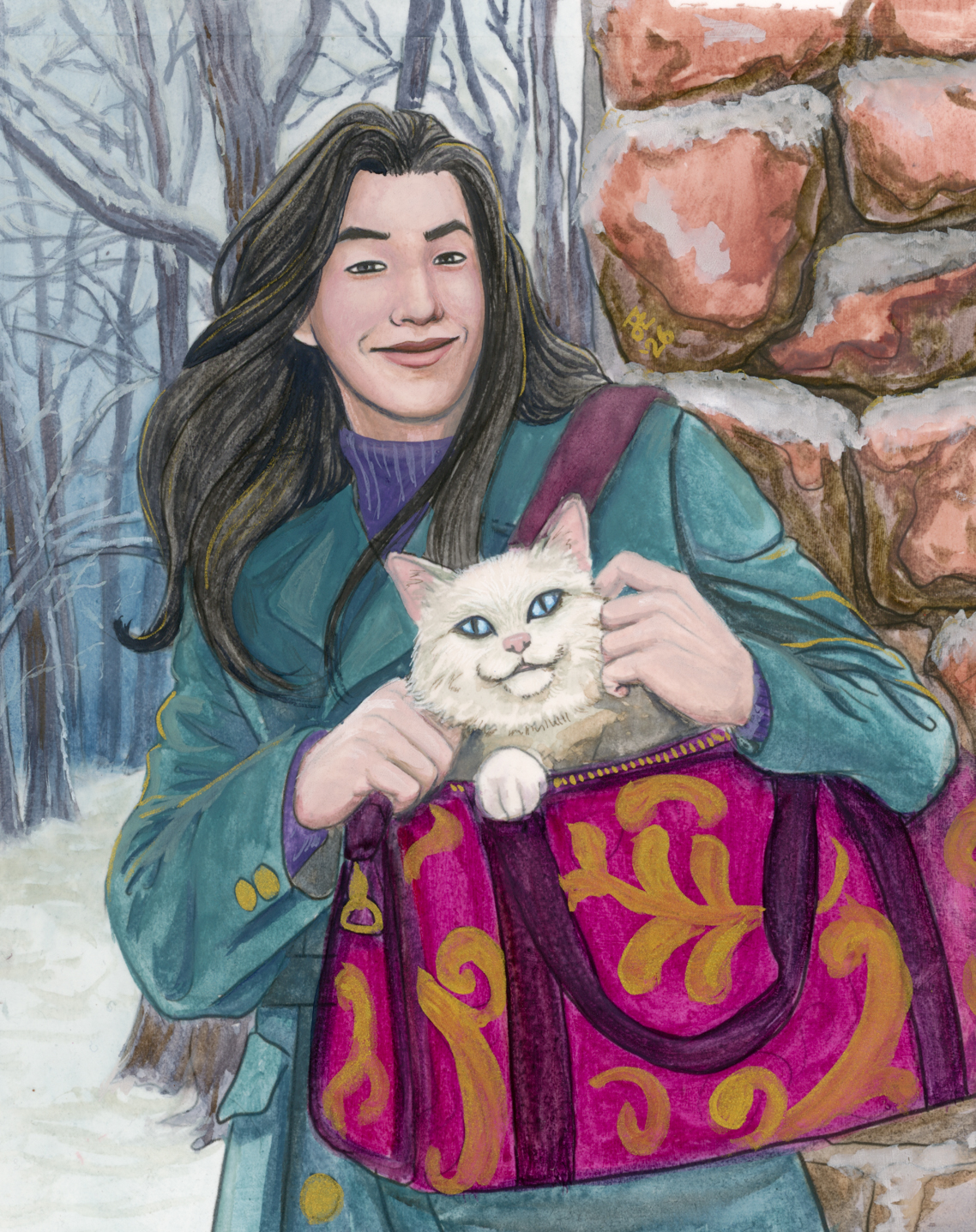
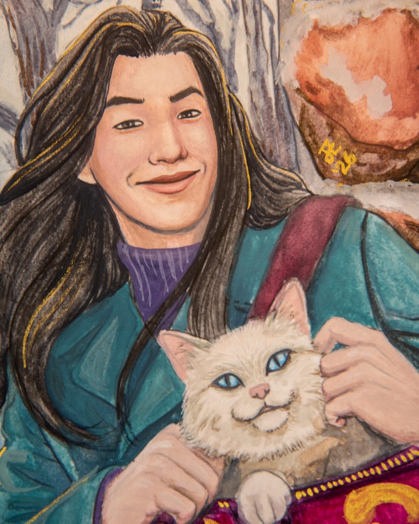
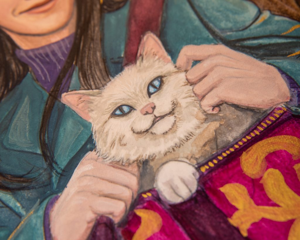
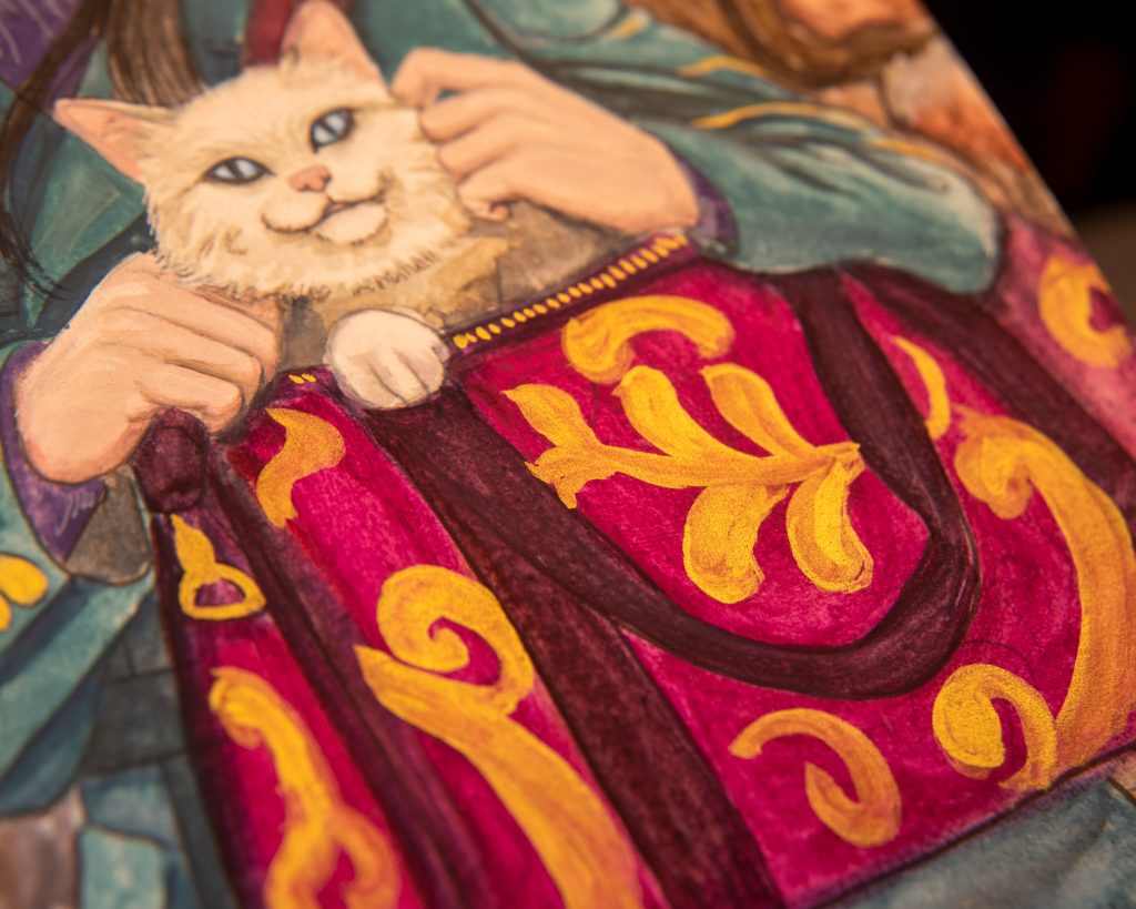
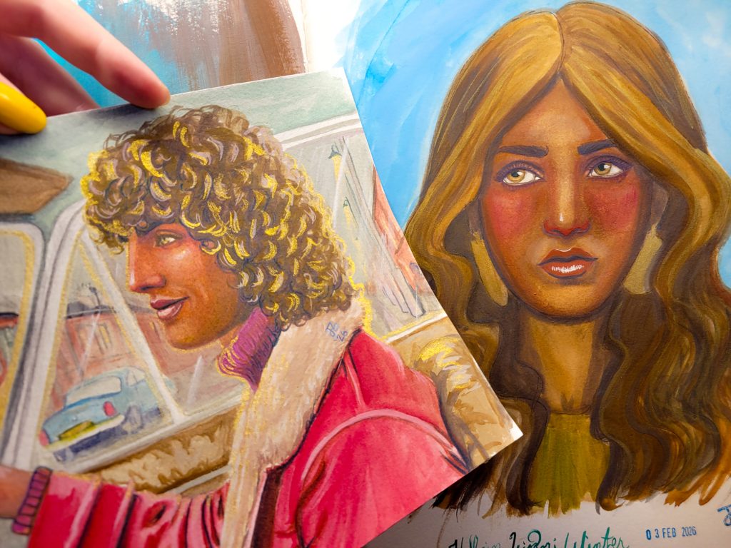
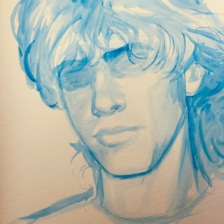
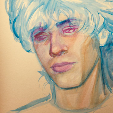
Jon and Mysty
Making light skin tones is pretty easy with this palette, and keeping the tone cool is natural. The bright of the Peony, which I used on the bag below, is a nice pop of saturation. The inclusion of PR83 is something I think a lot of people will dislike about this set. It’s in there twice.
Making black is also very easy. Mixing Blue Black and Dark Brown is one option (Jon’s hair uses this mix), but Patina and Russet Brown or Iron Oxide Red is a warmer option (used in between the stones).
I was satisfied with this painting, even though it’s just something in my sketchbook, so I decided to try and make something bigger.
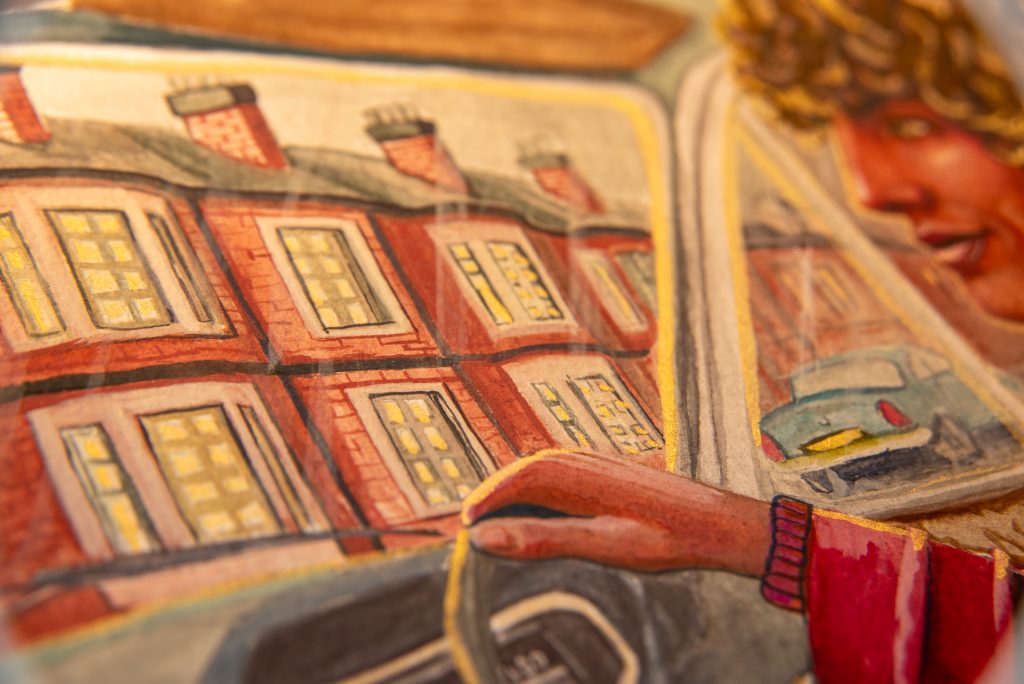
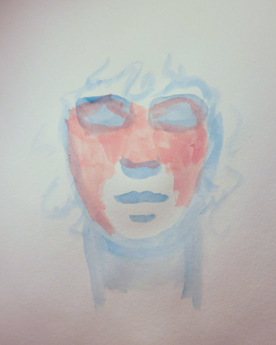
Mort Driving
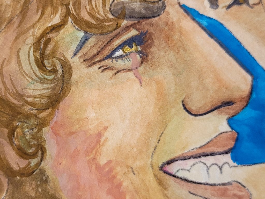
Making a warmer deeper skintone was ridiculously difficult for me. And the first thing I ended up with, while trying to make a warm brown, is not ideal. It’s much too red, especially under my warm studio lighting (rather than my scanner in the full image, which still shows the redness, though).
So that’s when I realised the other limitation of this palette was the lack of yellow. I used Russet Green and white to make some light warm tones (anything that looks “white”), but when it came to skin, I started with Dark Brown. I thought was going to be a perfect base for brown skin because it has PY119 and PR101 in it, which is one of my favourite mixes! However, because of PBk11, it was difficult for me to bring out of grey. Greyed tones are what the palette wants, but it kept looking unnaturally grey in skin. That’s why I kept adding more and more reds. Bits of PR101 (both Iron Oxide Red and Russet Brown, I did them both), and PR83. I even popped some Peony around the eye towards the end because I was trying anything that would stick.
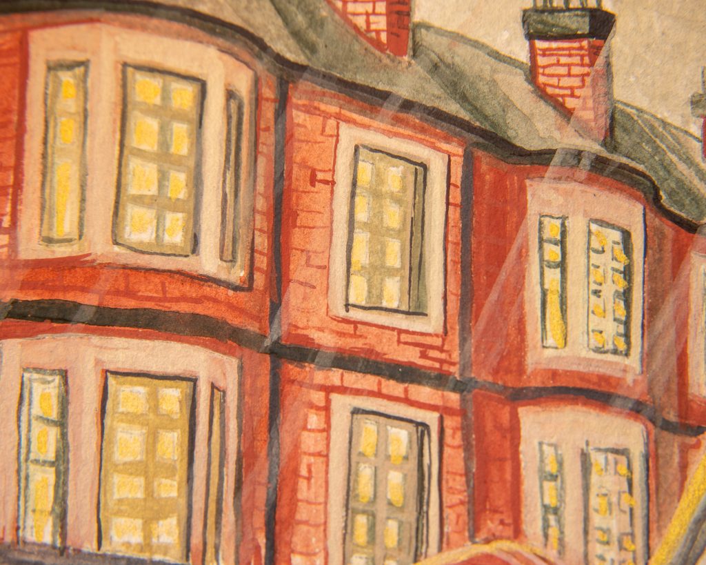
The video doesn’t show me painting the face, because the camera died. But, I’ve added it in because I think it’s great watching me paint the buildings.
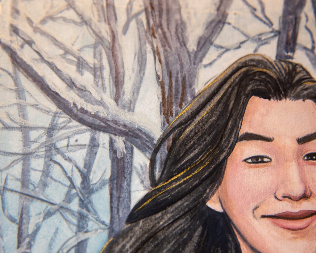
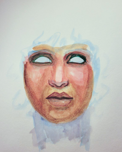
Keti
I was so dissatisfied with the skintone on Mort, that I tried again. I don’t have this many struggles when I have a yellow paint in the mix, but without one, my brain couldn’t seem to fathom how to get it to work. I’m trying to expand my understanding of colour relationships, though, so this was good practise.
I didn’t force myself to use every paint in the set for these attempts, but I do use every single one in the painting of Jon and Mysty, and both paintings of Mort driving.
My first attempt to try something new, was to try for something darker, and to mix the PG7 with the PR101 and/or PR83 to get a brown that has the illusion of yellow in it. The reds kept overtaking everything, and eventually I just ruined it by trying to rely on the Dark Brown again (convinced that I’d use it right this time). It’s pretty similar, just darker. Still too red.
Blue First
Then I tried to just make an underpainting with Blue Black and build on top of that. I thought the cool tones of the blue would make everything else look warmer. What did we end up with? Way too much red again.
Light Skin Again
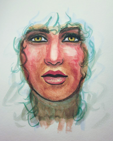
I started to think that I just forgot what I was doing in general. So I tried to do light skin again, just to see if I’d simply gotten lucky with my painting of Jon. No, it was working out just fine. I left it unfinished because it was a success and I didn’t want to put more PR83 on the palette just to finish a wonky sketch. For a moment, I was about to give up, but the next day I was compelled to try again.
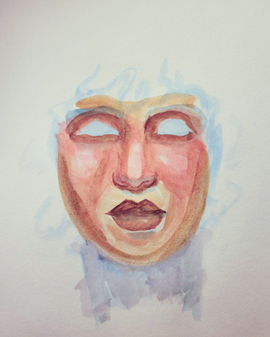
Mort and Mina
This time, I tried Patina as my underpainting. Green and red make brown, after all, and PG7 is quite the green. I was using it to make blacks, but why not tone it down for for brown? When I did this attempt, I was finally satisfied. There is a bit *too much* green in Mort’s undertones, but I think Mina’s, which I mixed with a bit of Russet Green got a pretty perfect balance. So, with that in mind, I decided to redo the painting of Mort driving, because the more I looked at it, the more I disliked it.
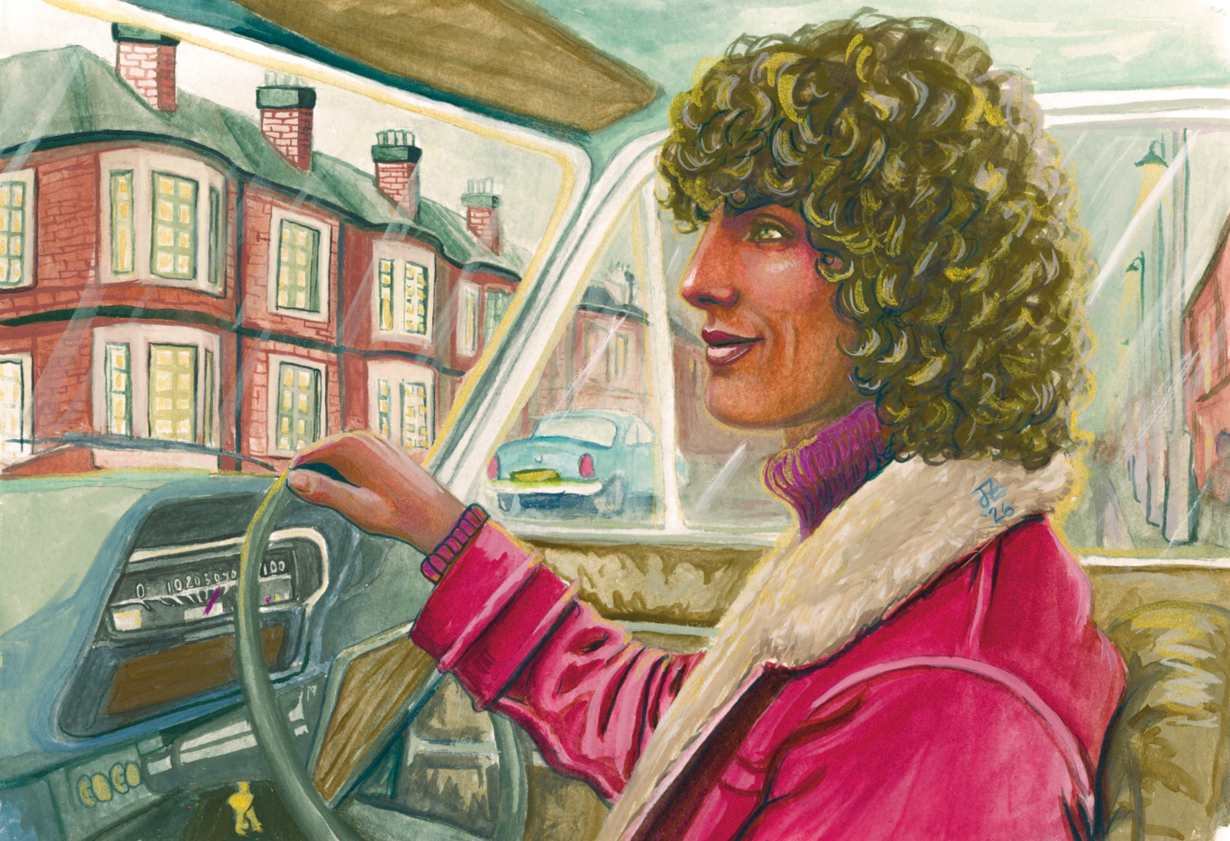
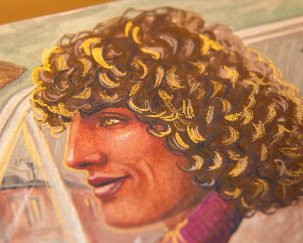
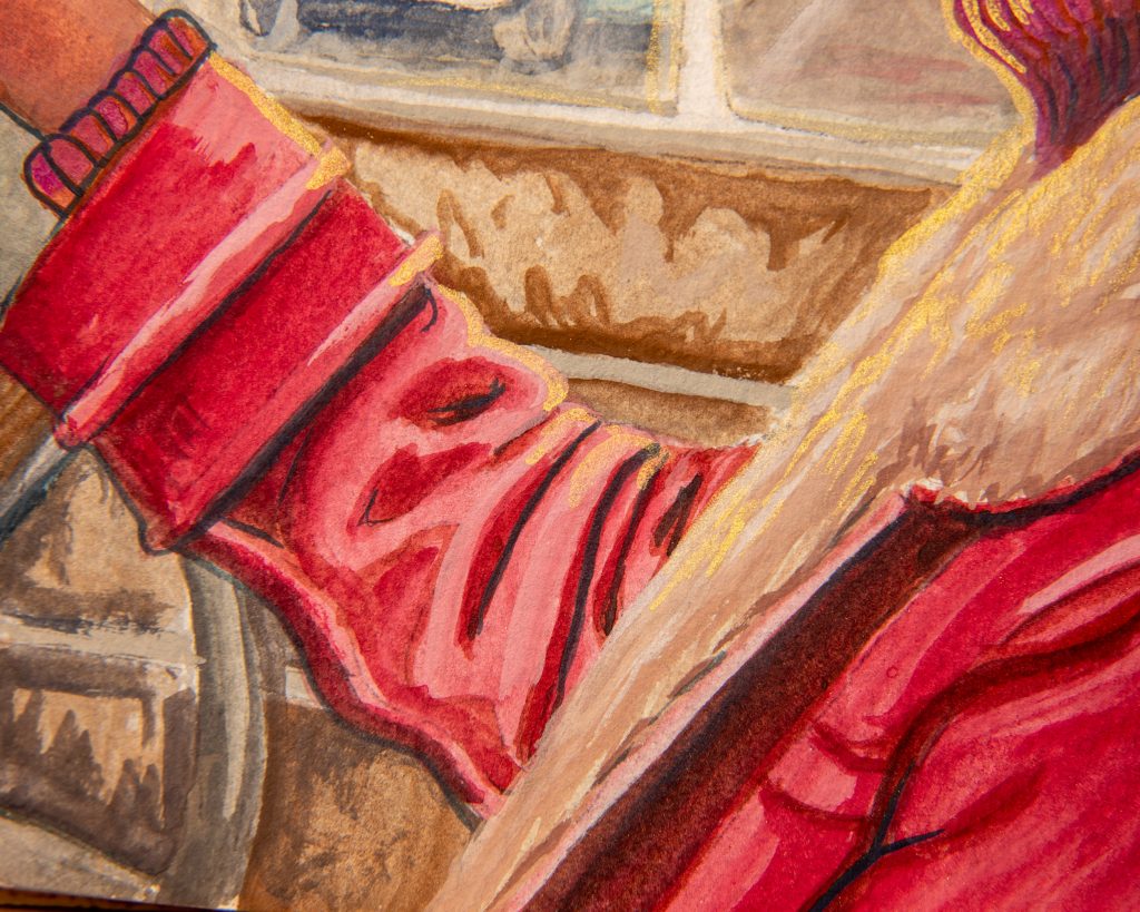
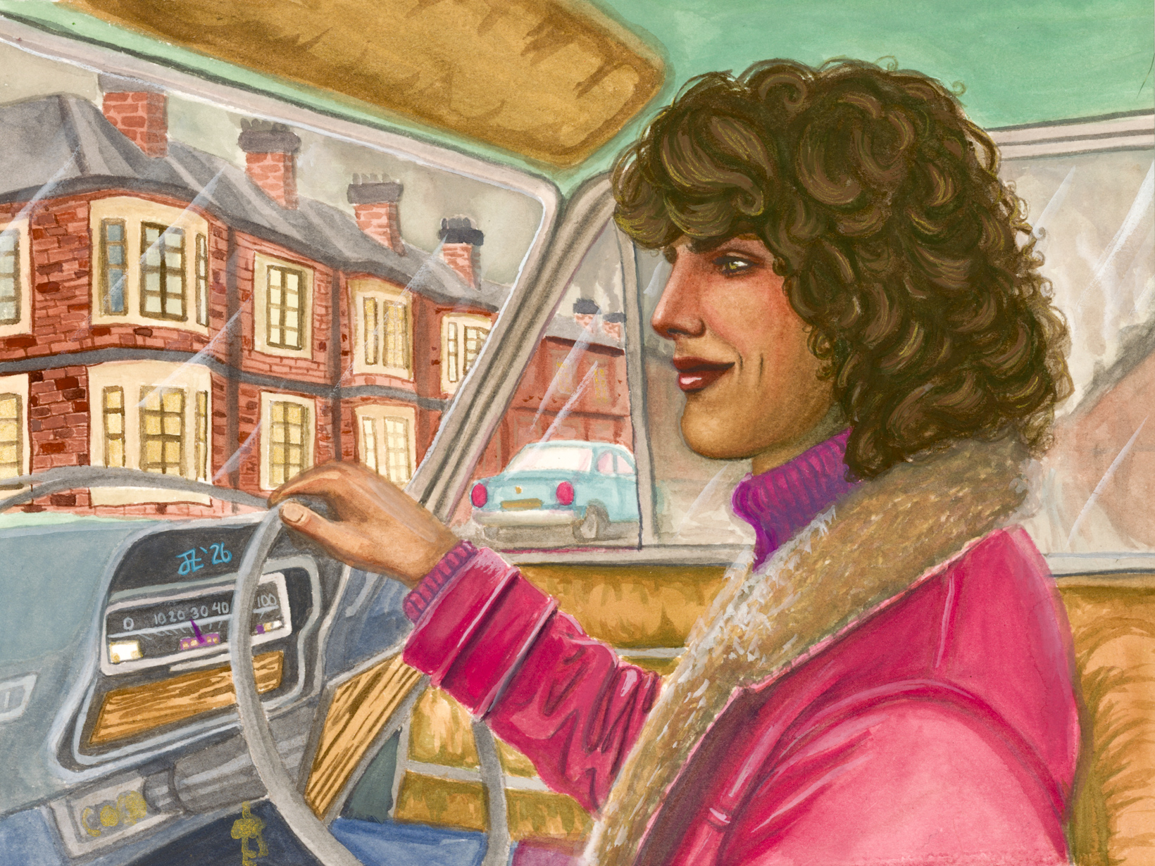
Mort Driving: A Much Better Version
Even though it’s still not quite the golden colour I usually end up with, that’s alright because the grey environment actually works this time. It’s more than just the skintone that makes this one superior, though. I stretched my paper, worked wet-in-wet, and was just much more patient with it.
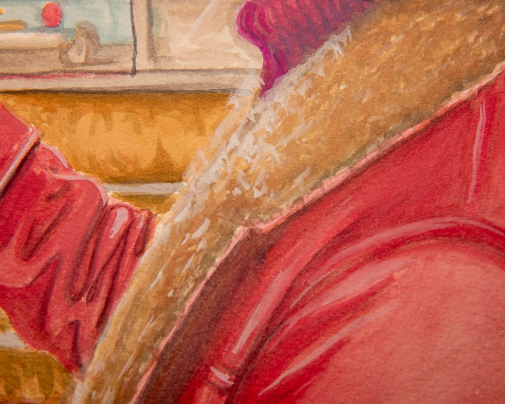
Russet Green is dabbed into everything in this painting, and I mean *dabbed,* which was a difficult balance for me to maintain. The car interior (seat/panelling/wood accents) are Russet Green with Iron Oxide Red and White. It’s also what the base mix for the skin was, but I added in some others for shadows highlights and blush. I used straight PG7 under the jaw for a spell, which caused me to panic a bit, but it looks alright. I do think that the face is unbalanced in tone, but it’s so so so much better than the other attempt.
The coat, by the way, it almost entirely just straight Crimson. So, enjoy it as it is now because according to everything ever, it will no longer be red one day.
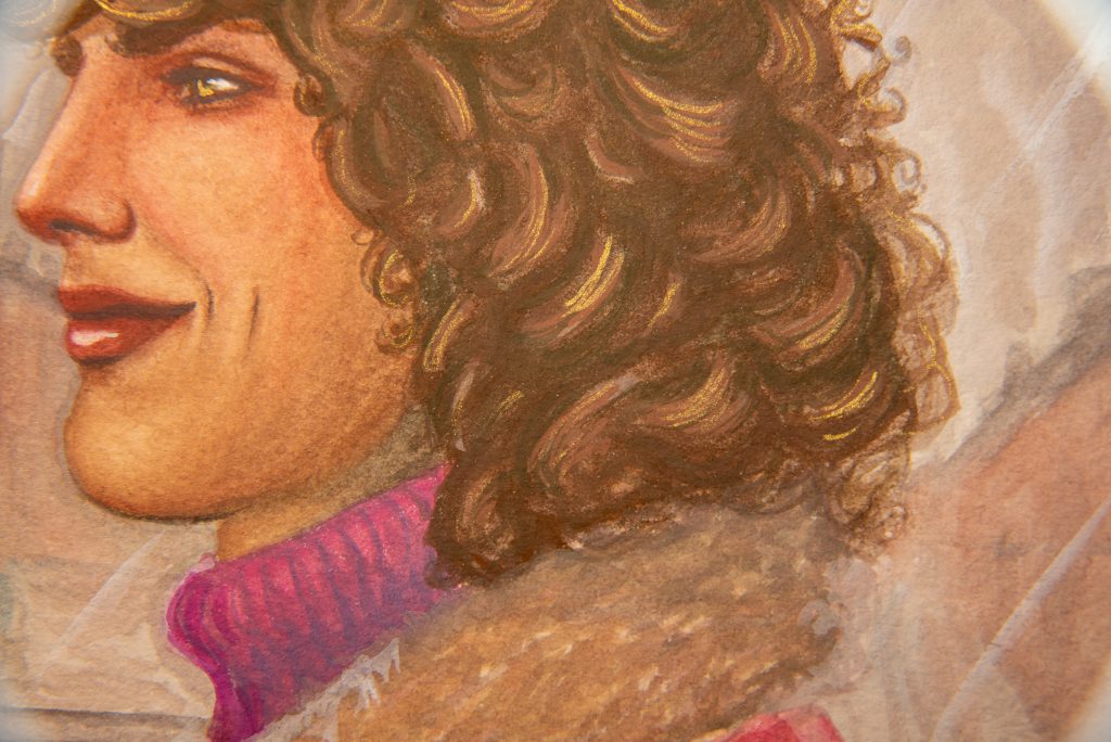
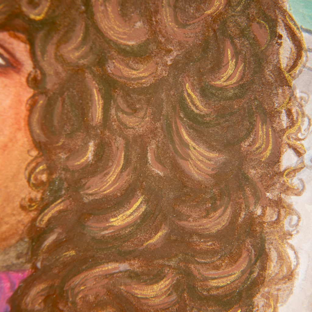
I do like the buildings of the first one better, though, to be totally honest. But, as a trade off, this hair is absolutely amazing, and I’m very proud of myself. The gold highlights are a bit lighter here, which I’m not sure if I like better or not, but I think it fits the whole vibe better.
To Conclude
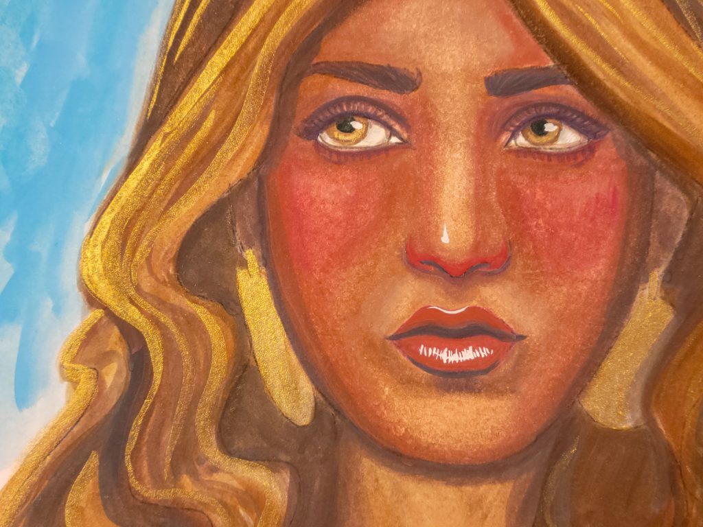
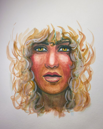
Colour is fascinating, and learning about it has brought me so much joy this year. I hope that one day I return to this set with even more understanding of how to get what I want out of the colours. I use the Iron Red Oxide in my normal palette ever since I got the set, and use Patina as my PG7 whenever I need it, but using it as a confined palette was a challenge. Spring is coming and I think I’ll probably try the spring set too. I checked and there is indeed a yellow there (three of them!) so I wonder what my new issue with be.
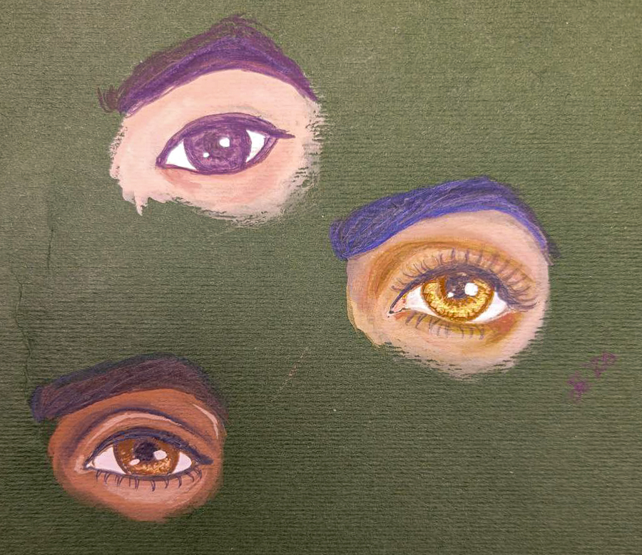
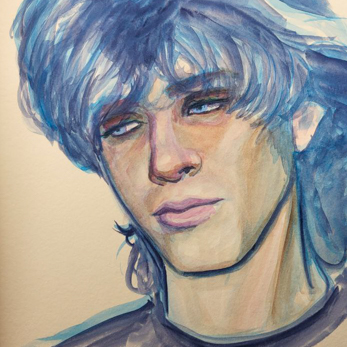
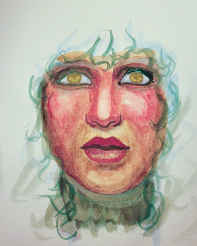
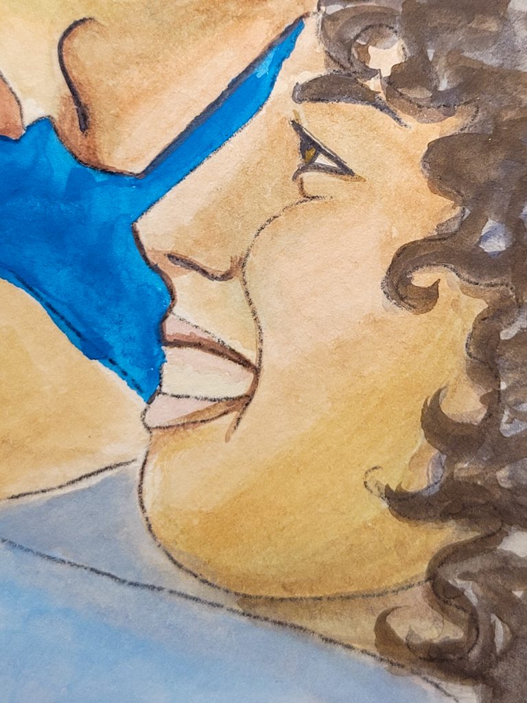
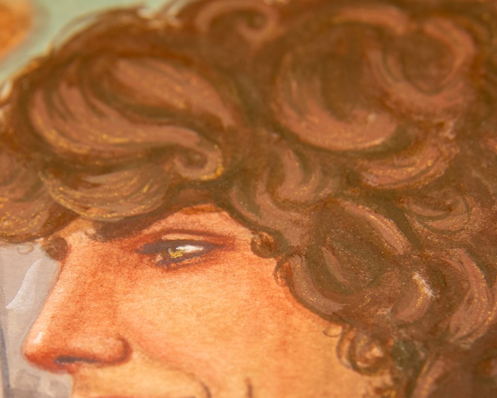
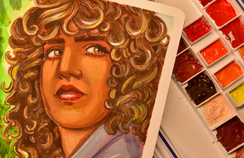
Above is an attempt to try and get just three skintones, and the struggle with golden brown is still there. The gold in the iris works because it’s the literal metallic gold. That doesn’t do well in skin, though, I promise.
One thought on “Holbein Irodori Gouache – Winter Set”