Fountain Pen Ink Beneath Gouache
I’m just not going through my fountain pen ink samples as quickly as I’m writing with fountain pens, so I’ve been trying to use them for more artwork. My first thought was to paint with them alone, as I do when I test them out, but then I recalled using Indian Ink as underpainting in university. Fountain pen ink is generally resoluble, though, so I thought, well, I’ll bet gouache will blend with it. Turns out this is a thing artists sometimes do, so I had to try it! It has ended up being my new obsession. Ink beneath gouache.
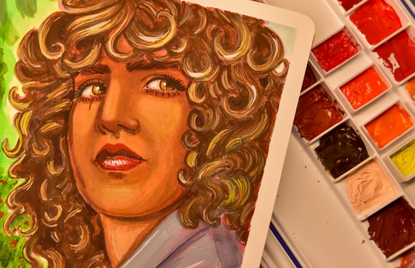
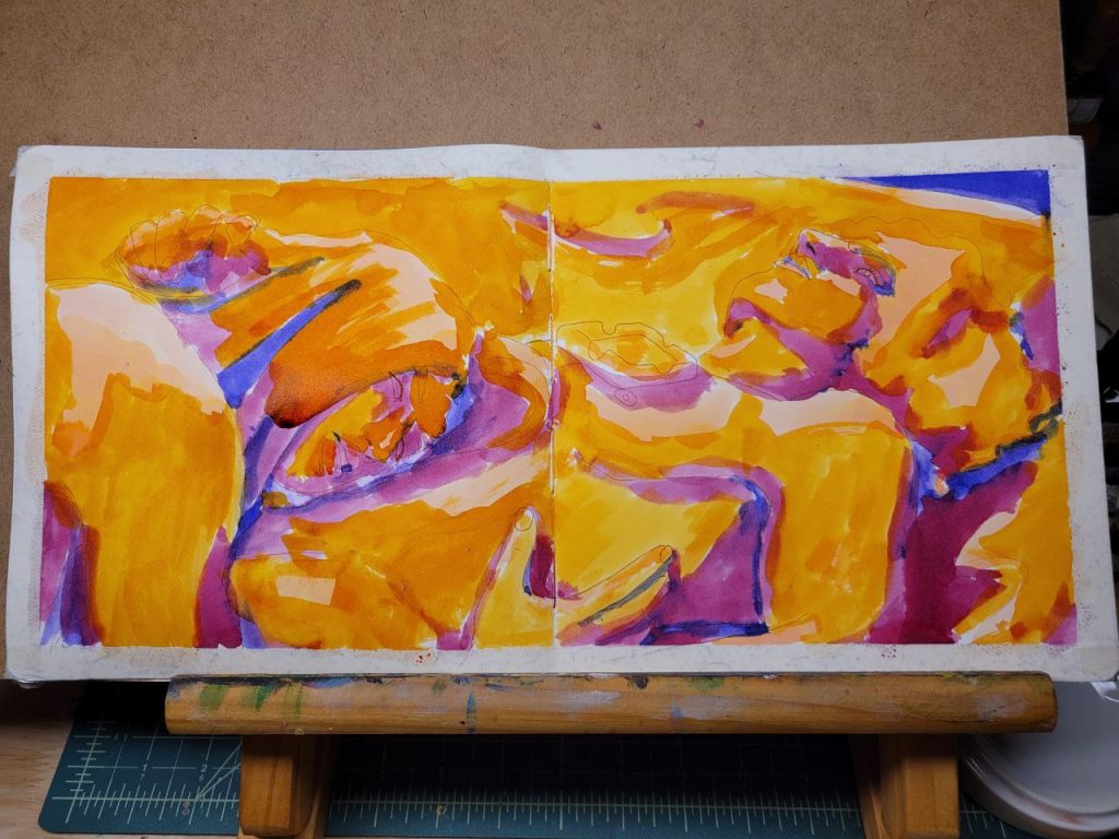
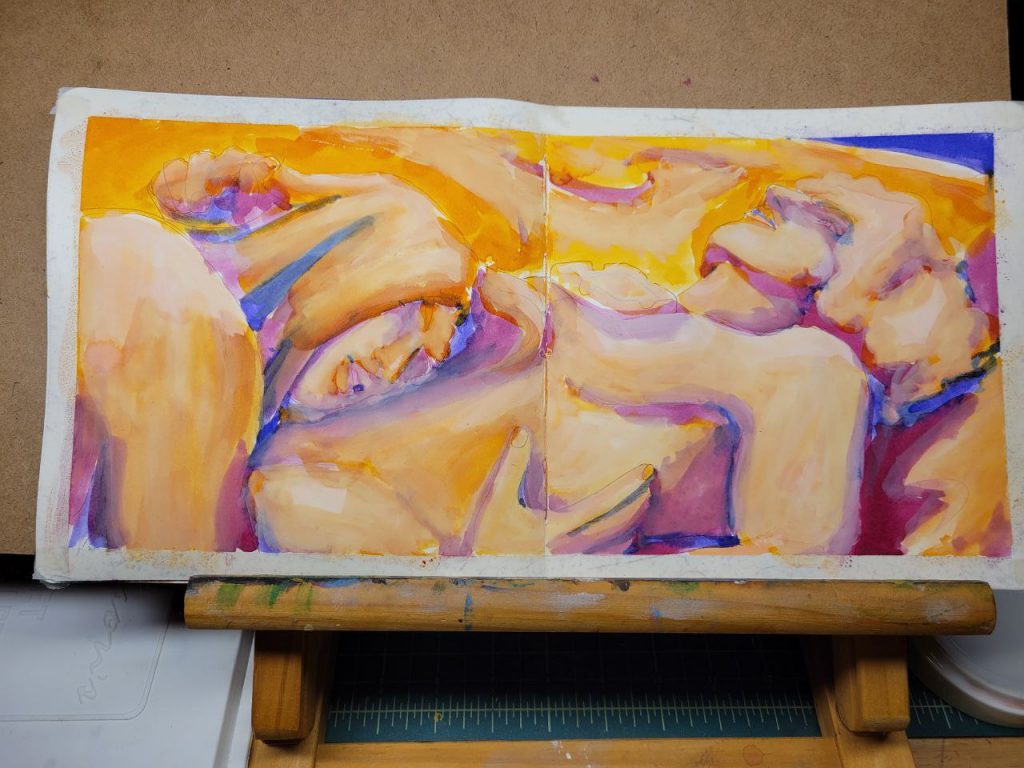
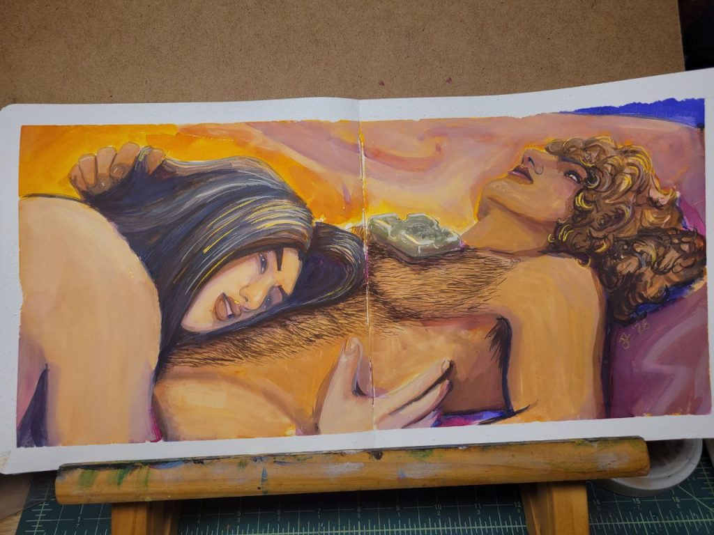
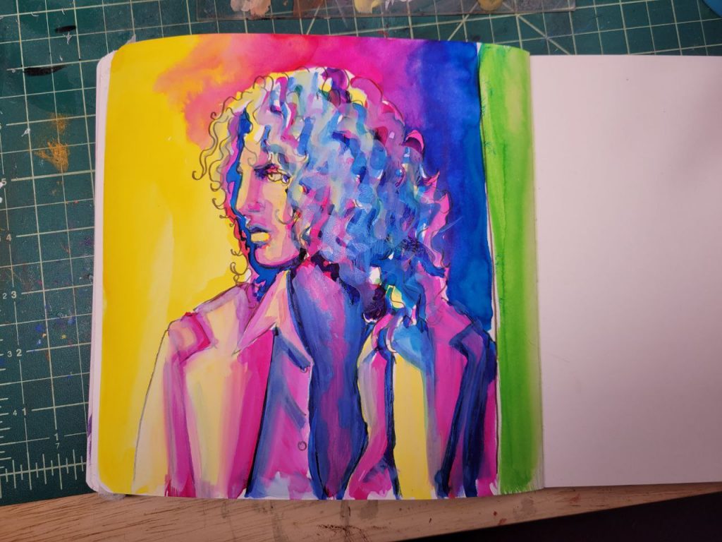
Jon and Mort Know the Same World
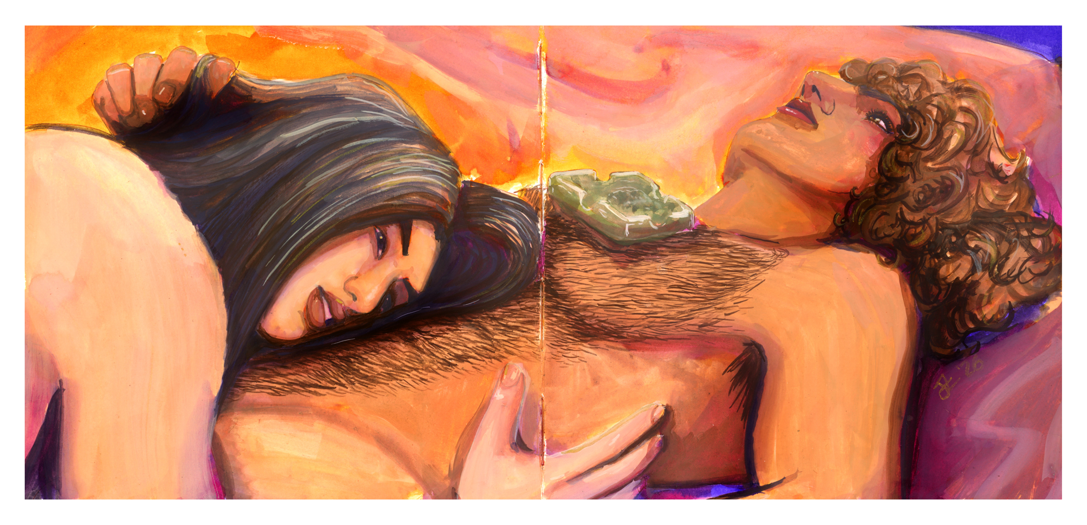
For this one, I used the following inks in the underpainting:
- IWI Spring Equinox
- Noodler’s Southwest Sunset
- Noodler’s Black Swan Australian Roses
- Lamy Azurite
I put too much white in this one, especially in the shadows. It would be best to add white gouache to the highlights, fade them into the midtones, and then leave the shadows for deeper colours. Seems kind of obvious as I’m saying it, but that layer of white gouache is really my favourite part. It gives every subsequent layer something to blend into.
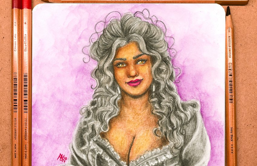
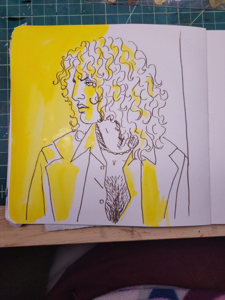
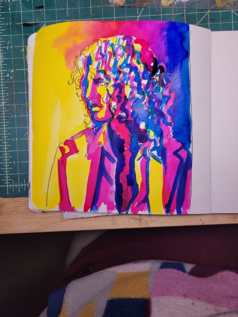
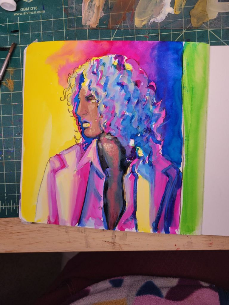
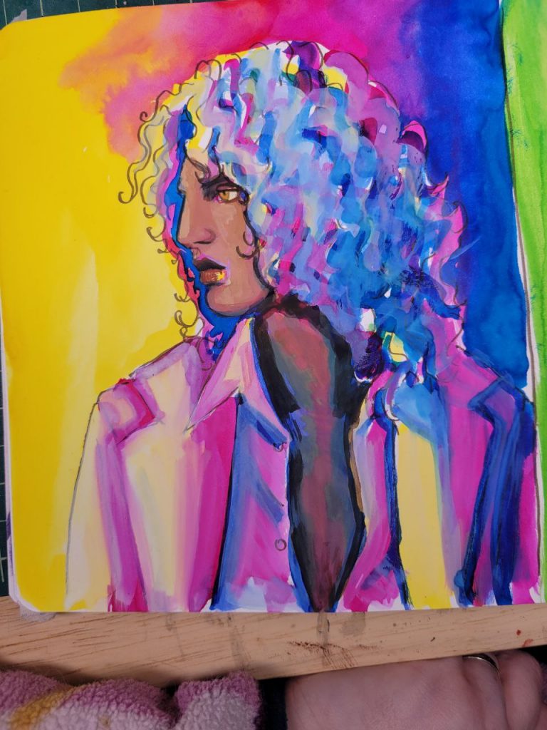
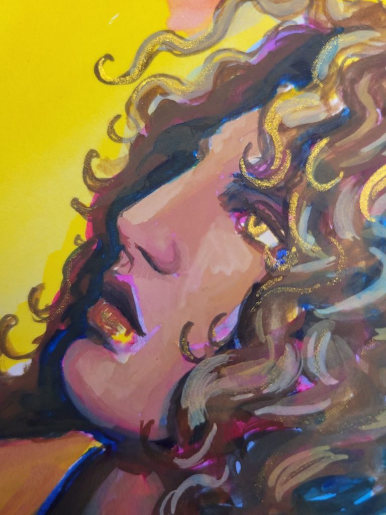
Mort’s 16th Birthday
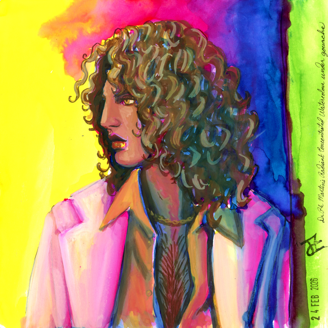
Here is when I discovered the use of Dr Ph Martin’s Radiant Concentrated Watercolours beneath gouache. I was looking for more information about underpaintings with fountain pen ink, and found an artist (Laura Loxley on youtube) who used these beneath gouache. I’d only used them for backgrounds before, but this is my new favourite use for them. The obsession held on strong.
I used Lemon Yellow, Moss Rose, and Turquoise Blue (and Grass Green for the side) in the underpainting and the details that is left in the unpainted edges is everything I’ve always wanted.
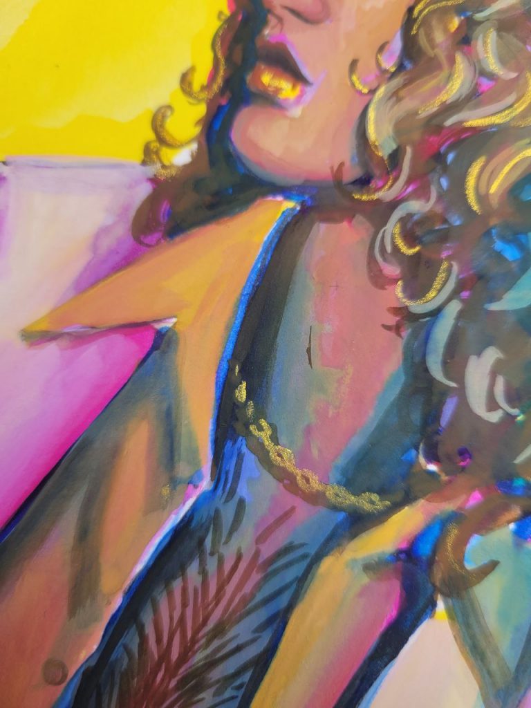
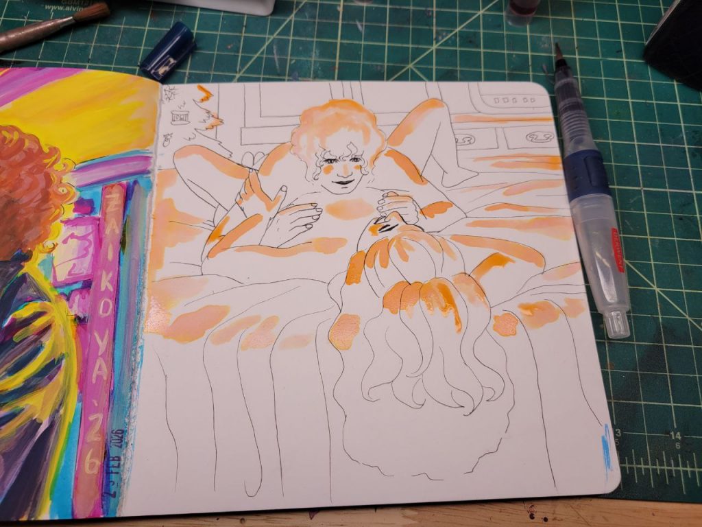
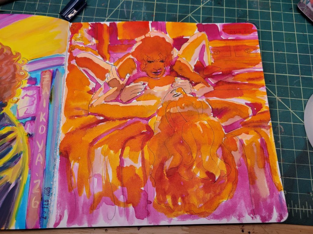
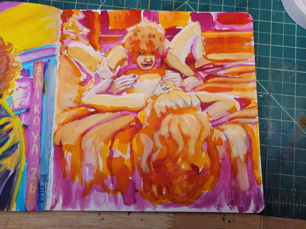
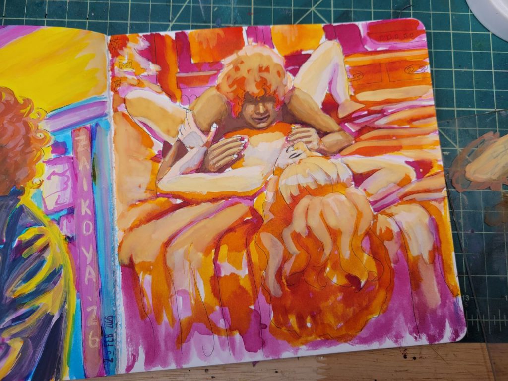
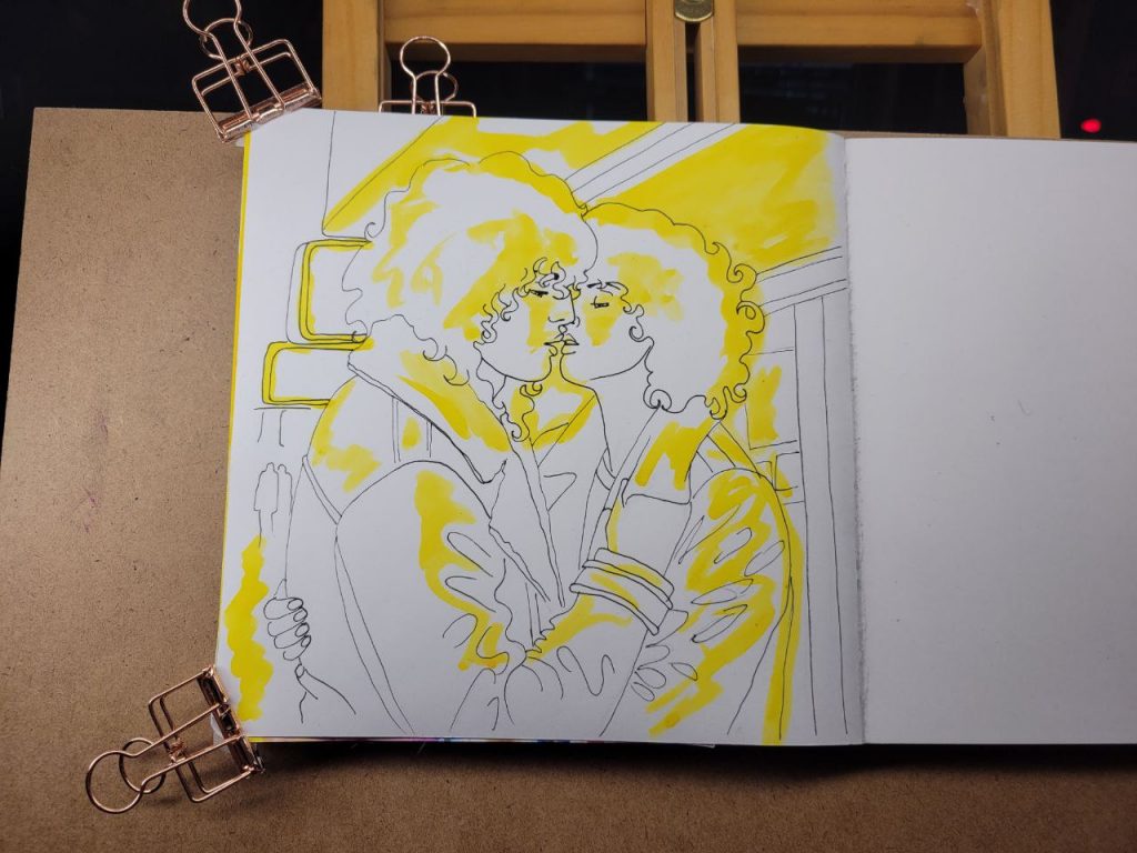
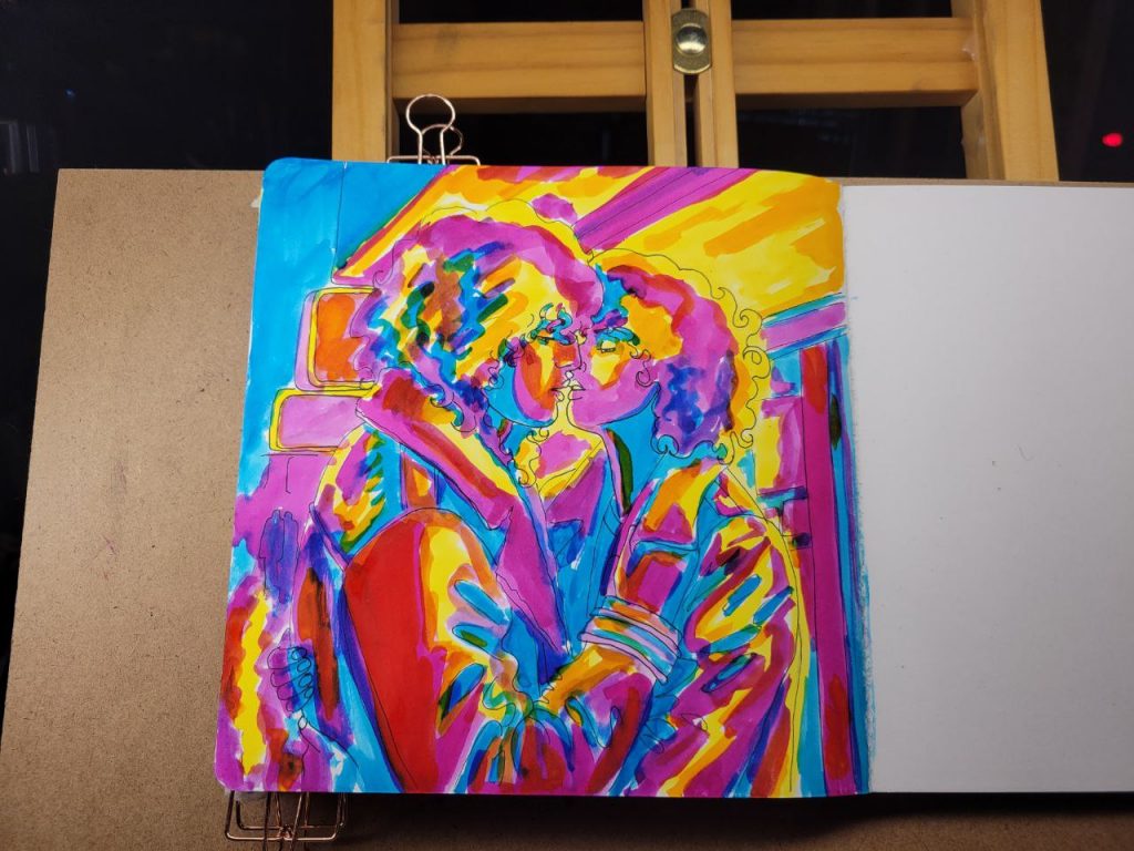
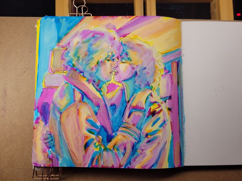
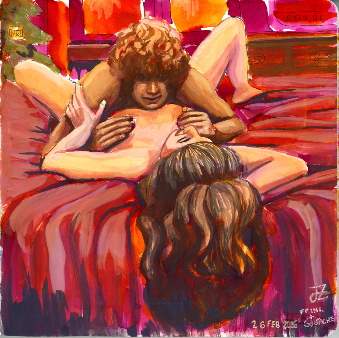
A First Kiss
This was with more of the radiant concentrated watercolours, with a red added in, as well as an orange. I could make this one better with a bit more care and love, but I was struggling to get opacity in certain parts and decided to move on. I’ve done about a hundred variations of this drawing/scene, and this is the closest I’ve come to the proper vibes. I hope I can figure this technique out and make this illustration lovely one day.
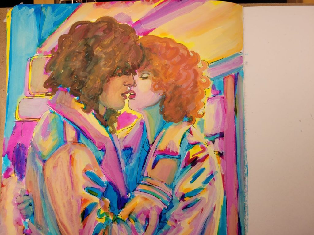
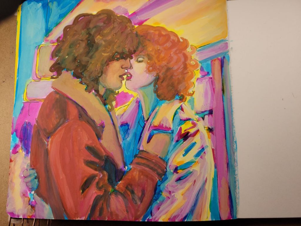
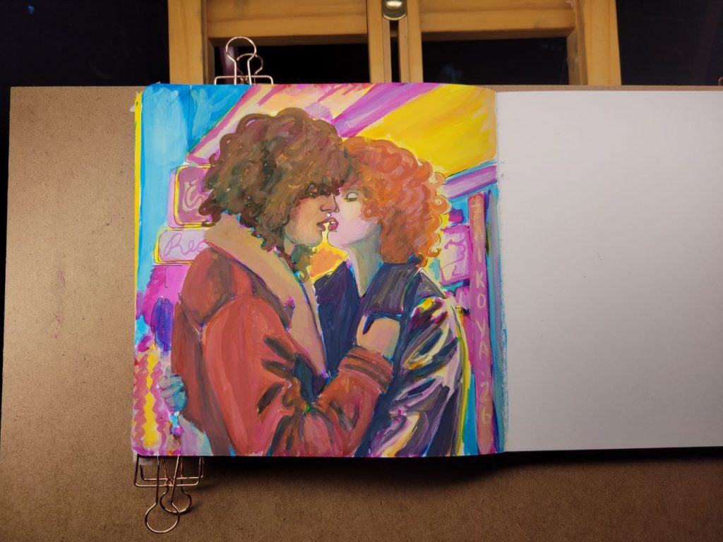
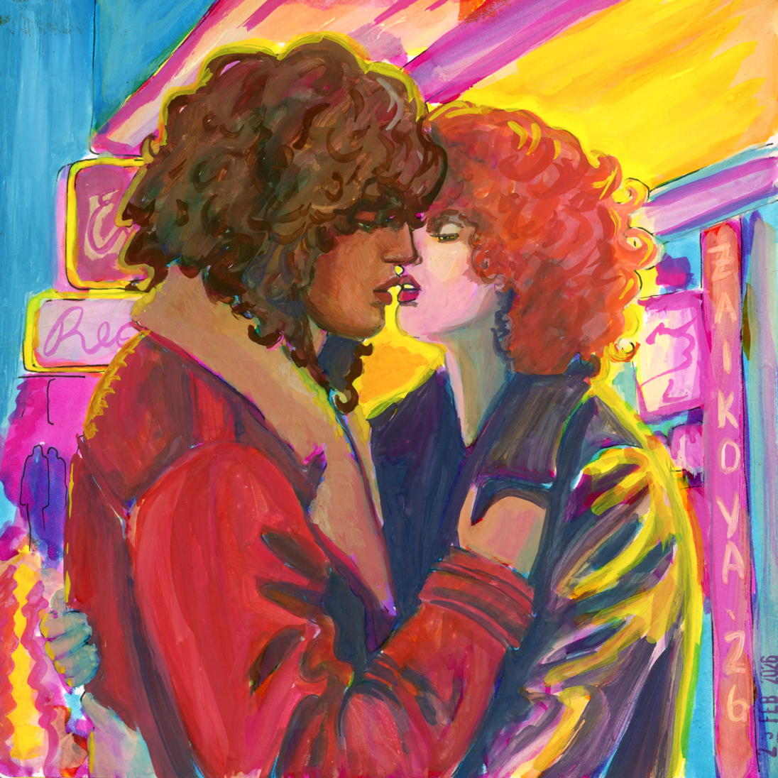
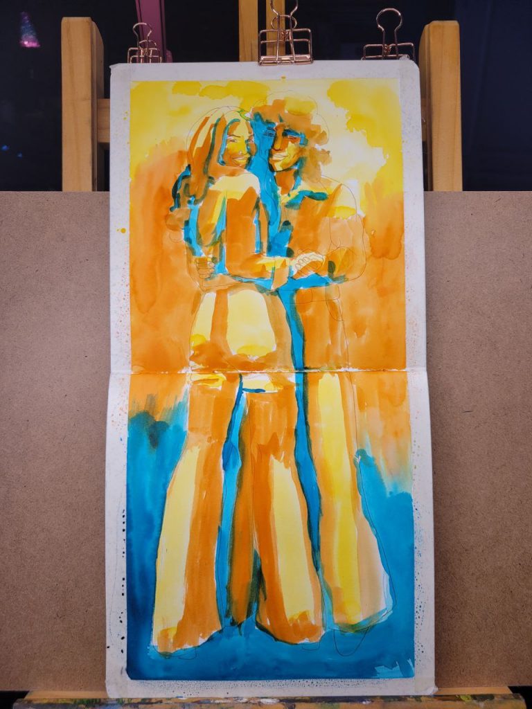
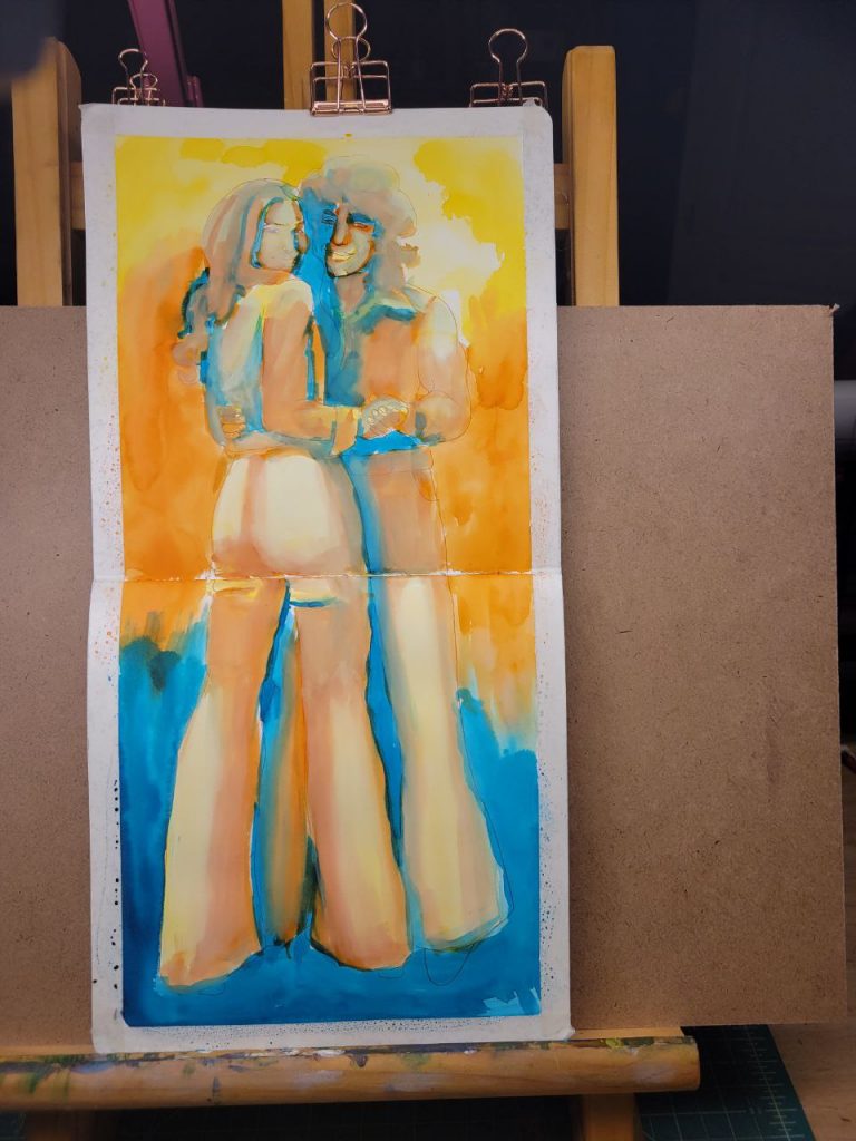
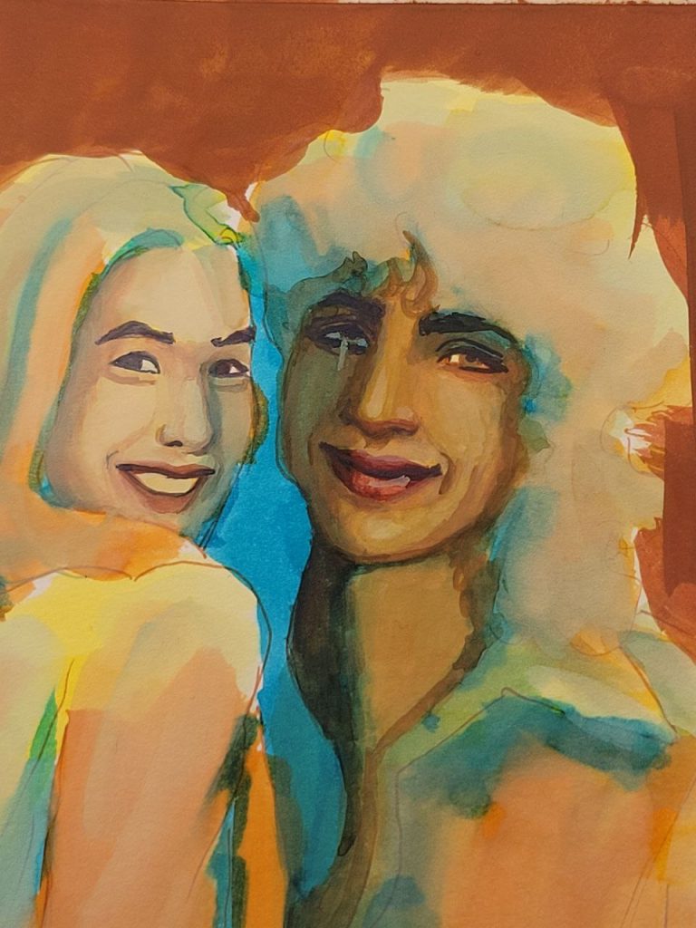
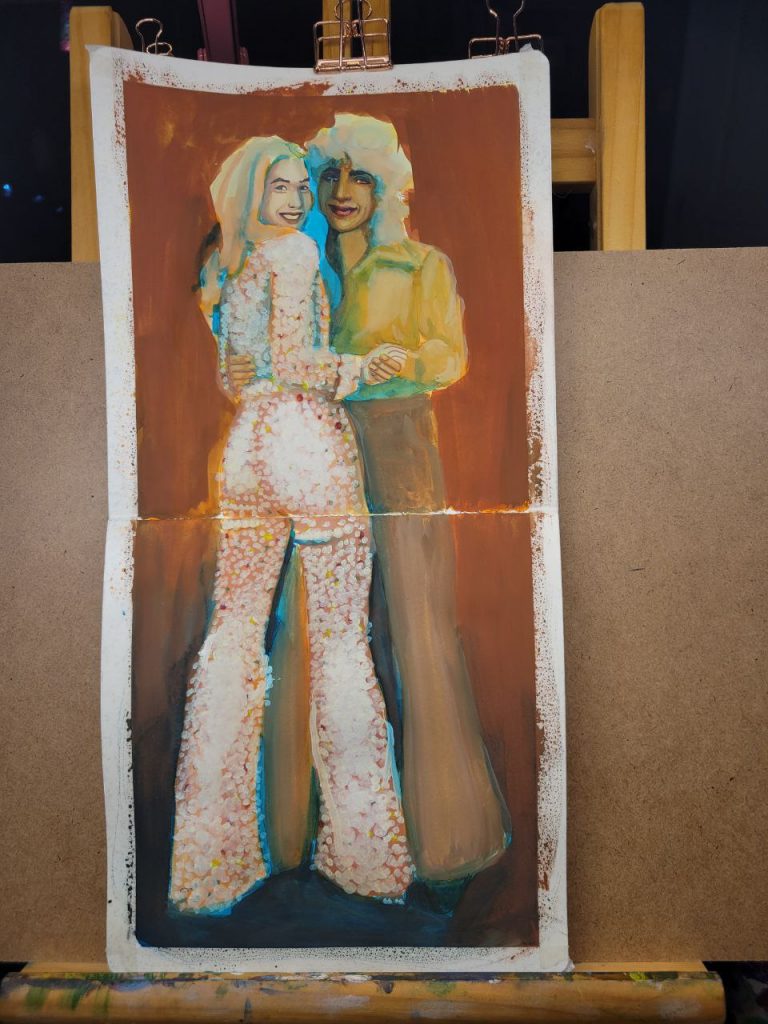
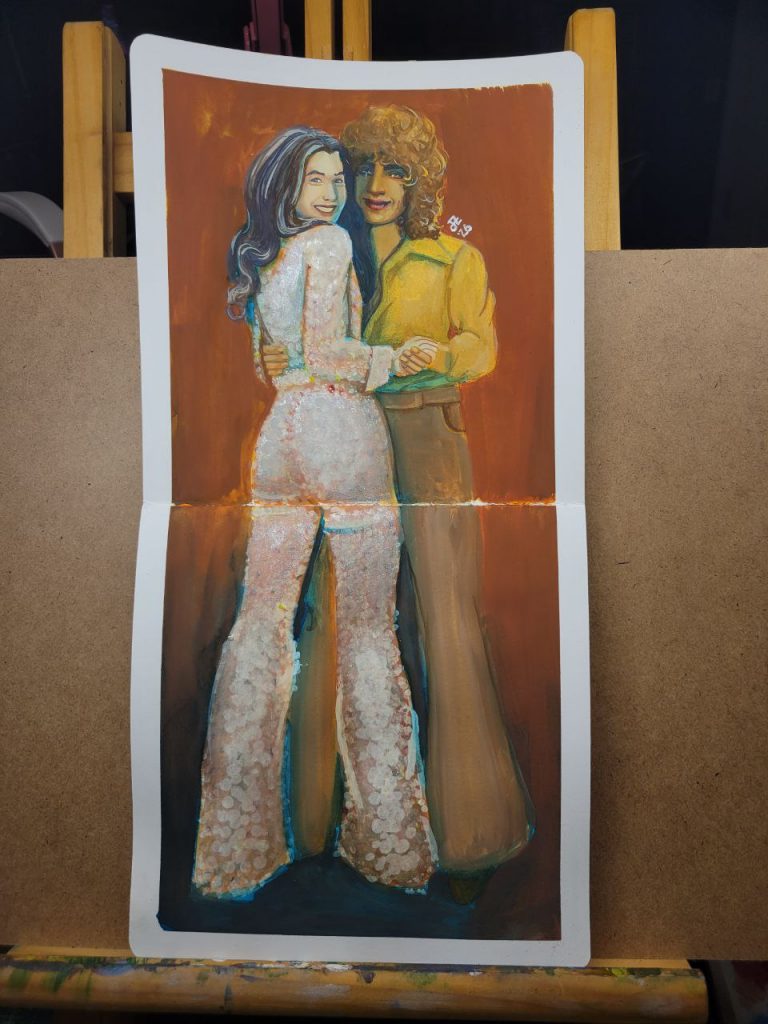
Disco
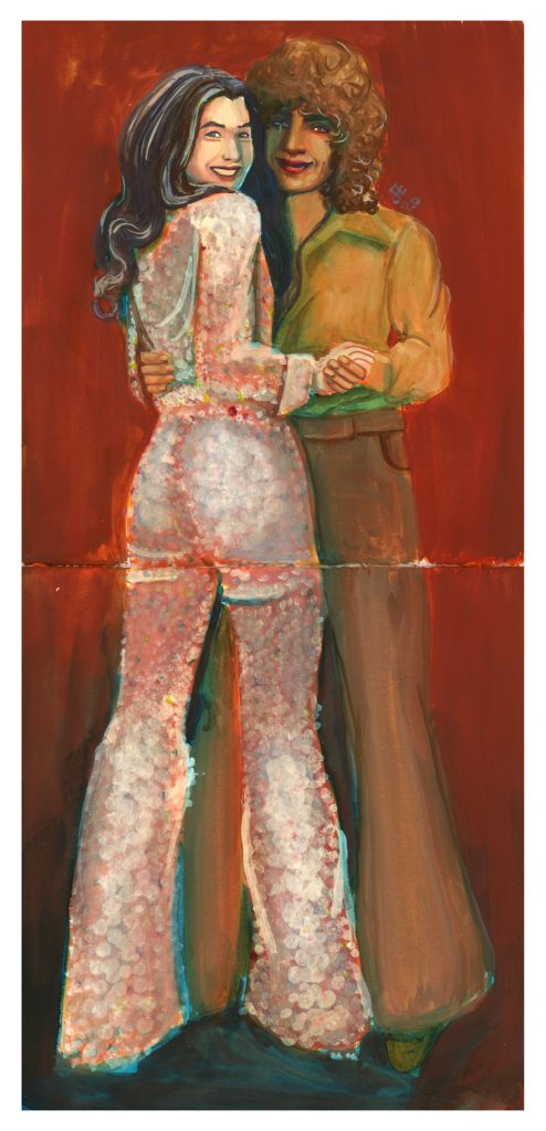
This one was an attempt to use warmer colours in the underpainting. I used Indian Yellow, Burnt Orange, and Juniper Green. I wish I’d used a red instead of a blue for the shadows, and embraced warmth completely. I still really like the way their faces came out, though. I’m proud of myself for allowing shadow to take up an entire half of the face. The blue peeks look great, but they’d be so much better if they were red or brown.
My Luck is Your Luck
For this one, which is my favourite, I returned to fountain pen inks. I used the same as the first one in this post, but no Azurite (which I like better). I also used Kobe’s Goshikiyama Ochre, but ended up covering most of it with Southwest Sunset because it was too dull. Southwest Sunset is really a fantastic ink for this. Shading inks are amazing.
I love everything about this one, most especially my continued progress with shadows. I feel like maybe I should do more to the background, but I also really love the saturated colours back there and would rather just leave it.