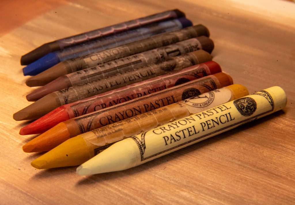
Sennelier Woodless Pastel Pencils
I’m a fan of Sennelier’s oil pastels, and their soft pastels are nice (PanPastel has my heart there, though), and these woodless pastel pencils are right in their wheelhouse of expertise.
Things I Noticed
-These are very hard pastels, like a Conté stick, but in a wonderful sharpened form.
-The half sticks (which I got), are just short enough to not rest against my hand when I use them like pencils. Someone with very small hands may not have that issue until they’ve been used enough to be shorter, someone with large hands might feel like they’re shaking hands with a cat. It is the nature of things that get shorter as they’re used, and all well-loved pencils will reach this stage eventually. These, however, start there. So having a pencil extender is helpful from the get-go.
-The points on these are strong and fantastic. My biggest issue in drawing with pastel is the difficulty with small details in small drawings. Even sharpened, many pastel pencils are too soft still and require thicker points. Not these. So they will already fit into my pastel flow. I used to use coloured pencils to fit this niche, or only have lines as thin as a Faber-Castell Pitt Pastel Pencil could make. Using a blending stump is another option, but less crisp. These do crisp and thin very well.
-Some are softer than others, and I notice that with every pastel pencil I’ve ever used. It’s the nature of some pigments. But, in this hard pastel form, it’s more noticeable.
-The back end can be used for larger areas, or the whole thing can be unwrapped, but in general, I don’t find them pleasant on huge areas.
-Though they have labelled sleeves, nowhere are the name of the colour or the pigments used listed. They do that with their oil pastels, but not with these. I’ve written on mine with a fine-tip marker in case I need to replace a colour at some point. The full size sticks have the colour numbers listed, though.
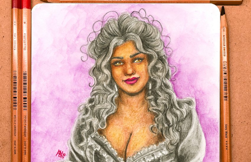
First Attempt
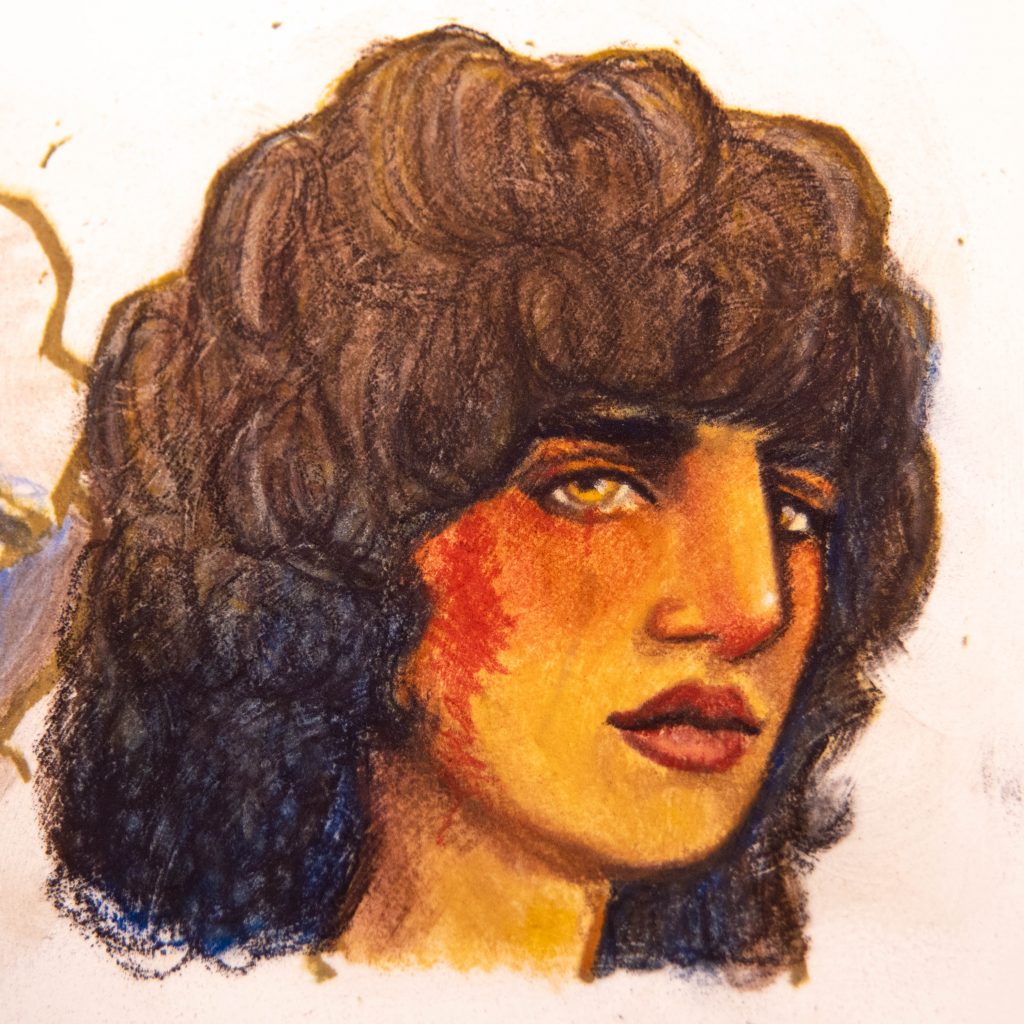
My default quick sketch here (the same sketch I do for anything I want to test or play with, which I try to do quickly to experience the feel of a new thing) was done with nine different colours. I drew it over Golden Pastel Ground painted into a sketchbook.
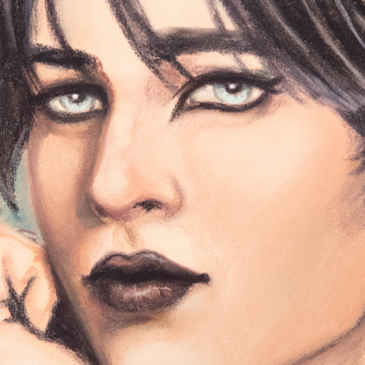
There was a mark on the paper before I began, which was a brown mark through the middle of the cheek. I left it to see how opaque things get with just a few passes. You can still see the mark, so there’s that. Pastels tend to be that way anyway. However, all the brown lines from my template were covered.
The hair was a bit difficult because I started to try and make big swathes of blue and brown, as I would with a soft pastel or even a softer pastel pencil, but even the thick back end of this pencil is too thin for that sort of thing, so I should have worked more along the lines of a coloured pencil.
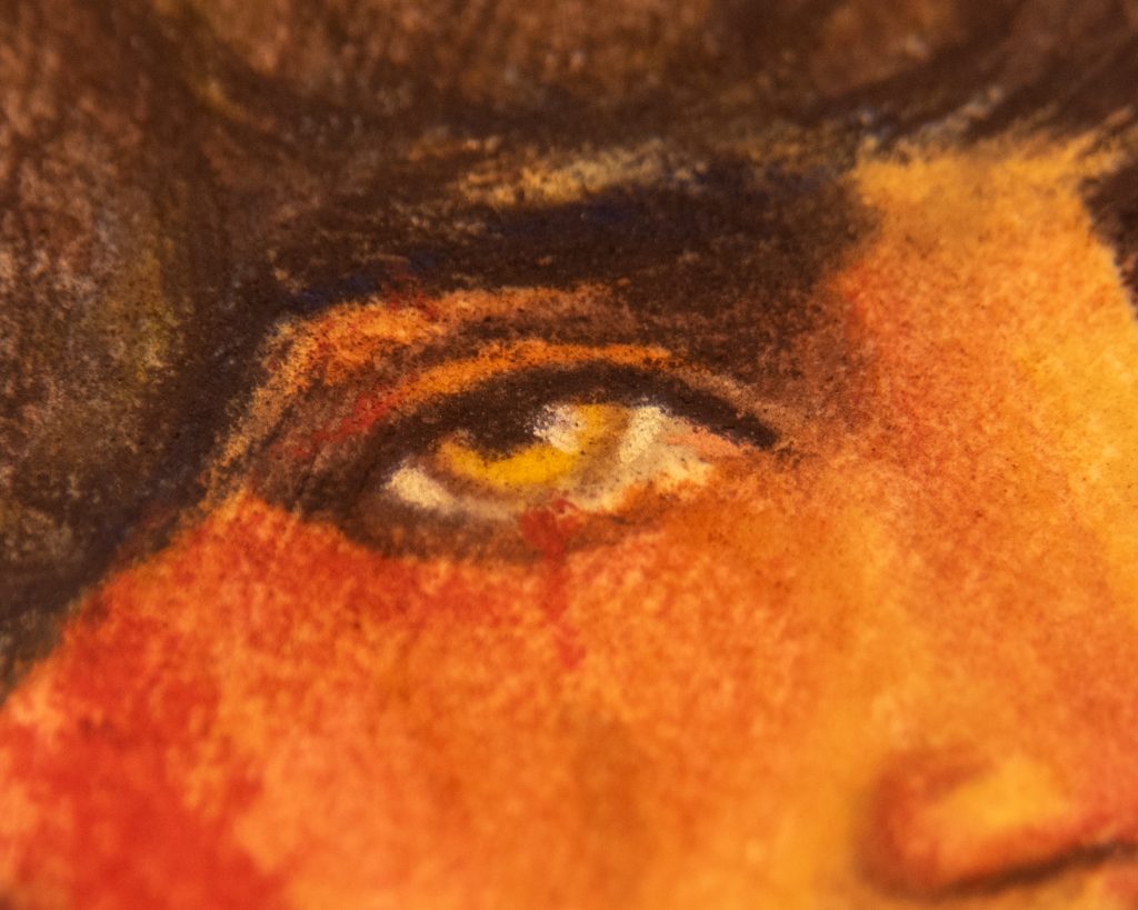
These do not blend like wet oil, as their soft pastels or oil pastels do. But they definitely do blend and they do so nicely, especially in layers. But, for fine lines (through the lips, around the eyes, the nostril, the shaded side of the nose) the lines stay crisp and I am so pleased by that.
The colour called “Violasceous Grey” (I assume it’s the same as 478 in the soft pastels) makes an amazing black. I didn’t use the Lamp Black at all in this. But, I’m sure there’s some in that colour anyway. But it blends out more purple (more violasceous, if you will), so it fits in nicely with reds. See the shade from eyebrow to nose.
I think these are perfect for small works in small sketchbooks, and I’m definitely going to use them on the details in medium pieces as well. I know for sure I’ll use a dark and a light for deep shadows and tiny highlights. Next, I’ll use them in a full piece on pastel paper alongside other various soft and hard pastels.
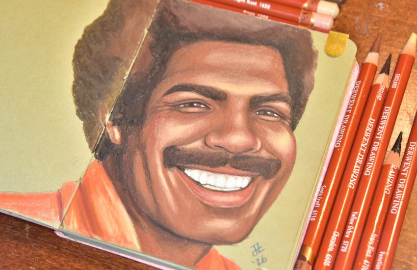
Larger Attempt
Though I did large laydowns with PanPastel, I used the Sennelier pencils for pretty much everything else. Details and accents, and anything small. I absolutely love these pencils after using them for detail like this. The fact that there is no wood barrel makes them great to use on their side but get thin lines. The branches of the trees are a great example of how beautifully that works. The hair as well. You just skate the pencil along on its shading-edge.
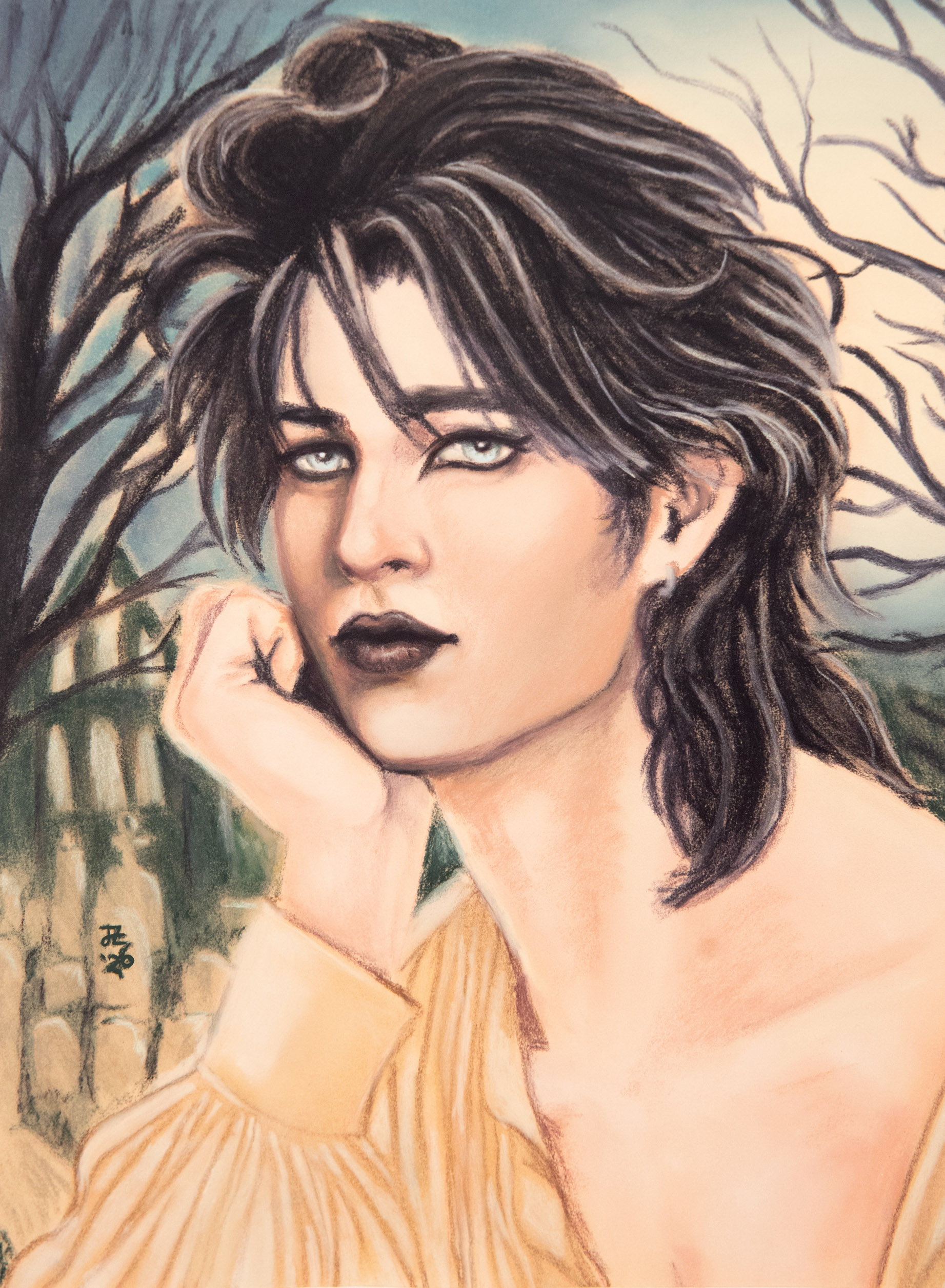
Unfortunately, I had the white balance set to ‘auto’ as I was recording. So don’t take this as a colour-accurate attempt, but as a show of the blending between the PanPastel and the Sennelier pencils.