Matte Acrylic Paint
I’ve got a thing for matte media, which has only grown the more I’ve worked to improve my art. It started way back in my teen years when I discovered charcoal was the less reflective cousin of graphite, and it’s just kept going ever since. I love the way a matte medium can blend into the background as though it is one with the surface, and the way that highlights of metallics and glosses really serve a purpose over something as wonderful as velvet.
I’ve only very recently taken up painting with any seriousness. I used to do oil paintings from time to time, but drawing is my major forté in the world of art. But I want to be more than what I’ve always been, so I’m determined to learn. In my quest, I started to get really obsessed with finding the most matte variety of paint to use. If for nothing more than the thrill of trying new things, I decided to compare the brands that most interested me.
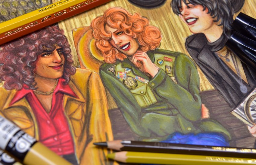
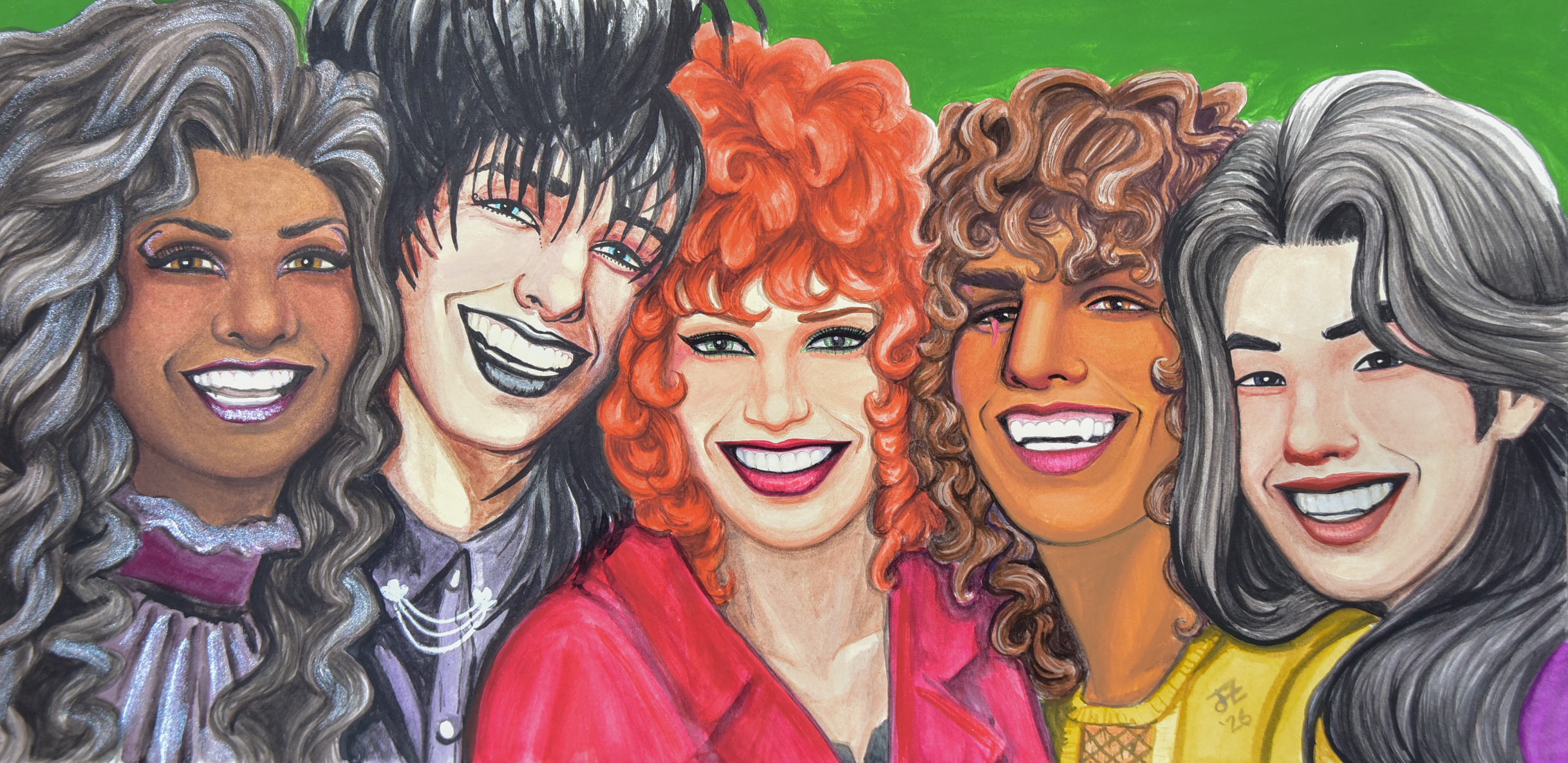
For this first comparative painting, I used a drawing of 5 people, so I had to cut off two of my known brands of matte acrylics. The first I removed was Lascaux Gouache, because though it *is* acrylic gouache in many important ways, it is resoluble, and I think that separates it from the idea permanent layers that all the rest have.
I also decided that Maimeri Polycolor and Lefranc & Bourgeois Flashe are both similar enough that I’d only need to use one. Since I hadn’t used strictly Polycolor for something more than a sketch, I decided to try it out solo. I do definitely blend Maimeri and Lefranc & Bourgeois when I paint with vinyl paints, but the rest of these I tend to use on their own. I used Lefranc & Bourgeois as the green in the background, though.
In each of these brands, I have mostly earth tones, but of course a magenta, red, blue and a couple of yellows to mix up whatever else I may need.
This piece was done on an A3 sheet of Arches hotpress watercolour paper, but cut down into a panoramic shape.
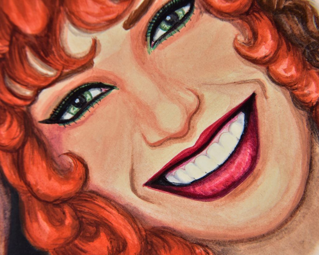
Maimeri Polycolor
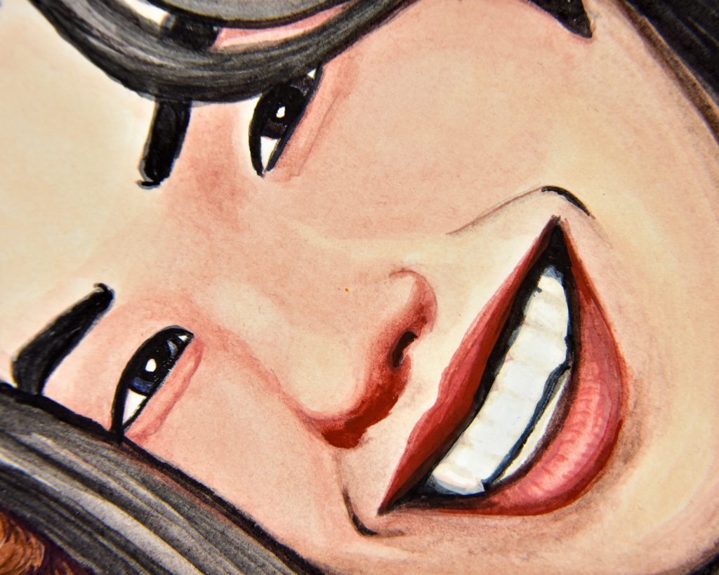
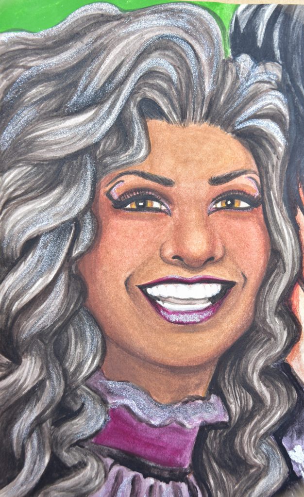
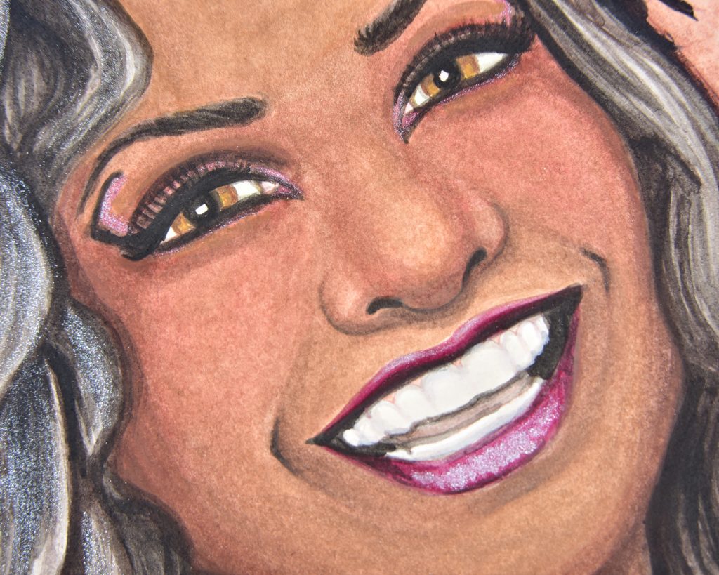
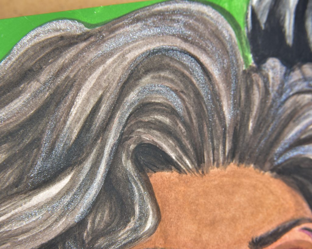
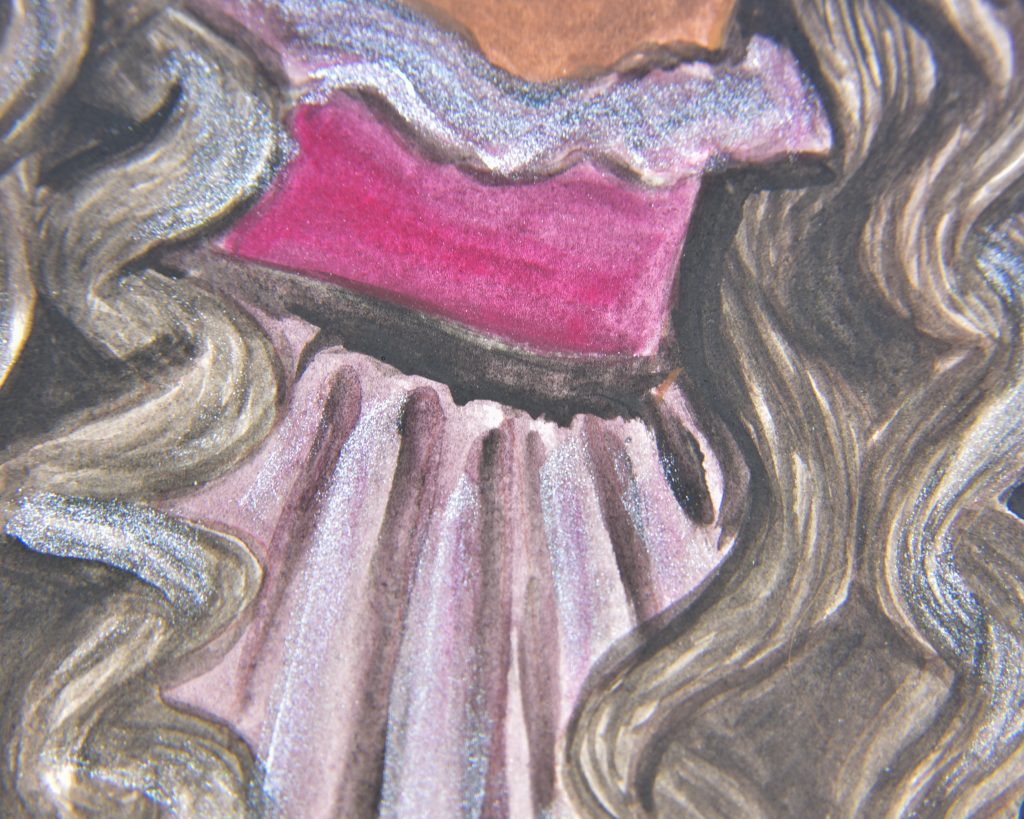
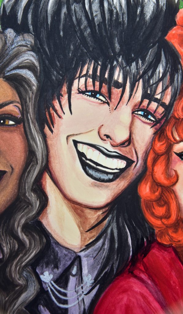
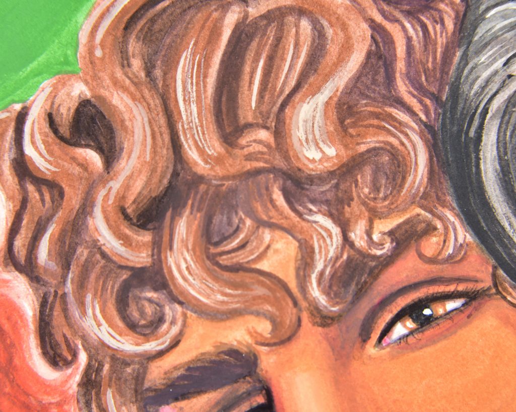
Sasha was painted with vinyl paints. I usually use vinyl paints underneath coloured pencils, but I do love how they look alone as well. The strange thing I came up against during this painting was that I could never get the black in her hair as dark as I wanted it to be. I don’t know if the Lefranc & Bourgeois is better (since I usually use that black) or if I’ve never noticed, or if it was just the paper, but I definitely noticed the inability to get a deep rich black.
As far as matteness goes, though: absolutely matte. I added some silver into her hair and on her lips for sparkle against the matte, which is one of my favourite contrasts.
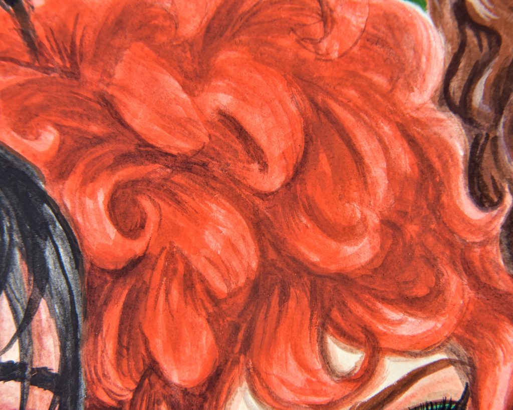
Liquitex Acrylic Gouache
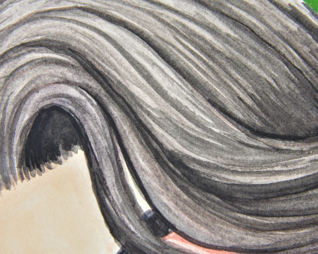
It’s very easy to see what I mean about the Maimeri black when it’s right next to the Liquitex black. on the one hand, this works because Sasha’s hair looks like a warmer natural black, while Rhys’ looks a bit ‘enhanced’ like perhaps he’s dyed it, but on the other hand, I would have rather made that contrast with hue than with value.
Liquitex acrylic gouache is a paint I have talked about before, and something that I really adore even though I keep finding that it’s not my favourite. The reason it isn’t my favourite is illustrated pretty well in this painting, I think. Sasha was streaky, yes, but I fixed it. Rhys, however, was streaky and I could not fix it. That perpetually happens to me with this paint. I think it must be in the way that I paint, but we’ll see it isn’t such an issue with the other brands. In the same way fountain pen inks can be described as ‘dry,’ I would describe this paint as ‘dry.’
Is it matte? Yes! But is it the most matte? No. I would never claim that it isn’t a matte paint, but it is a tiny bit glossier than the others, especially when using white. I find this so interesting because Liquitex Ultra Matte Gel is one of my favourite acrylic additives of all time because it’s perfectly matte and textured so wonderfully that I can use coloured pencils over the top of it.

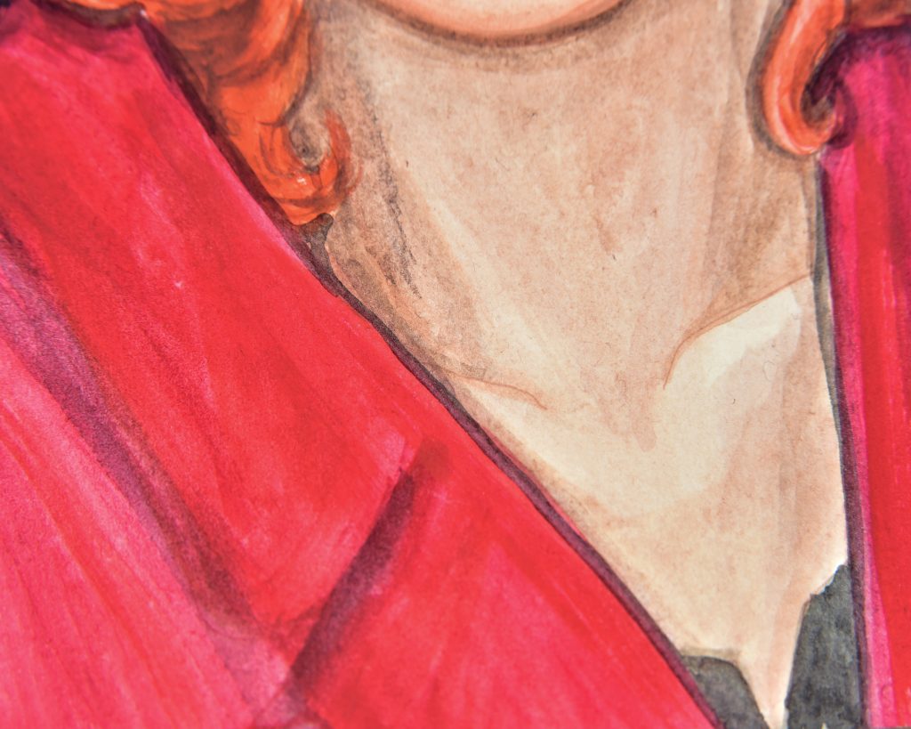
Holbein Acrylic Gouache
This was the first acrylic gouache I ever tried and I did not know how I was supposed to use it. It’s only recently that I’ve learnt acrylic paint is meant to be layered. I, personally, prefer opaque paint and have longed for something which doesn’t need multiple passes to get full saturation. Turns out this is a substrate issue and not necessarily a paint issue. Holbein’s acrylic gouache can cover well.
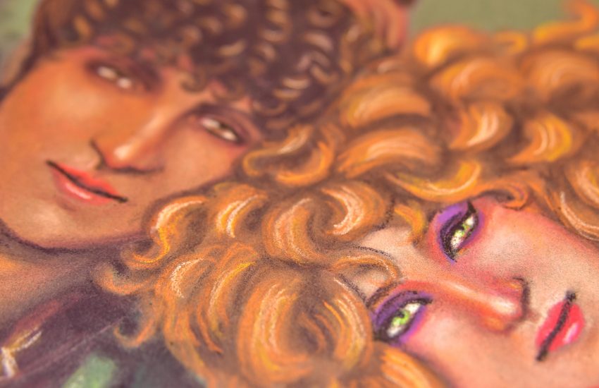
As we can see in this painting of Dana, there are less issues with the streakiness than there were with Rhys. I haven’t changed the way I paint, only the paint itself has changed.
I think Dana looks great here, especially her hair. Holbein barely shifts at all wet to dry, and I think that’s incredible. I wish they had more single-pigment or interesting-pigment colours, though!
Is it matte? Deeply matte, yes. Velvety. But still amazingly vibrant.
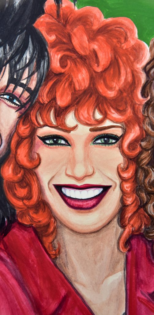
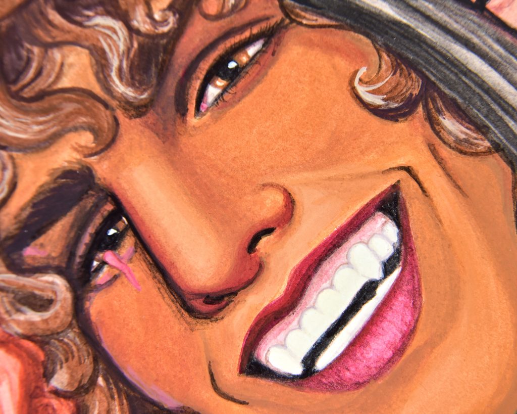
Turner Acrylic Gouache
Turner makes my favourite acrylic gouache. It mixes with water like a dream! In fact, it is required that you mix it with water, it’s not intended to be used straight from the tube, and that is exactly how I want to paint. The style which feels ‘right’ to me in my current stage of painting fits in perfectly with the way Turner acrylic gouache works.
The simple fact that I can get a golden-brown midtone without a hint of chalkiness or streakiness, in such few passes is incredible. Every time I use this paint I’m amazed all over again. Are there downsides? Rather the same issue I have with Holbein. Turner Acryl comes in like 250 different colours, but they are nearly all mixes. They don’t even have a pure PV23. Also, an earth red? Very tough with them! They use PR101 in some of their mixes, but you cannot buy PR101 pure on its own. They have a colour called ‘Red Ochre’ which is PR101 PR5 and PR122, for example; and another called ‘Venetian Red’ which is PR101 PO34 and PW6. I wish I could make my own mixes of pure earth tones.
The matteness of this is just as incredible as the usability, though. So matte that is will blend in with the background. I love it.

Golden Soflat
These paints are my second favourite with blendability, and they are the best to use for transparent techniques. Nowhere does Golden call these ‘gouache,’ and that’s good because they work best when you lean into their acrylic qualities. They remind me a lot of watercolours, in a way, because they can be thinned pretty seriously and work wonderfully. However, dark blacks are still attainable.
The unfortuante thing about this painting of Jon is that I do not like the way it came out. Nothing to do with the paints, but with my initial sketch. I did something very wrong with his nose or mouth and it’s glaring to me. I’m giving it time before I go back in and try to fix it, because I don’t want to make it worse and I need to figure out exactly what went wrong so I don’t experiment it to death. But, luckily, with this paint I think I’ll be able to correct my mistake once I figure it out.
Is it matte? So very matte! It lives up to its name. However! Pure white has a bit of a shine. Titanium is difficult to mattify, I’m gathering.