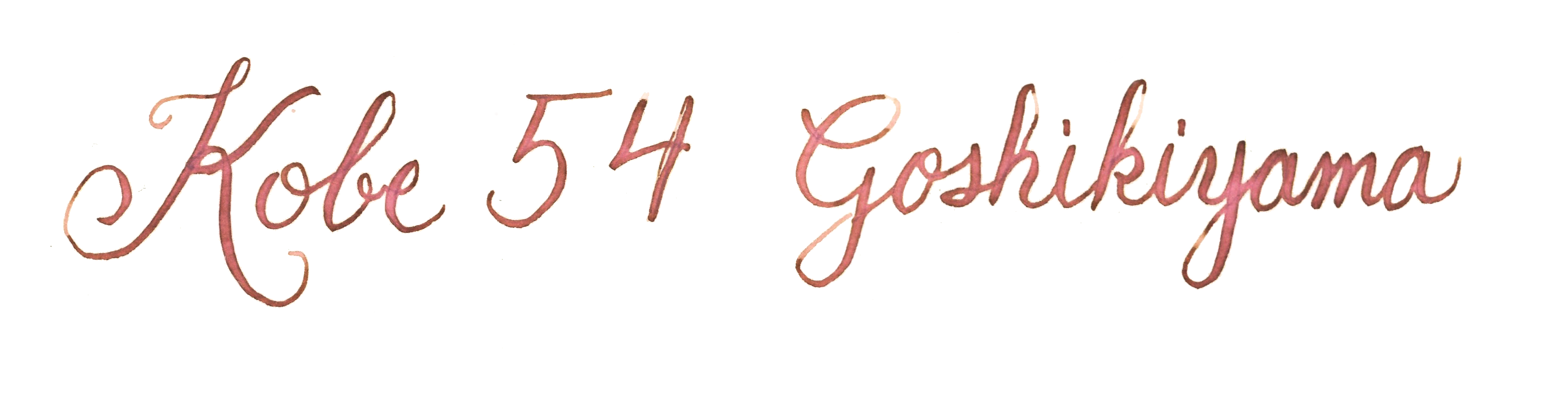
Kobe 54 – Goshikiyama Ochre

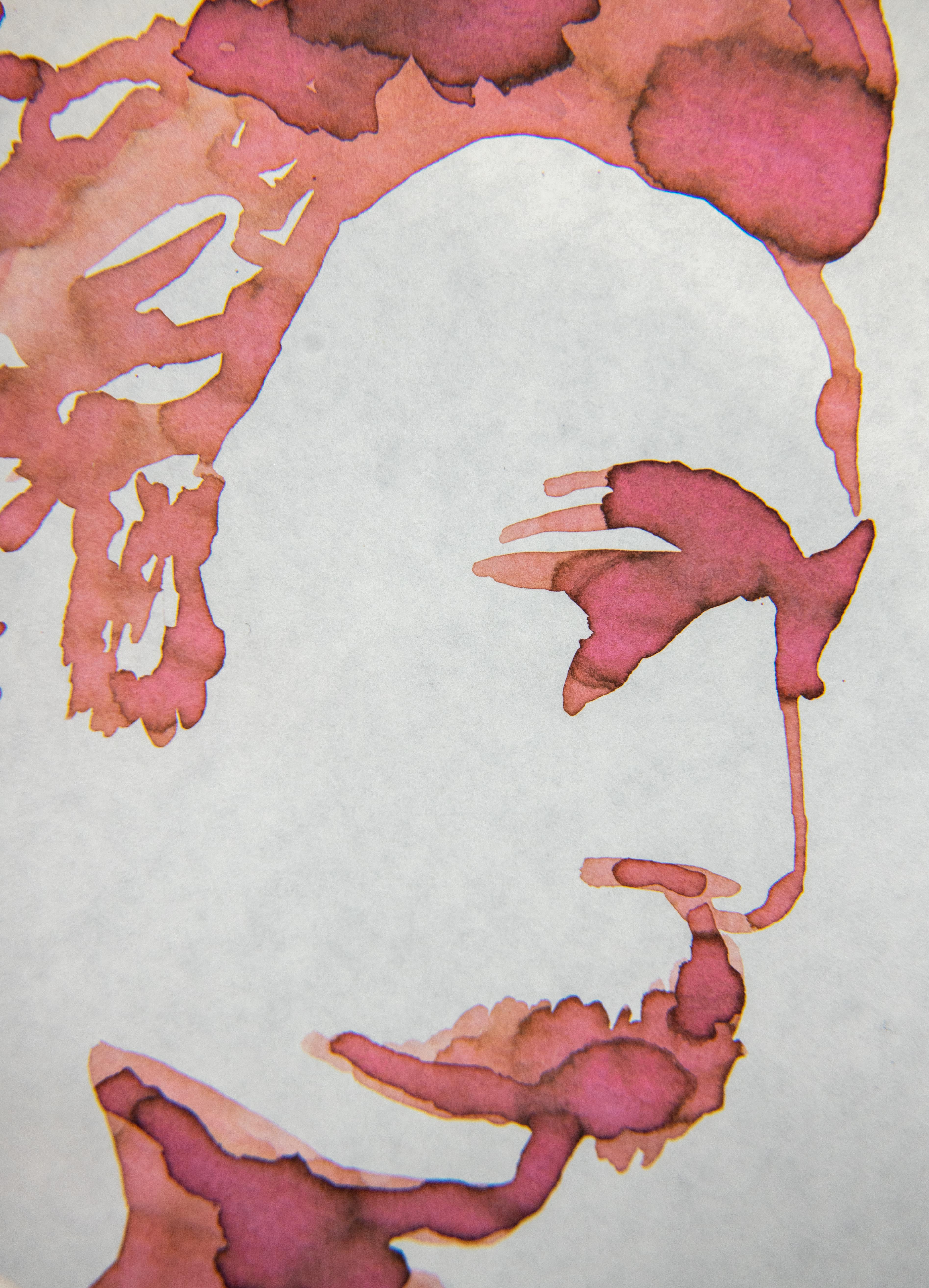
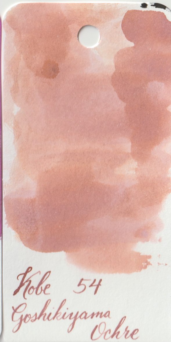
- Colour: Ochre, as I have always seen it is a red or a yellow colour. I suppose technically there is red and yellow in here, but it’s pastel enough to be considered pink. Love it.
- Special Attributes:
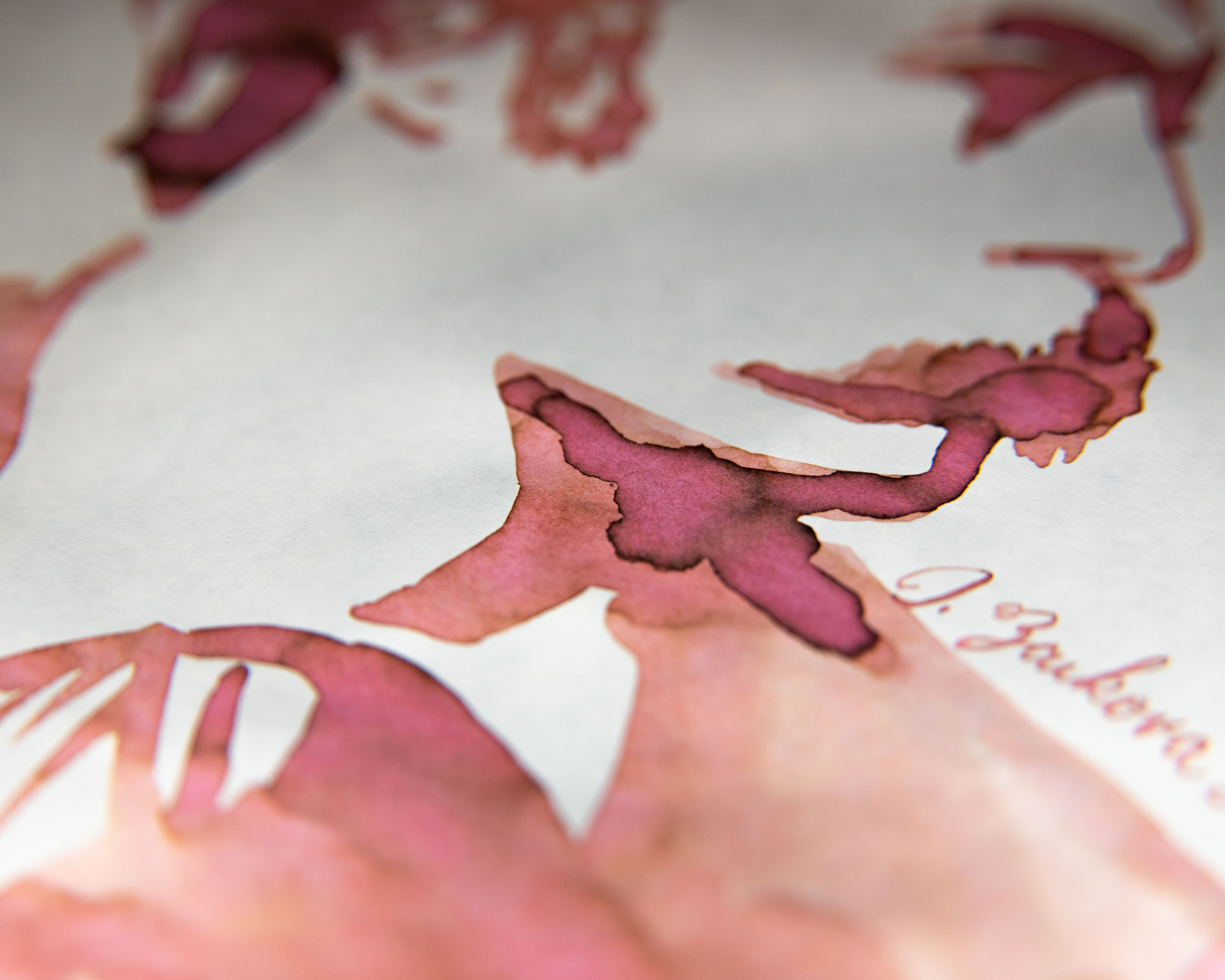
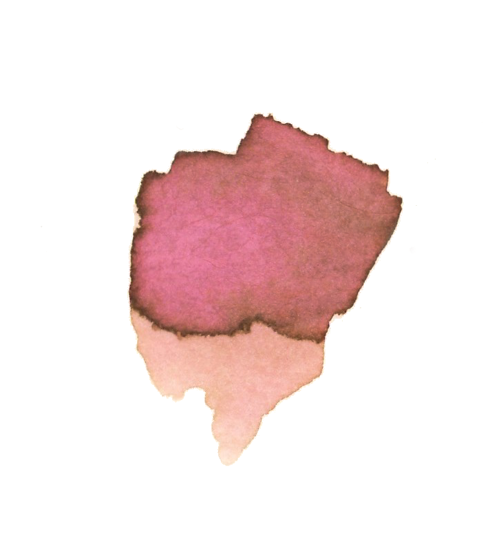
- Shade: Yes, very stark shading.
- Sheen: None.
- Shimmer: No.
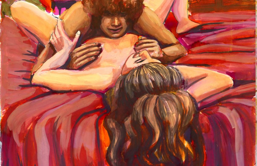
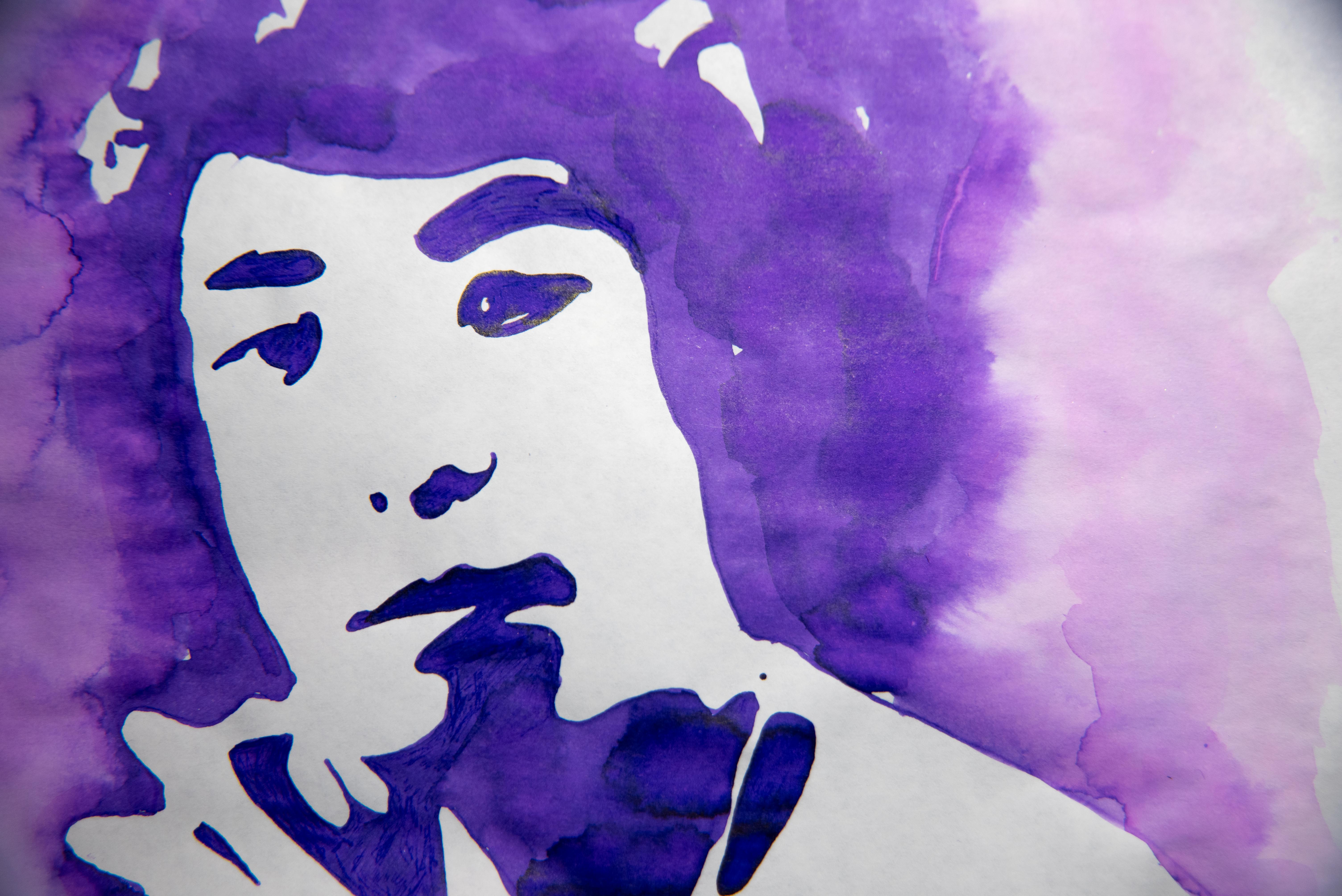
- Watercolour Usage: This ink is relatively firm against water. There is some nice fading that I got out, but water tends to wash it away as can be seen on the bottom left of the drawing.
- Harkens to Mind: Rust, peach roses, dusty once-pink chiffon robes.
- Similar to: It’s a paler, and more green version of Herbin Rouille d’Ancre.
- Expense: $30/50ml as of 2022.
- Example: Victorian actor Charles Wyndham and his epic mustache.
Link to buy this art on various things (I suggest a sticker)
Writing Sample
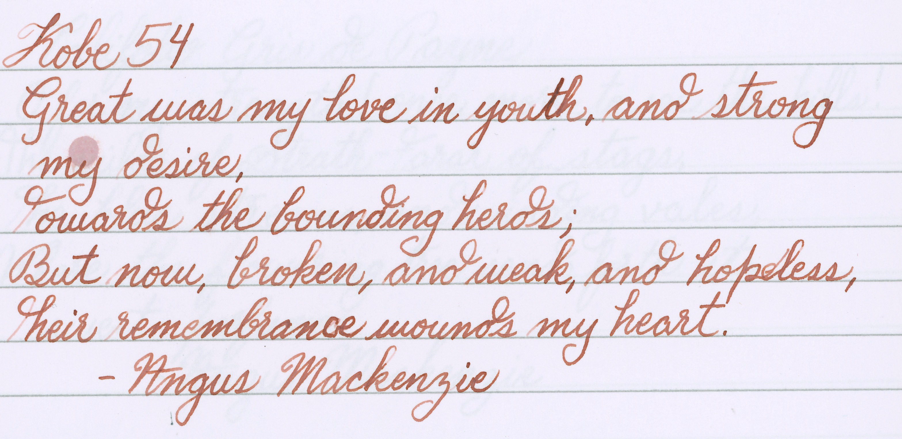
Verdict
I got this ink because it looked different and unlike anything in my arsenal. I was right, and it’s great! I ended up falling in love with it. It is the opposite of one of my favourite’s: Sailor 280, which is a green ink that shades to pink. I have yet to try this one inside a pen though.




I always had Rouille D’Ancre as my “gentleman’s pink” until I discovered this Kobe #54. I think I’m approaching my third bottle already! My once subtle Rouille D’Ancre looks like pepto-bismol in comparison! I have this in in two pens constantly, a Lamy with a broad gold nib and a custom pen with a 1.5 italic. I don’t think this color/saturation is suited to fine nibs.
My equivalent on the other side is the glorious Kyo No Oto Keshimurasaki “Ruined Purple”, but that was a limited edition. As this ochre is “not brown”, Keshimurasaki is “not grey”. I can’t imagine there being an equivalent when my last bottle runs dry, so Diamine Vivaldi will have to do.
Hmmm, I haven’t tried Sailor 280, but I am very fond of Robert Oster’s Melon Tea, an olive drab compound of green and pink.
Oh, I love Rouille d’Ancre so much as well, the desaturated pinks are underused colours in ink, I think. I haven’t tried any purples by Kyo No Oto, but I love their gold and their teal. It’s a good thing Diamine has so many colours, because they can usually fill a gap when something else gets discontinued, and they are decently intermixable I’ve found. You and I agree that the green-pink combos that end up olive are breathtaking.