Visconti Mythos
Overview
My very first Visconti pen, this. I know everyone talks a big game about the Homosapiens, but ‘sticker shock’ is an understatement. I know, it’s made of volcanic rock or something but…woof. So I went with something that was–gasp–on sale. Just like pretty much every pen I buy.
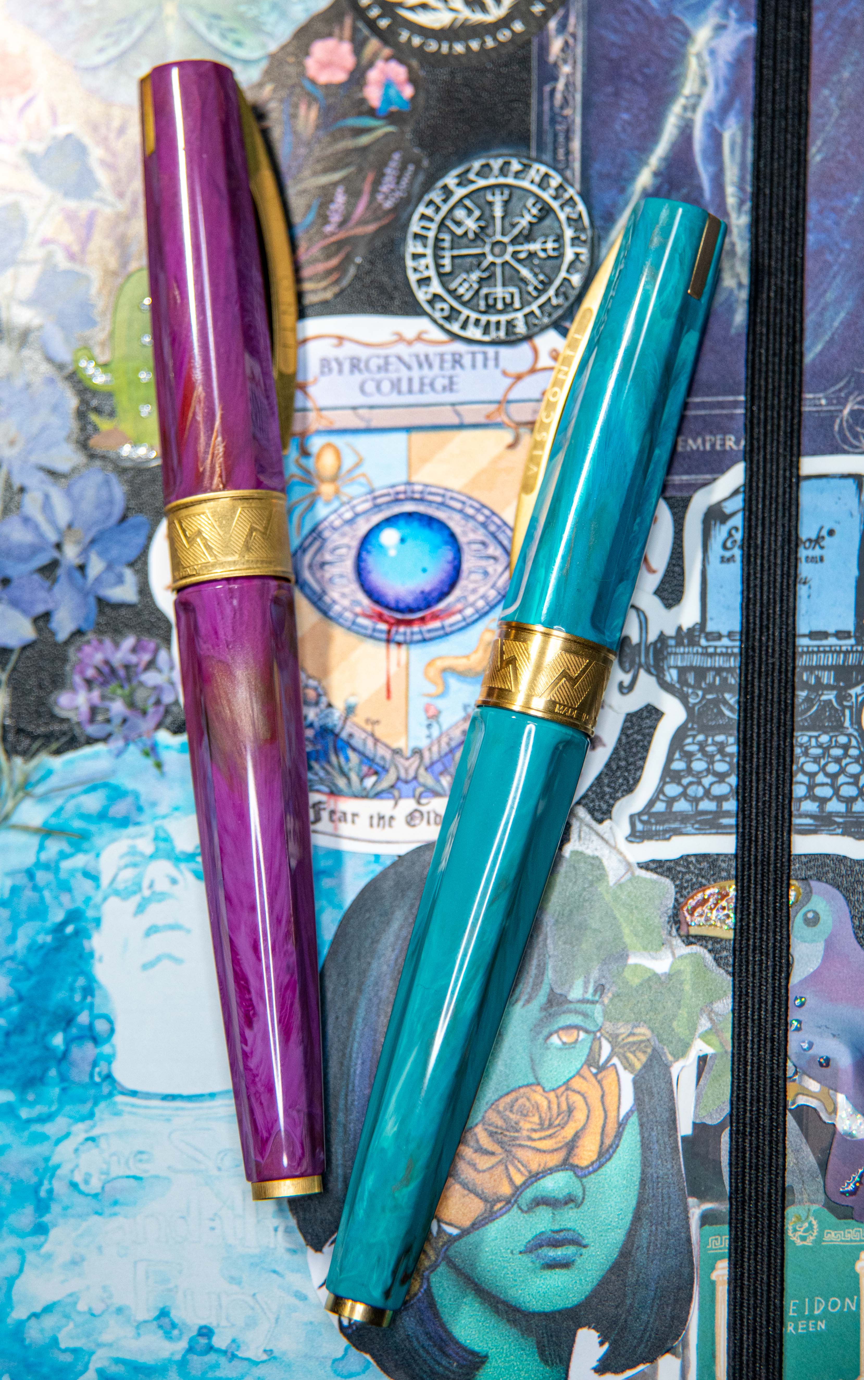
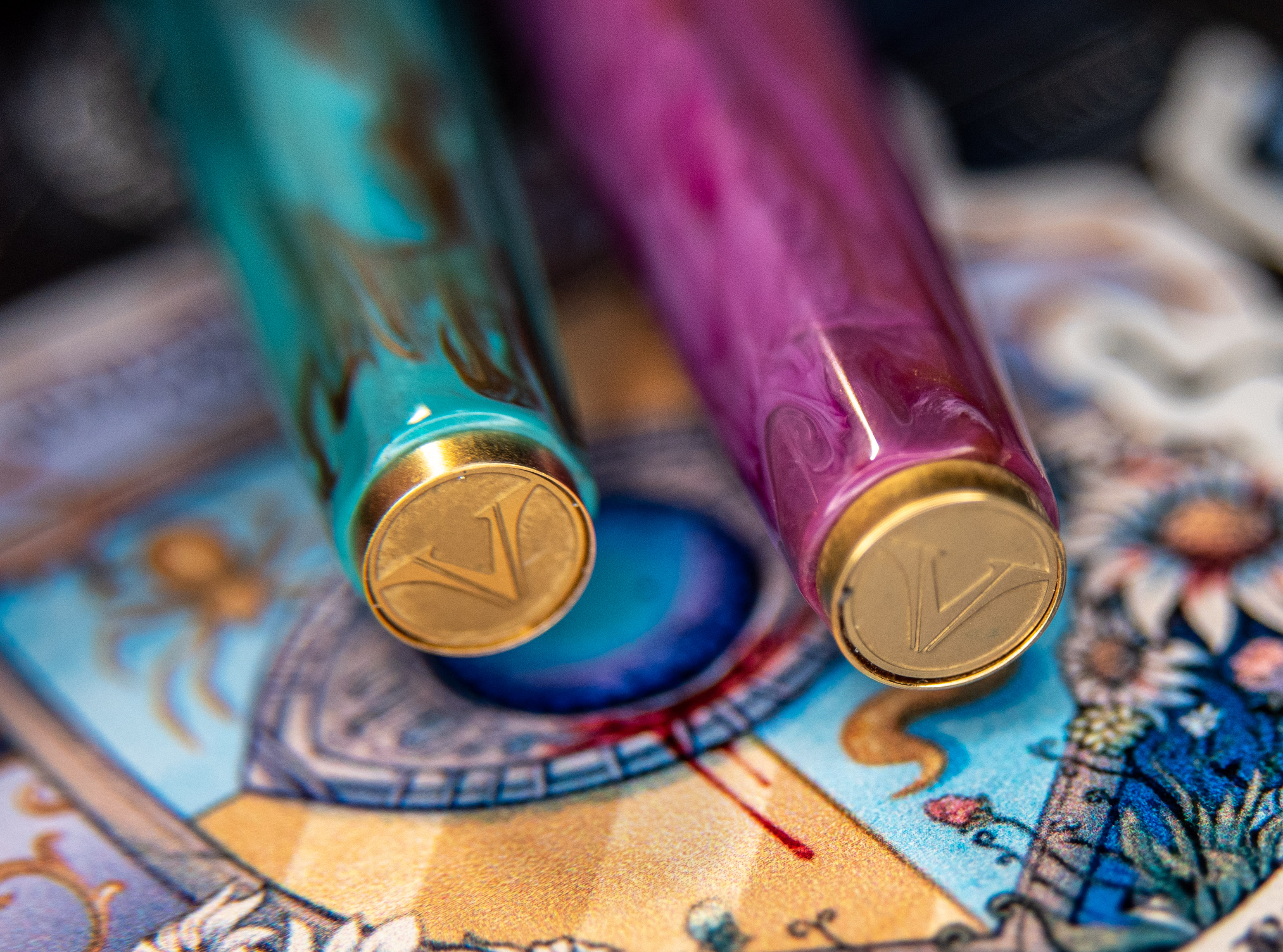
There are four colour choices in the “Mythos” category, all named for ancient gods. Zeus, Apollo, Aphrodite, or Athena. I chose Aphrodite because pink is much better to me than brown (Apollo) or dark blue (Zeus). Then, a year later, I got the Athena version the day it came out, in broad. So, spoilers ahead that I dig this pen very much.
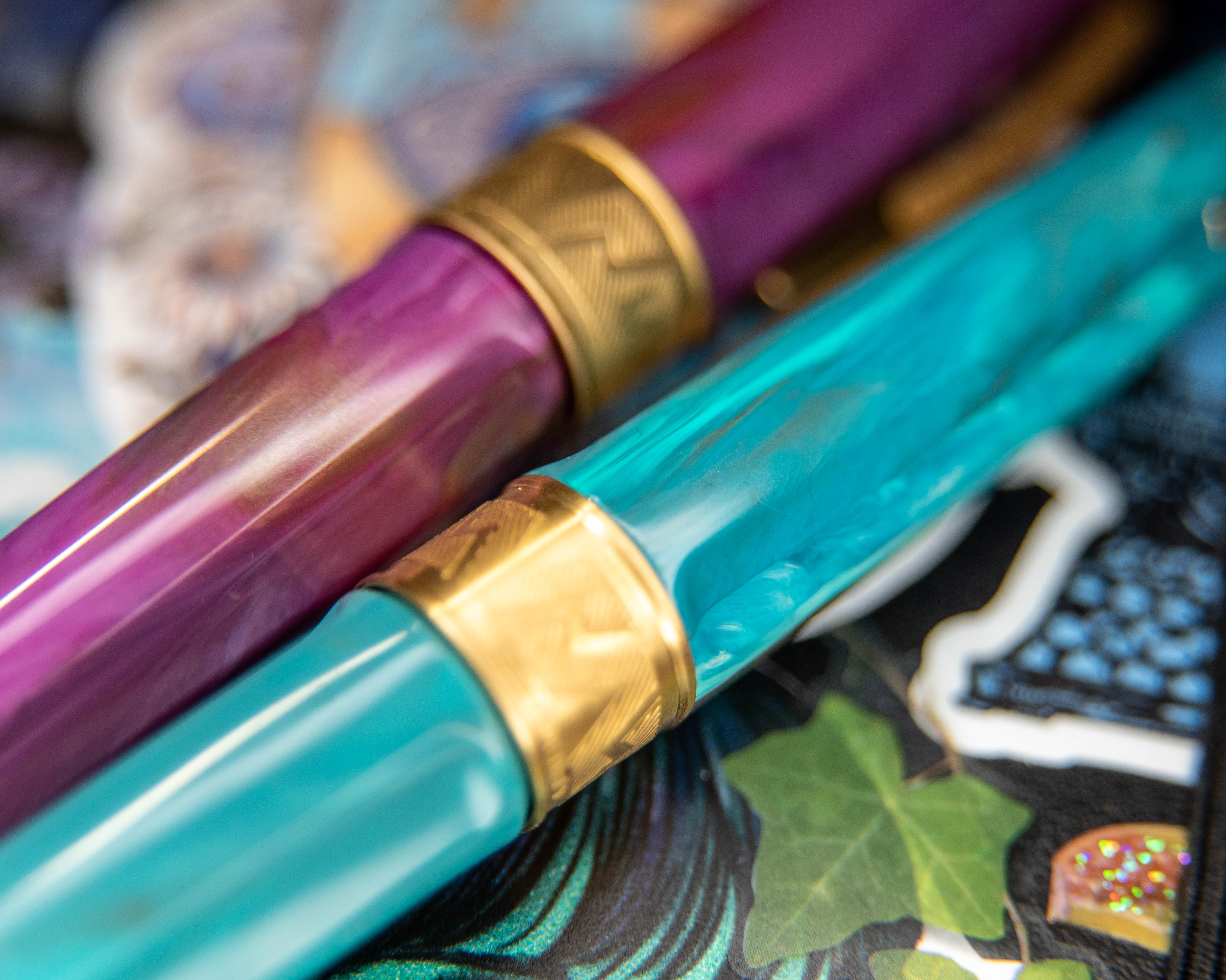
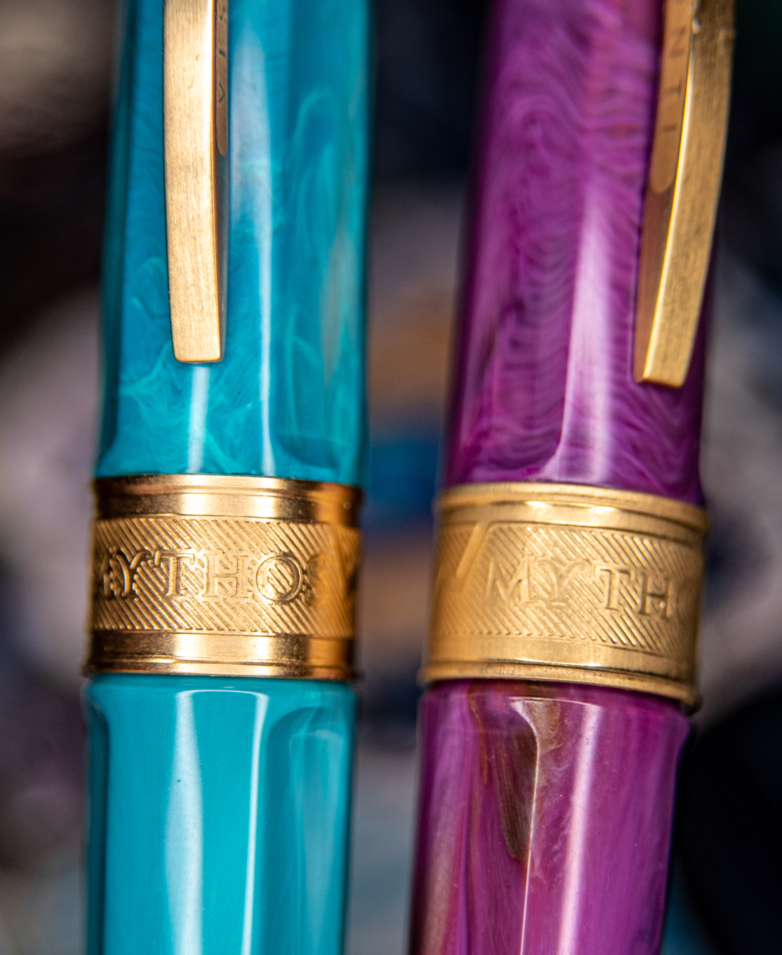
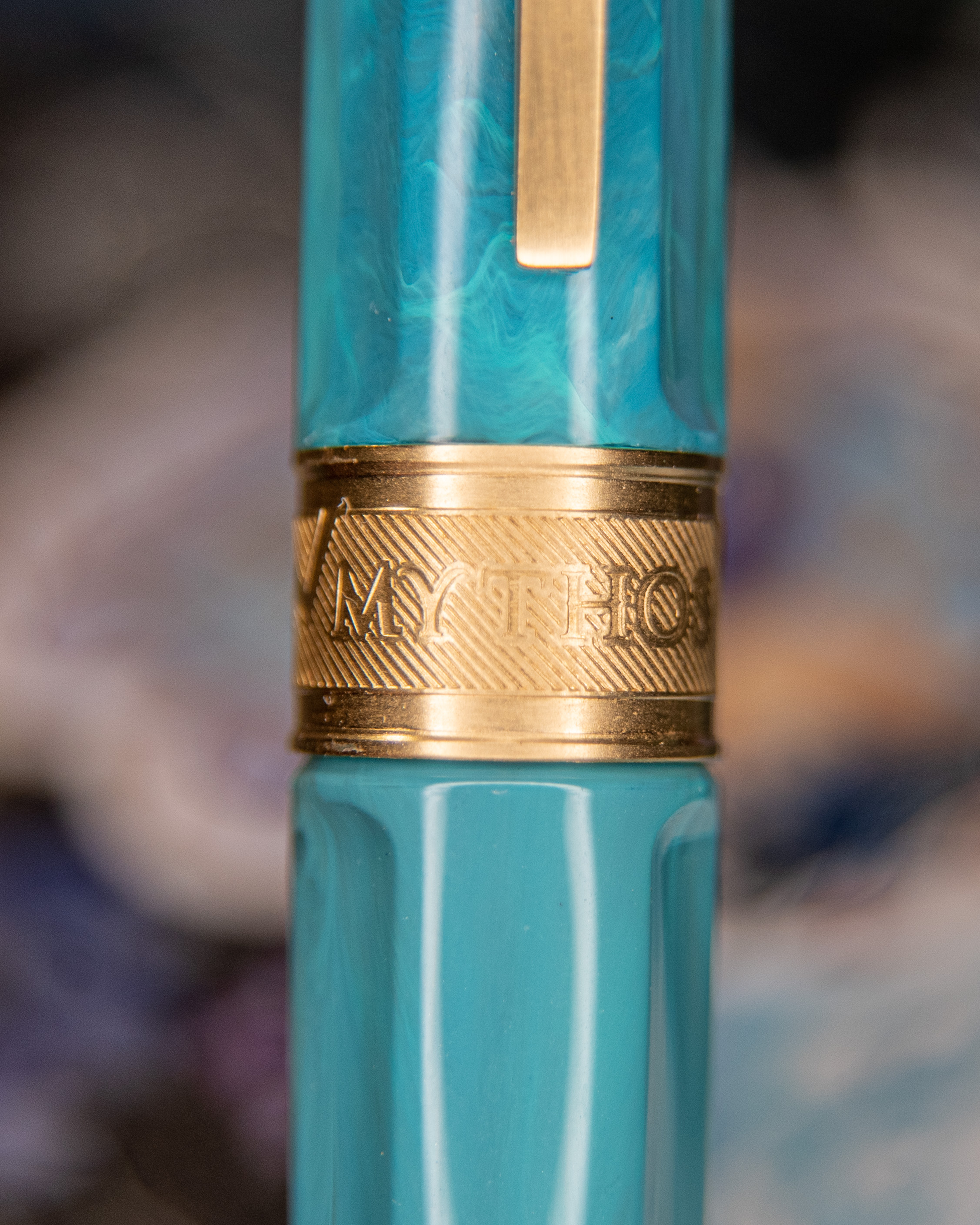
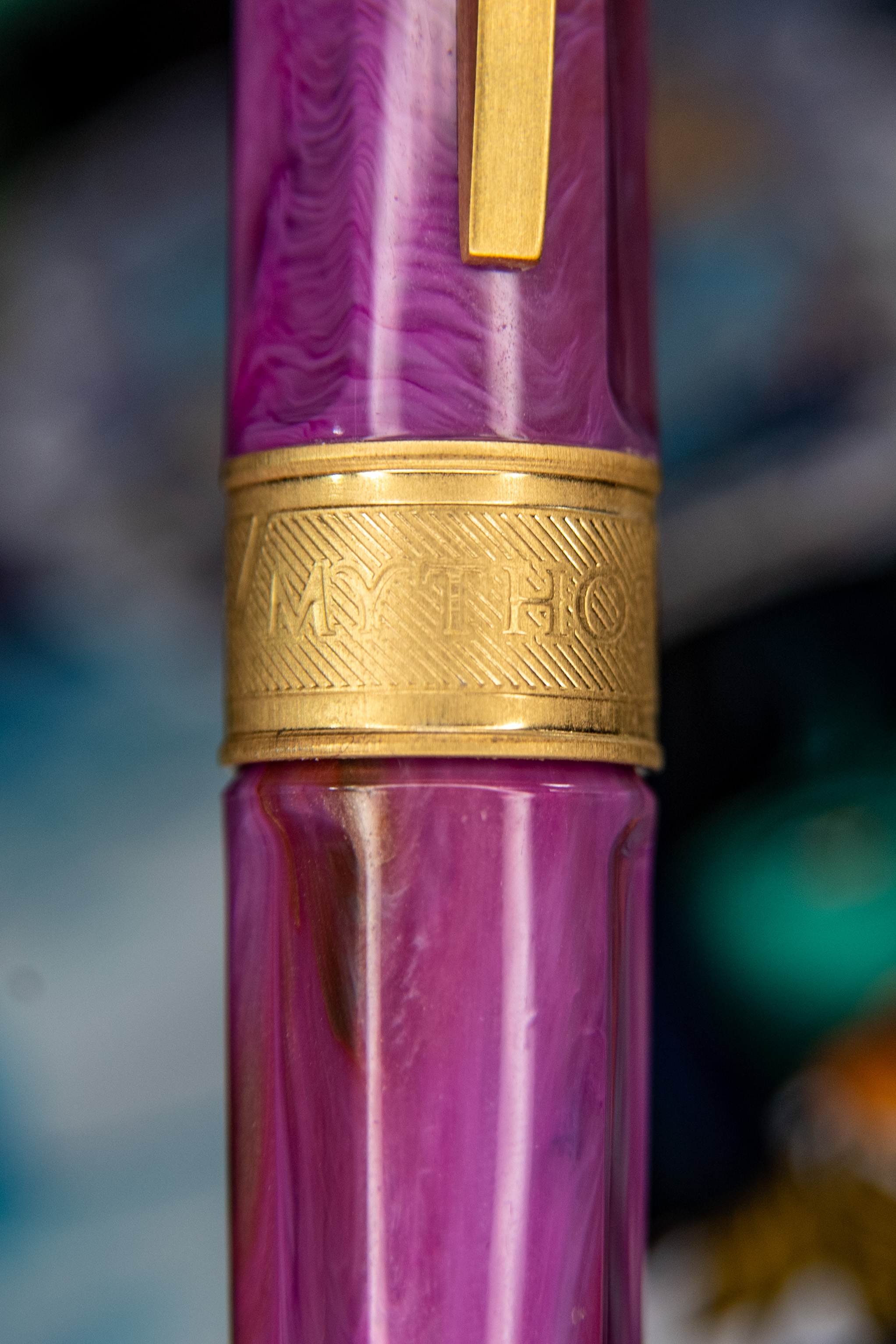
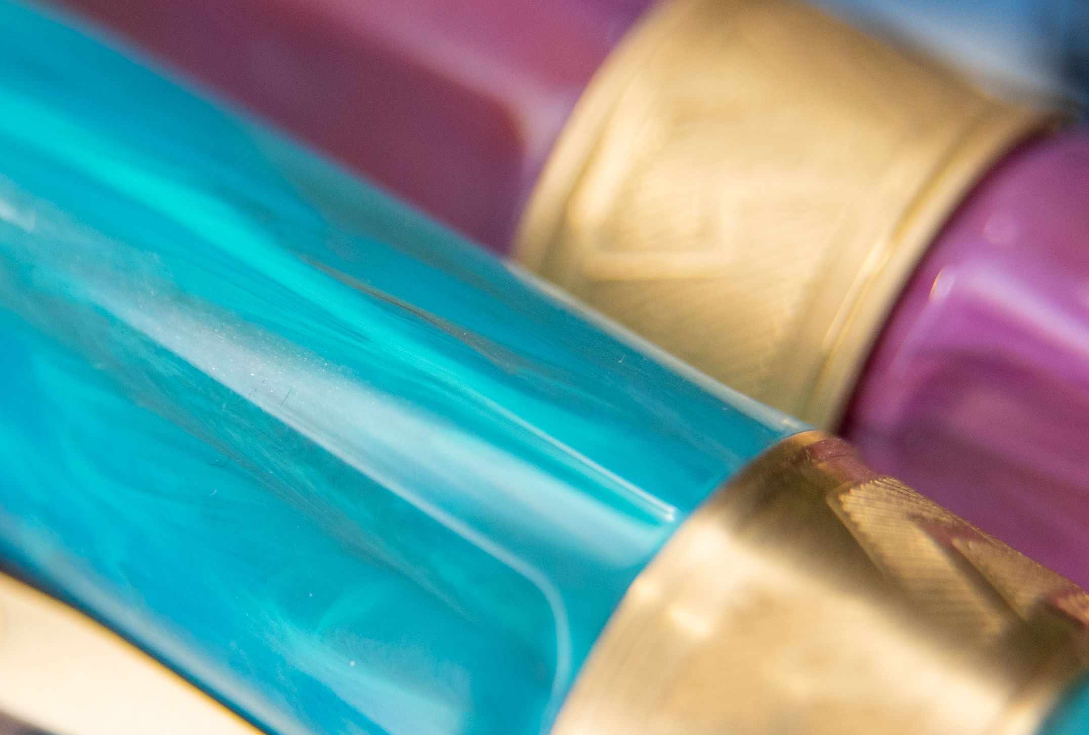
The Mirage model, though, isn’t just these four Mythos pens. There are six other pen colours to chose from if you get a basic Mirage. They’re shaped similarly but the Mythos has gold accents rather than silver and some design close to the nib.
Details
The cap is magnetic, and will only attach where the grooves allow it to, so it is always straight on. It also holds on to the end of the pen magnetically when posted. I haven’t had a single issue with it being insecure, and I think it’s a fine system overall.
The grip is one of my worst nightmares and I didn’t even think about it before I bought it. I actually saw the design by the nib and though “wow that’s so pretty!” without connecting that my least favourite thing a fountain pen can have is something that will grate on my ring finger while I’m using the pen. Interestingly enough, because there are no sharp edges, this is less bothersome to me that, say, a Pelikan M200. So unbothered was I, that I purchased a second Mythos a year later.
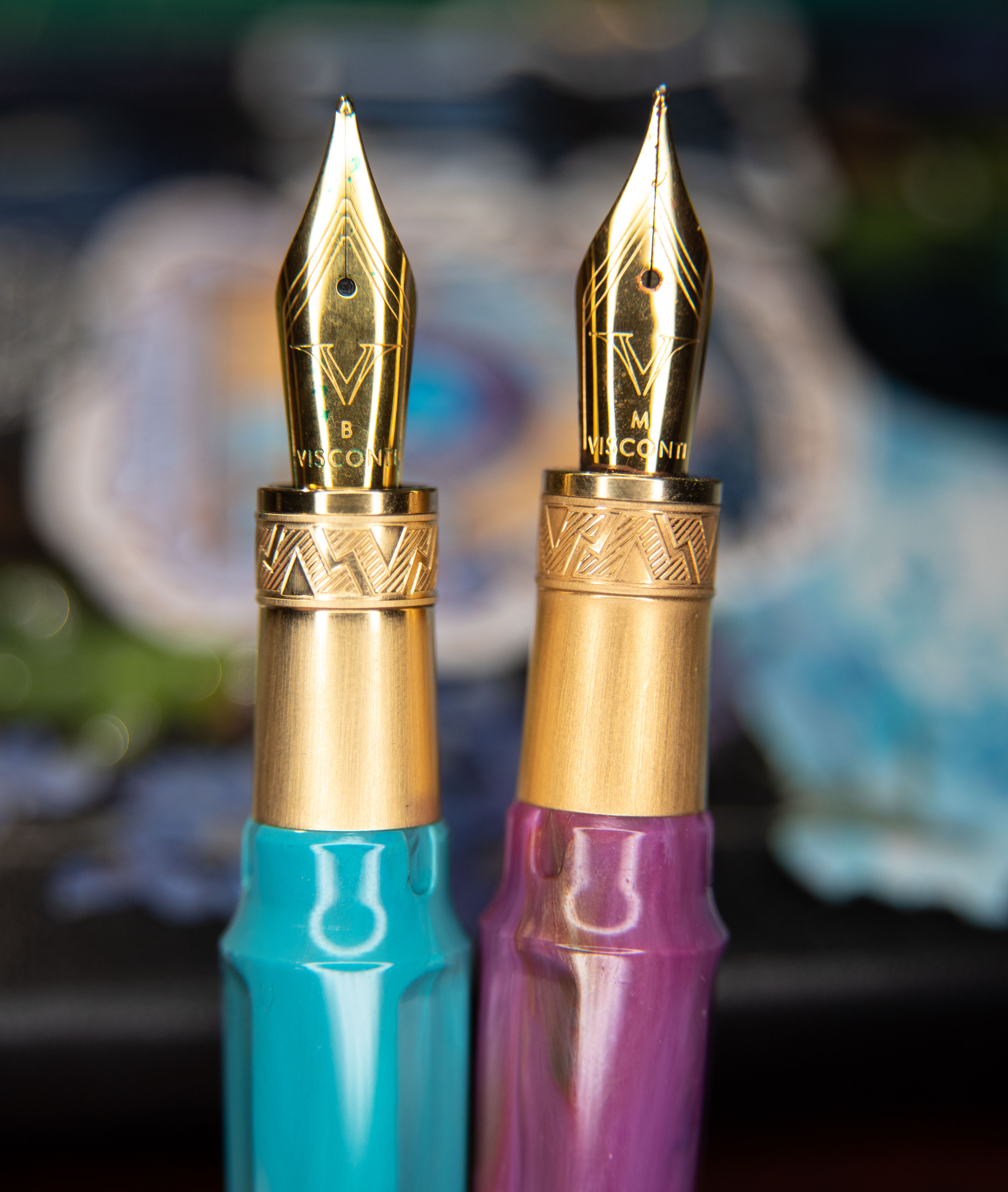
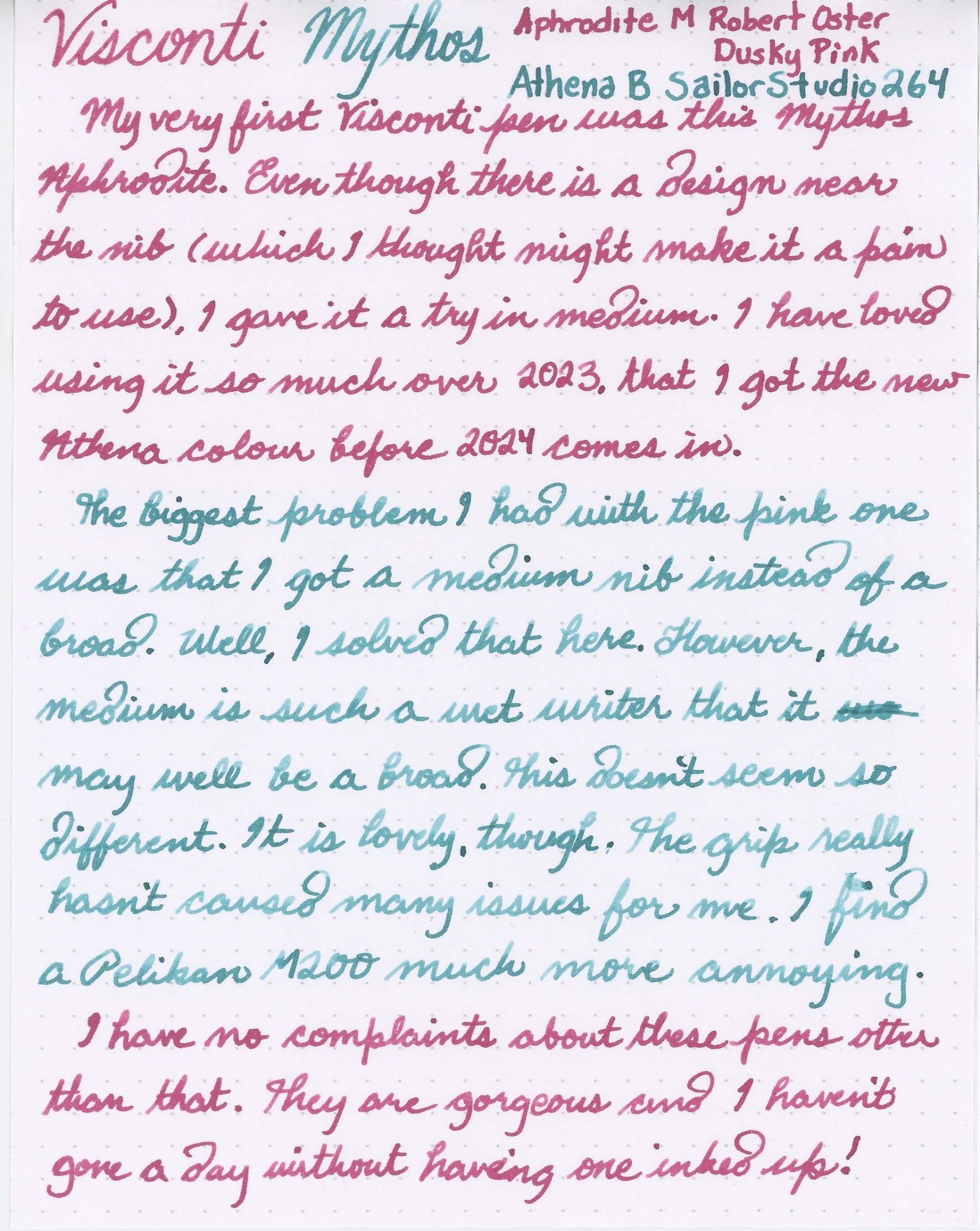
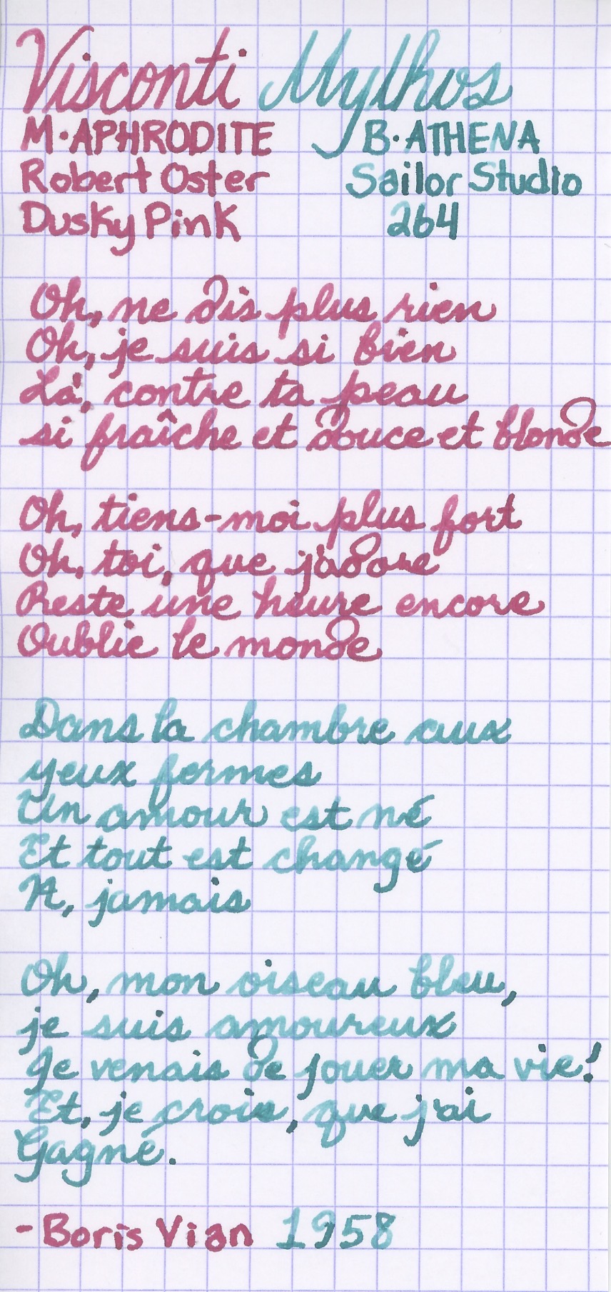
I chose a medium nib (steel) in the Aphrodite version and it is a very nice and wet writer with Robert Oster Dusky Pink. I have inked it up countless times and I’ve not had any issues with hard starting or skipping, and it stays wet. I wished I had gotten it in broad! I have yet to see available spare nibs for this one anywhere, either. So the Athena version I purchased in broad. It’s inked up with Sailor Studio 264 and it’s a wet writer just like the medium.
It is shaped to not be perfectly rounded and instead has three cutouts along the body and cap. I suppose this keeps it from rolling if it is uncapped and set down, but if the cap is on or posted, the band is thicker than the pen, and the clip (a very attractive feature by the way) is what stops the pen from rolling. The grooves also make it so that the cap can only be posted in three different orientations. I can dig that just fine.
I know some Viscontis have a little removable monogram at the end. This one claimed to have such a feature too, where you use a magnet to remove the Visconti “V” and replace it with a custom one. However I have not been able to remove this one with a magnet.
Writing Samples
Verdict
It writes so well (and wet) that I use it a lot regardless of the texture on my finger from the design near the nib. I’ve never had a single flow issue and that really matters more to me than comfort, I’ve learnt. Because of this pen, I’ve become more interested in Visconti as a brand.


Hi – couldn’t really find out much about this pen. You’re review has convinced me to get it!! Thanks
I’m glad I could help. I still use both of mine all the time.
Hey, I wanted to ask about the differences between the medium and broad nib. Since the line width looks very similar in your writing, is it just a case of the broad nib being more wet and smooth? I can’t decide which nib to get since I prefer max smooth writing but don’t like long dry times which is a conflicting conundrum.
The line widths are incredibly similar, but in my experience the medium is a way wetter writer, and therefore much smoother. I prefer it, since I want to practically paint with my pens. The broad isn’t dry, though, as far as I’ve found, it’s just not *as* wet. I suppose a wetting agent could be added to the broad, or a dry ink could be used in the medium, in order to find a nice balance, though! So, if you don’t like what wetting agents do to the ink, and how they affect the drying time, you could opt for a dry ink in the medium perhaps, with the option of switching to something naturally more flowy. I hope that was helpful!
Thank you, I’ll go for the medium then!