An Introduction to Art Paper
Let me start with the most important point: there are no unbreakable rules. The entirety of human creativity is a gift that requires only participation, and limiting technique is a loser thing to do. There will be artists who use paper in an unconventional way to great results! Exploration is the key to having fun with art, I really believe that. But, if you’ve ever been new to a medium and have been confused why it isn’t working for you the same way it is for others, substrate is most likely the reason.
‘Substrate’ is just a word for ‘art surface,’ and there are many more types of art surface than just paper, but I’m going to start with paper because it’s what I know the most about and is perhaps the easiest to access. It was also, for me, the most confusing part of creating art for a very long time. All the way up until I was required to in university, I bought the cheapest and easiest paper I could find and used it for everything. It’s likely why I never much liked painting and always went towards graphite. Copy paper was my main squeeze and pencils do great on it while almost everything else makes a frustrating mess.
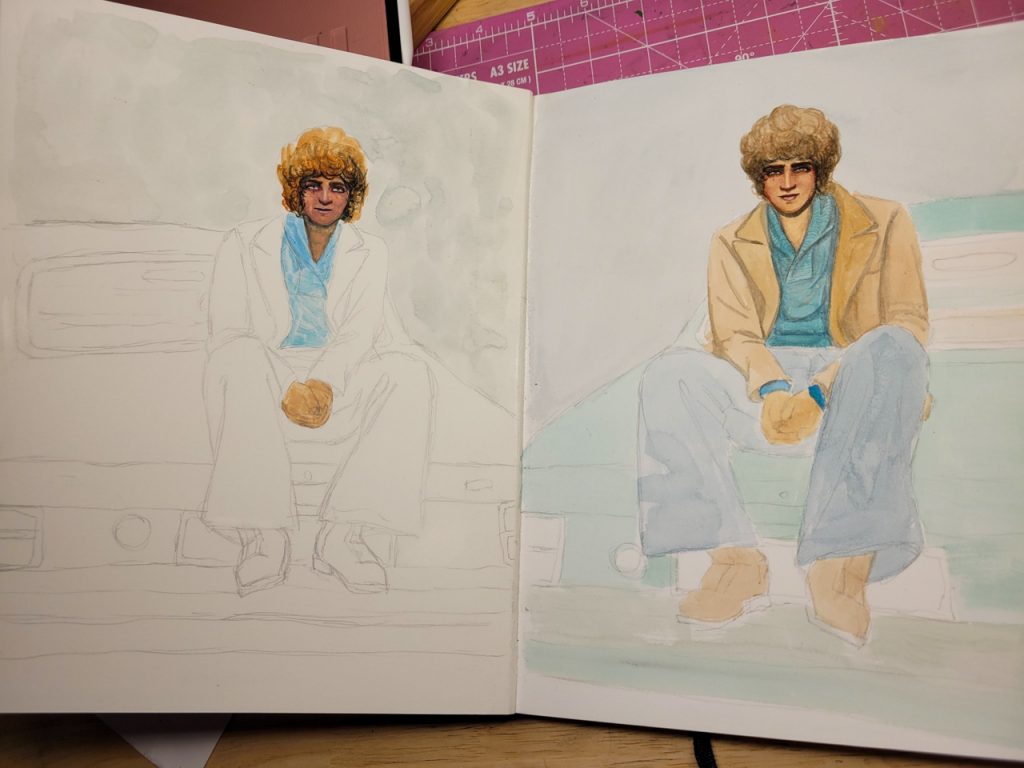
The other day, I was painting the first page of a brand new sketchbook, and I accidentally began on the flyleaf rather than the actual cotton art paper. Side-by-side, I saw some of the greatest evidence of all time that the paper matters more than anything else. I painted these two sketches on the same day, with the same paint, at the same skill level, and the difference is unbelievable. No doubt the paints would be unfairly hated if I didn’t know there was another way:
So, here’s a little introduction into what’s so special about art paper and why there’s so much variation out there.
The Four Main Qualities
In order of importance, this is the narrowest list I could think of for what’s important when choosing paper:
-Absorption: by default, fibrous papers are highly absorbent, and different sorts of paper have different types of sizing added to them (that word is a completely different word to ‘size’ as in ‘the size of this paper is A4.’) which decreases absorption to various levels. Some papers are coated not to absorb at all, and these are usually good for things like alcohol ink; other papers are ‘raw’ and absorb and bleed and feather and blur to the maximum degree. Raw Xuan and Mulberry papers are like that, which is how you get the lovely atmosphere in ink paintings.
-Weight: the thickness of the paper, thinner papers have a lower weight than thick papers. The weight in lbs is how heavy 500 sheets of the paper is; the weight in metric is how much a square metre weighs. A square metre of thin paper may only be 80g, and then thick paper can be upwards of 700g. That’s what that means.
-Texture: this can range from smooth plate paper and sheets of art plastic all the way to heavily textured pastel surfaces. More texture means more layers, but it also means tiny details are more difficult. Highly technical arts tend to use smoother papers on average, and expressive arts want more texture.
-Tone: from bright, bleached white, all the way to deep black, with a rainbow in between, papers come in all sorts of colours. Transparent media is generally used on lighter coloured papers, while opaque media can go anywhere.
Any combination of the above is possible, and will make the biggest difference in how it interacts with your art supplies. The scale of art supplies ranges from very wet materials that want to soak in, to incredibly dry materials that sit on top of the paper’s surface; and then from wispy transparent washes of colour all the way to heavy opaque impasto layers.
Some media is very versatile, like Indian ink or Chinese ink, and other media is incredibly finicky, like metalpoint. I’ve come up with a list of media that I personally have enough experience with to speak on, and have organised them below. If you want to skip to a certain one, click the corresponding button.
Dry Media
Graphite and Charcoal
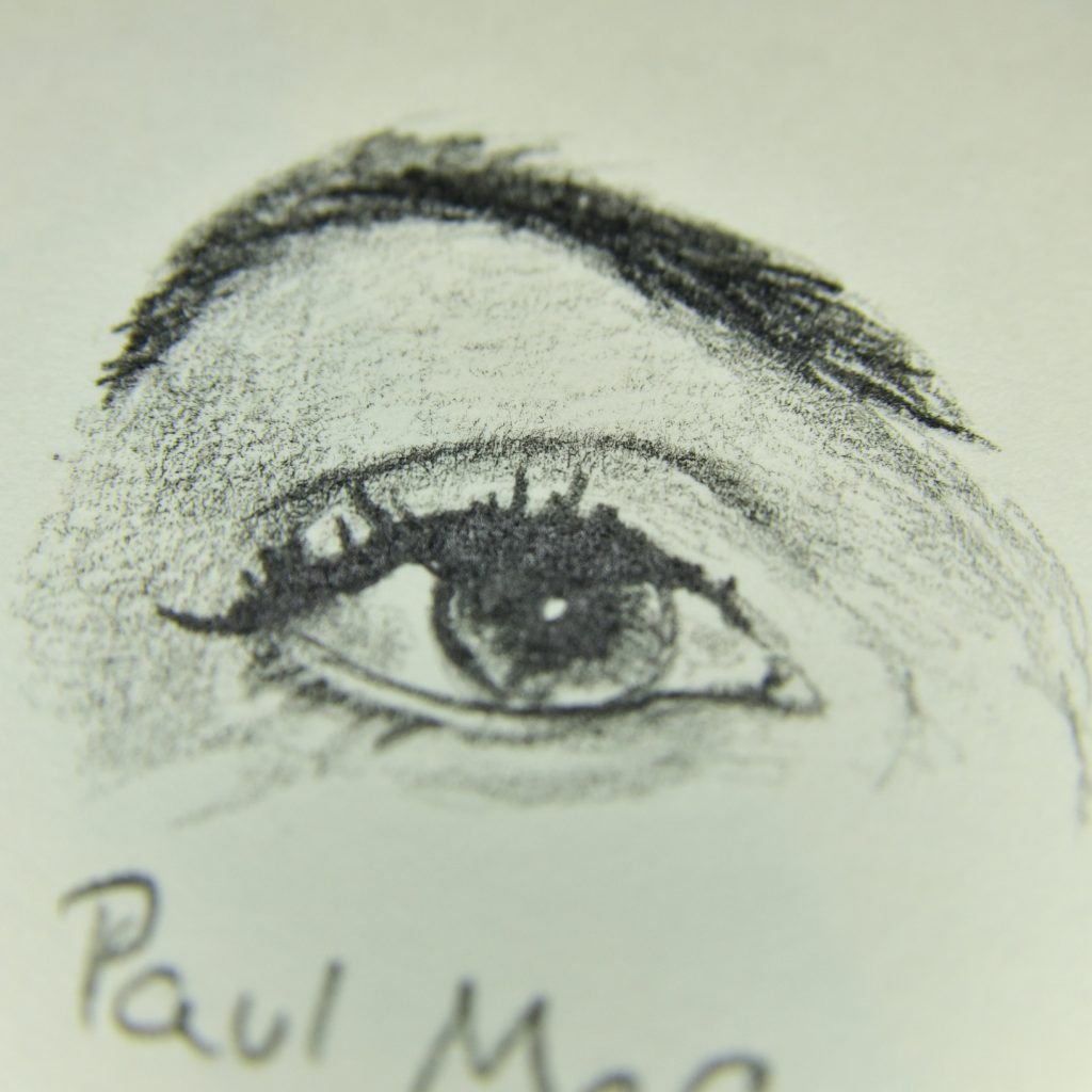
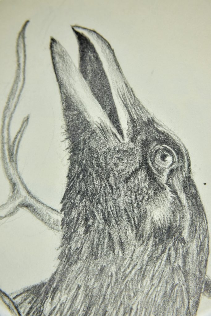
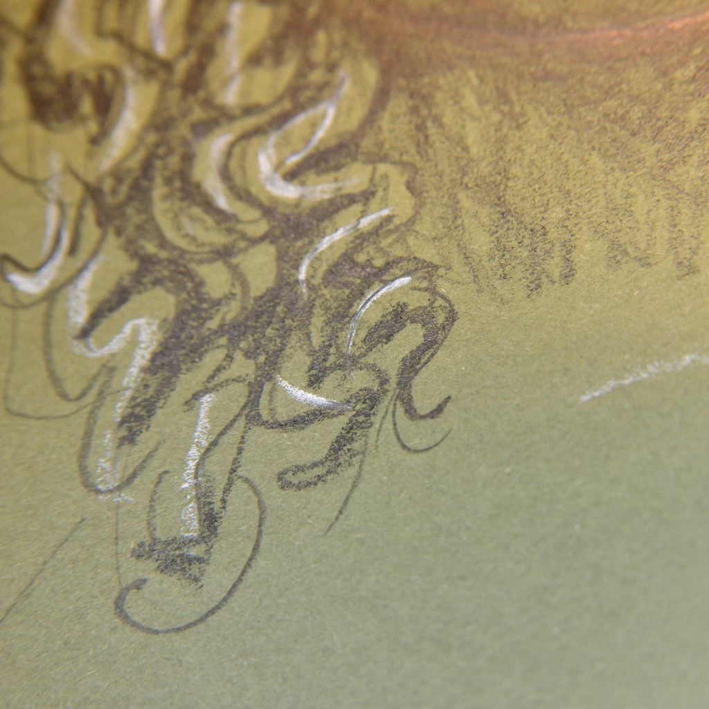
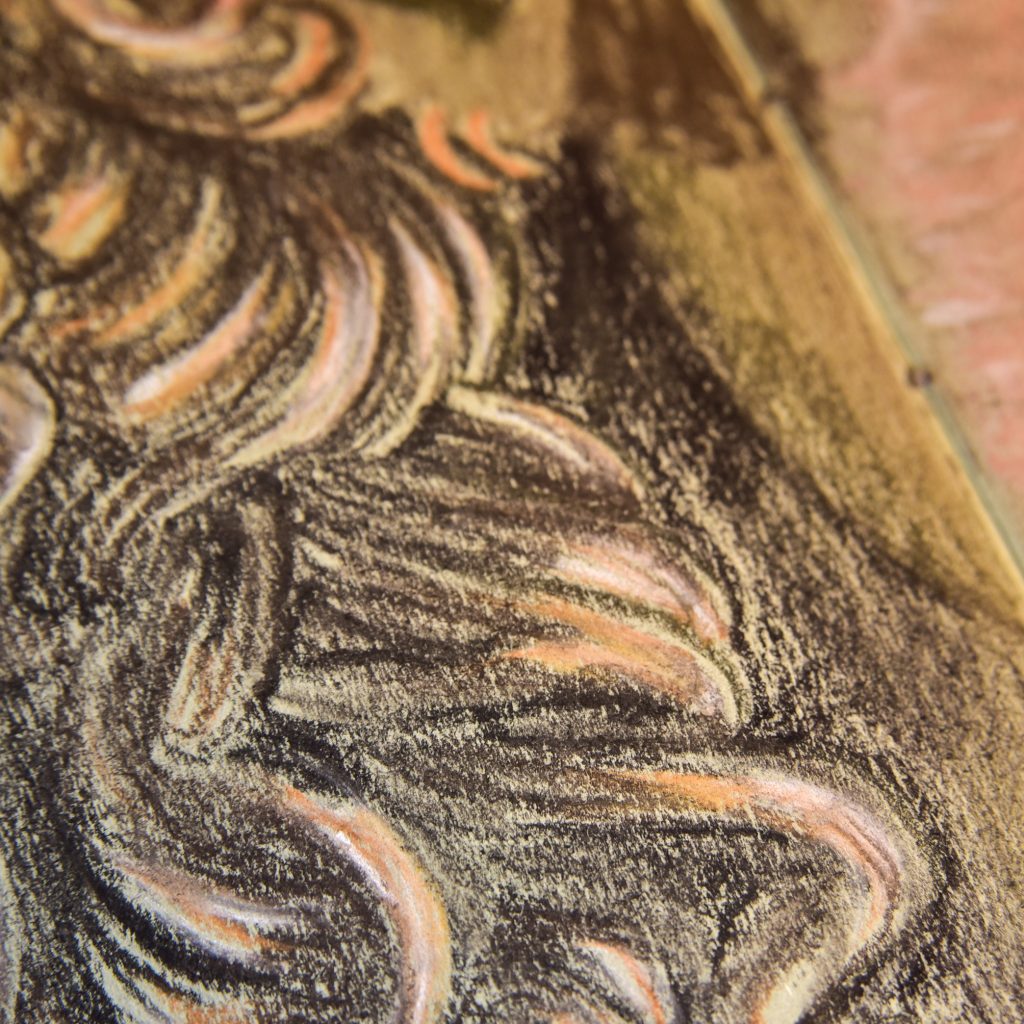
-Absorption: doesn’t matter much, unless you’re using water with them, in which case the more water you use the less absorbent you likely want your paper to be.
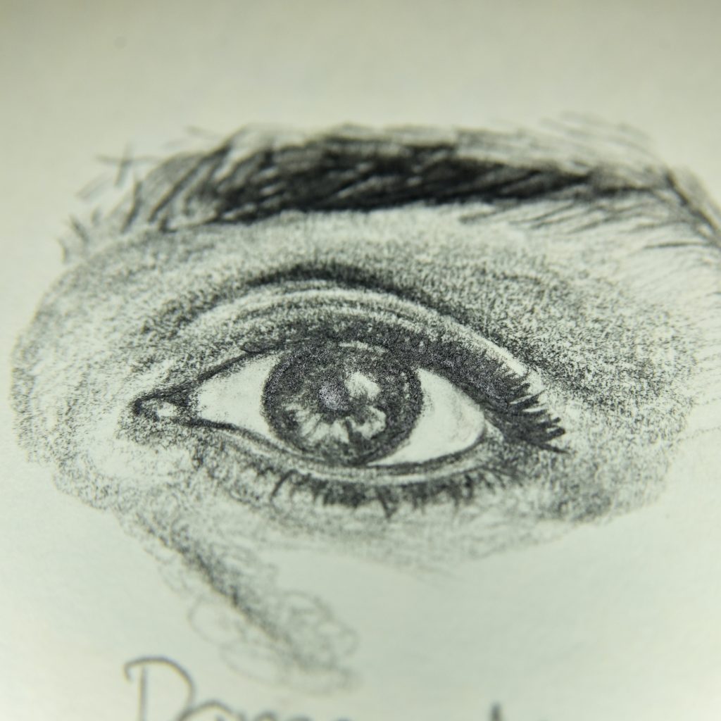
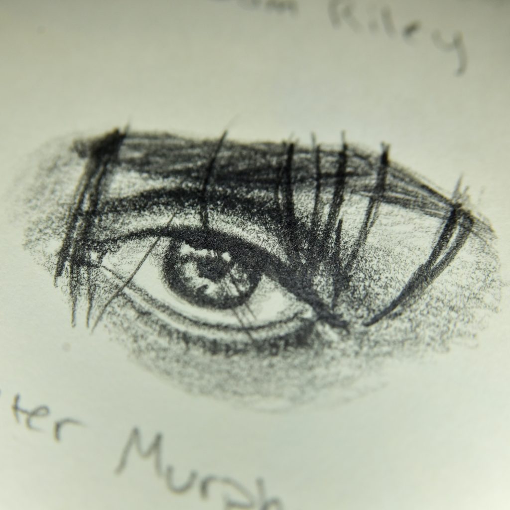
-Weight: the same thing applies to these are to coloured pencils: heavier is generally softer and therefore more comfortable. You’re able to get much deeper blacks on heavier paper, but you can sketch on onion skin, practically. Graphite and charcoal are such universal media because of the ability to sketch without specialist paper.
-Texture: too much texture isn’t generally that good for these things, but if it’s too smooth you won’t get dark darks as well and the graphite shine will be increased. Charcoal, being like pastel, needs more texture, but since it is the grade of charcoal that determines the darkness, and not the pressure, using highly textured pastel paper can decrease your ability to blend with other tools.
-Tone: charcoal works best on mid-toned papers, using a white charcoal of highlights in my opinion, whereas graphite needs light tones.
Coloured Pencils and Wax Pastels
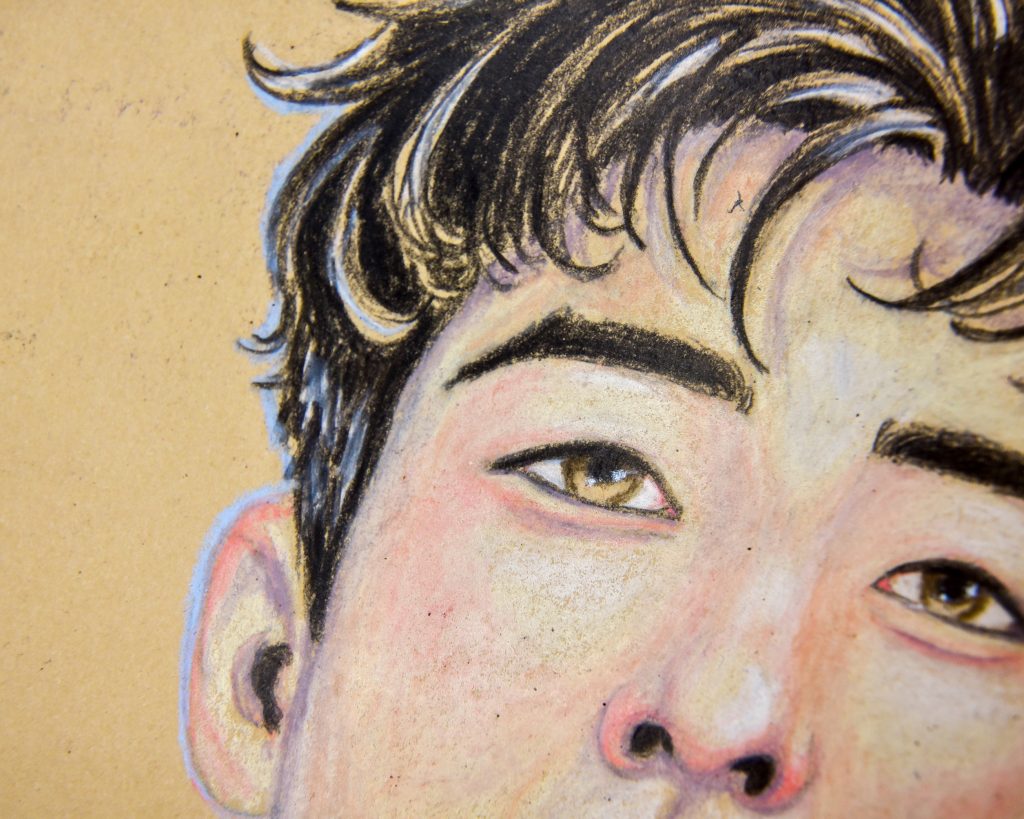
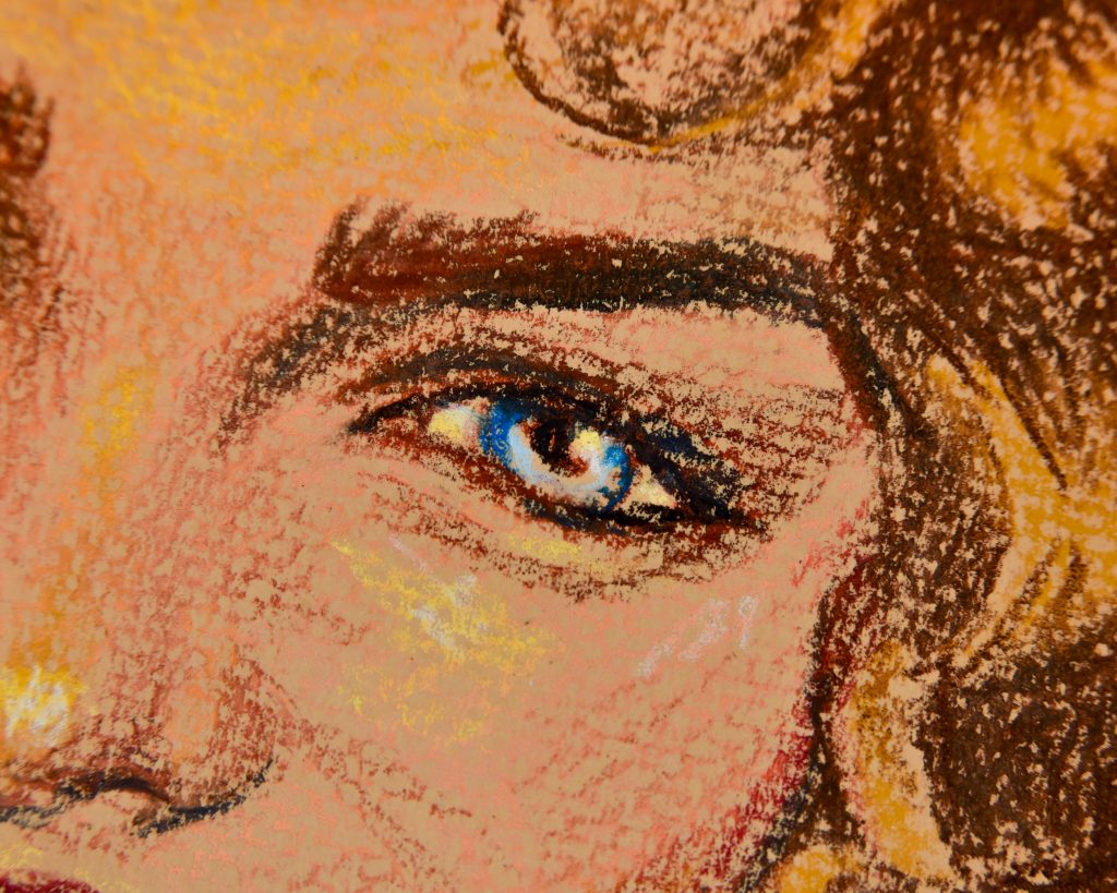
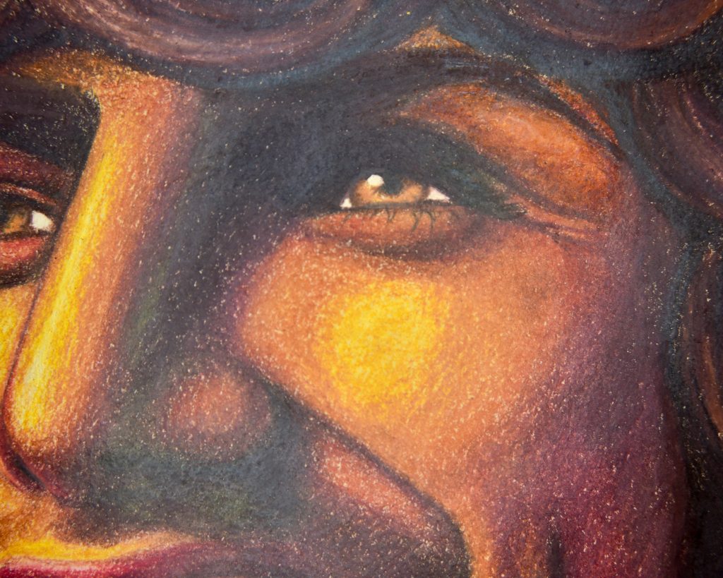
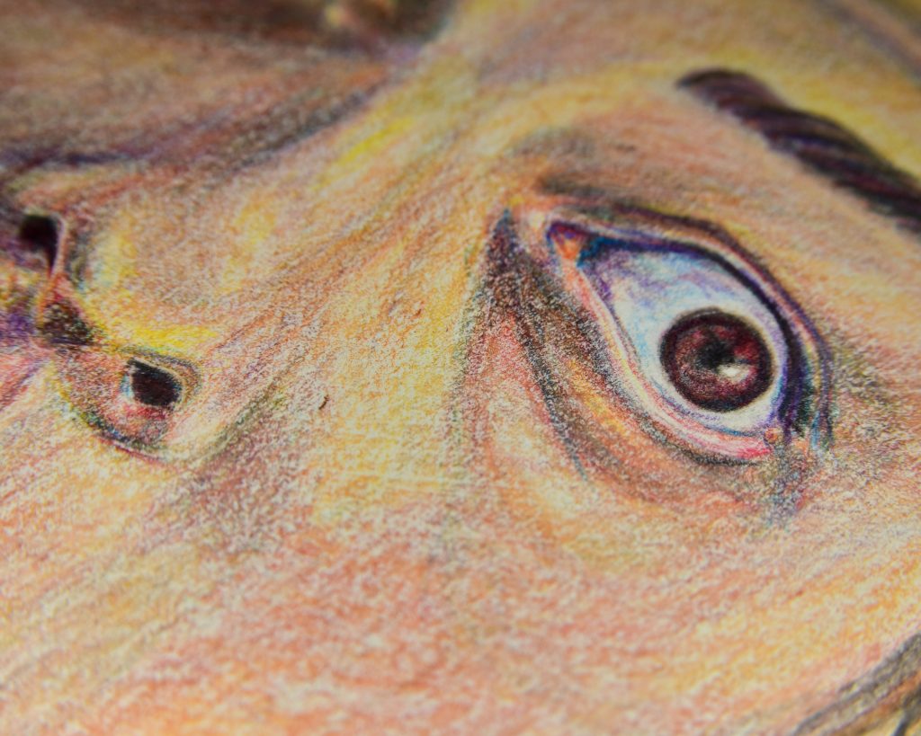
Coloured pencils are pretty versatile, but, there are certain things that bring about better enjoyment.
-Absorption: doesn’t make much difference. Heavily coated papers don’t take too well to pencils, but that’s generally not the coating but rather the texture. If you’re using water-soluble varieties, then you want to use less absorbent paper.
-Weight: heavier papers feel much nicer beneath the hand in the same way that writing a note is easier on a pad than on a bare table. Thinner papers give heavier lines, thicker give softer blends. This is a matter of preference, but if you’re finding you aren’t able to blend well, it’s because your paper is too thin and it can’t hold enough texture.
-Texture: the most important aspect of paper for coloured pencils. Smooth paper will limit every single aspect of coloured pencils, from the softness of blends, to the amount of layers you can get, to the saturation of the colours. You need a bit of ‘tooth’ to use them to their best abilities. The more tooth there is, the more layers you will be able to create and therefore the smoother the piece can be in the end. It will, however, take longer to look smooth, the more texture you have, and it will use up more product as you are literally grinding away at the pigment as you go. Pastel-prepared papers work for coloured pencils beautifully, but most beginners will be happier with something less extreme, such as drawing paper or, if you want to have something luxurious, hot-press watercolour paper. Yes, watercolour paper can be used for more than just water media.
-Tone: this is wholly dependent on the brand and model of the pencils you’re using. Prismacolor premiers work well on darker papers, so do Caran d’Ache Luminance and Derwent Lightfast. Polychromos are a bit more transparent because they are harder and therefore lay down less pigment with every swipe. Holbein are soft but I find not all that opaque in general. I personally like to use mid-toned papers with coloured pencils, and have a great opaque white on hand at all times.
Pastels (chalk and dry pencils)
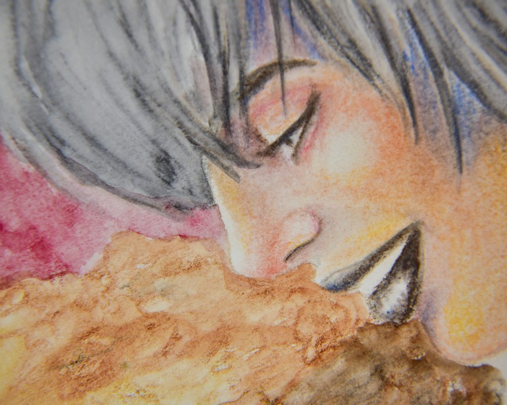
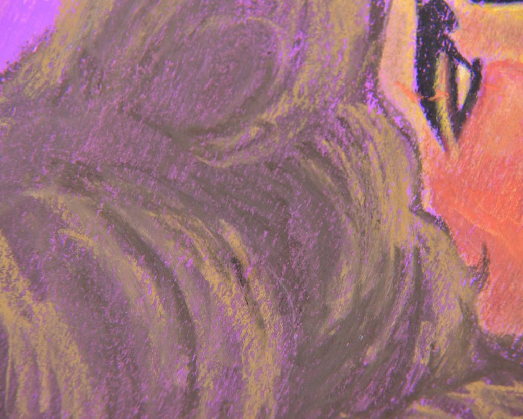
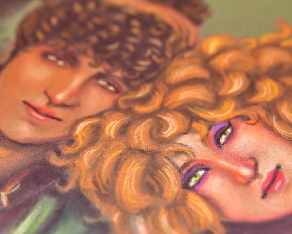
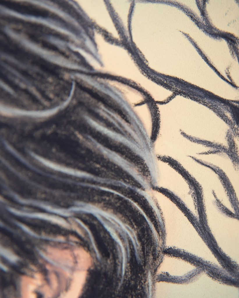
-Absorption: only matters if you’re using water-soluble pastel, then you want to abide by the same advice as graphite and charcoal: more water=less absorbent paper.
-Weight: thin papers don’t hold enough layers for blending, but pastel will work on thin papers.
-Texture: the most important thing for pastels. They won’t work on smooth papers, they need to be ground down even more than coloured pencils do. Even something like PanPastel, which will ‘work’ on smooth paper (as in, it will produce colour on the surface), can be blown away almost completely by breathing on it if the paper is too smooth. Specialist pastel papers, like Pastelmat, really are worth it, but at least use something like drawing paper or things labeled for pastels. It’ll change the game competely.
-Tone: chalk pastels work SO WELL on deep dark papers! I adore using black paper with pastels, and honestly refuse to use bright white with them. I like to put my highlights on in white on my own. That doesn’t mean you can’t use white, that’s a preference, but pastels are one of the best candidates for dark papers.
Metalpoint
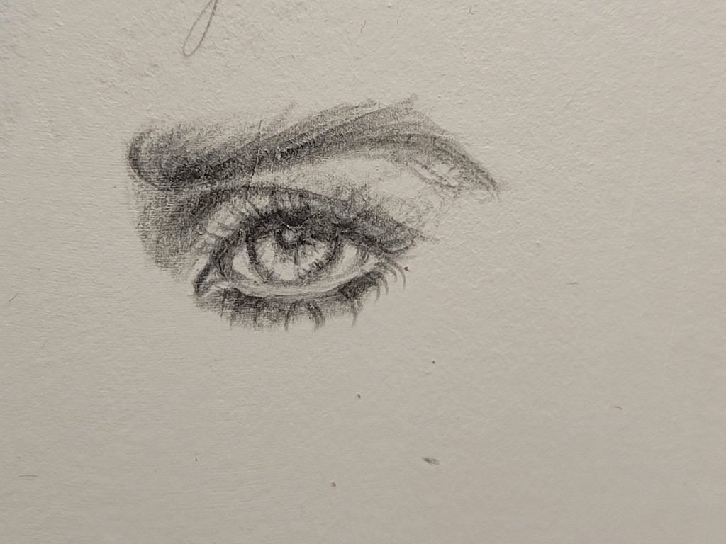
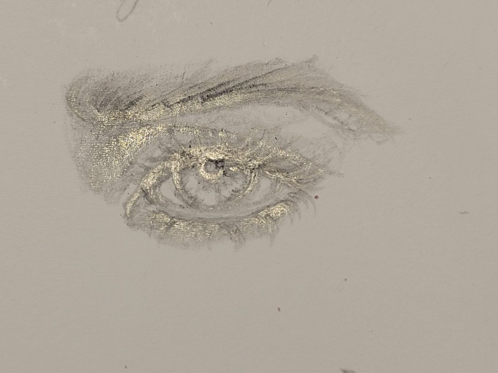
Metalpoint will only work on specially prepared surfaces with the right sort of texture. You either prime the surface with gesso (which, you know, you can put gesso on any paper you want so in that way it isn’t picky at all), or you use specialty paper. The only type of paper that I know works with metalpoint with no preparation is mineral paper, which is made from calcium carbonate and resin. If you try and use it on copy paper, nothing will happen. If you try to use it on the most expensive watercolour paper, nothing will happen. It needs to be ground down by microscopic marble texture, and that is literally all that matters. So, if you want to get into metalpoint, you need a special surface.
Wet Media
Ink (Shellac or Glue-based)
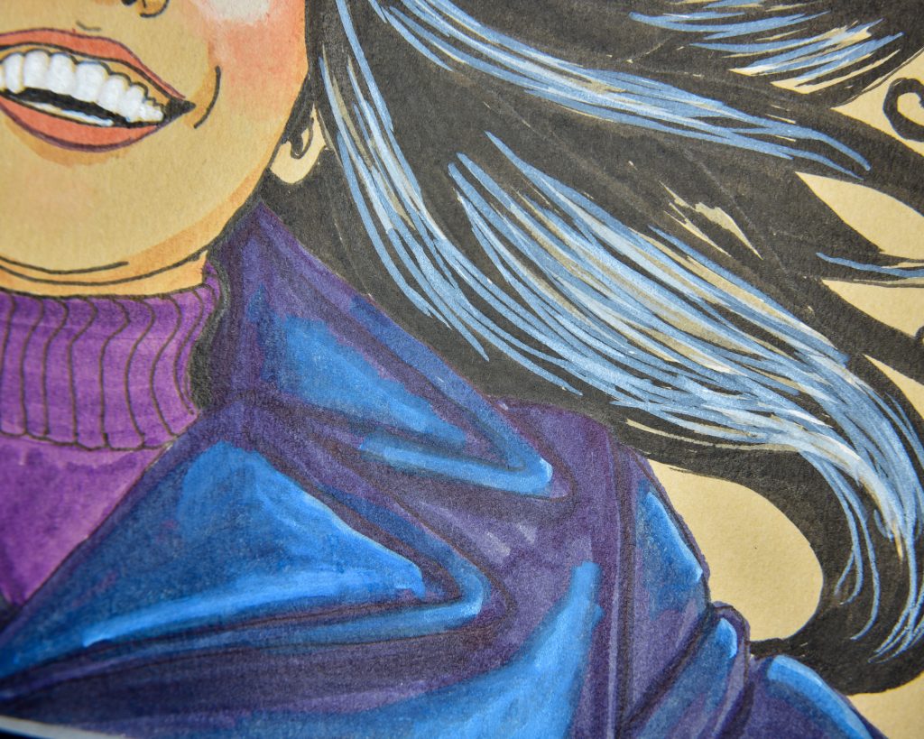
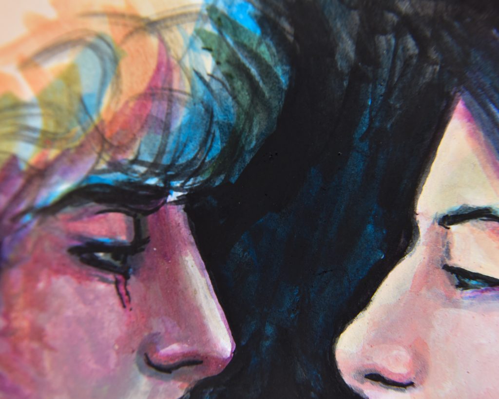
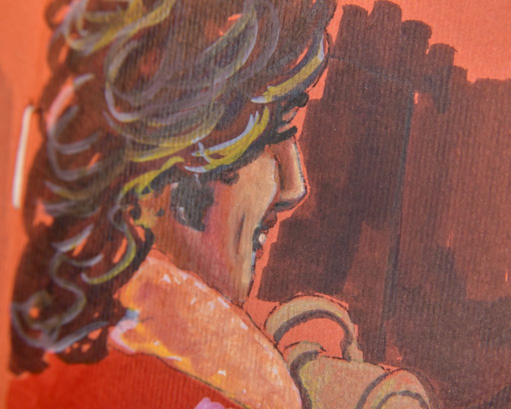
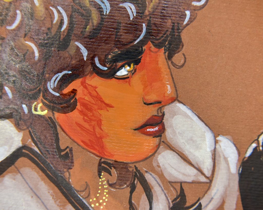
One of the least picky of all the media when it comes to paper (brushes are another story, make sure you clean them often). This covers things like Indian ink, Chinese ink, Sumi ink, Chinese watercolor, Korean colours, Tech Ink, and, as far as I can see, most varieties of things sold as ‘drawing ink.’ Also, Gansai Tambi if not being used with lots of water like it’s western watercolour.
-Absorption: by design, they faire well on both absorbent paper and sized papers, giving a different look based on which one is used. Unsized absorbent papers give expressive atmosphere, and highly sized papers allow for fine detail. Though, they might bead on something too non-porous and chip off when they dry.
-Weight: since the pigments in the ink tend to be larger and the binder is thick enough to sit on top of the paper, inks can be used on surprisingly thin papers and do nicely on very thick papers as well, depending on preference. They’re great for sketchbooks.
-Texture: the only issue with texture would be that it’s difficult to use something like a technical pen filled with Indian ink on really textured paper, but with a brush? It’s all back down to personal preference. You really can explore the wide world of paper with these sorts of inks.
-Tone: because it can be used in thin watered-down washes or thick opaque layers, you can easily use these inks on toned paper. The more you dilute them, the lighter the paper should be in order to see your washes, though.
Alcohol Ink
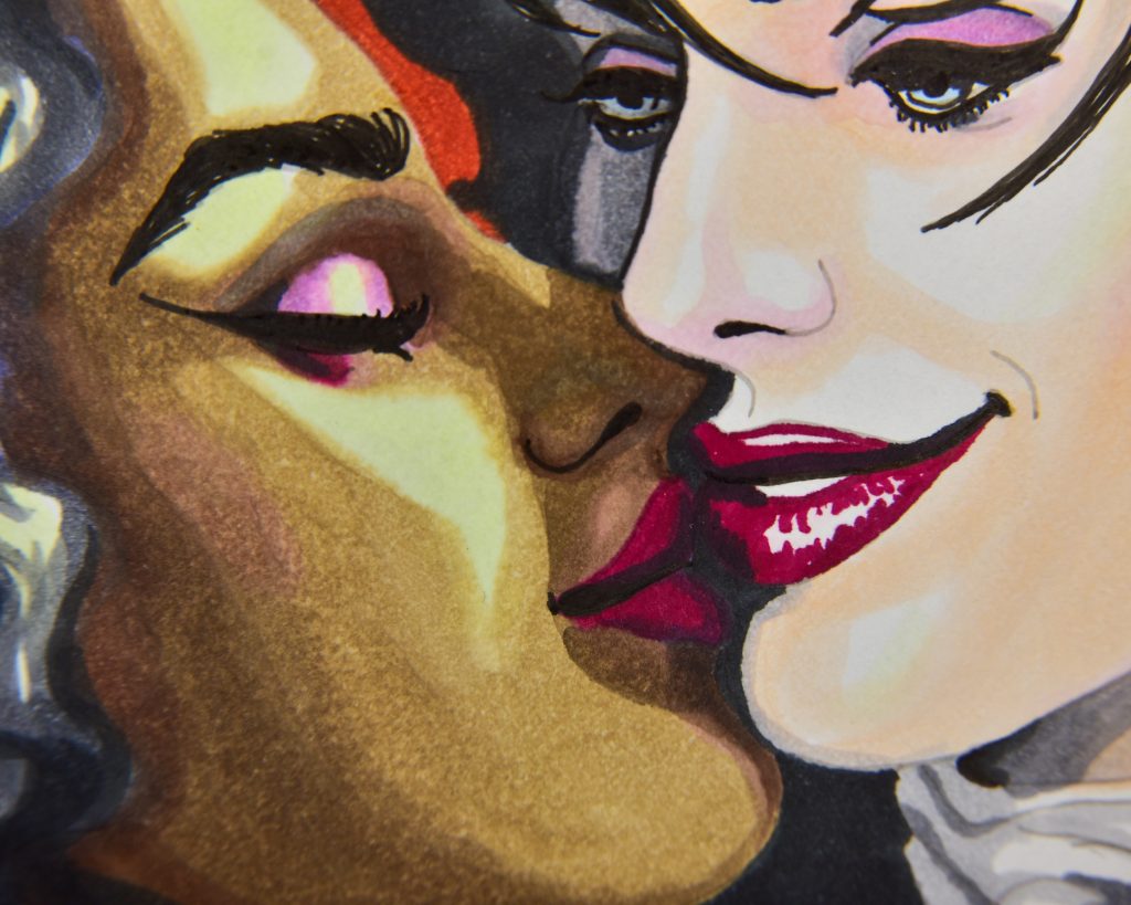
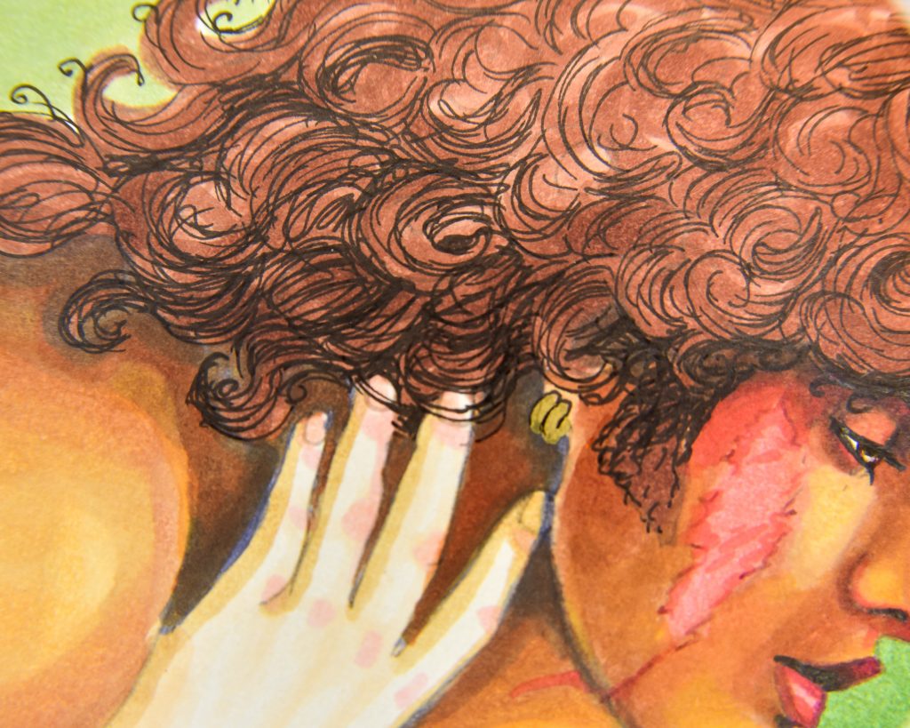
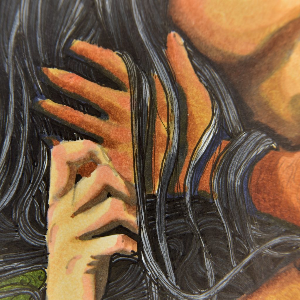
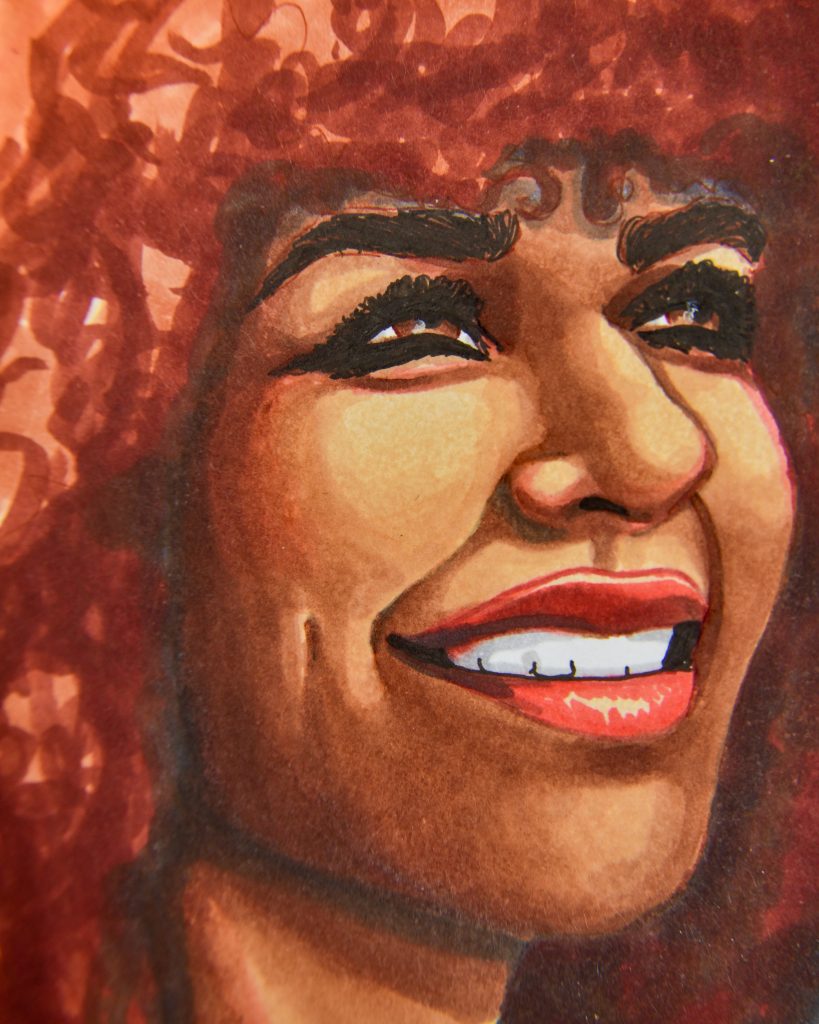
Unlike the above inks, alcohol ink is a finicky art supply, this is the first one that I actually had to concede to when I was a kid.
-Absorption: very absorbent paper will make the ink bleed and feather wildly. Blending will be difficult, if not impossible, and the ink will dry before you’ve finished your stroke. For most, this is not what they want when they are using alcohol markers/ink.
Non-absorbent papers will keep the ink looking bright and saturation, and will slow drying time down unbelievably. Sometimes, that can even be an issue, as the ink won’t dry fully (or ever!). If you put alcohol ink on porcelain, you can reactivate it indefinitely.
Bristol paper is semi-absorbent! The ink will bleed through to the other side! But, that is *not* a problem. When the colour has saturated through to the other side, you know that you know that you’ve reached the capacity of blending, and you can’t layer any more ink in that area. The smoothest blends happen on bristol, where there’s light feathering and high bleedthrough, so don’t instantly think that bleed and feather is bad. It’s only a problem when it’s uncontainable or on too thin a sheet of paper.
-Weight: this is the quality that will make bleed and feather a pain. Thin absorbent papers don’t hold layers, thicker papers do. Cardstock weight is where you want to be.
When it comes to crisp lines on non-absorbent paper (where it does *not* bleed through to the other side), the papers can be a bit thinner, but we’re usually looking at least at 100gsm. Thinner papers will tear or break or be unable to handle the moisture.
-Texture: heavy textures will wear down nibs on markers, but if using a brush, this is a matter of preference. Most marker papers are very smooth.
-Tone: alcohol ink is transparent, so it works best with bright light papers. You can use opaque white inks that some brands make in order to mix opaque colours to use with painting techniques, but I don’t know of a marker that has that capability. On dark papers, most inks will completely disappear.
Recommended: low-absorbency vinyl, like that made by Graflix; coated marker papers like Borden and Riley Paris Bleedproof or Crescent Rendr or Ohuhu; or, perhaps most popular, bristol.
Note: There are papers out there called ‘maker paper’ which are transparent thin sheets. These are design papers. Yes, they work with markers, and there is an entire world of design where that paper is useful. If fashion, architecture, or design are your bag, that paper might be useful for you. If you are trying to illustrate things in the same way you would with paint or pencil or whatever else, then the thin marker paper is not for you. It is not for blending, and it is not for layering.
Xylene Marker Ink
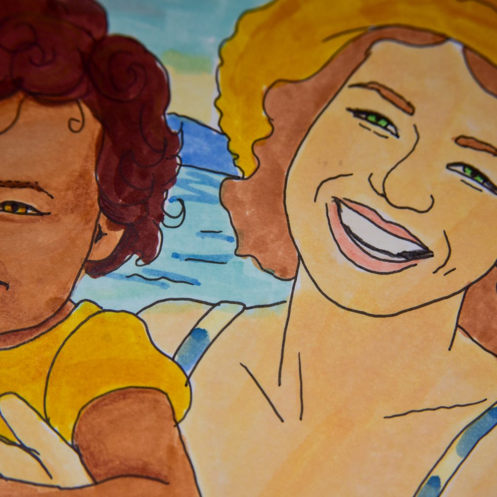
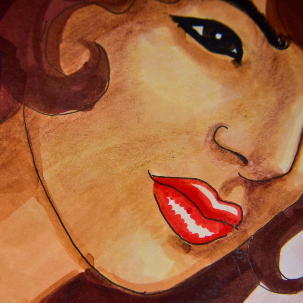


-Absorbency: these are even pickier than alcohol ink markers when it comes to thins. They will feather and bleed exponentially more on the papers that alcohol ink will bleed on. That isn’t necessarily a bad thing, it just means that the same thing which makes bristol so great with alcohol markers makes xylene markers great on coated marker paper.
-Weight: because they are much more wet, they really need thicker paper.
-Texture: the same preferences with alcohol ink apply here. Texture isn’t good for nibs, and these glide nicely on smooth paper.
-Tone: even though they lay down a lot of ink, they are still a transparent media and therefore work best on light papers.
Note: The only paper that I have ever seen which keeps xylene markers from feathering is the specialty paper made by Chartpak for their AD markers. I prefer a little feathering, because I use them beneath coloured pencil in mixed media work, but for strict xylene art, the Chartpak paper is great.
Acrylic
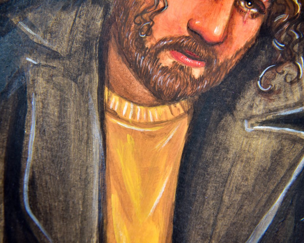

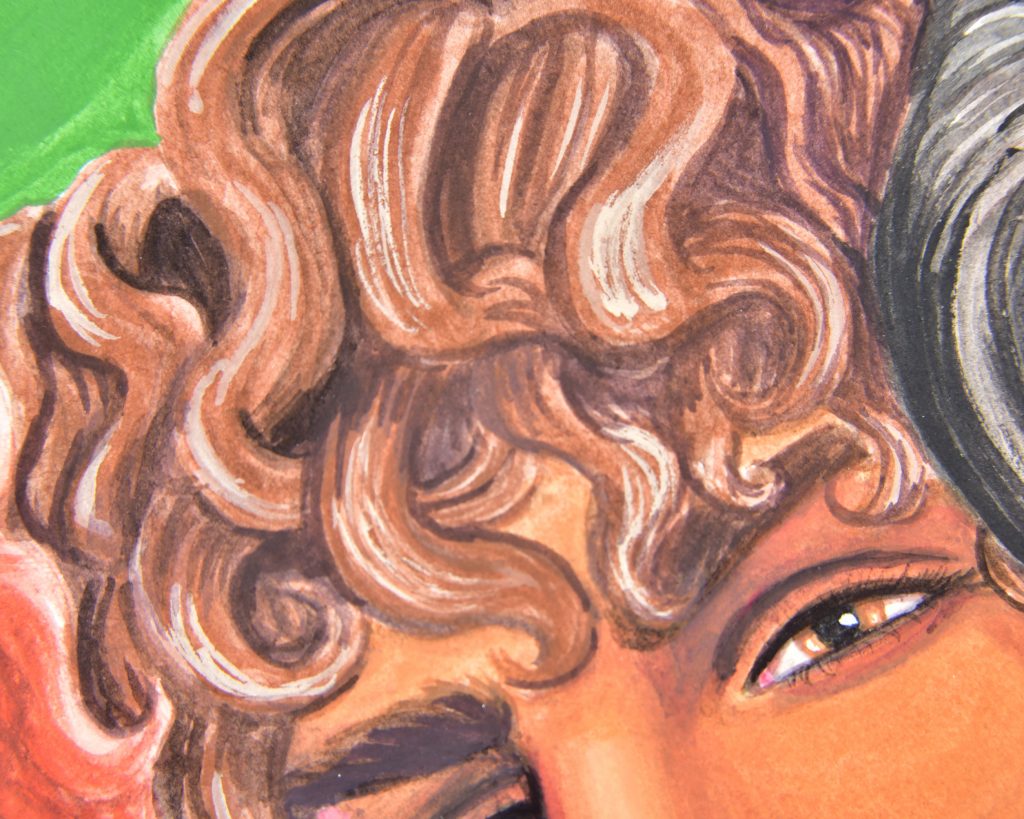
Another medium that is popular because of its versatility.
-Absorbency: if you’re using acrylic inks, or fluid acrylics, and you want them to work like transparent watercolours, you need non-absorbent paper. You can use watercolour paper in this case to nice results. Heavy-body acrylic (or fluid acrylic meant to be used in layers) can be used on either sort, though highly absorbent papers will take more layers to build up.
-Weight: acrylic will work on pretty much anything, but like any paint, sometimes the weight of it can be a real bummer. So heavy layers of acrylic on thin paper will make the paper curl and warp and is not a particularly pleasant experience. I personally like thicker papers for acrylic media. At least cardstock weight.
-Texture: this is another place where acrylic isn’t too picky, but you might be. Smooth surfaces show more brushstrokes and don’t blend as readily. Texture grips the paint off of the brush, and holds it in place easier. This one is an area that requires experimentation, because the texture of the paper will change the experience of painting so dramatically. My personal favourite paper for acrylic is Clairefontaine PaintON.
-Tone: acrylic is a pretty transparent media, but only when in thin layers. It becomes quite opaque in layers and can therefore be used on any tone of paper. The darker the tone, the more work needed to cover it, and more white needed in mixes, but anything is possible from watercolour-style washes to heavy impastos.
Watercolour
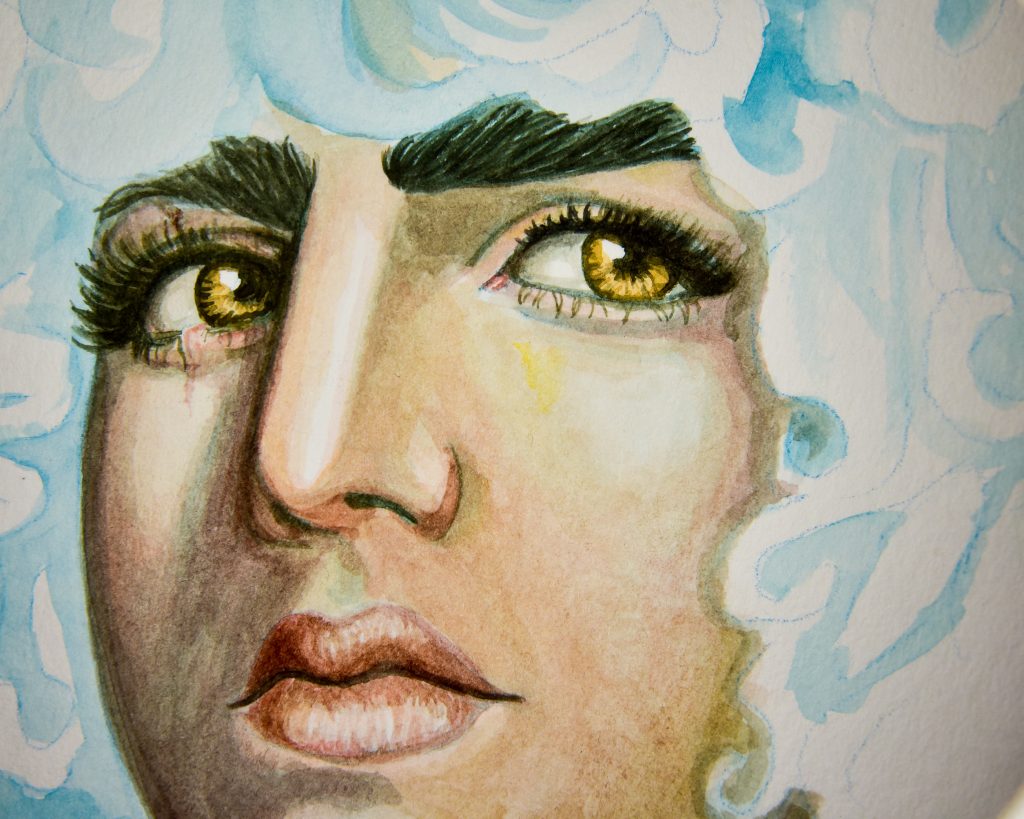
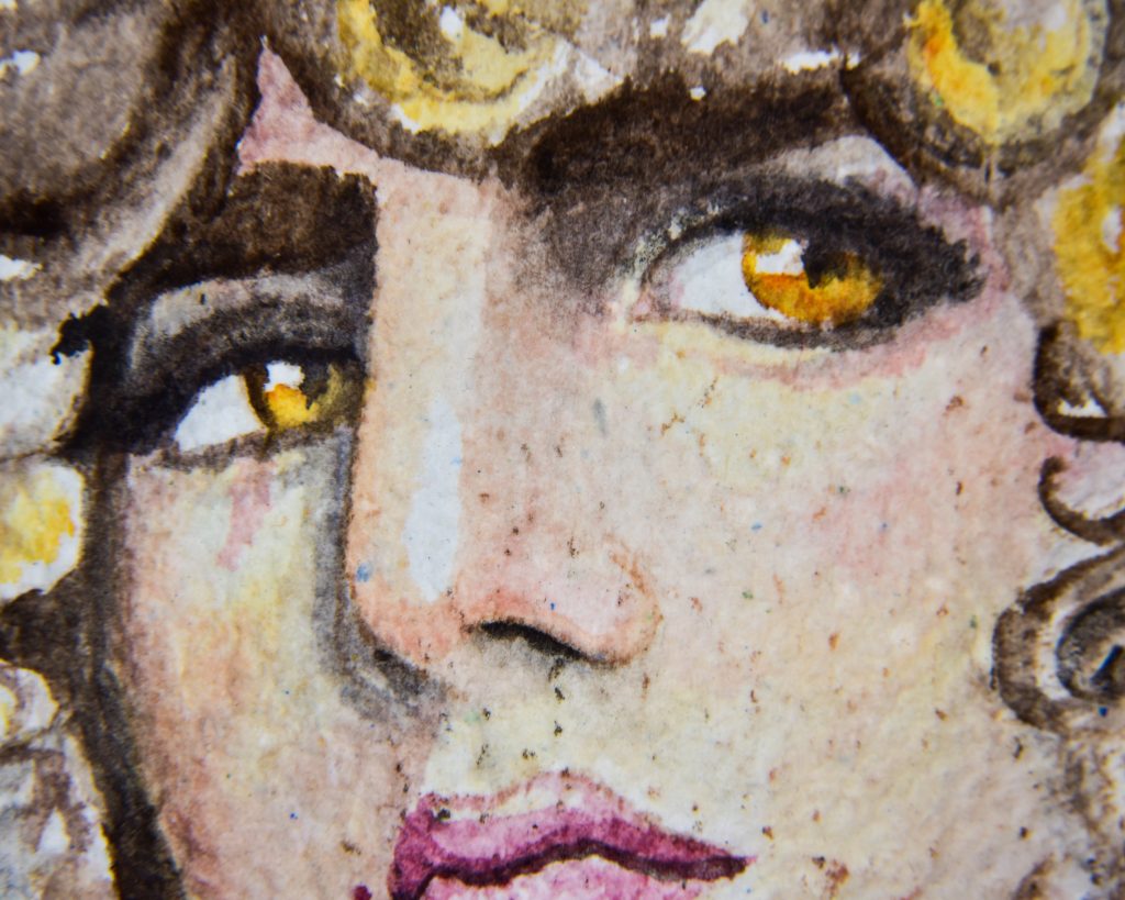
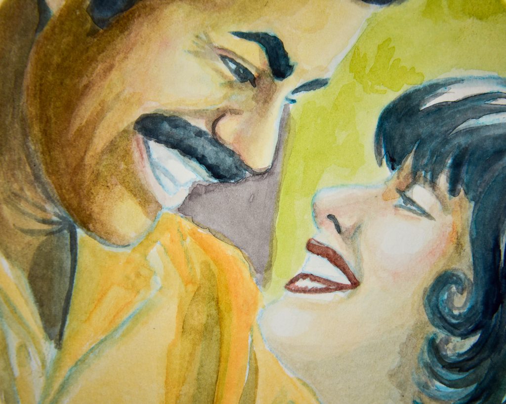

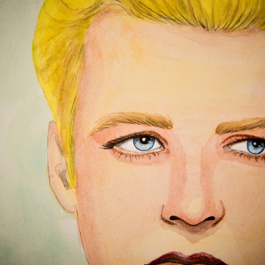
Watercolour is really quite versatile, but at beginner levels it’s very easy to hate it because it prefers the following:
-Absorbency: non-absorbent paper is a must when learning. There is an entire realm of paper dedicated specifically to watercolour and there is a very very very good reason for this: it changes everything. If you use paper that is too absorbent, you will not be able to blend, the paint will feather and bleed, and you’ll be frustrated very quickly. Watercolour paper is sized so that the moisture absorbs slowly and the pigment doesn’t sink too far into the paper. If something is called ‘watercolour paper,’ then it is non-absorbent.
-Weight: thin papers will buckle, warp, and even tear with watercolour. The more water you use, the worse it gets. Because of this, there’s an entire pain known as ‘stretching’ watercolour paper that people go through. This involves wetting the paper completely, and stretching and taping it to a surface to that it stays taught. You can avoid that by using heavier paper. I like to use 600+gsm paper for watercolour because I like to use a lot of water. It is, unfortunately, four or more times as expensive as the thinner variety, so I understand that it is not a solution for many. At least 300gsm, though, is really important.
-Texture: this is where watercolour gets really exciting, because you can use it on smooth or textured papers. There are lots of different grades of watercolour paper texture, and some brands have their own words for different textures, but in general, from smoothest to more textured, it goes like this: hotpress, coldpress, rough.
Hotpress paper allows for tiny details and renderings and easier print reproduction, but the cost is that colours tend to be a bit less saturated.
Coldpress paper is the most common sort, most people use it. You can’t get as many tiny details, and the texture will be difficult to replicate in prints, but the colours will be vibrant and the rendering softer.
Rough paper is the most expressive, because you really cannot be getting into it with a ruler and a technical pen. Not to perfection anyway. It adds a lot of moodiness to paintings, but it give you less tight control over realism. I think more people should experiment with it.
-Tone: watercolour is completely transparent. Even the most opaque pigments can be transparent if enough water is added, so using white paper is practically a must. If you’re only using watercolour, and not adding opaque white at the end, then you will need to reserve the white of the paper as your highlights.
Note: There is a fifth category of paper quality that, though it’s a factor in most types of art paper, I find is most important with watercolour paper, and that is the composition. There are lots of different things paper can be made of, and watercolour paper is perhaps the most diverse, but the main two to know about are cellulose and cotton. Here is a short overview of important distinctions:
Cellulose paper is made from tree pulp. It is the cheapest variety of specialty watercolour paper, and very readily available. The main downside to it, is that if it get too wet, it will pill and tear, so you must learn water control when using it, and you have to be patient as layers dry. Subtractive methods of painting (where you ‘scrub out’ colours that you’ve laid down, or wet them heavily to lift them off) aren’t really that much fun on cellulose paper. It is, however, the best for practice, and learning water control is an important skill in your artistic life. But, if you are constantly destroying your paper like this:
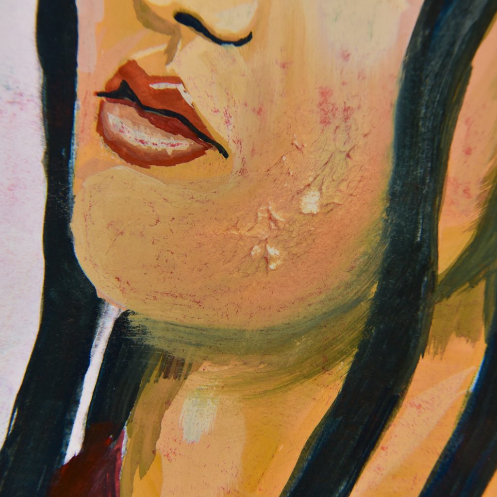
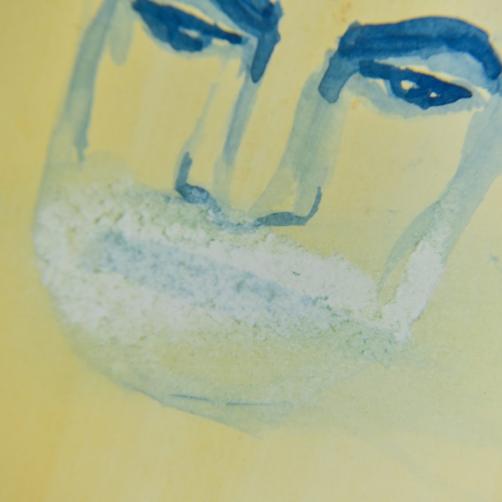
Cotton paper is more expensive than cellulose, but is greatly considered to be of a much higher quality. It isn’t immune to destruction (most tapes still tear it), but can be used wet-in-wet, and therefore it’s suitable for any technique, including lifting. It swells, though, and that’s why even cotton will warp when the paper is thin. Thicker cotton watercolour paper can be soaked and soaked and soaked some more.
Gouache
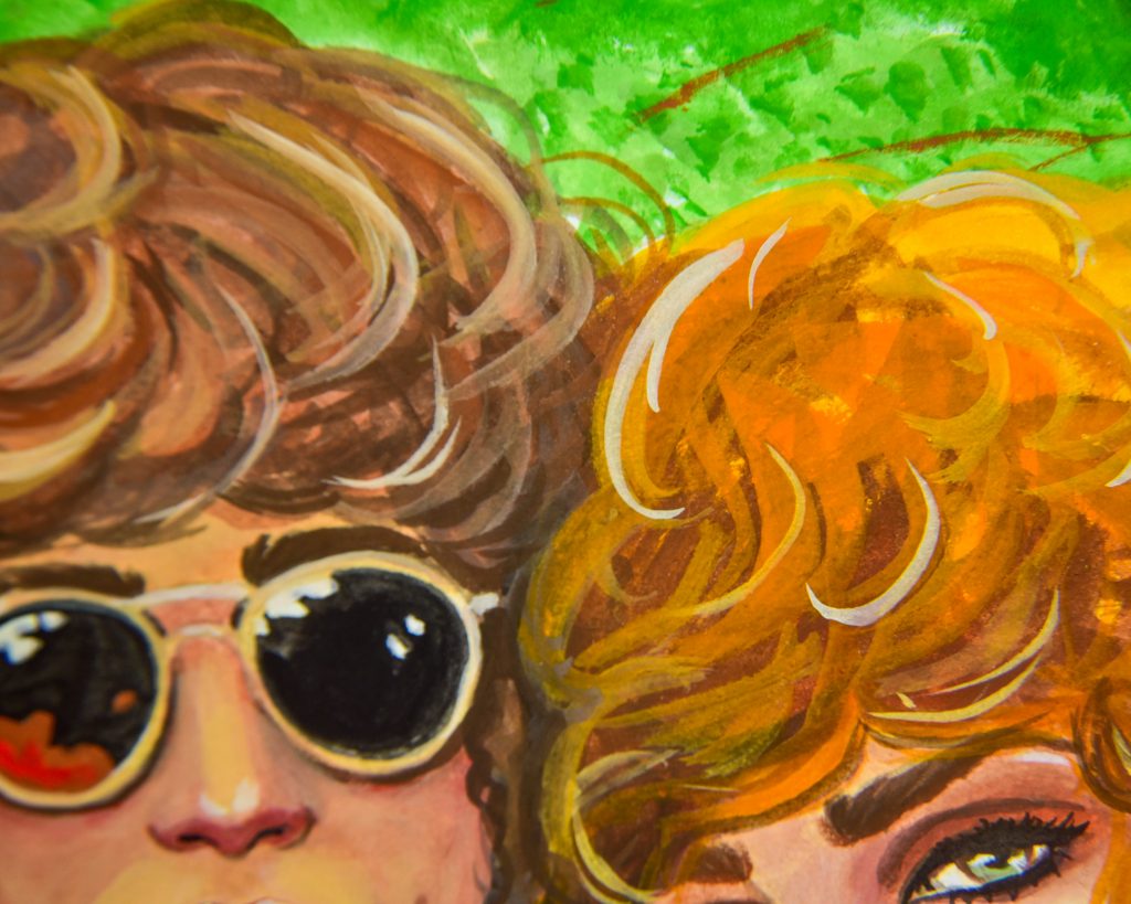
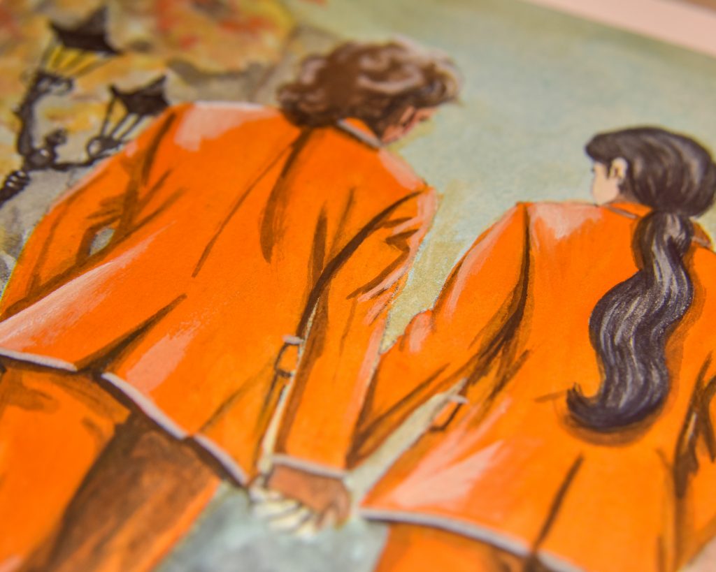

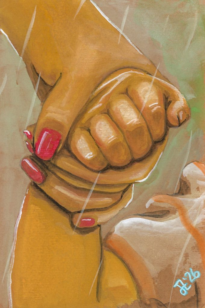
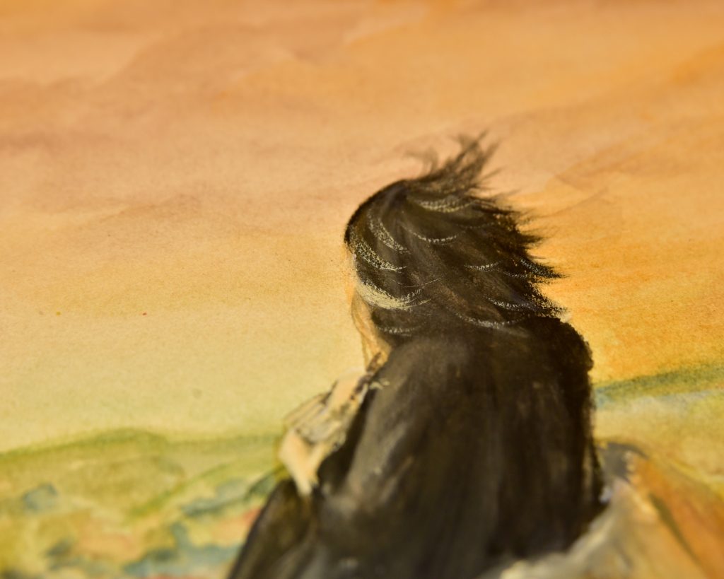
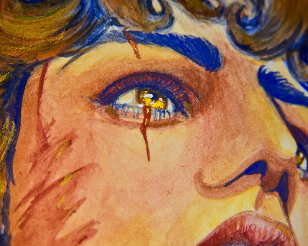

If using it thinly, gouache follows all the same preferences as watercolour, but one of the best things about gouache is that it is much more versatile if used with less water. This is why water control is a good skill to have.
-Absorbency: non-absorbent is still going to be the best.
-Weight: you can use much thinner paper with gouache than with watercolour. Most papers which are made for drawing, ink, and ‘light washes of watercolour’ will work beautifully with gouache. One of my favourite examples is Stillman & Birn Nova paper. It’s much too thin to use with a lot of water, but it is beautiful when you control the water.
-Texture: the same sort of preferences as watercolour, however, if you’re struggling with streaky gouache in thicker layers, it’s because your paper is too smooth. One of my favourite sketchbooks (Stillman & Birn Zeta) has very smooth paper, and I struggle to paint strictly with gouache on that paper. I actually fancy modifying it with transparent gesso beforehand. Gouache is lovely on textured paper, and in general, anything smoother than hotpress will take patience and practice.
-Tone: another one of the best things about gouache is its opacity. You can even use it on black paper, though rather like acrylic on dark paper, you’d need to use more white when mixing and probably do more layers than usual. That can be tricky with gouache, especially if the paper isn’t textured enough, because it reactivates with each layer. I would suggest mid-tone papers, though, and I pretty much always tone my paper before a gouache painting.
Oil Pastels and Oil Paints


Oil pastels can famously be used on nearly anything. Pablo Picasso (derogatory) was known to use them on walls, and they’ll work on anything from your t-shirt to a sheet of glass. They are an incredible medium in that way! But, that doesn’t mean that they’ll work *well* on everything. When it comes to paper, yes, they’ll work on toilet paper if you want them to, but they will leave a huge oily mess on the backside of most every sort of paper. Also, they never fully cure, but that’s another issue. Oil paints follow the same preferences, really, though they will eventually cure.
-Absorption: non-absorbent papers are a must, but even in that realm, you need specialist papers sized specifically for oil pastels or oil paintings. You can use the same canvas-textured sheets you can use for oil painting by brands like Strathmore, but my personal preference is for the oil-friendly papers that feel like paper rather than canvas. Sennelier makes some thick card and Arches and Stonehenge make some lovely cotton paper.
-Weight: thin papers honestly just aren’t fun with these things. Like any pastel, oil pastels need layers in order to reach their full potential, and the less layers your paper can hold, the less opportunities you have for blending. Oil paint, since it dries, can be layered pretty much indefinitely, but it’s heavy, so thicker substrates are better.
-Texture: as with the other pastels and pencils, it’s the texture that really lets you blend and build. The same Pastelmat that is used for dry pastels will work very nicely with oil pastel, and hold lots of layers. But, the slightly smoother cotton specialist papers layer nicely as well. This is a big difference between oil pastel and oil paint, because oil paint will work nicely on smooth surfaces, but it must be worked in stages if used on something smooth. You’ll get wispy blends, but it’ll be an exercise in glazing not really best for alla prima. Pastels will reach their limit immediately on a smooth surface, and you will not be able to layer. That’s a style too, though.
-Tone: oil media can range from transparent to opaque, and works lovely with toned surfaces or bright white!
Fountain Pen Ink
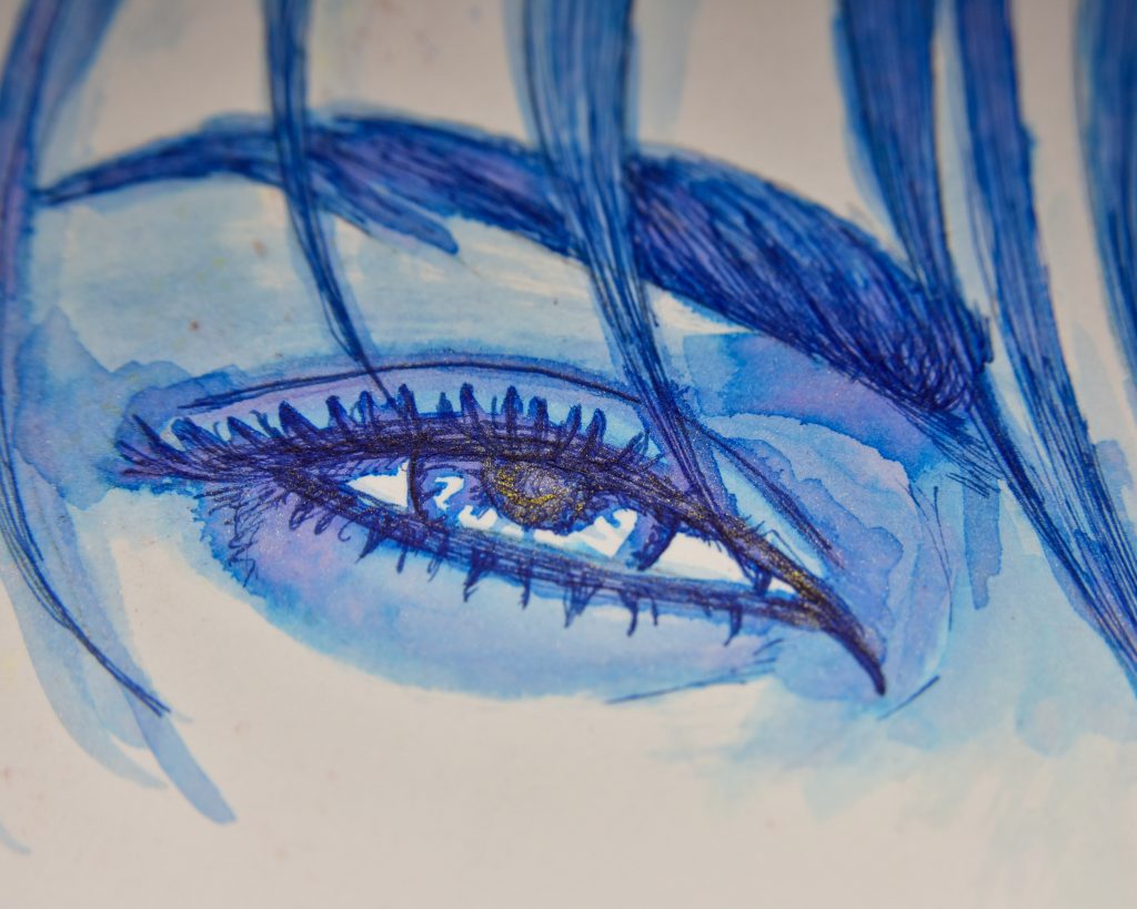
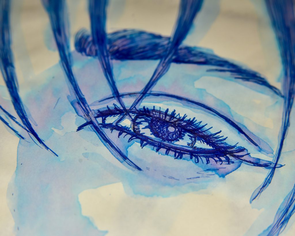


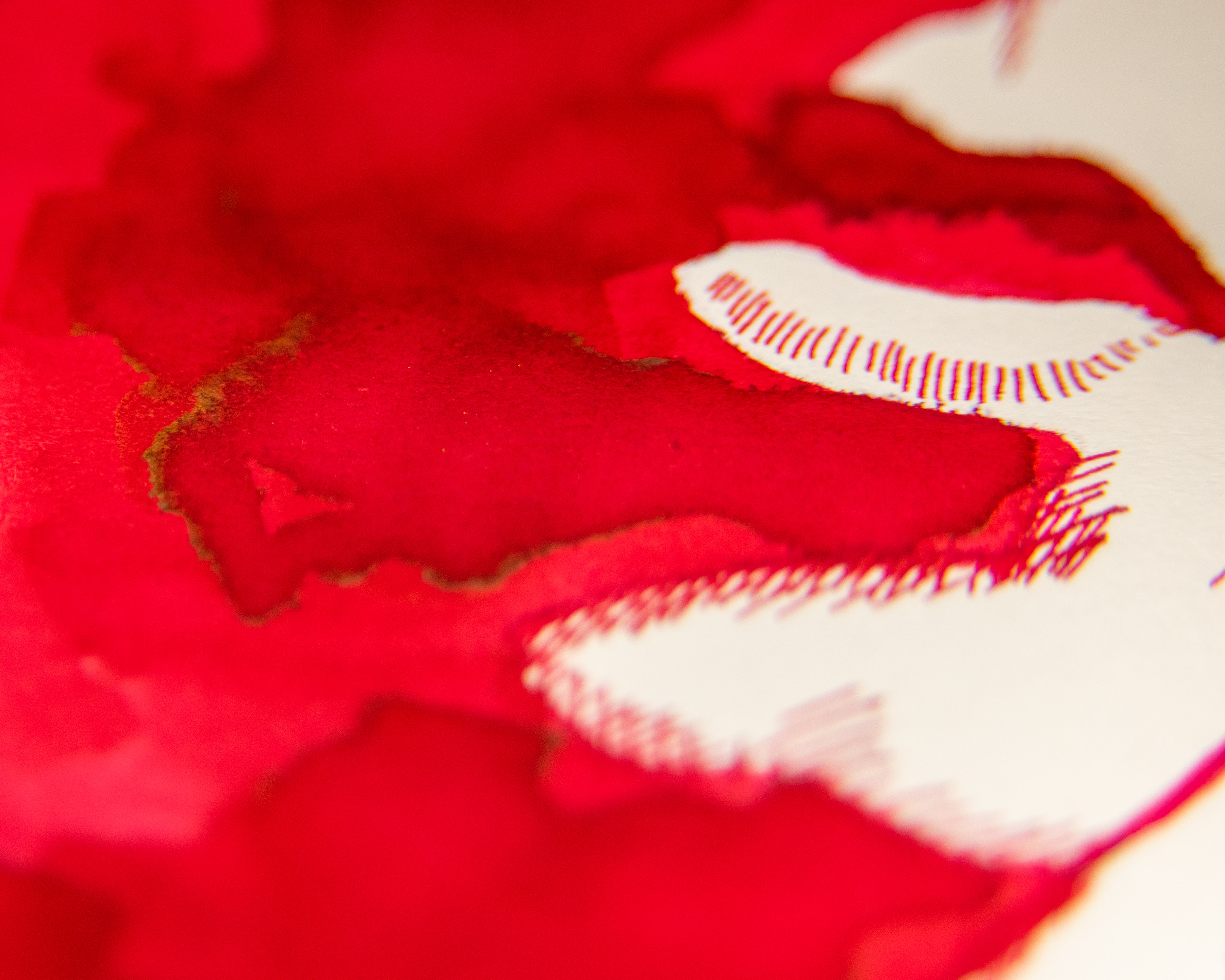
I could do an entirely separate post just about these sorts of paper, because it’s when I really started to understand the differences, but I’ll keep it short and just assure you that if you’re having trouble with fountain pens, it’s definitely the paper’s fault.
-Absorbency: you want coated paper in the same way you want it for alcohol ink. You can paint with fountain pen inks on watercolour paper or bristol or even have an interesting experience on unsized paper, but in general, to get the ink to look the way it does on the box which first attracted you to purchase it, you need fountain-pen friendly coated paper. Otherwise, it will feather, and it will bleed. And, no, alcohol ink and fountain pen ink do not share preferences here. You can use fountain pen ink on coated marker paper if you want, but alcohol ink with bleed terribly on many fountain pen papers.
-Weight: most of the highest quality and most favoured fountain pen papers are incredibly thin. One of my favourites (and the favourite of many), Tomoe River paper, is just 52gsm! There is ghosting, because the paper is thin, but no bleed or feathering. It’s all about the coating when it comes to fountain pen inks. Thick papers exist too, for a softer writing experience, but there’s a little bit of historical joy to the art of shaving off excess weight when writing letters so that you pay less postage.
-Texture: if you’re using a brush, the world is your oyster here, but if you’re using a pen, you want smooth paper. Metal pen nibs don’t take kindly to texture, and over time the tipping will wear down and the pen might start skipping, making you push harder, leading to spit tines, and a pen that doesn’t work any longer. Personally, I like a little bit of texture, I think it make things flow easier and gives a better tactical experience (I slide around on onion skin and hate it), but still within the realm of papers made for fountain pens.
-Tone: this is another transparent media that won’t show up on dark papers very readily, so light tones are needed.
Encaustic Wax
Really, encaustic isn’t meant to be used with paper. The reason isn’t to do with any of the four properties I’ve been going though, but with the flexibility. Paper bends easily, and that will crack wax right off. Thick board is better, but wooden panels are best. I, however, practice on watercolour paper sometimes. It will adhere, it will allow you to experiment lightly without the panel investment, but in general, paper isn’t recommended, and if you’ve only been using it on paper, this is probably why you haven’t been having a good time.
If you’re using water-soluble wax, though, like Ceracolors, that works lovely on paper, with the same preferences as acrylic.
Urethane
The same is true for Urethane, unless it is specifically meant for flexible surfaces. If it’s the sort that flexes, it follows the same preferences as acrylic.
Hybrid Media
Watersoluble Pastels and Pencils
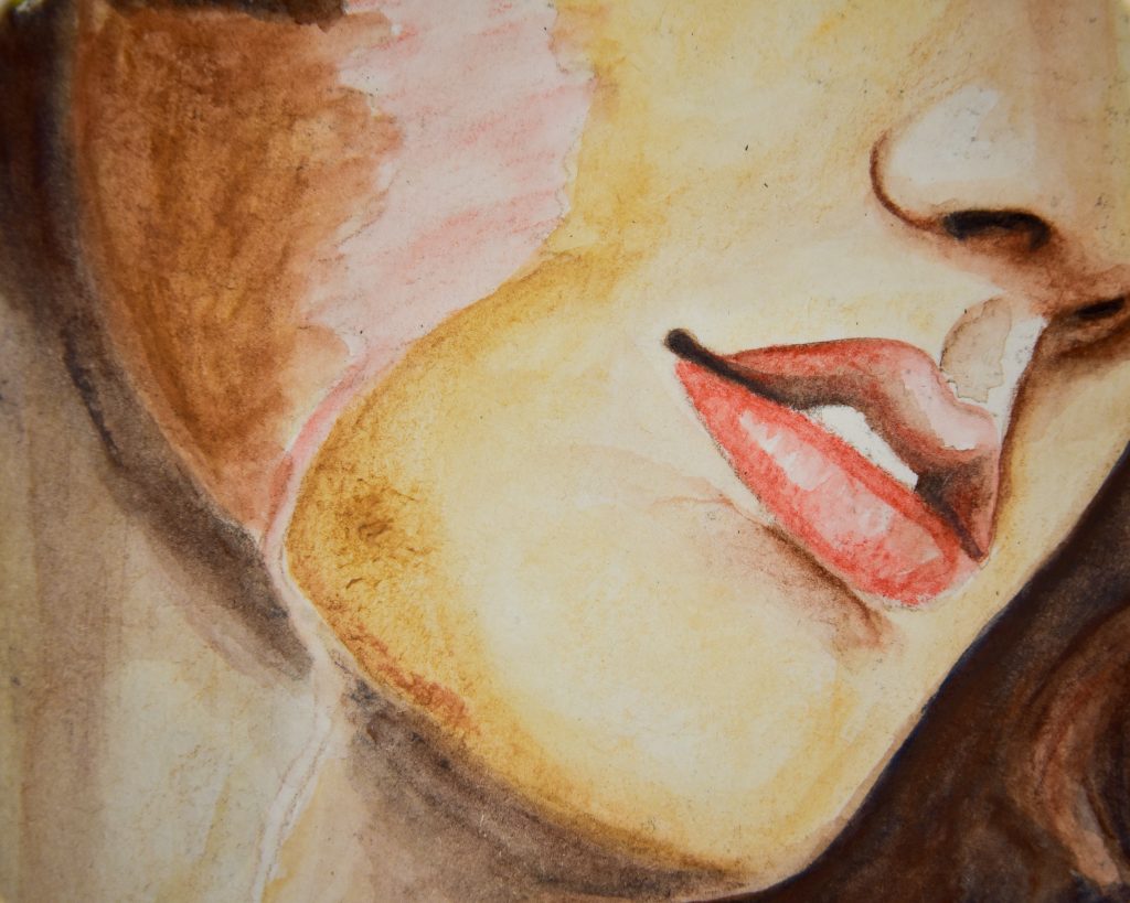
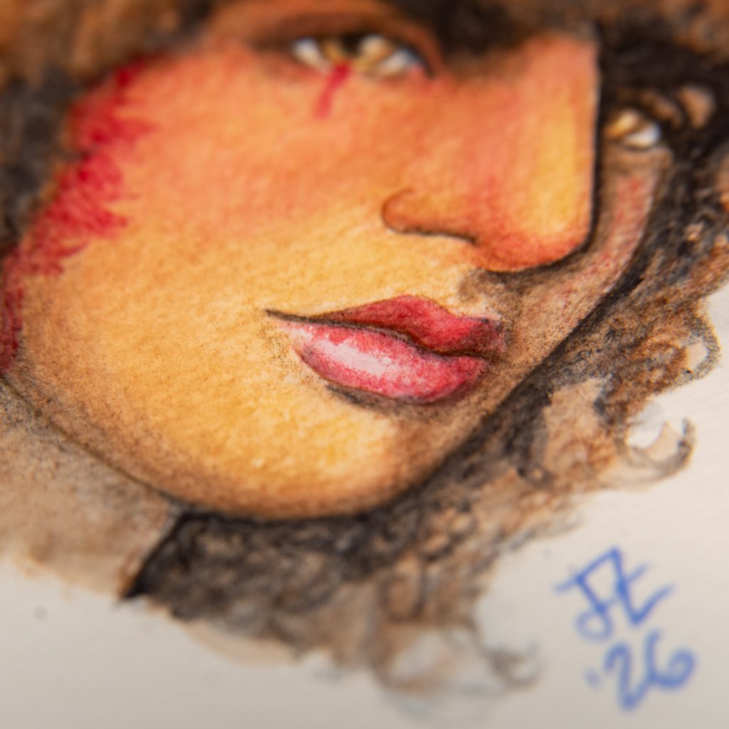
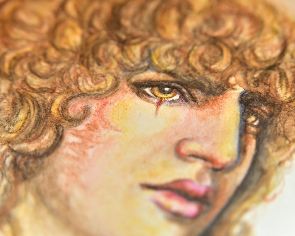
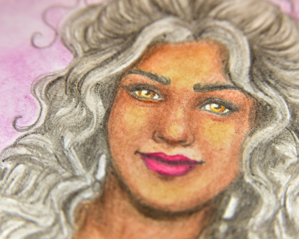
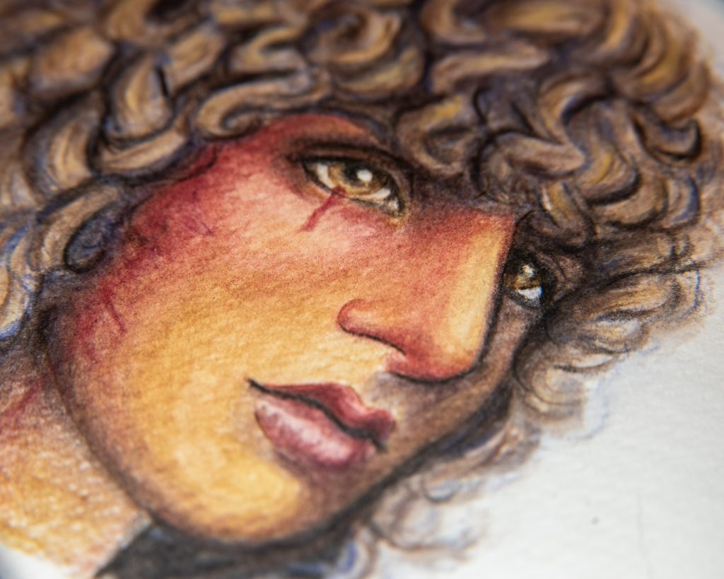
-Absorbency: technically, if you don’t activate these with water, they are a dry media and follow the same preferences as coloured pencils and wax pastels. If they are activated with water, they adhere more closely to watercolour preferences, with the caveat that, since you’re using much less water, you don’t have to be as strict. These generally fall into the ‘light wash’ category that sketchbooks are touting they can handle.
-Weight: same as coloured pencils, thicker will be softer and give a nicer colour payoff. But, because less water is generally used, you are less likely to buckle and warp thinner papers, so there is more freedom there. Once again, great in sketchbooks.
-Texture: this one is interesting, because too smooth of a paper will just not work with them, they do need to be ground down as any pencil does, but too much texture can make it difficult to get details and give uneven distribution of pigment, where the high spots will become patchy. Even coldpress paper can be a pain when working with watersoluble pencils and pastels, and I suggest hotpress watercolour paper.
-Tone: when used dry, they can build up some opacity, and thicker applications of something like Neocolor II can work well on toned papers, but, in general, they are to be considered transparent when used with water, so stick to lighter tones.
Modifying Existing Paper


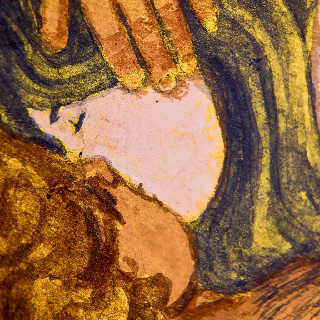
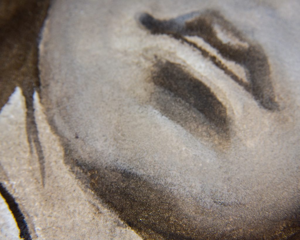
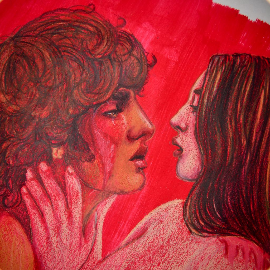
One last important note is that there are all sorts of amazing things you can do to an unsuitable substrate in order to make it usable for whatever you fancy. Most of my sketchbooks are used in this way.
-Sizing: there are glum/alum sizings, plum sap sizings, gelatin sizings, and acrylic sizings (and probably even more sorts I’m forgetting). You can brush them onto absorbent paper and that renders it less absorbent. The more you use, the less absorbent the paper will be. That’s one way I use my homemade papers for painting. It also helps transform raw paper into paper suitable for detail work.
-Grounds: watercolour grounds add a textured and semi-absorbent surface to whatever you paint them on. They’re acrylic-based, so they can be painted onto pretty much anything. Wood boards, canvas (though that’s not always very successful due to flexiblity), glass, and paper that just isn’t cutting it. Important to note, though, is that these grounds are more absobent than watercolour paper. They work differently! They also add lots of texture.
Pastel ground and pumice pastes add a sandpaper-like texture to a surface, which allows you to add more layers of pastel or pencil. The spray varieties of texture, like fixitif, can be added on top of your work when you want to add more layers after already working on something.
Oil ground does its work to remove absorbency and seal an area for oil (thought sealing with acrylic like GAC100 beforehand isn’t a bad idea)
-Gessoes: these add texture and change absorbency. If a surface is too smooth, adding gesso will give it grip and tooth. It will also increse absorbency in many cases (though not all gessoes are the same, you must read up on the bottle what sort it is).
-Matte paints: this one is one of my favourites. Vinyl paints and some matte acrylics have beautiful texture on them and can be drawn over with dry media like pencils or pastels to beauitful results! You can also use Micaceous Iron Oxide in acrylic to create a ground.