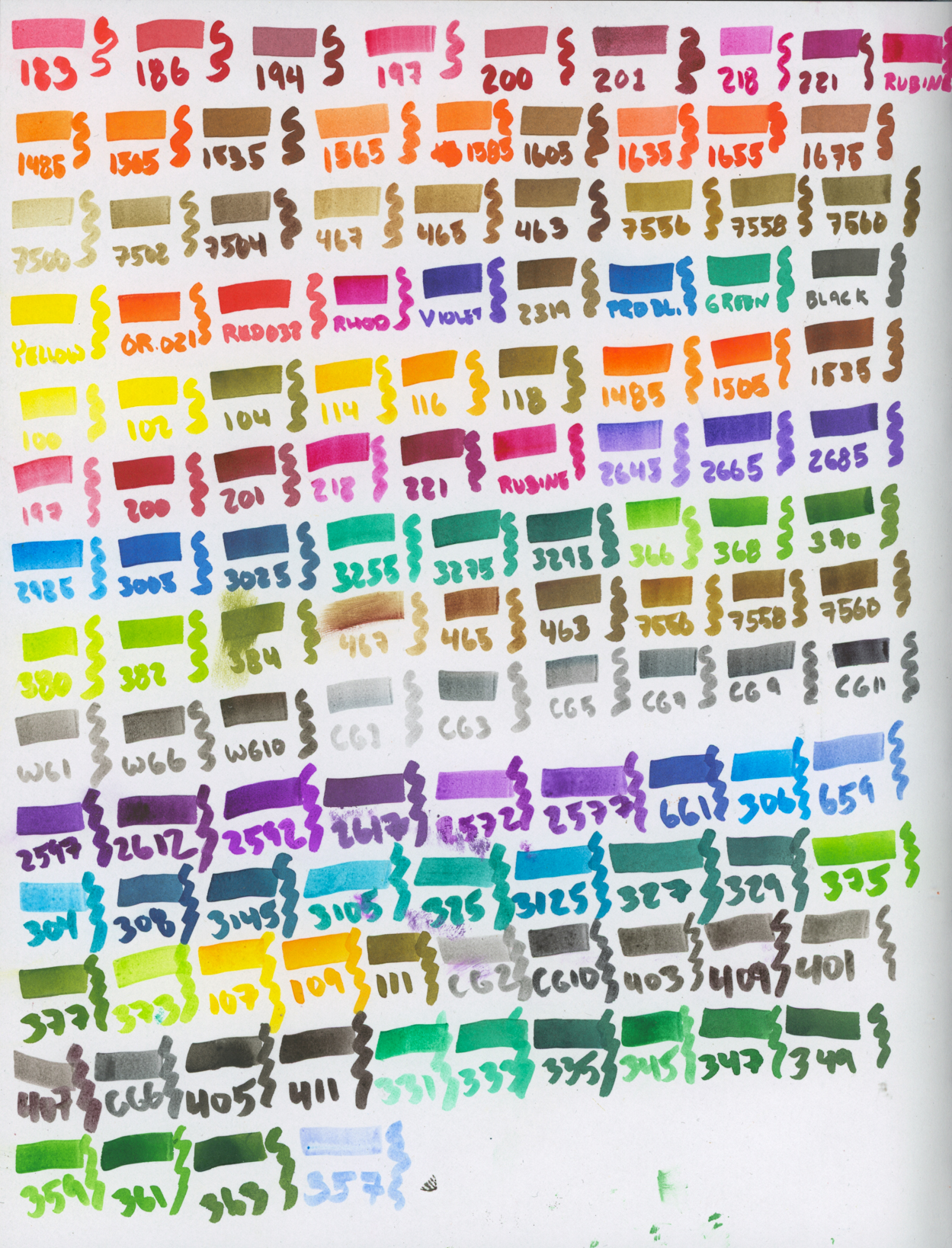
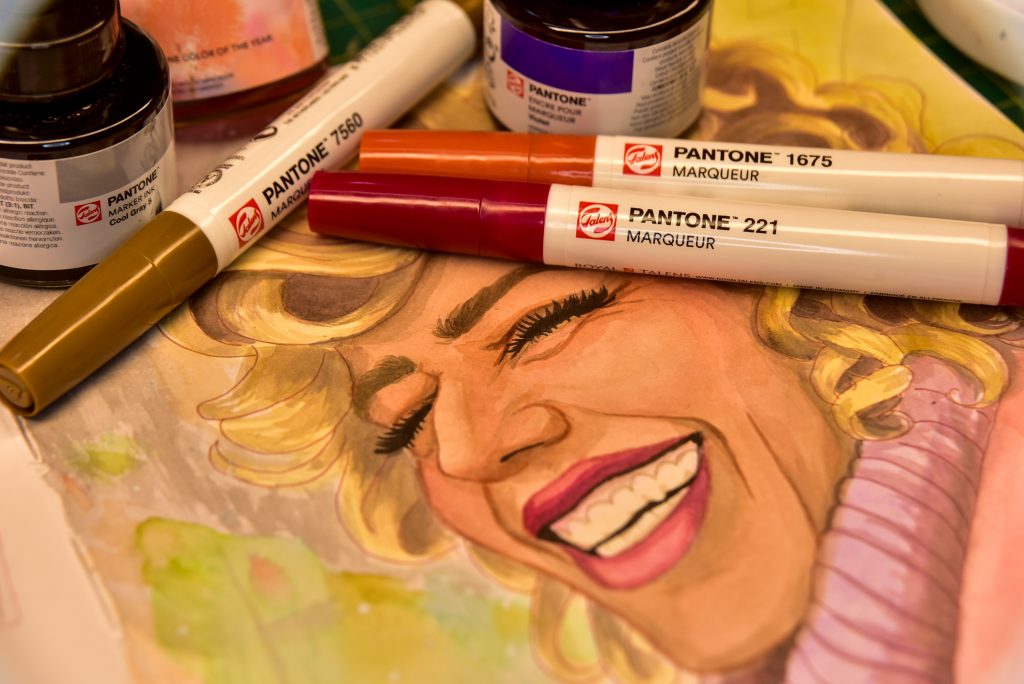
Talens Pantone Markers and Ink
Inks are one of my favourite mediums of all time. Ink from fountain pens, technical pens, and markers are wonderful, but my ultimate favourite is to use inks with a paintbrush. I love these for that.
Pigments vs Dyes and Alcohol vs Water
Inks come in quite a few varieties, from the stuff in bottles to the stuff in markers and pens. Indian ink is the first ink I got familiar with in school, and alcohol ink is what I fell in love with as a teenager.
Most things called “ink” are dye-based. That means that they’re made with organic materials that are not lightfast, but can be brilliant and vibrant while they last. They can be water-based or alcohol-based. Most art markers are alcohol-based, like Copics, Ohuhu, and Letraset (now Winsor & Newton Promarker). Chartpak makes alcohol-based markers as well (but I quite like their xylene-based ones, the only xylene markers I know of.) Water-based dye inks include Kuretake markers (such as Real Brush), Tombow markers, and the vast-vast-vast majority of fountain pen inks. Also, there are some dye-based ‘liquid watercolours’ out there that behave similarly to ink, such as Dr Ph Martin’s Radiant Concentrated and Synchromatic, as well as Talens Ecoline.
Water-based inks are wonderful to use with a brush. Even if not in bottle form, but in marker/pen form, they can be drawn on the paper directly from the instrument and then softened with a wet brush, or drawn onto a porcelain palette and used like paint. Most water-based inks I know of are resoluble like watercolour to some extent, and therefore simple to blend.
Pigment-based inks are something I’ve only ever seen in water-based varieties (though I’m going to do some experimenting someday with pure pigments and alcohol). The first ink I ever knew was Indian Ink, which is pigment-based, and Faber-Castell Pitt Artist Markers are filled with that very stuff and are incredible. There are also acrylic inks, and pigment-based liquid watercolours (by brands like Schmincke and Dr Ph Martin). Pigments are inorganic materials, and have much better lightfastness than dyes for the most part.
So, where do Talens Pantone Markers and Inks fit into this wild smattering of categories? They are water-based and pigment-based, like Indian Ink, but they have something very different about them.
Uniqueness
These inks have two qualities that I adore and have found in no other pigment-and-water-based ink: they’re matte, and they’re permanent.
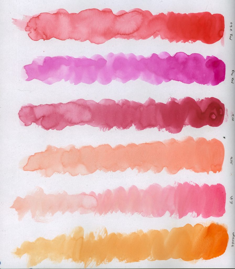
Dye-and-water-based inks can be matte, but are generally resoluble. Indian inks and acrylic inks are also waterproof when dry, but they are both very glossy (except for some specialised black inks). But these come in 108 colours aside from black and dry into amazing matte transparent layers.
They’re discontinuing these markers and inks, I think perhaps because they were advertised to the wrong crowd and have a high price tag outside of Europe. These are *not* like alcohol markers at all.
What They’re Not For
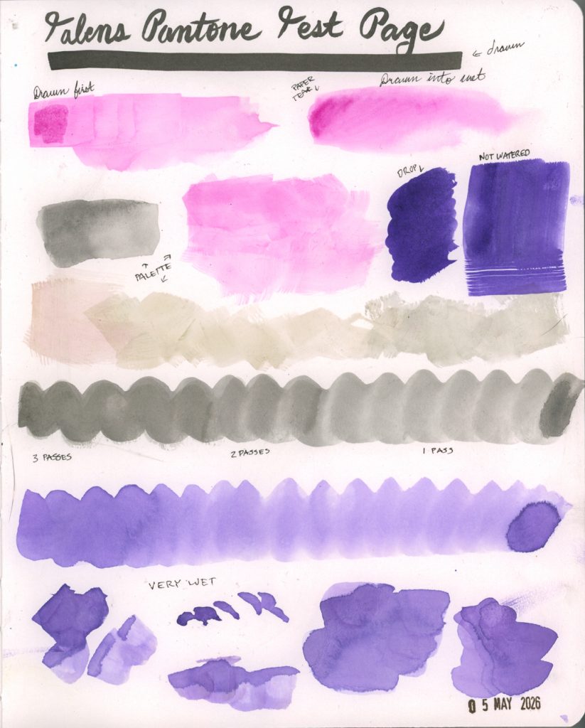
You won’t get blends with these easily while using them as markers. They’re nothing like blending a Copic or a Kuretake. They dry incredibly fast, sometimes more quickly than you can get yourself the next marker open that you want to blend. There are ways to help this, such as using them on wet paper, but that’s another issue because they are finnicky with the paper they’ll work on, I’ve learnt. They tear lightweight wet papers quite easily.
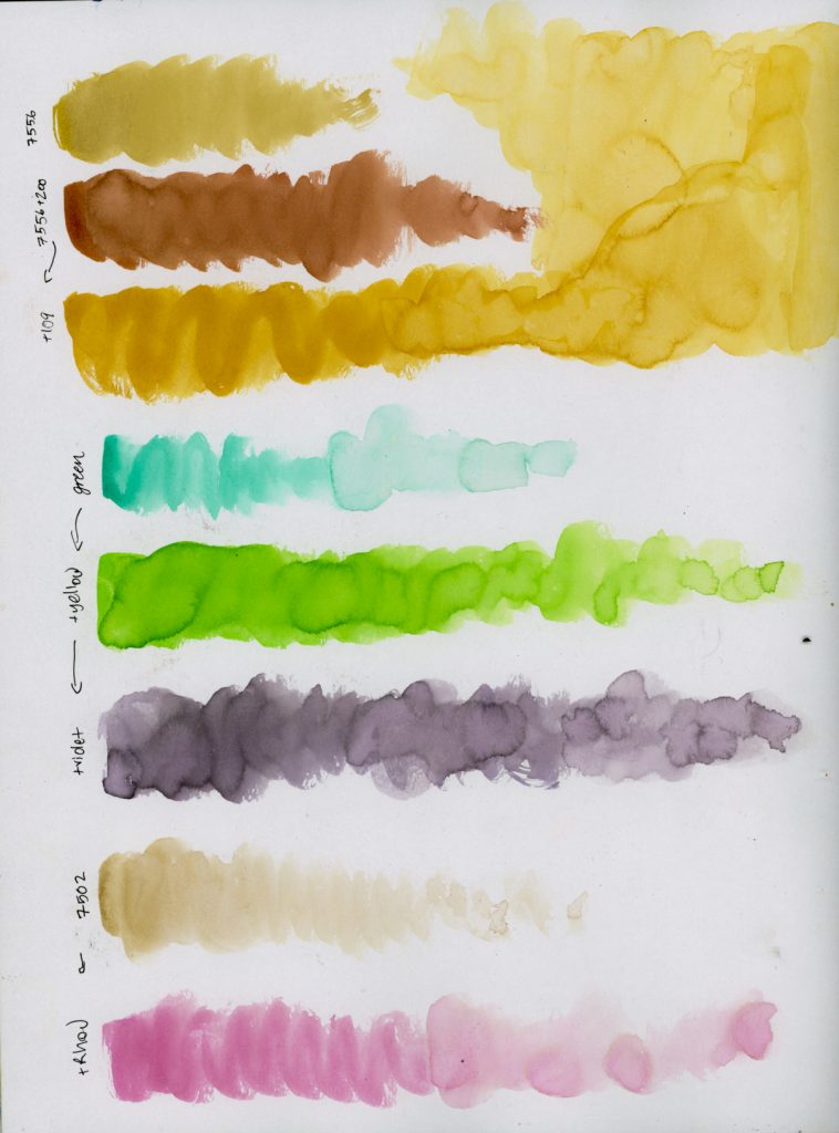
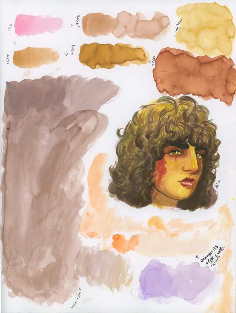
The first paper I tried these inks on was inside my Rendr sketchbook. I only had the bottled inks at this point. I’d purchased the ‘basic’ colours (same 9 available in the ‘primary’ marker set) and a couple extra reds. I assumed they were going to bleed and feather, so I went with what I use for markers. They look fabulous on this paper, I think, and adding water to them from this stage looks incredible. Painting them from a palette is great, and mixing can absolve a need for having all the colours.
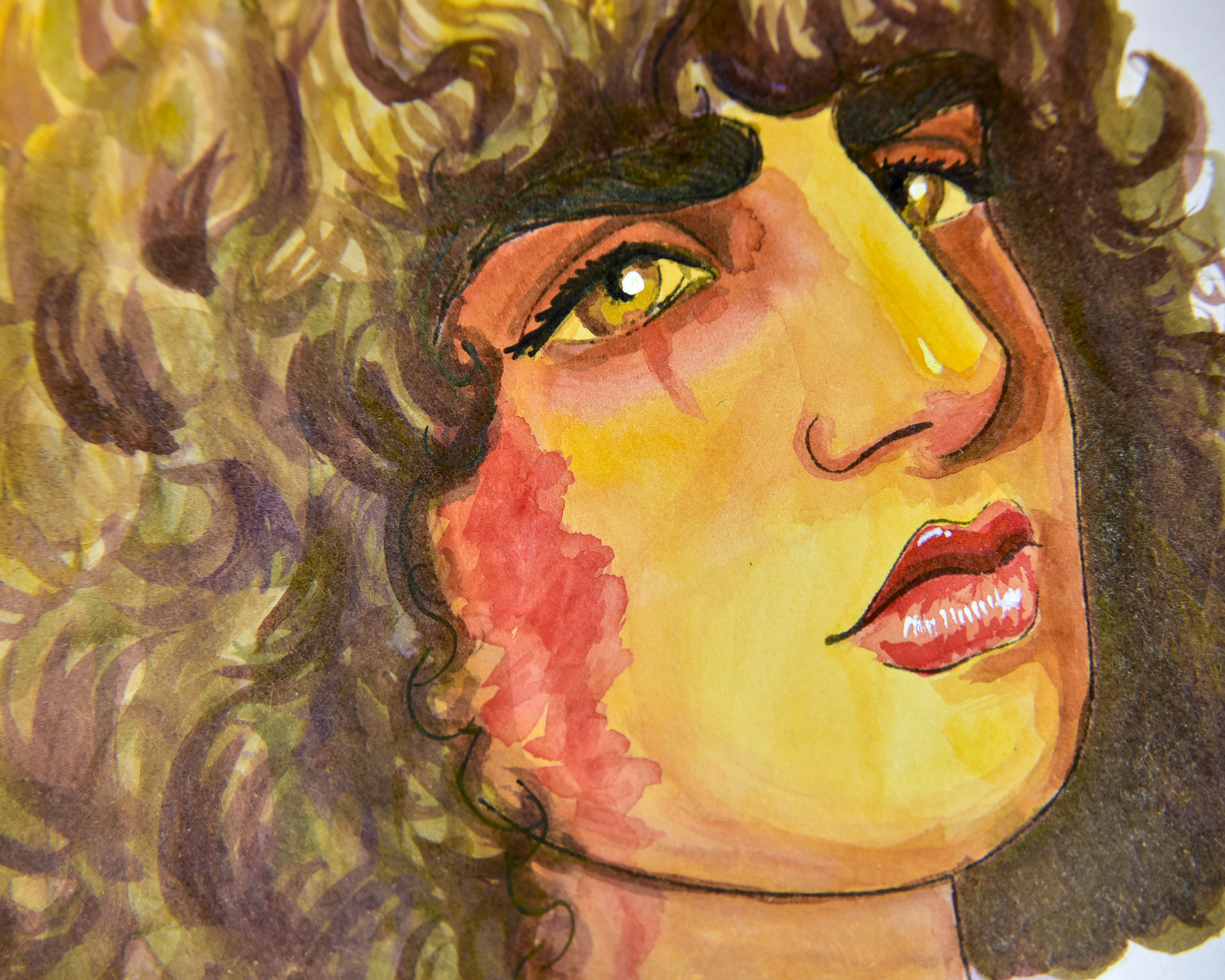
The only downside was “oh wow this paper warps terribly when wet!” I did four paintings with them in this book before I decided to try something else. Starting with my default sketch below, which made me completely fall in love.
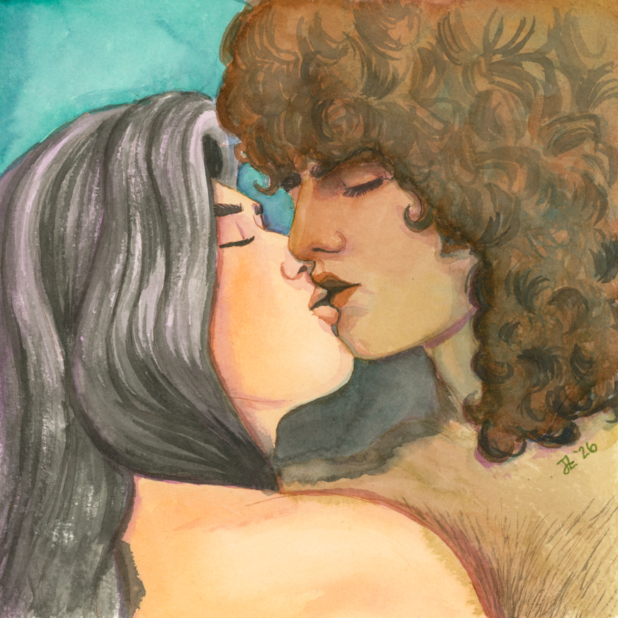
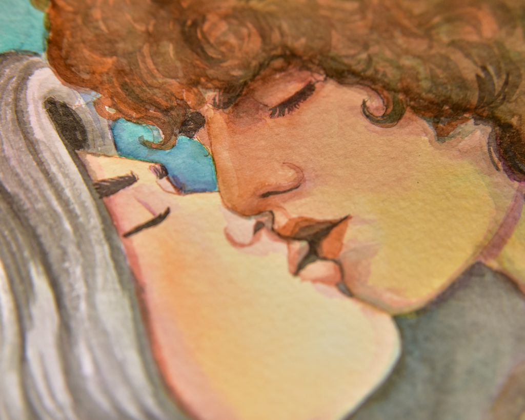
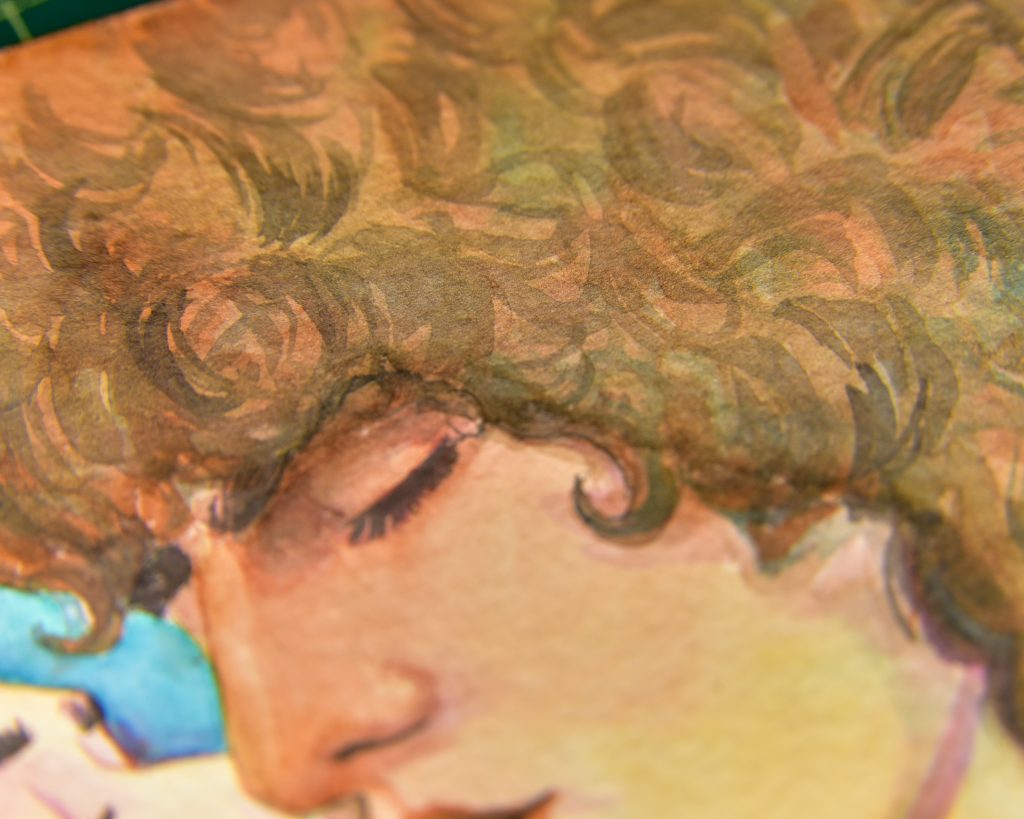
Forest Kiss
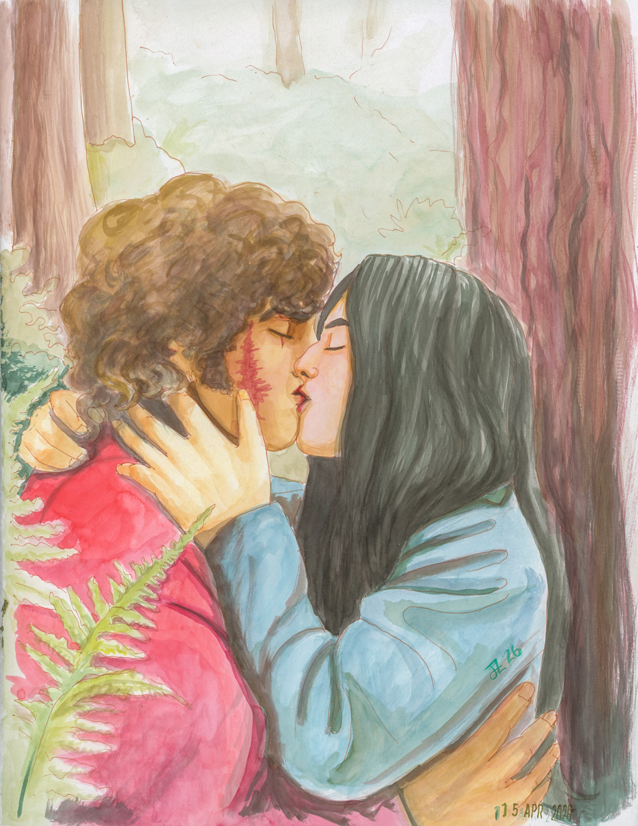
I did this painting in my Rendr sketchbook entirely from a porcelain palette. I used the bottled Talens ink exclusively, no markers.
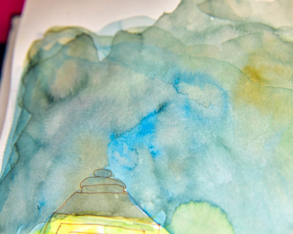
In general, I was just as in love with the process during this painting as with the first experiments, but things weren’t getting deep enough for me, everything seemed much too light and highkey. My first thought was maybe I should get a couple of the markers in dark colours to really accent things, and build contrast. I still haven’t gone over this with markers, because I think the real issue was the paper and my scant use of the ink. I could have used it less diluted and with a firmer brush. But, best save that for better paper.


Mort at Rhys’ Wedding
This was also done in the Rendr, and I hardly like anything about it. For one thing, to deepen the blacks, I tried using a Pentel Indian Ink pen as well as some fine liners, but the gloss is so different and the blendability is non-existent and it was a terrible idea all around. All I like about this one is the effect around the smoke in the sky. Also the skintone is decent, and the backlighting is alright. But this ain’t it.
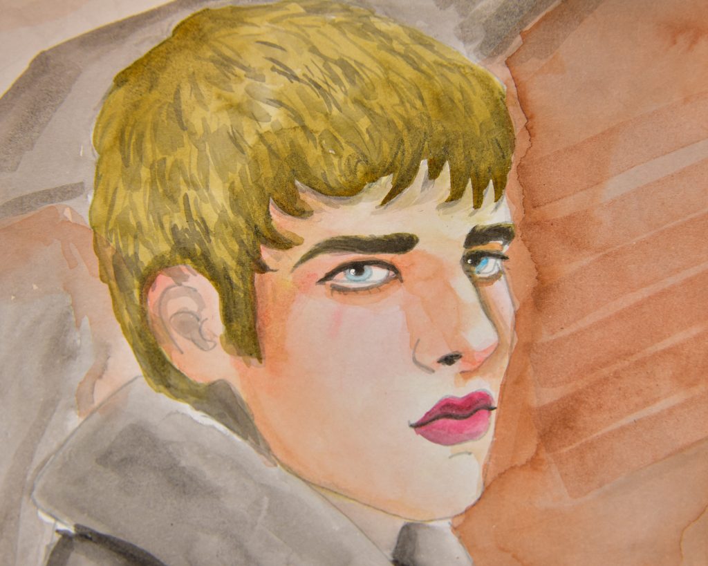
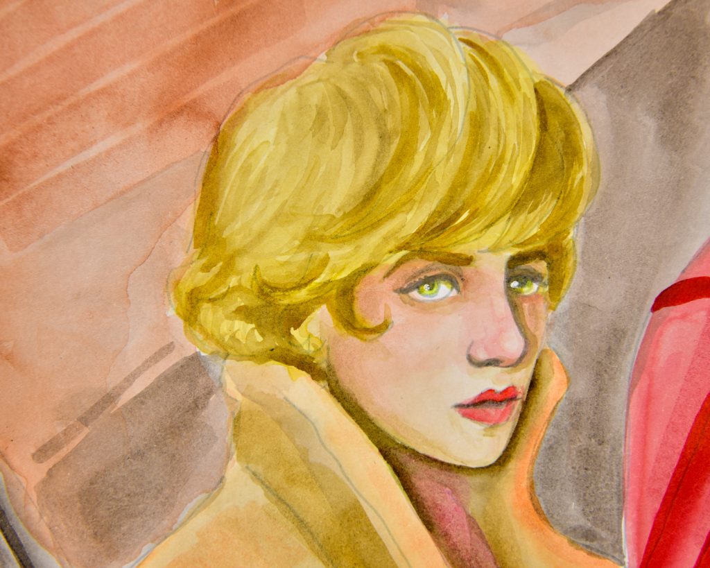
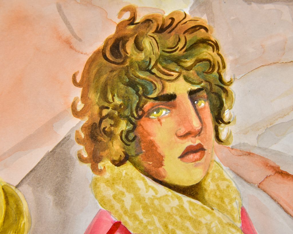
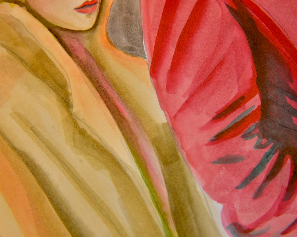
Shorn
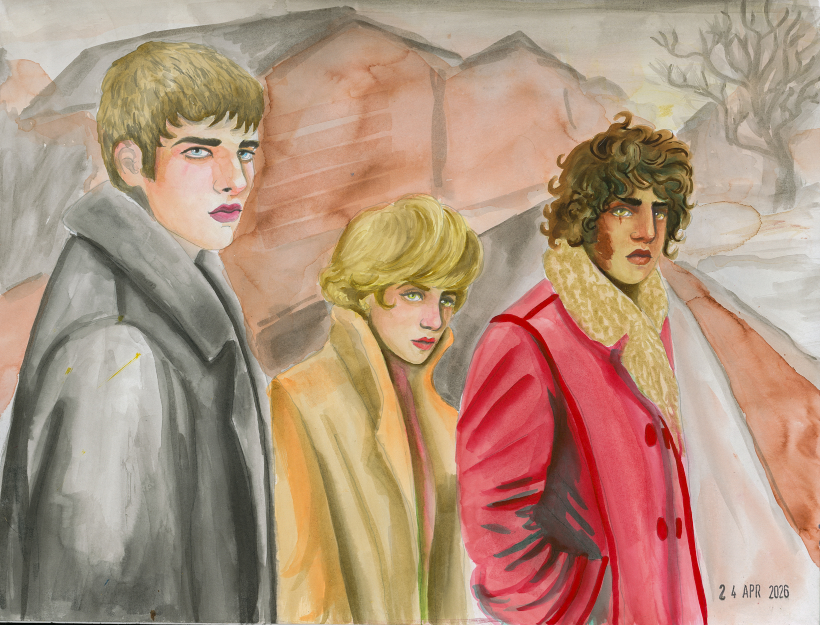
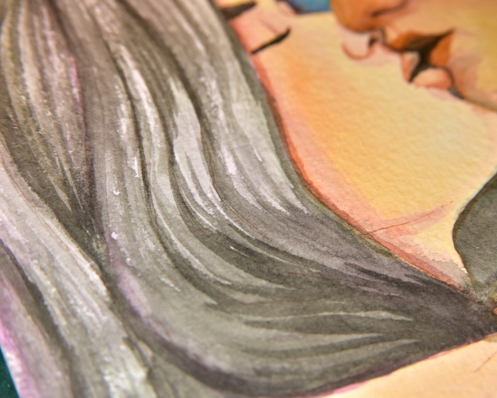
This is when I got some of the markers. There was a great sale on them, they were like 3 dollars each, so I jumped on the opportunity and used some markers along with the bottled inks. Mort (in the red coat) looks fabulous in this, I count that as a total success. This is where I learnt that the markers dry *fast* and that’s why I gave up on the background for the most part. But, if you draw them into something that’s already a bit damp, they make great transitions. Rhys’ (black coat) hair is a great example of this, I love that look.
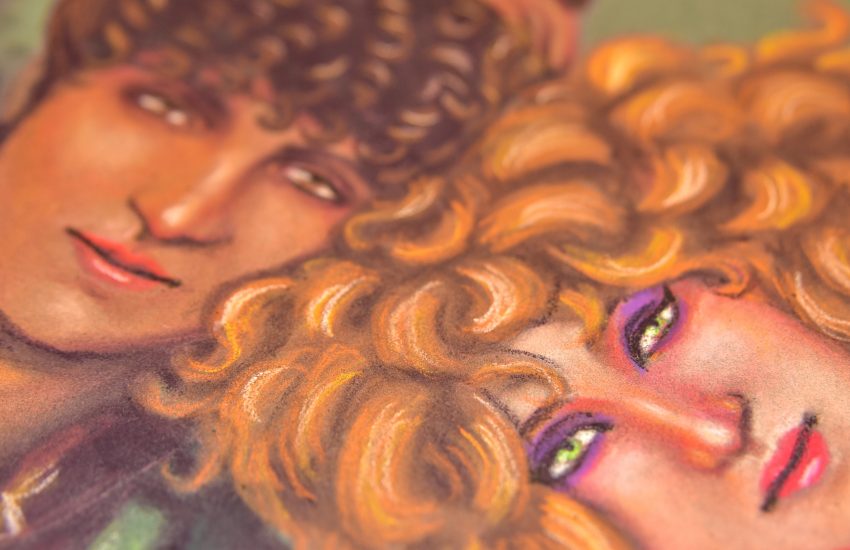
A Snog on Watercolour Paper
This is where things really started to get exciting and wonderful. I thought, since I’m using these like paints, let’s use them on cotton paper. This is a small square sheet of Magnani Italia paper. I used mostly a palette for this, but also drew into the wet paper, especially the hair. I absolutely loved this (it’s a version of a huge panel painting I’ve been working on for a while in oil). The only downside I found was that there aren’t as many tide lines and hard edges. Obviously the cold-pressed nature has a lot to do with that. Also, I think Mort’s skintone is a bit too green in parts.
Zeta Sketchbook
I think my favourite sketchbook of all time is the Stillman and Birn Zeta. Sometimes I prefer textured cotton paper, but in this sketchbook I can try pretty much anything and get a great feel for it. Since I use it as my main experiment book, I thought I should try the markers and inks out in there. By this point, my birthday had passed and I’d collected every single colour in marker form and a few more ink refills, so I was ready to use these in all the things. I was shocked by how fabulous it looked in this sketchbook. No bleedthrough, either.
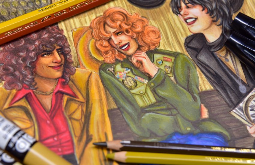
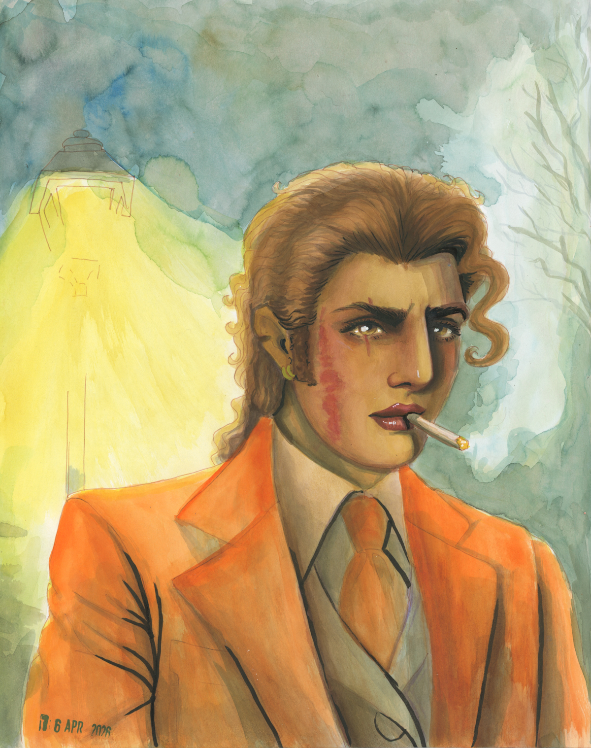
Aminah
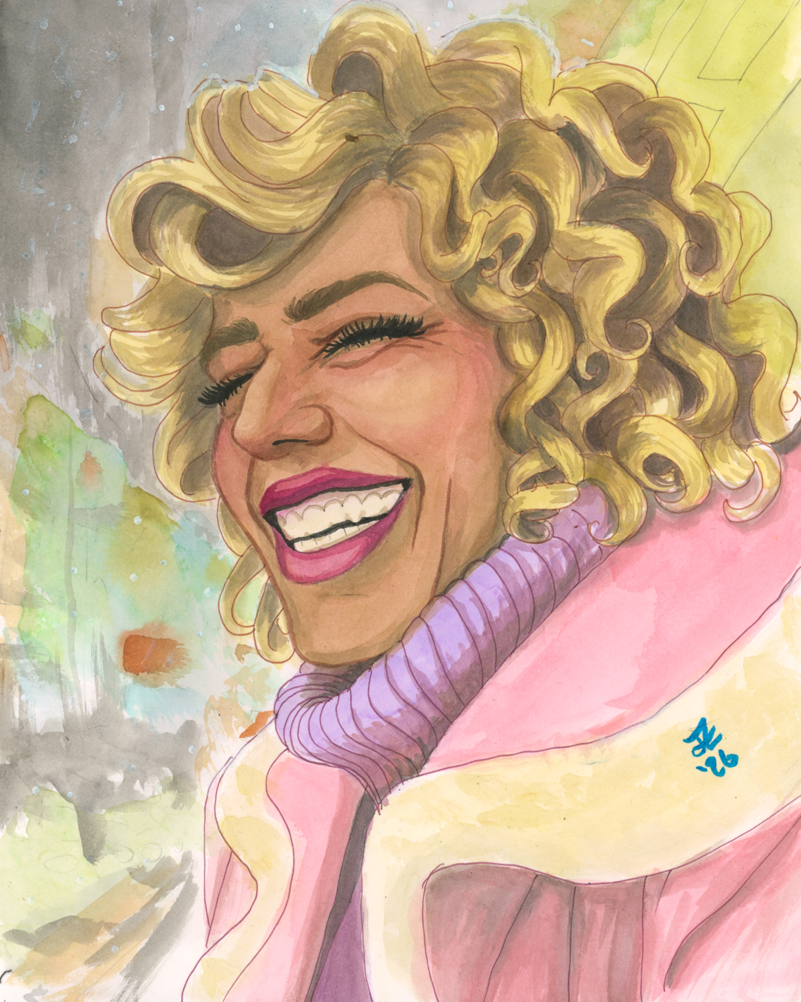
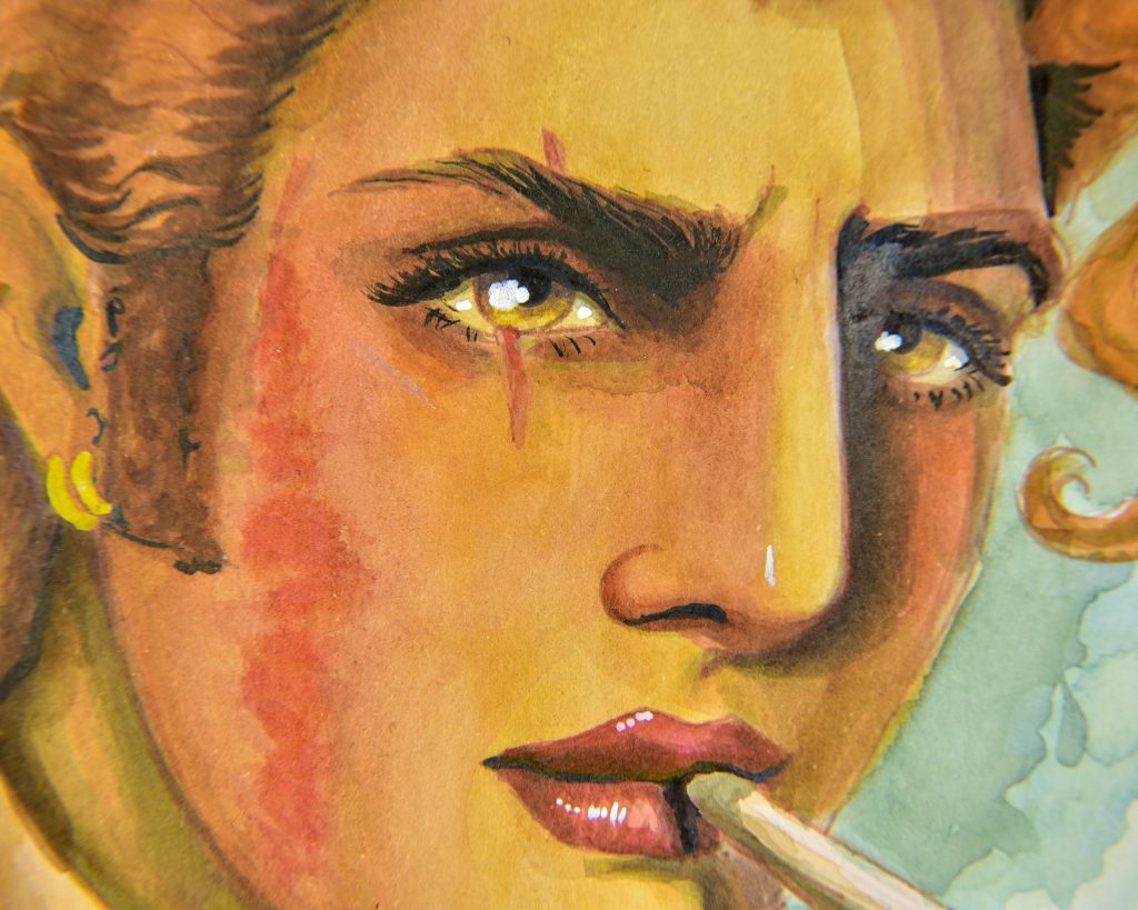
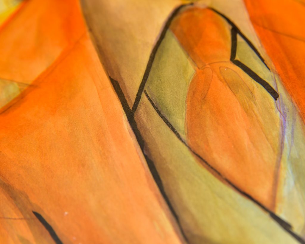
This is the painting I’m so far most satisfied with out of all of my first attempts. The biggest thing is that I find the paper pretty perfect, but my technique is improving. One thing I’ve learnt is to layer even more heavily, as in get five layers just of a midtone to pump up the saturation. Another important thing (something I need to remember with all my water-based painting) is to let it dry in between stages.
If worked too heavily, this paper will tear. If drawn into while wet, it can pill a bit. But for painting off of a palette it’s a dream. The lines are so crisp (just look at the shading around the left eye, I love it! And on the lapel of the coat!)
I still need to work on my backgrounds, but this is a skill issue not a tool issue.


Do I Adore Them Still?
Yes! Even more than before. But for this sort of painting usage only. I don’t like using them as markers very much (yet), but painting with them is phenomenal. I also have a small pad of the paper which Royal Talens made for these inks, so I will see how it faires in comparison.
It’s a shame that they’re not making them anymore, because there is nothing else I have ever found that’s quite like this. I was thinking of perhaps adding aquafix to watercolour to get a similar effect, or maybe adding airbrush medium to acrylic gouache? But that will increase gloss. Either way, I’ll enjoy these while I have them and when they’re gone, I’ll remember them fondly.