Holbein Irodori Gouache: A Complete Year

I saw the sets of Holbein Irodori gouache when I was first starting to learn how to paint with gouache, but the price and the choice paralysis got me on it and I didn’t do a thing about it for quite some time. After a lifetime of using graphite, charcoal, coloured pencils, and alcohol markers as my main art supplies, I wasn’t sure if I would ever get the hang of the pigment thing, but I’ve been determined to figure it out!
The first thing I learnt, as I think many do, is that most colours can be made from very few pigments. Some people go the PR122/PY3/PB15 route, with black and white, and others go for a ‘classic’ PB29/PR108/PY42 (or PY35 sometimes?) route. The limited palette run was very helpful for me, and taught me a lot about concepts like the importance of greys in mixes, and how to get different sorts of browns. But there are just so many gorgeous pigments out there and I wanted to learn even more!
I looked over the pigments in each paint, and decided I’d just mix the paints up on my own from existing pigments I had, since none of the paints used anything extraordinary, there’s lots of phthalos and oxides and the like. But, I searched for the Irodori sets used just to see, and got the full set for the price of one season at the shops. Seemed worth it to let my experiments grow, and now I’ve used them over the course of an entire year!
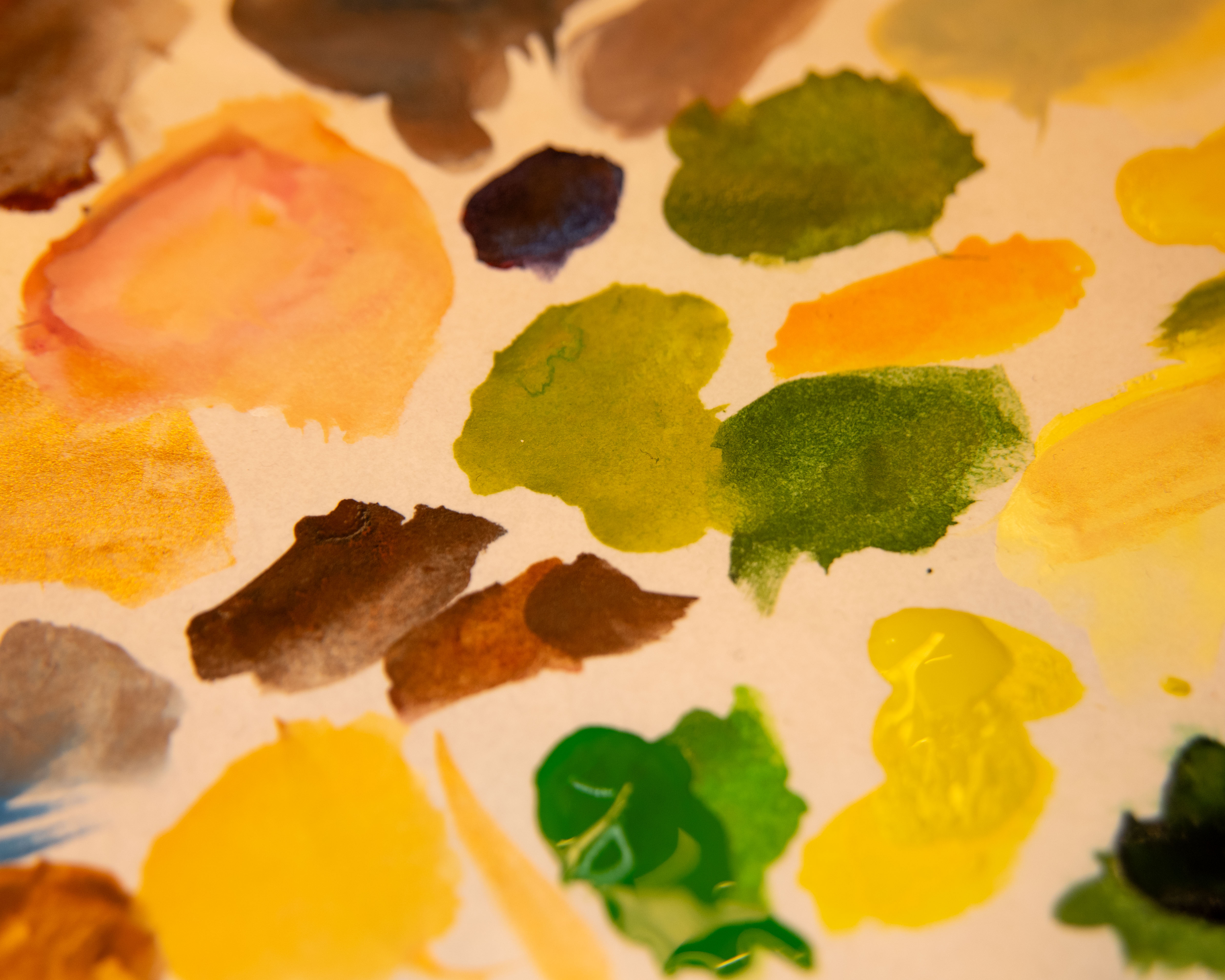
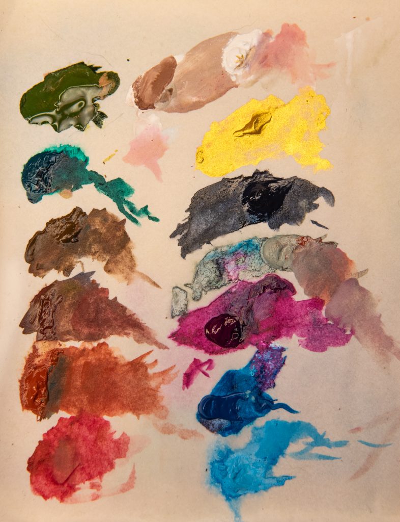
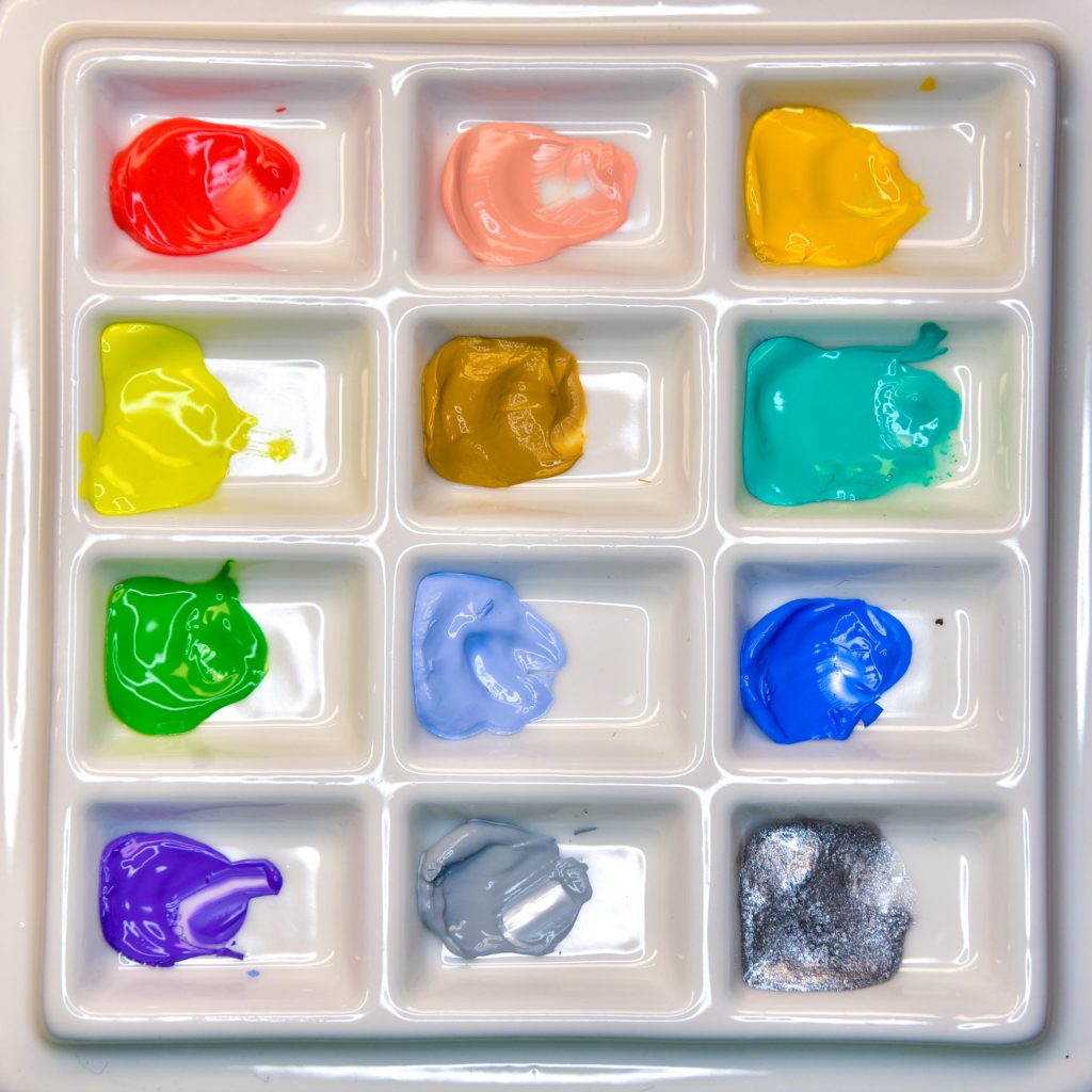
Things I Enjoyed
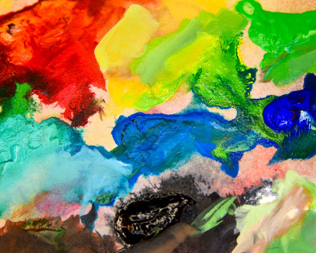
As someone just learning about colour, I loved the challenges that came up. In the Winter Set, I struggled due to a lack of pure yellow pigment to works with, and in the Spring set, I struggled with the inclusion of white in most of the mixes. I loved coming up with solutions to work around those issues!
At first, I was put off by the entire idea of ‘convenience mixes’ in paint, and I have no idea who taught me that. The painting world is huge, pure pigments are great, but I’m mixing the same things, really, and boy aren’t the premixed tubes convenient? No wonder they call them as they do.
Since the majority of the paints throughout these sets contain two or more pigments, it makes it really easy to learn the limits of mixes. Once you reach a certain number of total pigments in one mix on your palette, it’s going to be a shade of grey or brown. But that’s useful too! You can add that cocktail in tiny bits around to unify things. There’s a lot of experimentation to be done when you’re limited to a palette chosen for you.
I already know that I love Holbein’s gouache in general, and so there’s not a risk of having poor quality supplies here. The first gouache I ever bought was a Holbein 18 colour sample set, and that started my love for the medium. So I’m not reviewing the brand itself, and I like that I already trusted them before I started.
Things I Could Have Enjoyed More
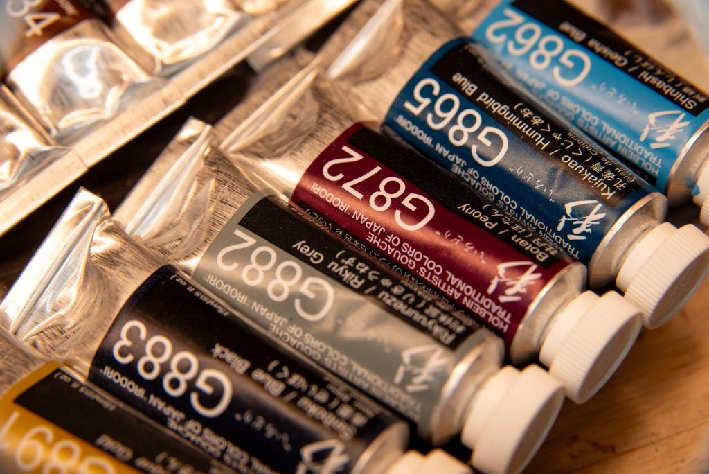
I understand that these collections weren’t curated for mixing. They have more thought behind them for being used at their full strengths. They’re rather like the Gansai Tambi paints one can buy from Kuretake: the colours are as they are, and meant to be used in the same way one would use a set of coloured pencils. But I think some more triads could have been formed if the variety shifted a little.
I’m not an expert, but I love looking into the ways different people throughout time have catalogued and experienced colour. Using the Irodori name means that Holbein is harkening to Japanese colour traditions, and that’s a fascinating dive! But, for each season, nature gave hundreds of colours to the Japanese, and when narrowed down to 12 per, I’d expect a slight bit more variety. Not of pigments, but of colours. The lack of yellow in Winter was a fun challenge, but there is yellow in winter, there is ochre, there is light, and what about mikaniro, the colour of winter oranges? In the Autumn set, there are four greens, but no purples to represent the grapes or the twilight. But, I was not on the colour-choosing team and I am not Japanese, so perhaps there is more to it than I am seeing.
In the same theme, but in the opposite direction, there could have been less colours. However, that would be a different product, one which encourages mixing. That’s something I’ll come up with on my own, but this inspired me to do so.
Pigments Throughout All Sets
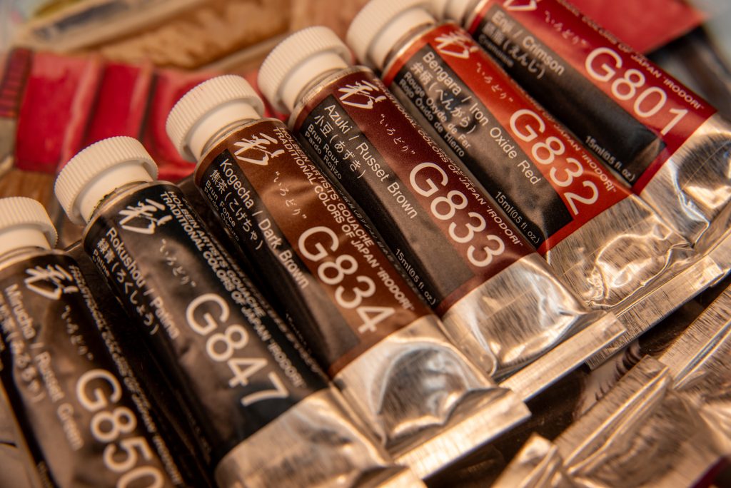
Not counting the three metallic pigments for the Antique Gold, Antique Silver, and Antique Rich Gold, there are 32 pigments found throughout the Irodori sets.
In order of frequency:
| PG7 (9) | PW6 (9) | PY42 (7) | PY3 (7) | PR101 (6) |
| PY83 (5) | PBk6 (5) | PG8 (4) | PB29 (4) | PB15 (4) |
| PR83 (3) | PR254 (2) | PR122 (2) | PR170 (2) | PY74 (2) |
| PY119 (2) | PBk11 (2) | PO73 (2) | PV23 (2) | PY111 (2) |
| PY14 (1) | PY154 (1) | PR9 (1) | PY17 (1) | PY43 (1) |
| PG17 (1) | PB16 (1) | PB60 (1) | PBr7 (1) | PBr25 (1) |
| PBk7 (1) | PO36 (1) |
By pigment type:
| PR | PO | PY | PG | PB | PV | PBr | PBk | PW |
| PR101 (6) | PO73 (2) | PY3 (7) | PG7 (9) | PB29 (4) | PV23 (2) | PBr7 (1) | PBk6 (5) | PW6 (9) |
| PR83 (3) | PO36 (1) | PY42 (7) | PG8 (4) | PB15 (4) | PBr25 (1) | PBk11 (2) | ||
| PR254 (2) | PY83 (5) | PG17 (1) | PB16 (1) | PBk7 (1) | ||||
| PR170 (2) | PY74 (2) | PB60 (1) | ||||||
| PR9 (1) | PY119 (2) | |||||||
| PY111 (2) | ||||||||
| PY14 (1) | ||||||||
| PY154 (1) | ||||||||
| PY17 (1) | ||||||||
| PY43 (1) |
Lightfastness
For those concerned about lightfastness, Holbein uses a 4-star system, with 4 being the best. In the whole set of 48, there are:
12 4-star tubes
14 3-star tubes
22 2-star tubes
0 1-star tubes
The inclusion of PG8, PR83, and PY83 are the ones I know people complain about the most, Crimson (PR83) seems to be quite controversial.
My Examples for Each Season
Click the name of the season to go to the in-depth post about each one.
Autumn
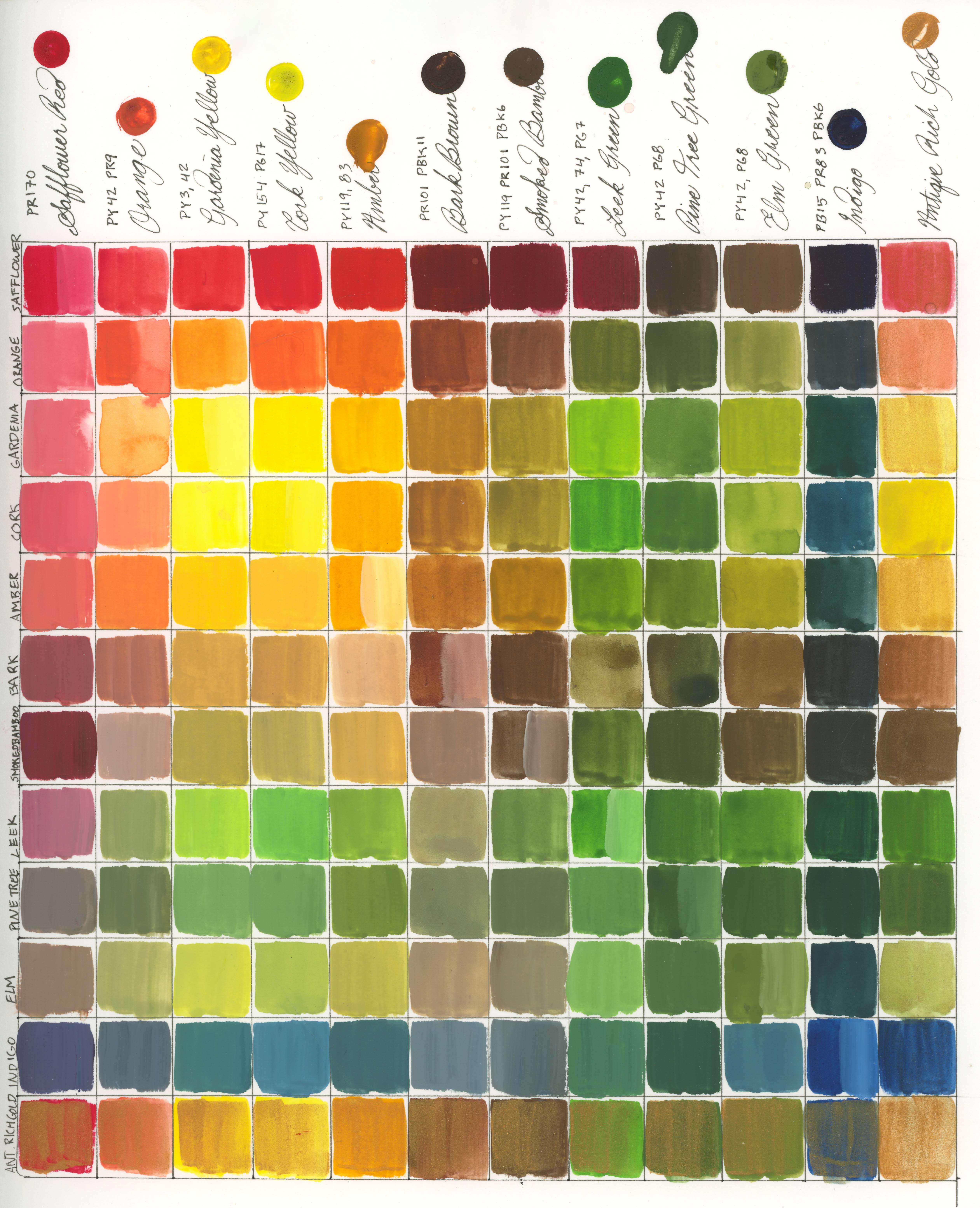
Safflower Red, Orange, Gardenia Yellow, Amur Cork Yellow, Amber, Bark Brown, Smoke Bamboo, Leek Green, Pine Tree Green, Elm Green, Indigo, Antique Rich Gold

Winter
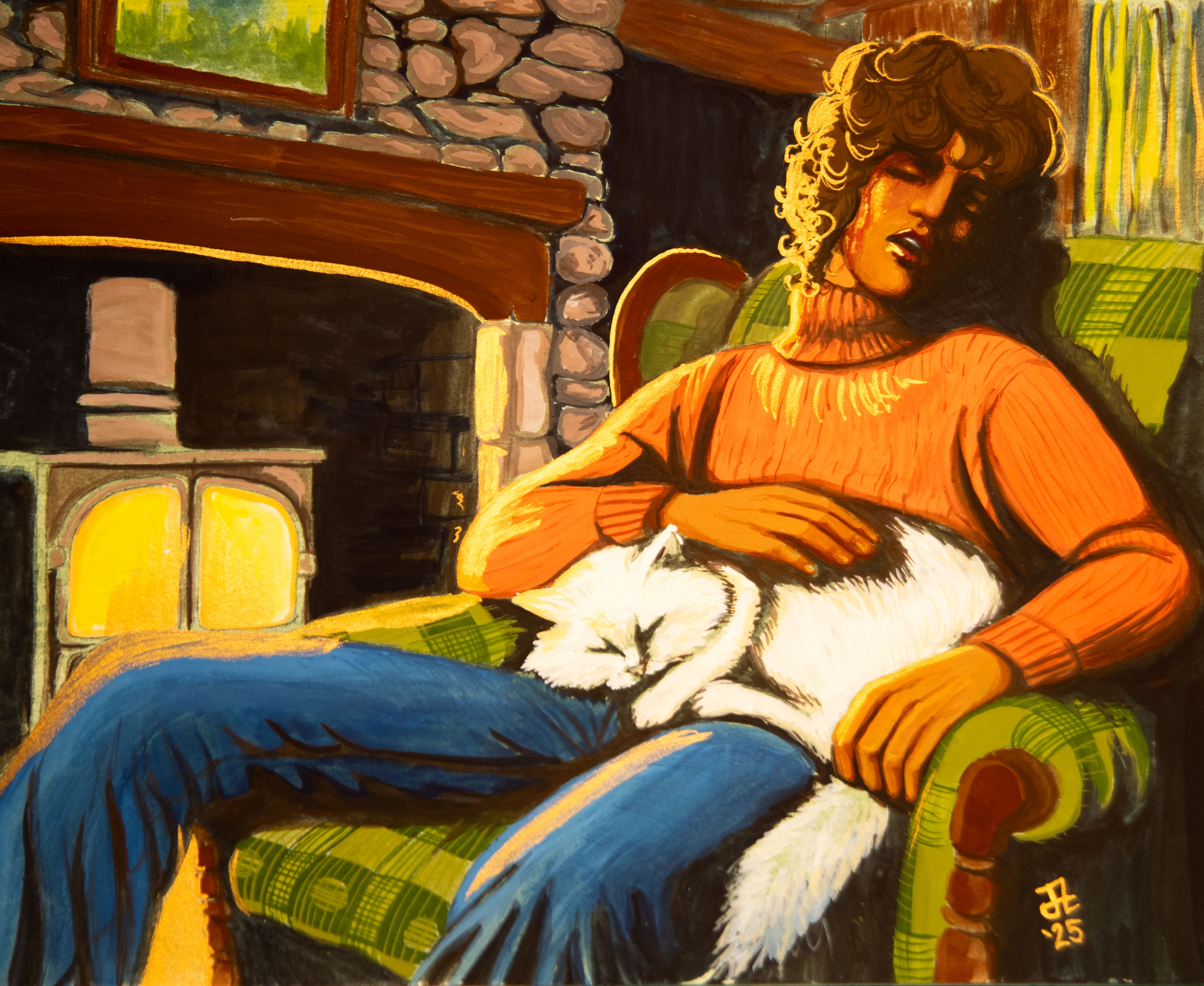
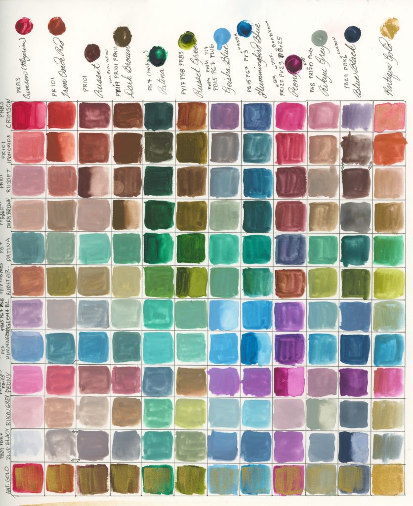
Crimson, Iron Oxide Red, Russet Brown, Dark Brown, Patina, Russet Green, Geisha Blue, Hummingbird Blue, Peony, Rikyu Grey, Blue Black, Antique Gold


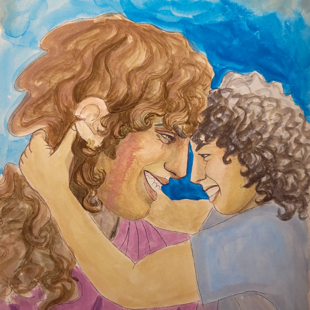
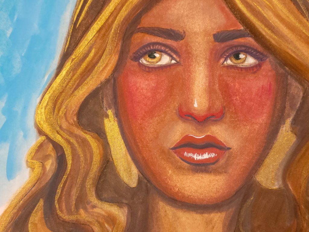
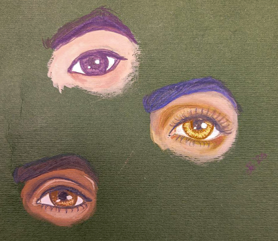
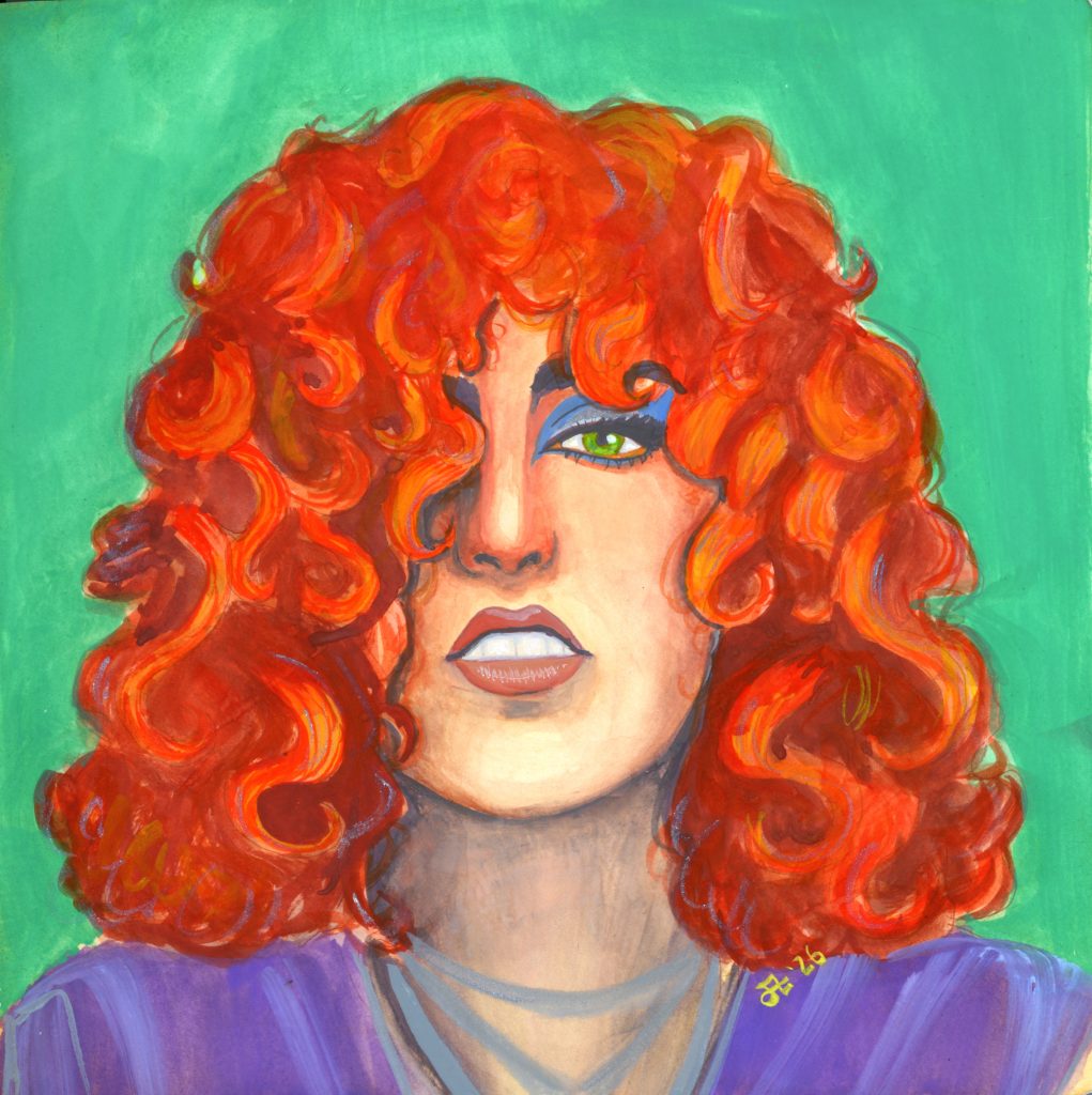
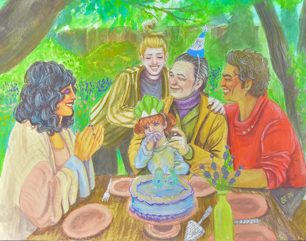
Spring
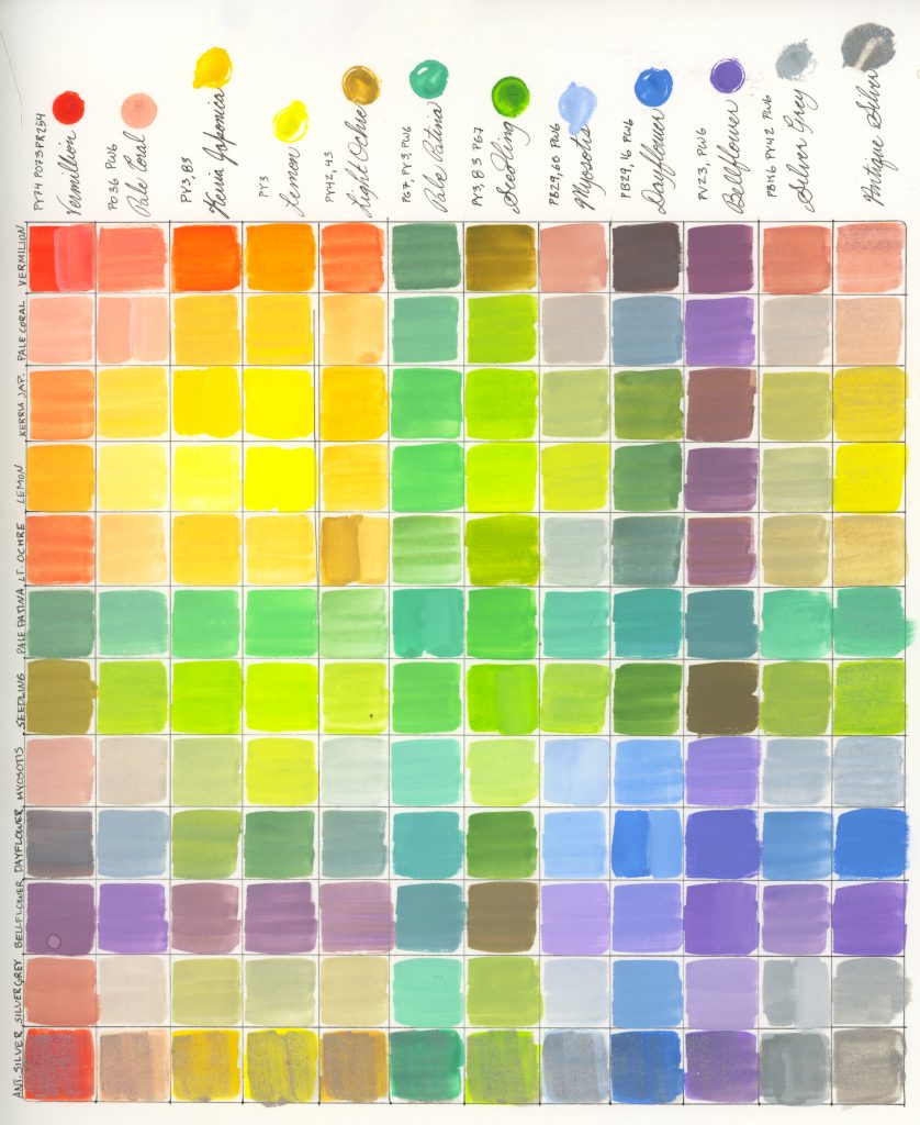
Vermillion, Pale Coral, Kerria Japonica Yellow, Lemon, Light Ochre, Pale Patina, Seedling, Myosotis Blue, Dayflower Blue, Bellflower, Silver Grey, Antique Silver
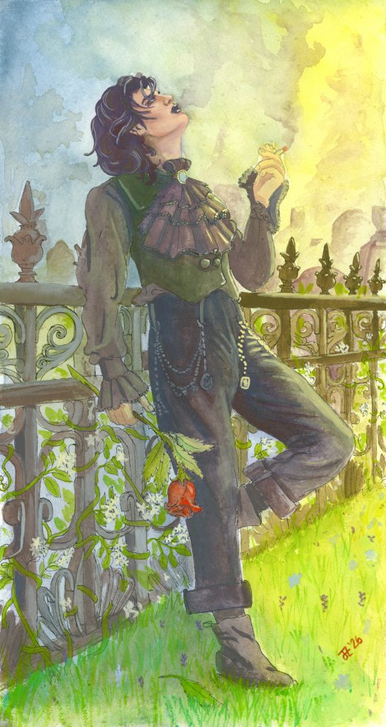
Summer
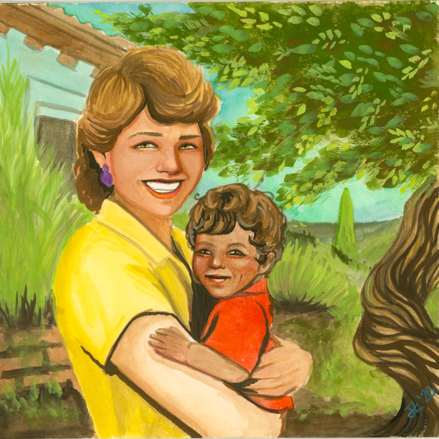
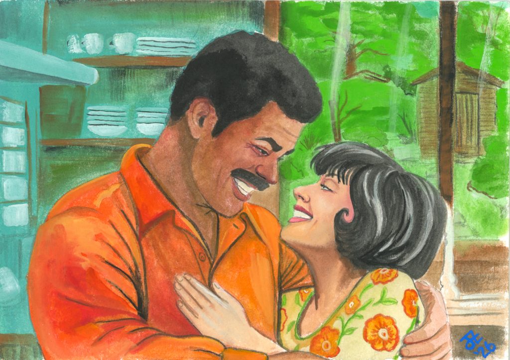
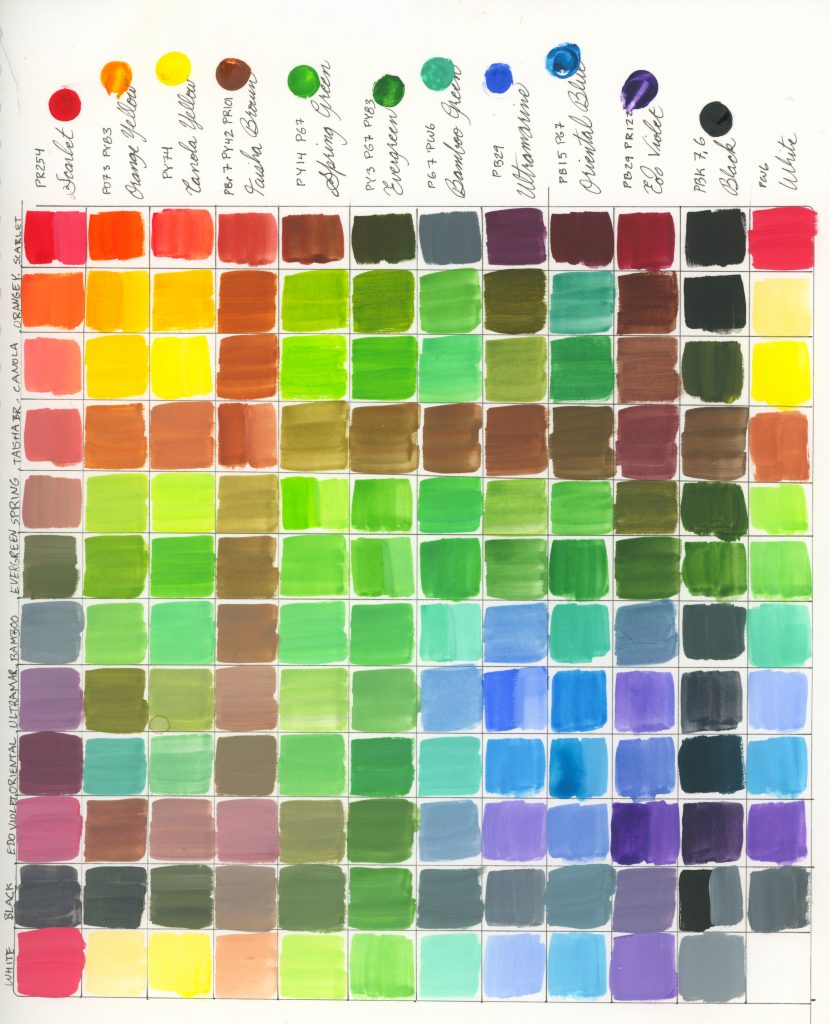
Scarlet, Orange Yellow, Canola Yellow, Taisha Brown, Spring Green, Evergreen, Bamboo Green, Ultramarine, Oriental Blue, Edo Violet, Black, White


Mixing Charts
I made these as soon as I got the set, to see what range of colours could become from just two levels of mixing. Here they are for us all now:
Should You Get These?
A lot of the people who find my website do so through reviews, and are looking for some advice on whether or not a product is worth paying for. It’s always a big question, because everyone is different. For most people, I’d say no, these are completely unnecessary. The mixes can be more affordably made with existing gouache, using these palettes as inspiration. If you’ve never used gouache before and want to start here, there are better places to start, as in with a 5-piece set of primaries and black and white. However, if you still fancy to start here, I suggest getting only the Summer set first. You can paint practically anything with it, because it has a workable triad of pure pigments that you can mix. (PR254, PY74, PB29) as well as black and white.
Otherwise, unless you want to try out the limited palettes like I did, you’re just a huge fan of Holbein and collect their products, or you have no stop mechanism on the size of your gouache collection, the answer is that they’re fun but unnecessary.
However, you can buy all of these colours open stock as far as I can see, and there are a few that I think are worthy mixes to have.
–Peony (PR122, PV23, PBr25), from the Winter set, is a gorgeous colour and not necessarily one you’d readily be able to mix otherwise simply because of the PBr25 inclusion.
–Antique Gold/Silver/Rich Gold, from the Winter, Autumn, and Spring sets are great fun if you ever want to add metallic details to your paintings. I use them outside of these sets quite frequently.
–Iron Oxide Red (PR101), from the Winter set, is nothing ‘special’ as far as pigments go. PR101 is one of the most common pigments out there, but it comes in many different shades temperatures and I use some variety of it in every painting I do pretty much. This one from this set is my favourite one. Honourary mention to the other PR101 from the Winter set, Russet Brown, which is another pure pigment but is darker and cooler and not a bad one to have as well.
–Pale Coral (PO36, PW6), from the Spring set, is the only place I’ve seen PO36 in gouache (though I see Stoneground Gouache makes it as a pure pigment gouache) and it’s just a really pretty tint that I find useful in skintones, florals, and really whenever I want a pink since I prefer orange-leaning pinks.
–Amber (PY119, PY83), from the Autumn set, is such a lovely base for skin, just add some red and white for a lighter gold, or a bit of red and green (or blue) for darker tones of gold to olive. PY119 is one of my all time favourite pigments and the only way I found it ‘pure’ was to make it or to order abroad to get the ShinHan Raw Sienna. PY83 is a bold yellow, but it’s such a nice addition and I’ve been in love with this mix ever since I used it in my very first Autumn paintings.
–Patina (PG7), from the Winter set, isn’t one that I suggest for everyone, but I do find that it’s a really lovely and very dark PG7. It’s the only one that I use, but it’s such a common pigment that if you’ve already got it (most people do) then it’s not worth having it as a duplicate. But, when you run out, give it a try.
Conclusion
I’ve loved using these, and I think I’ll continue to do so with each season. It’s nice to have restrictive palettes, and I’m going to try and come up with my own as my journey progresses. I’d also like to use these for printmaking, as that’s another thing Holbein advertises them for. I’ve found a lot of great mixes in here that I use frequently even outside the sets, but the vast majority serve their purposes only in the groups they’ve come with as far as I’m concerned.
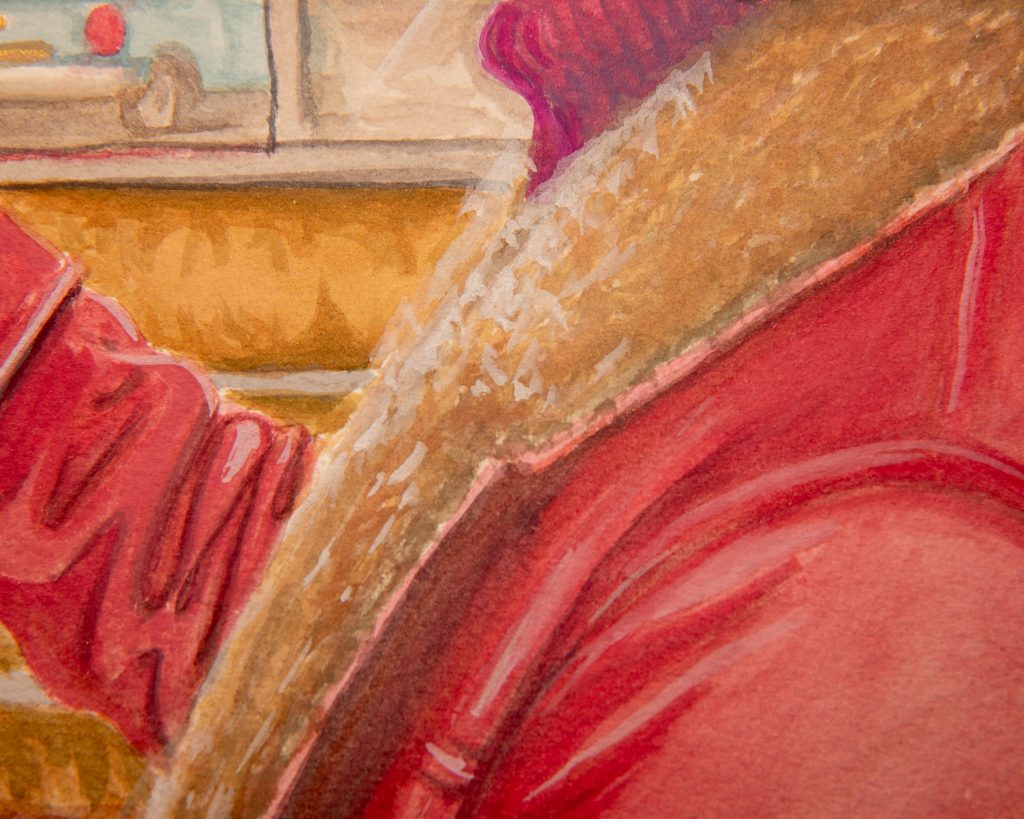
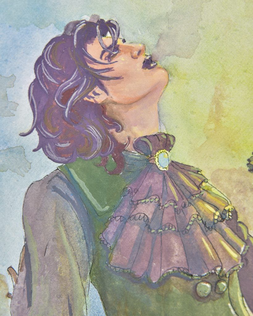
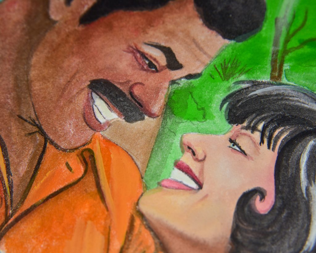
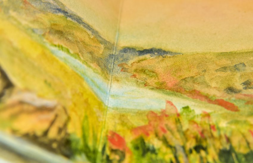
Detailed images and more descriptions on each of the season’s pages:




4 thoughts on “Holbein Irodori Gouache: A Complete Year”