Holbein Irodori Gouache – Summer Set
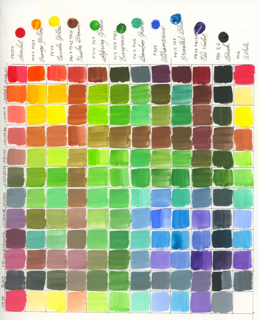
Pigment Contents
4 pure pigments: Scarlet PR254, Canola Yellow PY74, Ultramarine PB29, White PW6
1 pure pigment tinted: Bamboo Green PG7+PW6
5 two-pigment mixes: Orange Yellow PO73+PY83, Spring Green PY14+PG7, Oriental Blue PB15+PG7, Edo Violet PB29+PR122, Black PBk7+PBk6
2 three-pigment mixes: Taisha Brown PBr7+PY42+PR101, Evergreen PY3+PG7+PY83
Unlike with the autumn set, the winter set, and the spring set, I didn’t have to use my own white for this set, as it is put in instead of a metallic.
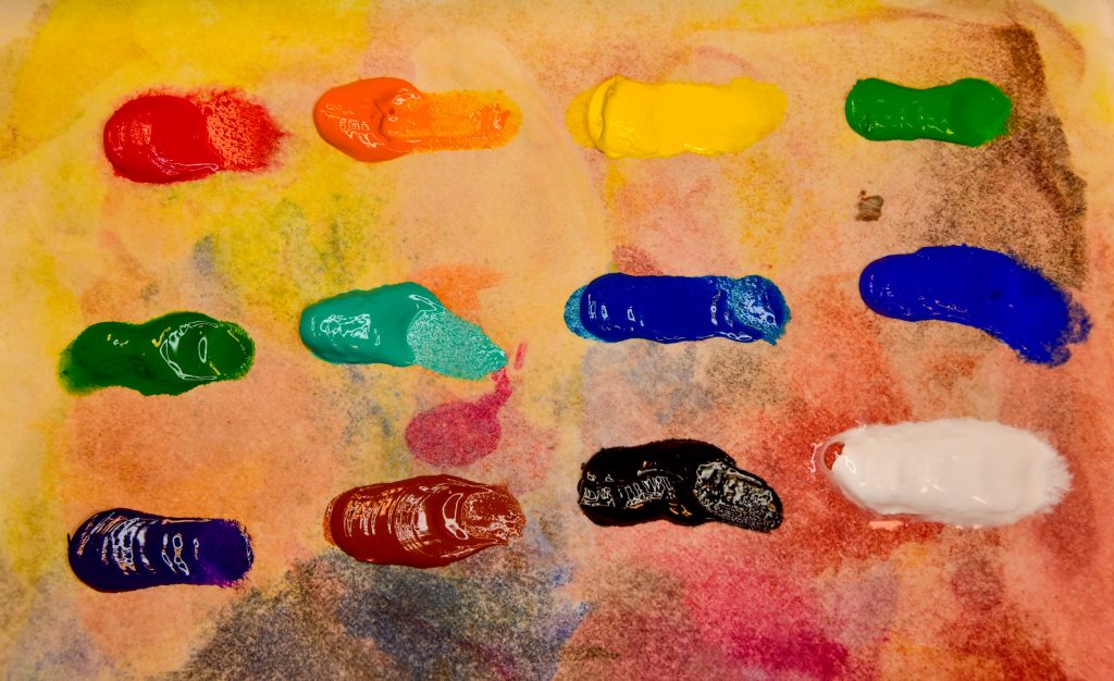
This assortment has everything you need to make most any colour you want. PB29, PY74, and PR254 along with PW6 and the PBk7/6 mix can make most anything. Adding a bit of the Edo Violet mix can cool things down, making great shadows, and the brown makes a fantastic neutral and base for skin. I had a lot of issues with the winter set for lack of yellow and the spring set for the abundance of white, but this set brings no issues with it at all. I didn’t have a single struggle other than missing having a pure PY42 (yellow ochre) somewhere to use.
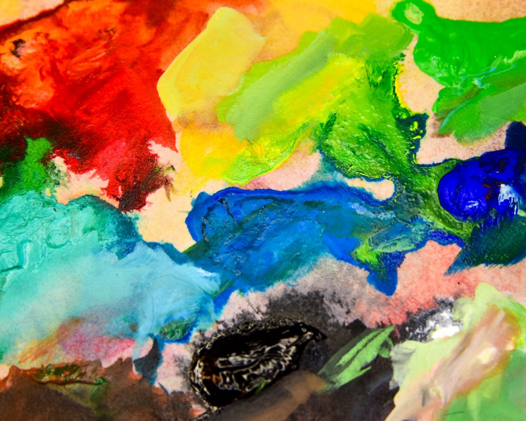
Examples
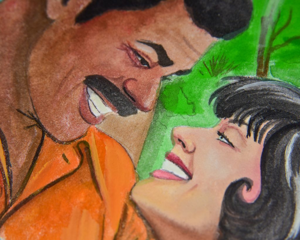
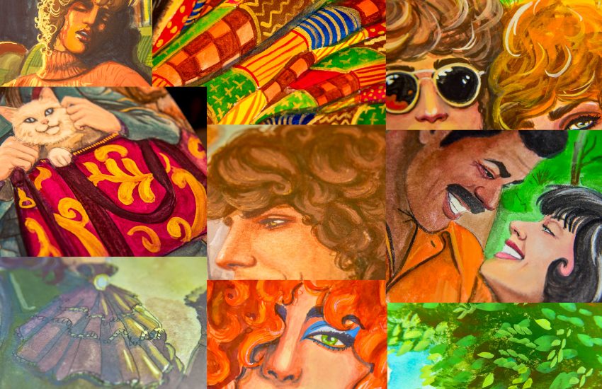
Patti and Rhys, Summer 1979
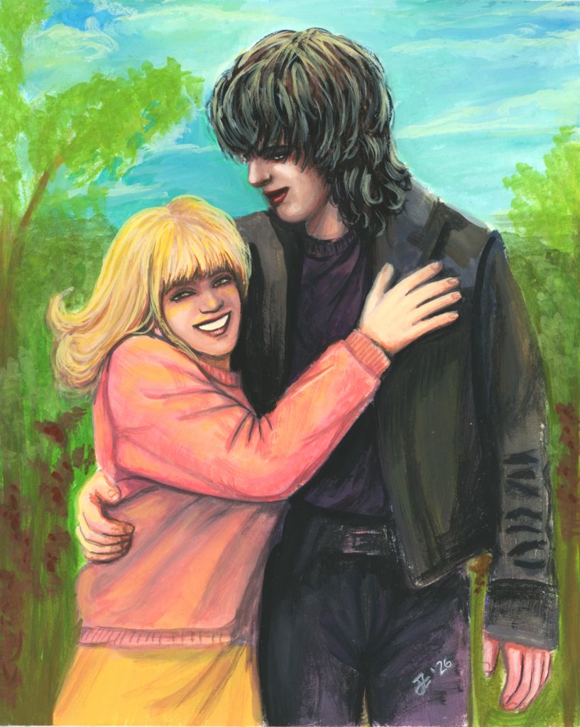
My first attempt was done on a new sheet of paper I had leftover in a sample pack. It’s Hahnemühle coldpress (not any of their series, just Hahnemühle watercolor paper, 100% cellulose, 300gsm), and I hated working on it. It was a very unpleasant texture and quite difficult to get wet enough. This first attempt I do not like at all! In my frustration, I messed up so many things, and left so much unfinished. However, it has some important things of note about the palette itself.
For one, I did an underpainting with the Canola Yellow, Scarlet, Ultramarine, and Edo Violet. That was a very cool idea on my part and I think it would be fun to keep doing it. I sometimes do that technique with fountain pen ink or liquid watercolour, but why not try it in gouache.
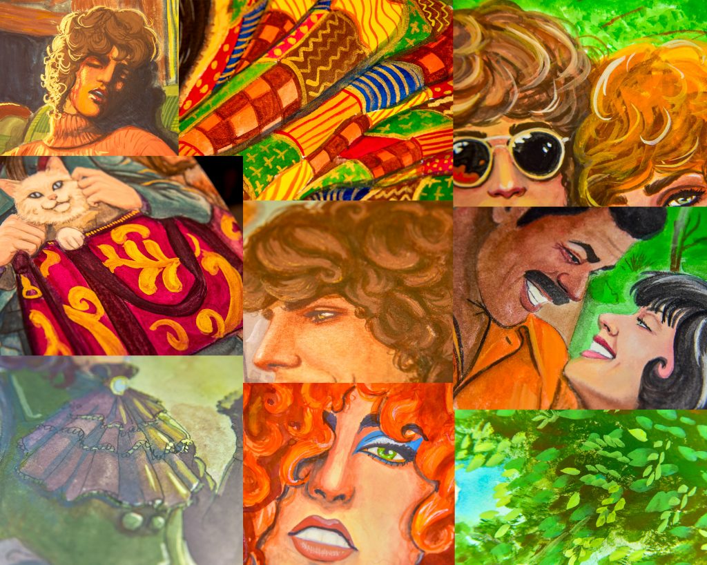
Also, it really shows the brightness and clarity of the colour mixes. These mix together so well!
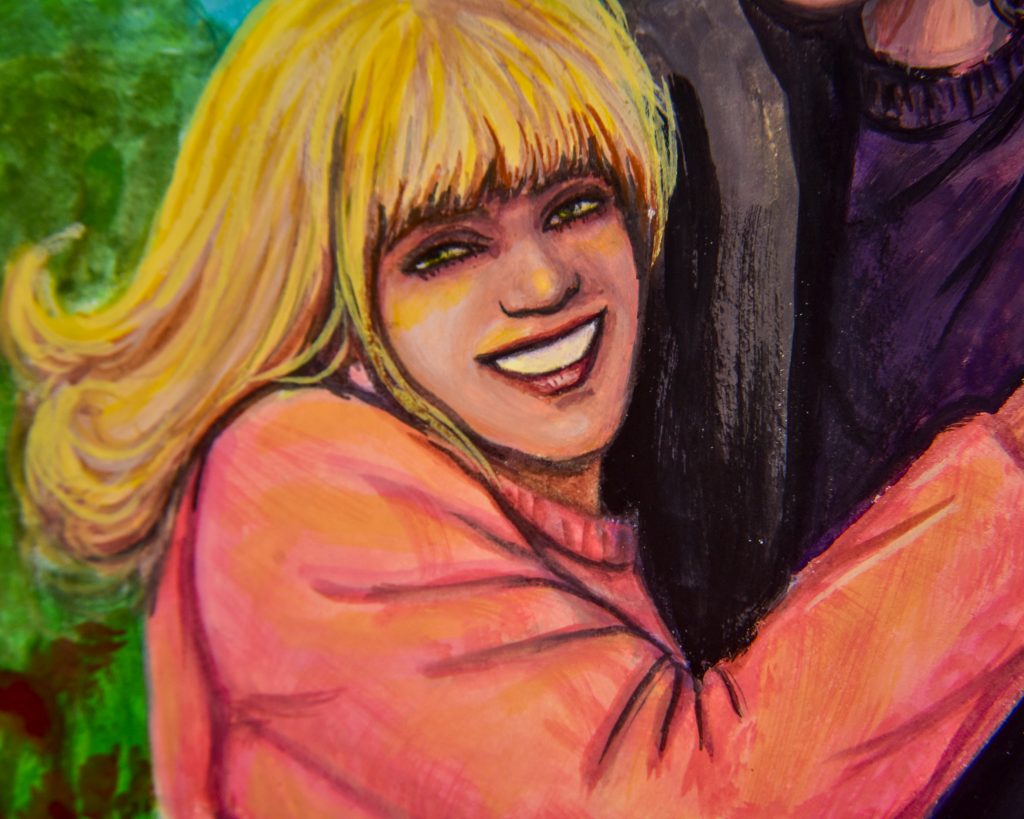
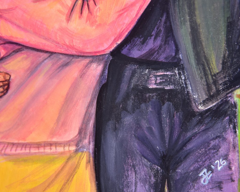
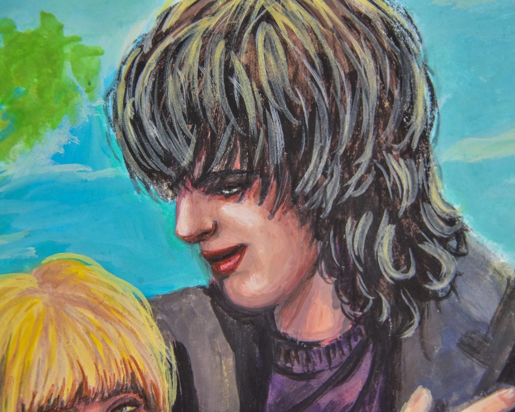
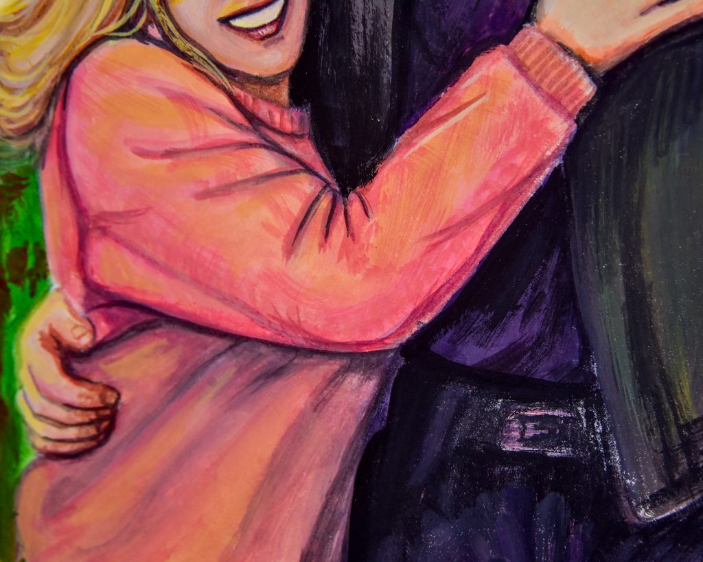
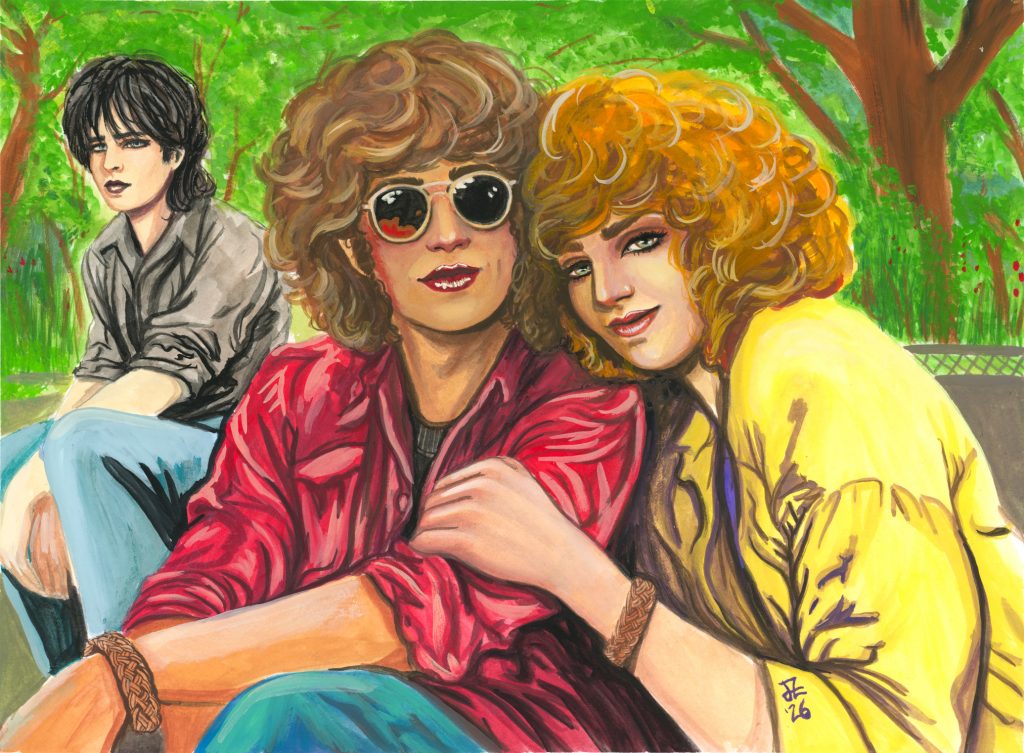
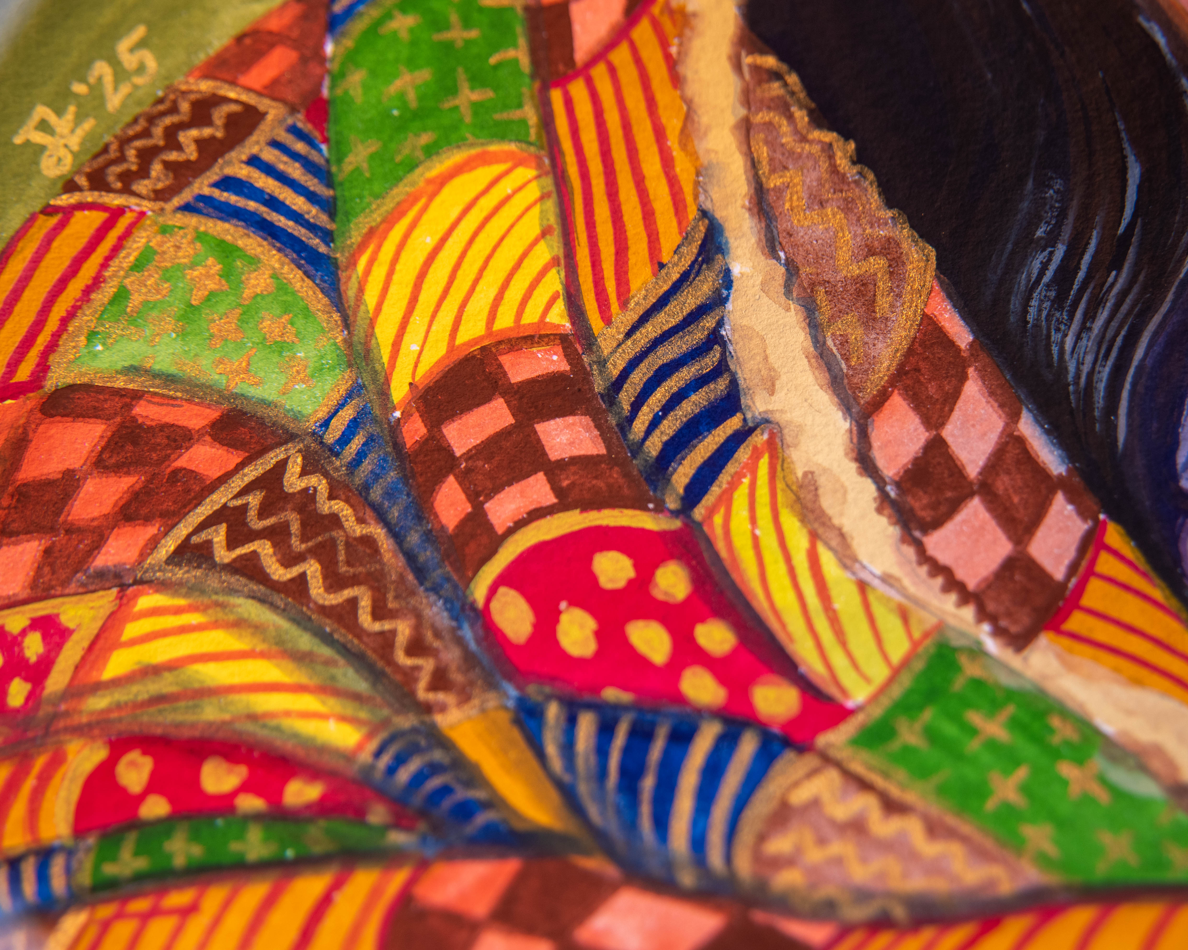
London, 1978
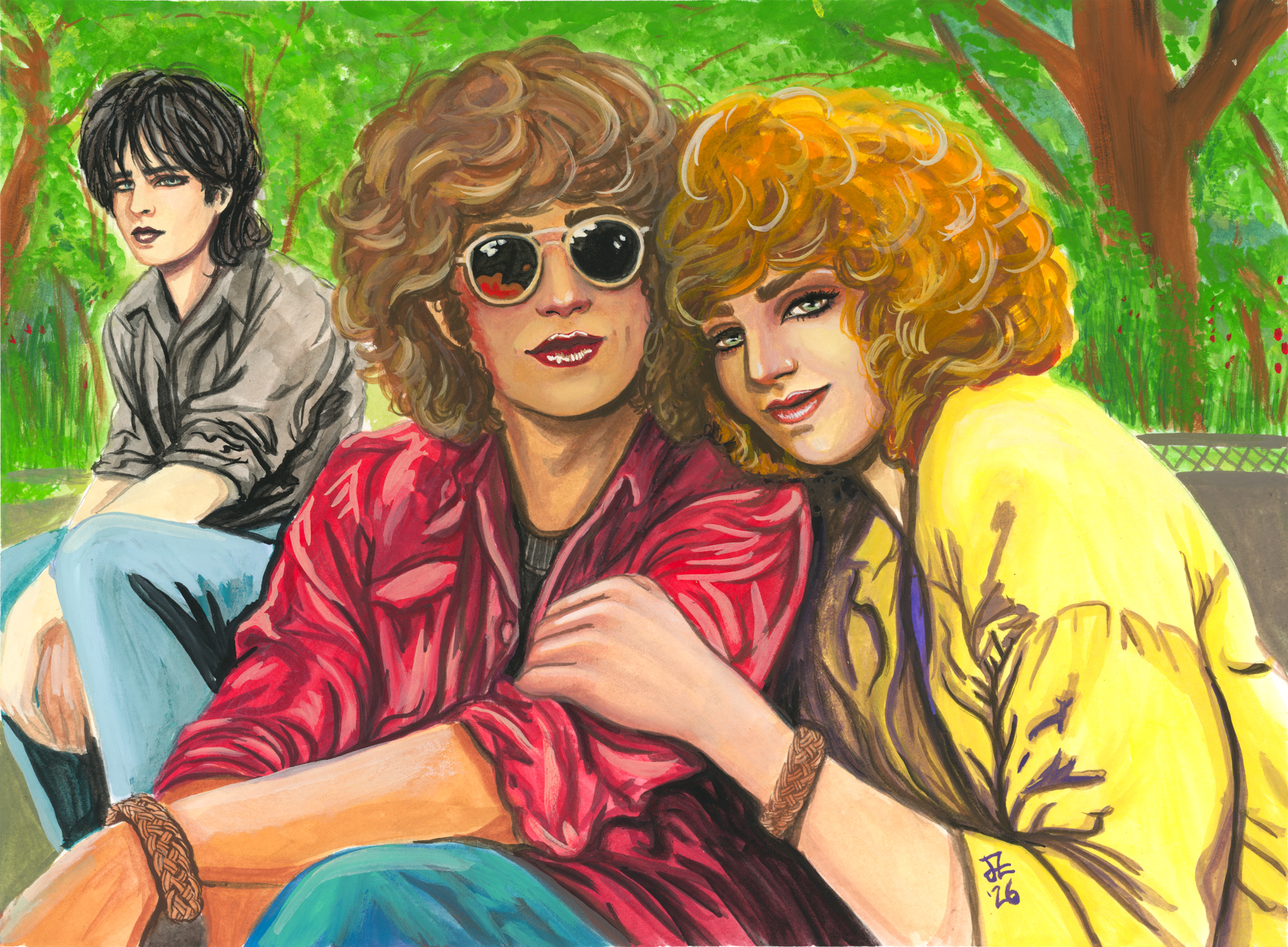
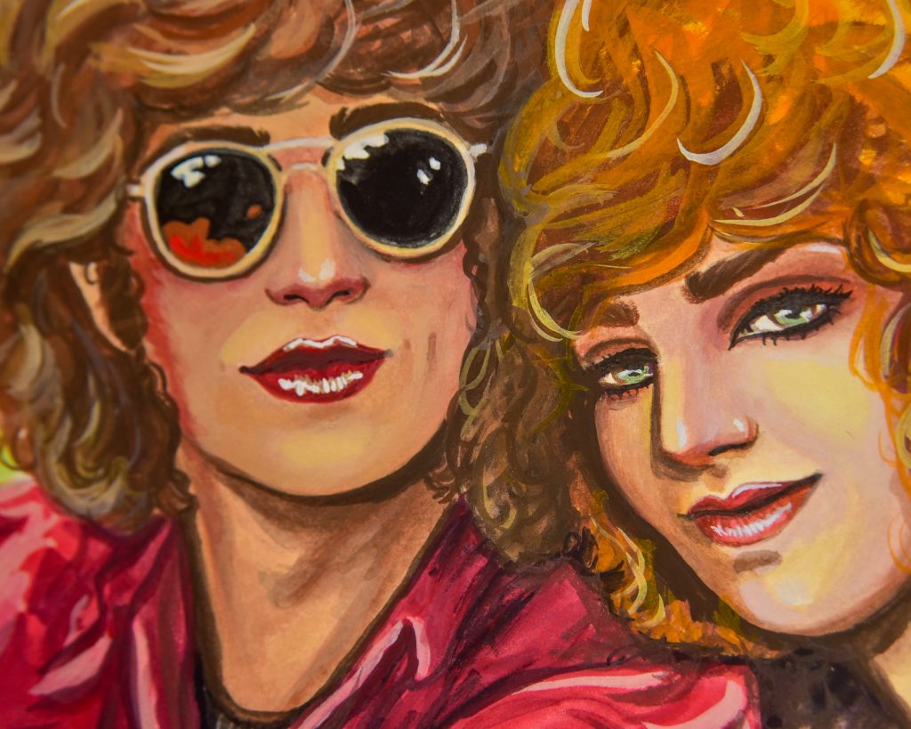
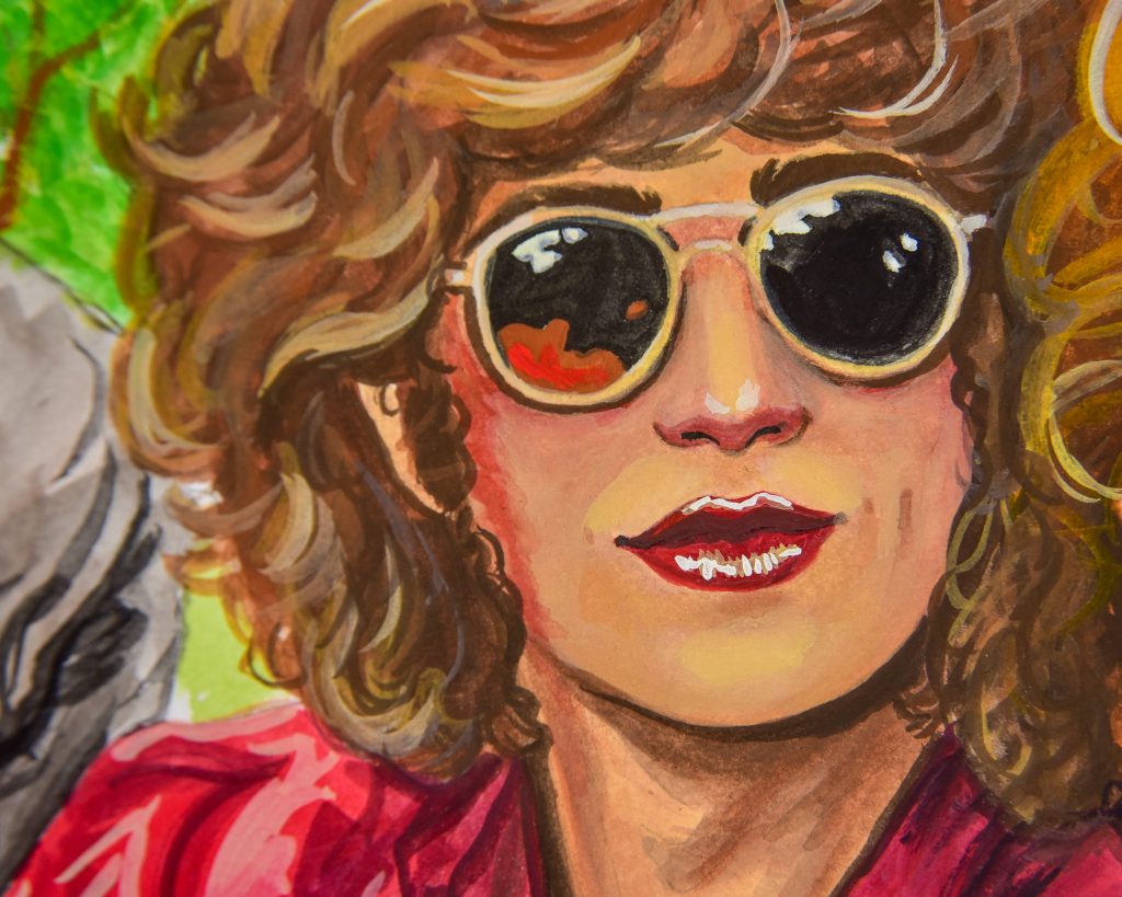
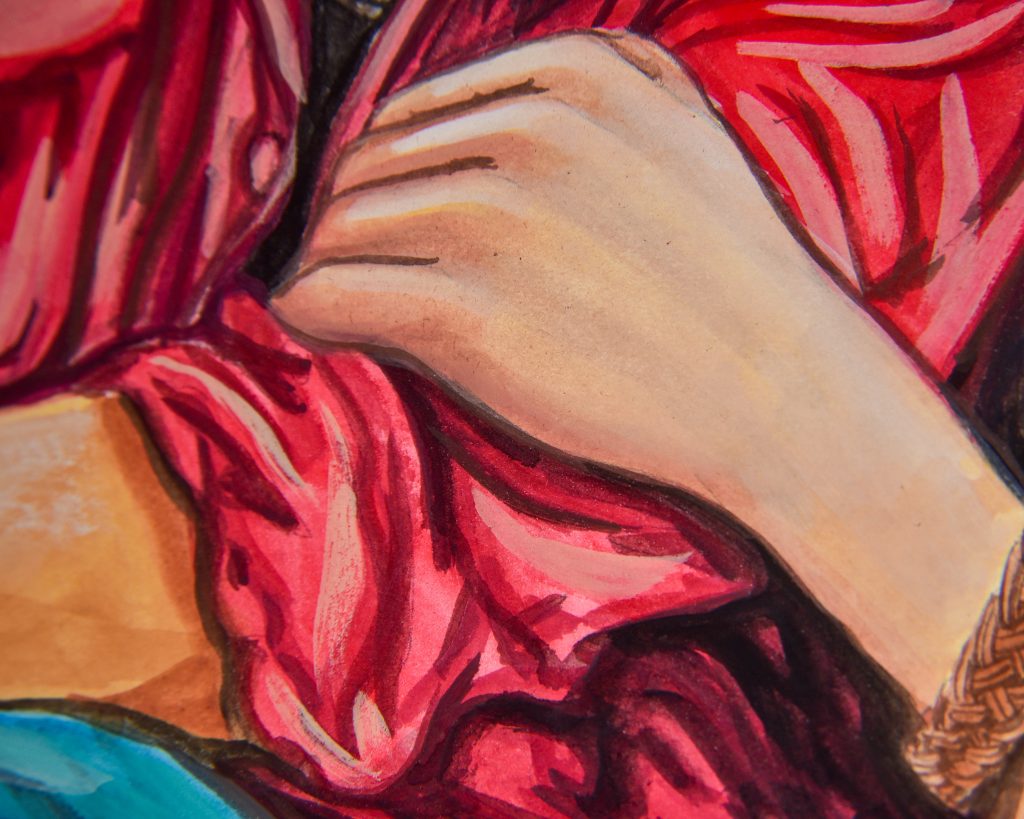
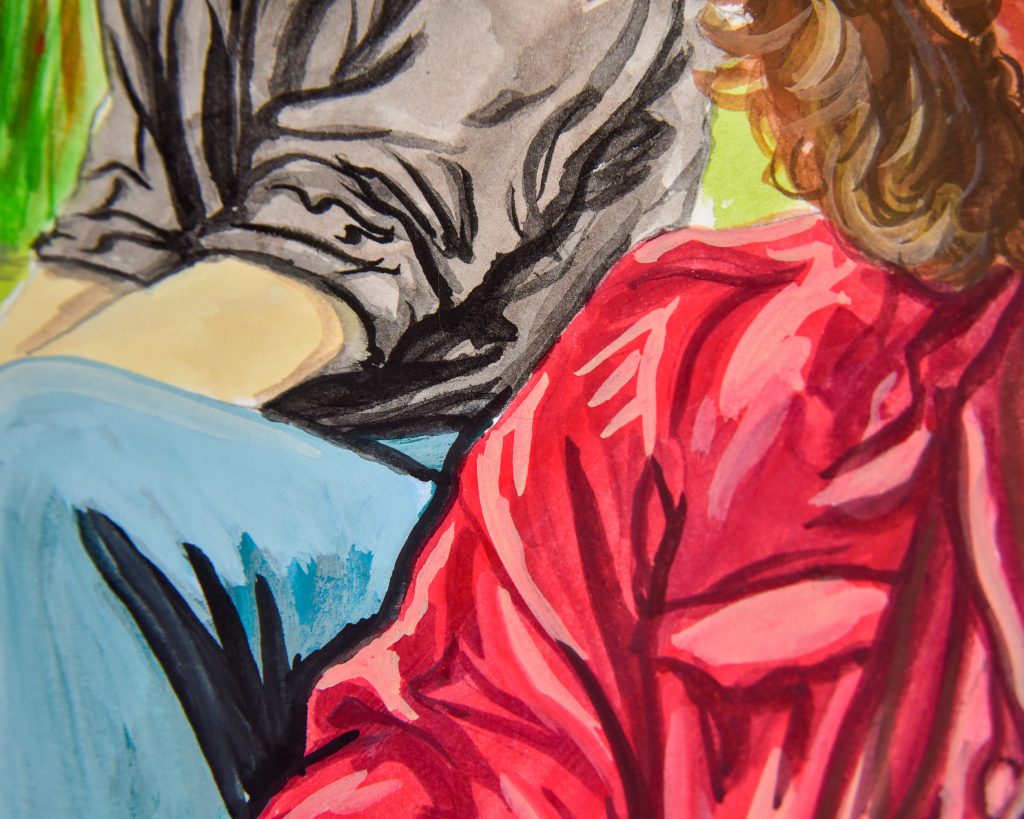
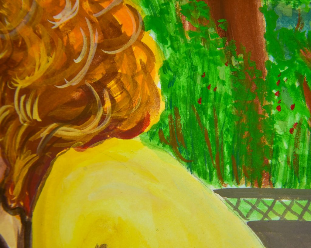
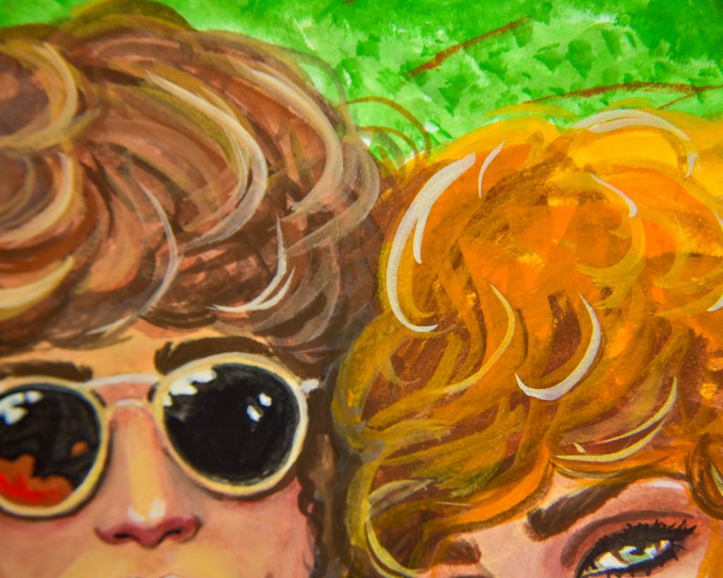
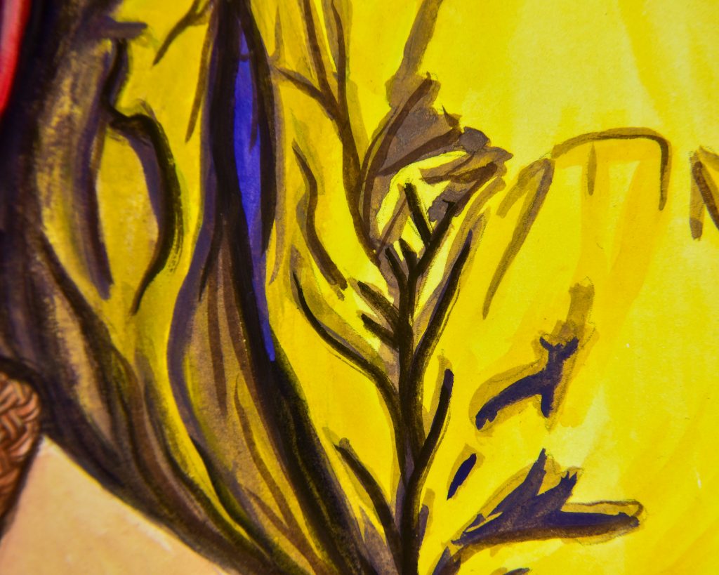
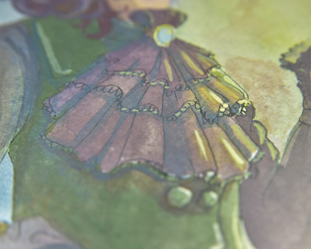
This is one of my favourite drawings that I’ve done, but I hadn’t yet finished an attempt that I was happy with. This one, though, I adore! I knew it would work well since this is a capture of the group from a very important summer moment in their lives, and I was correct to choose it. I also used Fabriano Artistico hotpress paper for this, something I already know I love.
Every colour is used in this in a raw form and a mixed form, though the smallest example of that is the little sliver of Edo Violet as Dana’s undershirt.
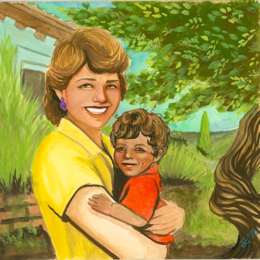
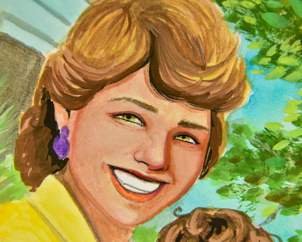
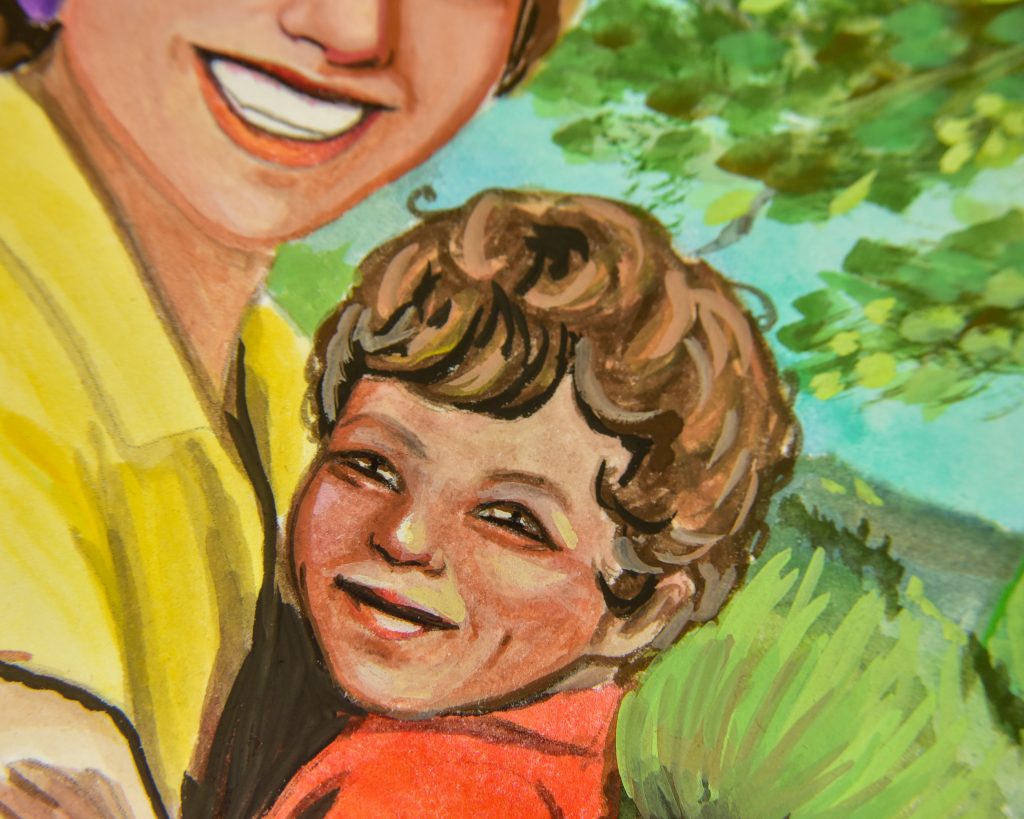
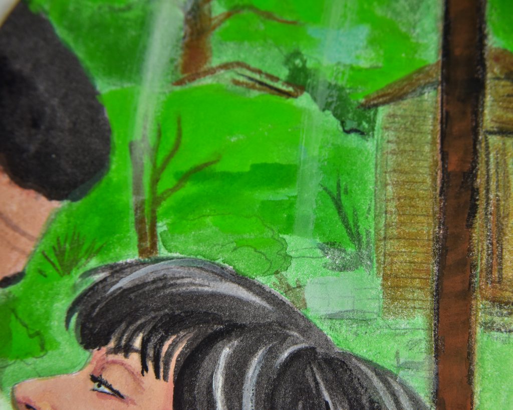
Froso and Mort, 1961
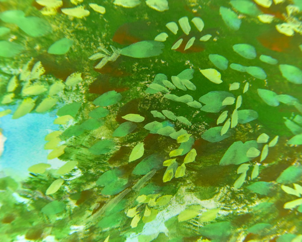
This is another painting I’ve tried with multiple media and so far I haven’t liked any more than my initial digital mockup, so something needs work or practice. However, I wanted to stretch the greens as far as they could go in this, making olives and grey-greens and blue-greens and bright greens and I think I succeeded. The leaves on the olive tree are something I am particularly proud of.
Unfortunately, as I was adding some small black details, I dropped my paintbrush and couldn’t properly remove or fully cover the black mark left through Froso’s nose without scrubbing everything away. I used the thickest applications of paint in this one.
Oh, and it’s on Hahnemühle Bamboo Mixed Media paper, which is fabulous.
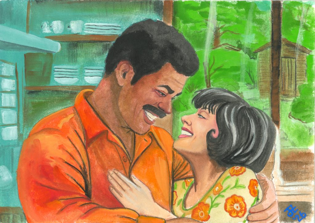
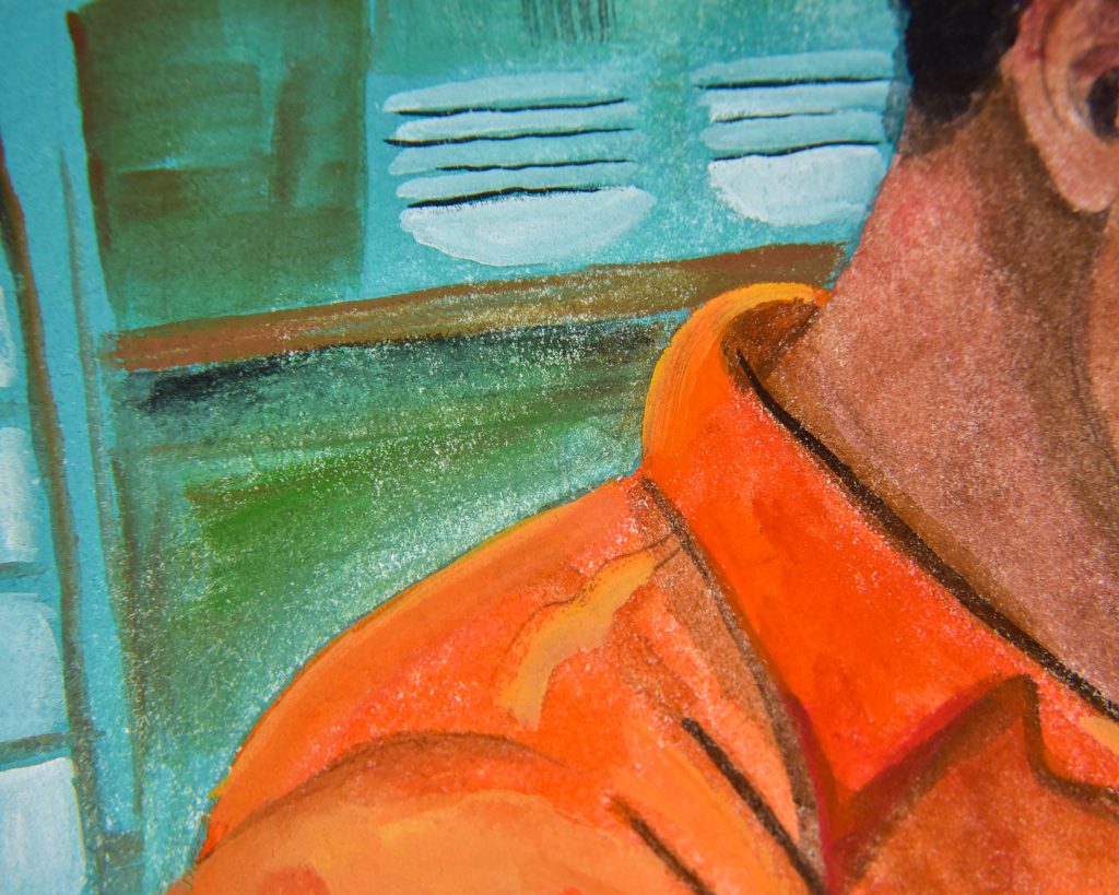
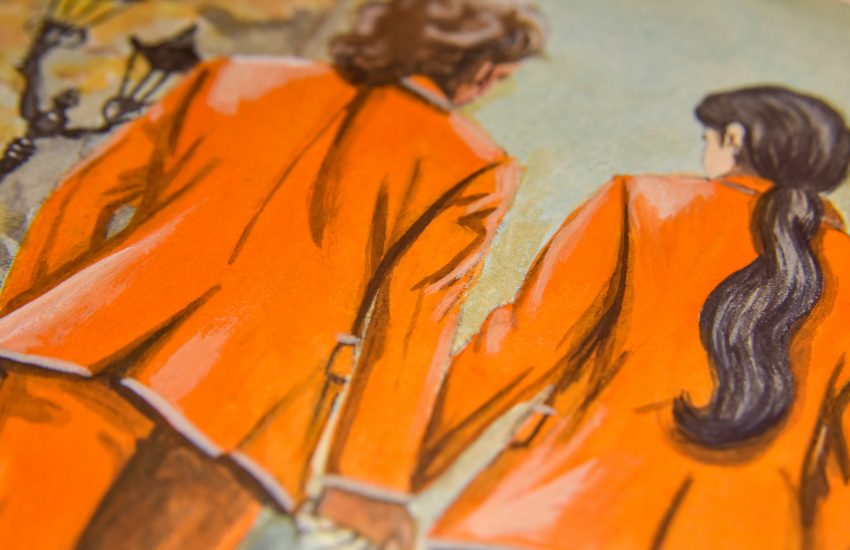
Paul and Eira in the Kitchen
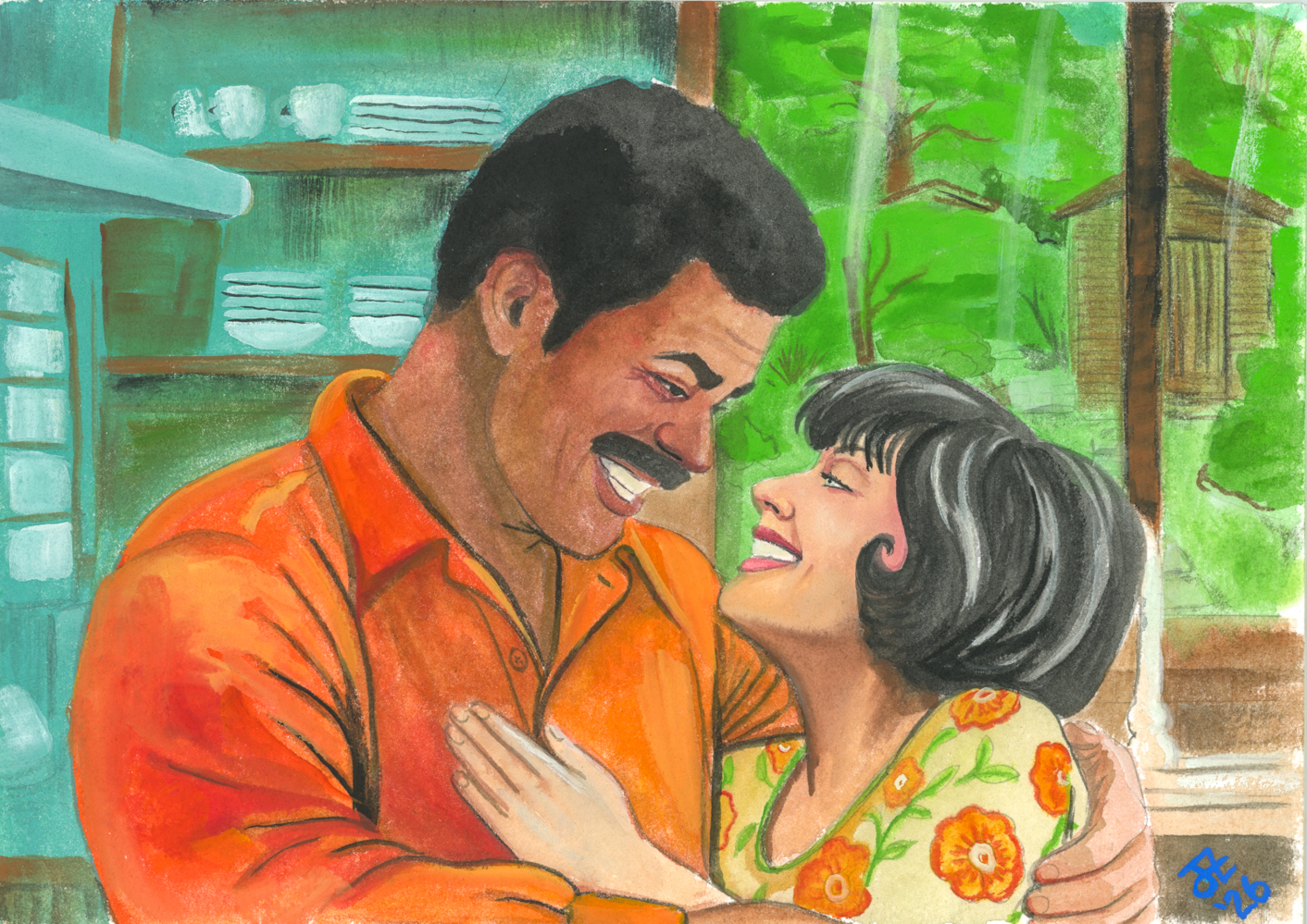
This one is being added after I’ve posted this, so as a bonus update. I still had more paint leftover on my palette and decided to do some more. I was out of yellow for this one, but used all the other colours. I can make a yellow-free palette work after my trials with the Winter set!
I adore this one, and my only issues are with anatomy. I think Eira’s hand might be a bit too small, and the shadow under her jaw too harsh. But otherwise I love it. It was done on a sample of Hahnemühle Turner watercolour paper, which is a very interesting textured cotton paper! I am tempted to get a block of it!
To Conclude
I’m not displeased at all with how easy it was to use this palette, though I perhaps should have started here on my colour learning journey, because it wouldn’t have been much of a challenge. It is a wonderful way to see how certain colours work together to seamlessly create anything you want them to.
So now I’m done with the full Irodori series from Holbein, I’ve spent the whole year experimenting with the colours set out to represent Japanesque seasons and seeing how I can use colour to create different moods and feelings. I hope to go more extreme with them on the next round!
I’ll make a full post of my complete conclusion on the set, but here are the other seasons’ posts to check out:

4 thoughts on “Holbein Irodori Gouache – Summer Set”