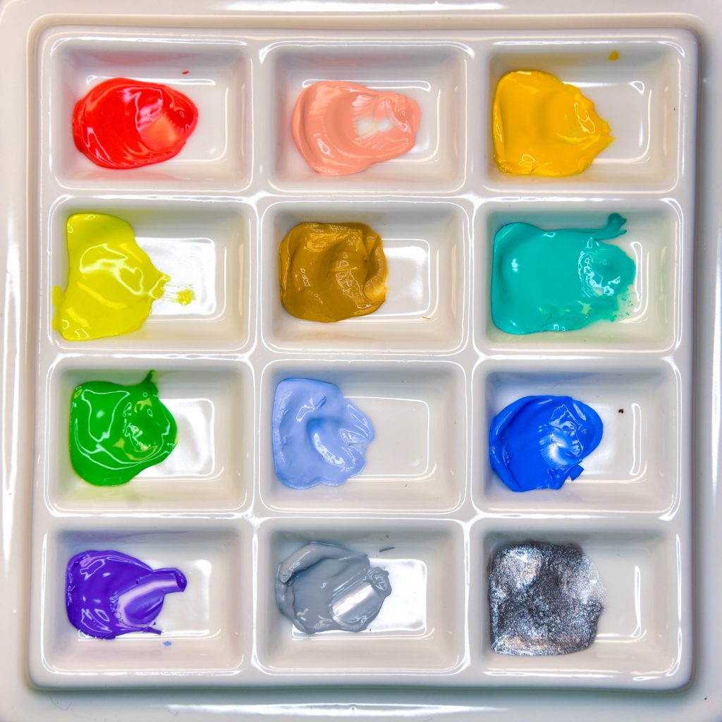
Holbein Irodori Gouache – Spring Set
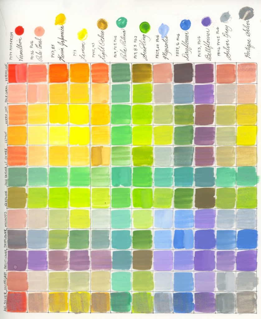
Pigment Contents
1 pure pigment: Lemon PY3
2 pure pigments tinted: Pale Coral PO36+PW6, Bellflower PV23+PW6
2 two-pigment mixes: Kerria Japonica PY3+PY83, Light Ochre PY42+PY43
4 two-pigment mixes tinted: Pale Patina PG7+PY3+PW6, Myosotis PB29+PB60+PW6, Dayflower PB29+PB16+PW6, Silver Grey: PBk6+PY42+PW6
2 three-pigment mixes: Vermillion PY74+PO73+PR254, Seedling PY3+PY83+PG7
1 metallic: Antique Silver
As with the autumn set and the winter set, I used my own white while painting.
I had no issues at all when I used the autumn set, and the winter set brought me troubles because of a lack of yellow to use while mixing. I wondered what the challenge would be with the spring set, and can now understand that it’s difficult to get dark chromatic black anywhere in this palette. But I didn’t let that stop me, and I found a way to give one portrait four different shades of black (every goth’s biggest struggle: when blacks don’t match).
Examples
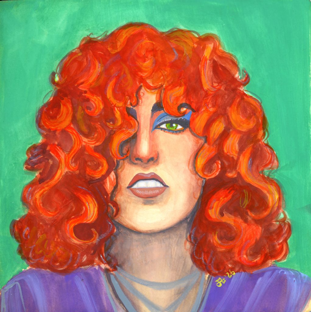
Default Sketch
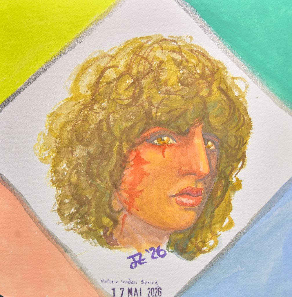
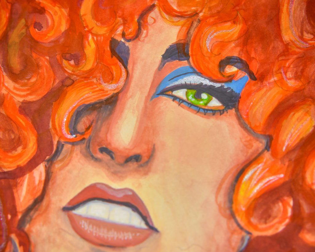
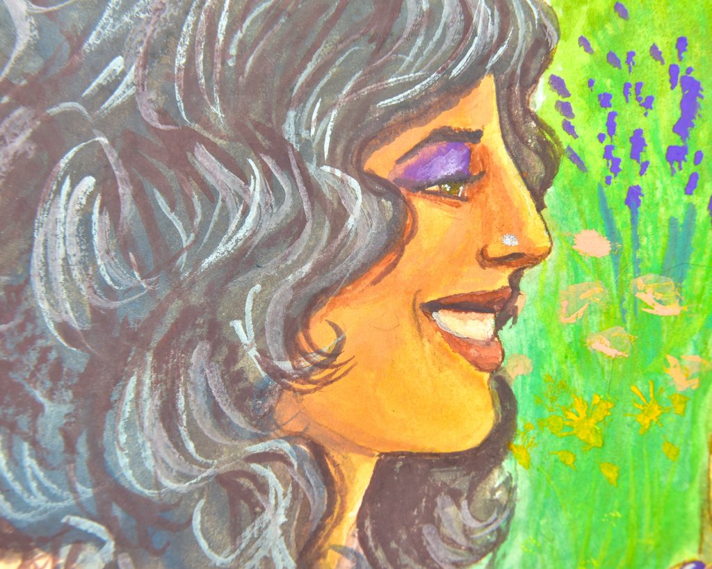
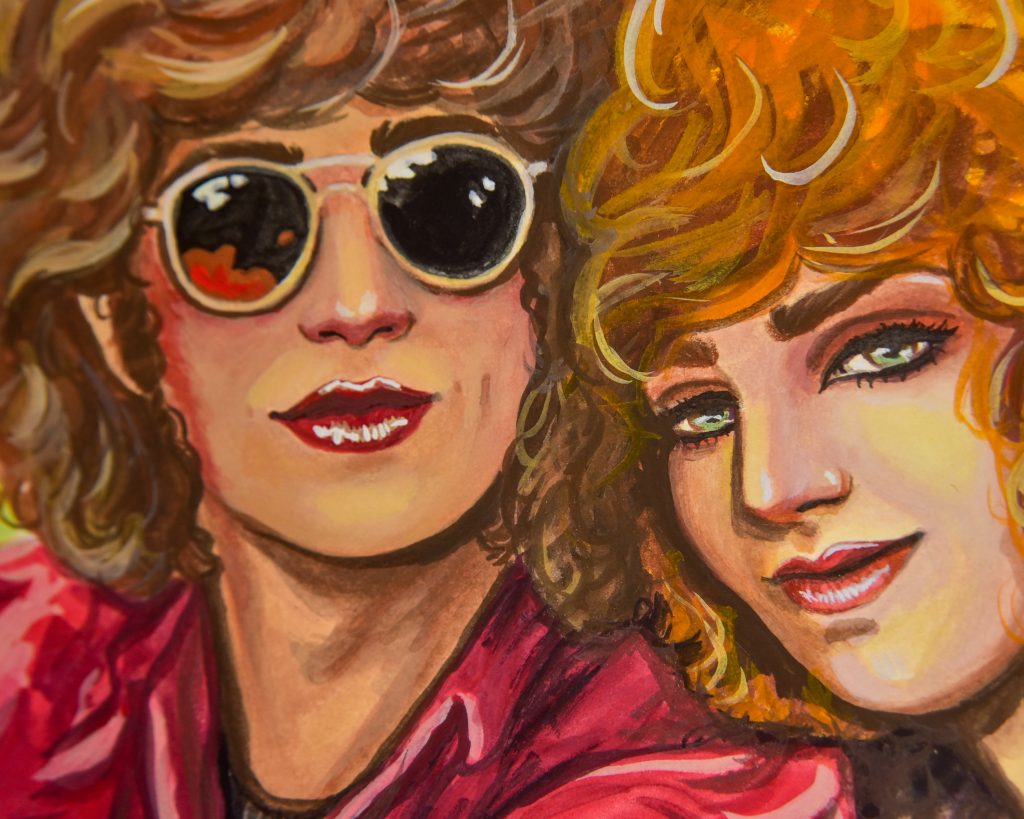
I didn’t do my default sketch with either of the other two that I’ve tried, but I went for it this time because I got a special sketchbook just for variations of this sketch and I’m excited to get it filled up. The very first thing that I noticed was that there is no conflict from a lack of yellows. Light Ochre, Vermilion, Pale Coral, and Seedling work together to make some great skin tones.
The challenge began to come in when I wanted to darken areas such as nostrils, around the eyes, and in the hair. I tried mixing Dayflower and Vermillion, but struggled getting it deep enough on its own. I was a bit shocked at how much I did not like the way this came out, as the tones are very nice.
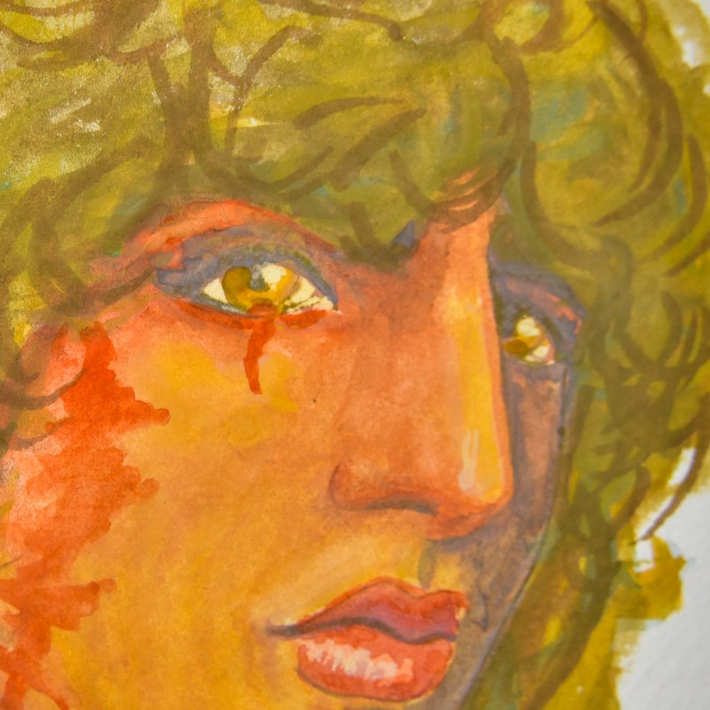
Dana
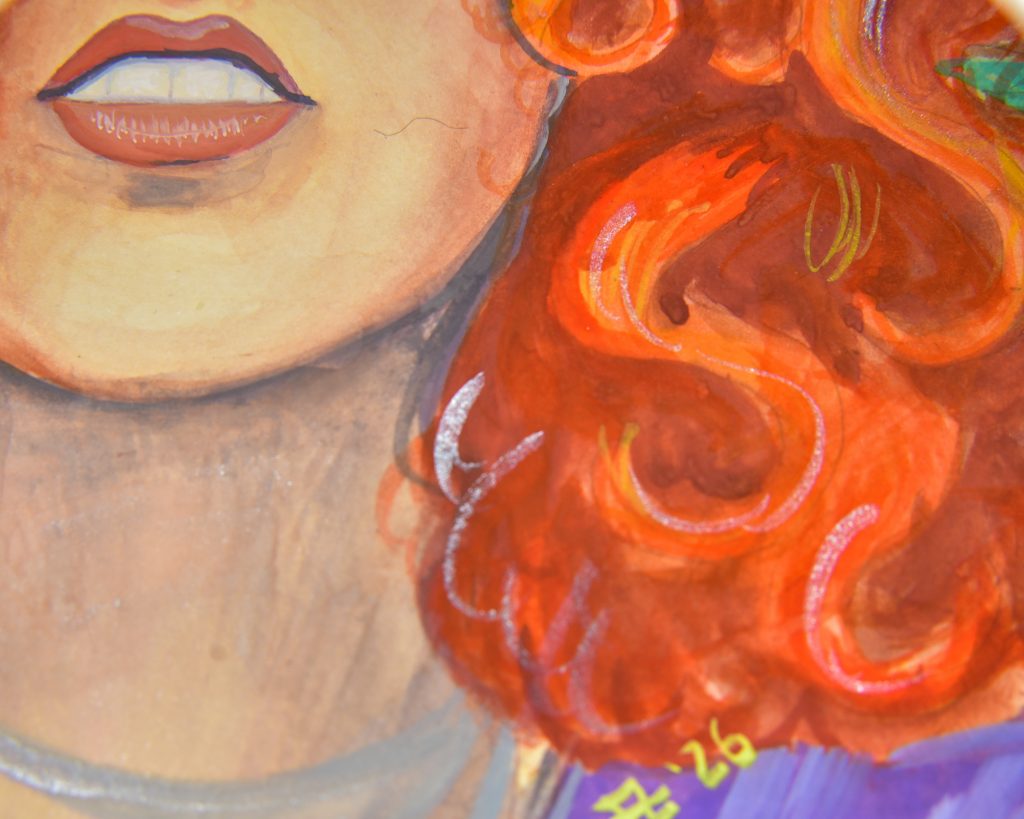
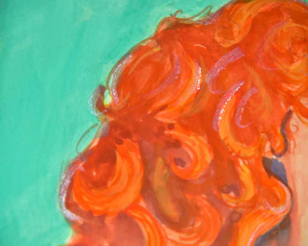
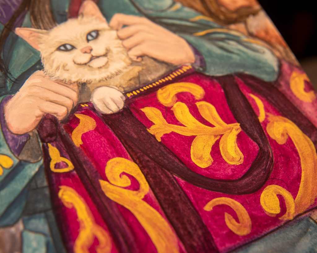
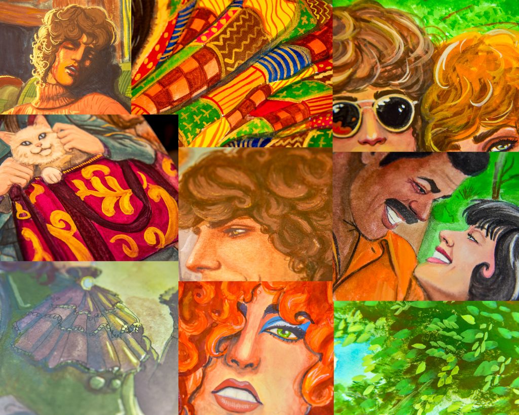
I’ve done this painting before in acrylic and I will probably do it again somewhere down the line. It needs work, and I’m learning and growing. I thought it would look great with this palette of colours, though, because there’s a great orange and the Pale Patina (used in the background) is dreamy. I was mostly looking at ways to get darks during this point. And I had some success with the dark shadow around the hair. But I kept adding Vermilion to it, to carry it into the hair and it ended up being too dull in the hair. But, the eyebrow and the eyelashes are a decent dark.
I wasn’t enjoying this painting as I was doing it, and I decided it was the fault of the paper. This is in a 100% cotton Hahnemühle sketchbook and…I might not actually like that sketchbook at all. At least not for gouache.
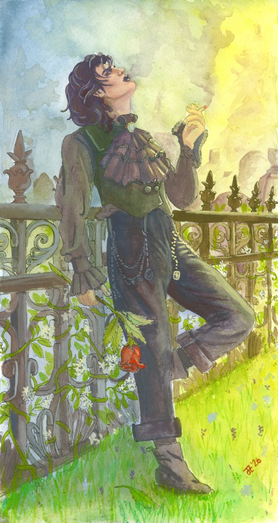
Rhys Being A Stereotypical Goth
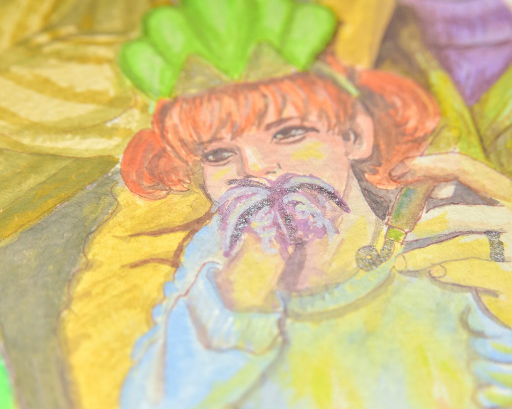
This one is my favourite of the four paintings I’ve so far done with this palette. But it has tragedy all over it. First of all, I painted it on 640gsm Fabriano Artistico paper. I got a wild deal on this paper, you see. It’s normally about $20USD per sheet, and I got each sheet for around $5USD. Well, it turns out that the deal was too good to be true in some ways. At least on this first sheet that I’ve cut up to use, the sizing is off and there are little speckles all over the paper. That doesn’t generally matter with gouache, since it’s opaque, but I like my backgrounds to be watercolour most of the time, and this is one of those times. I know I can use the paper for many other things, but it’s still a shame. The other shame is that I didn’t film this one.
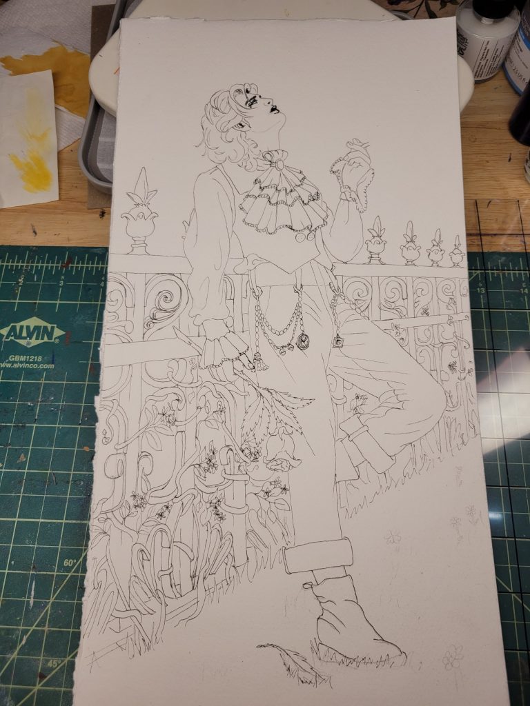
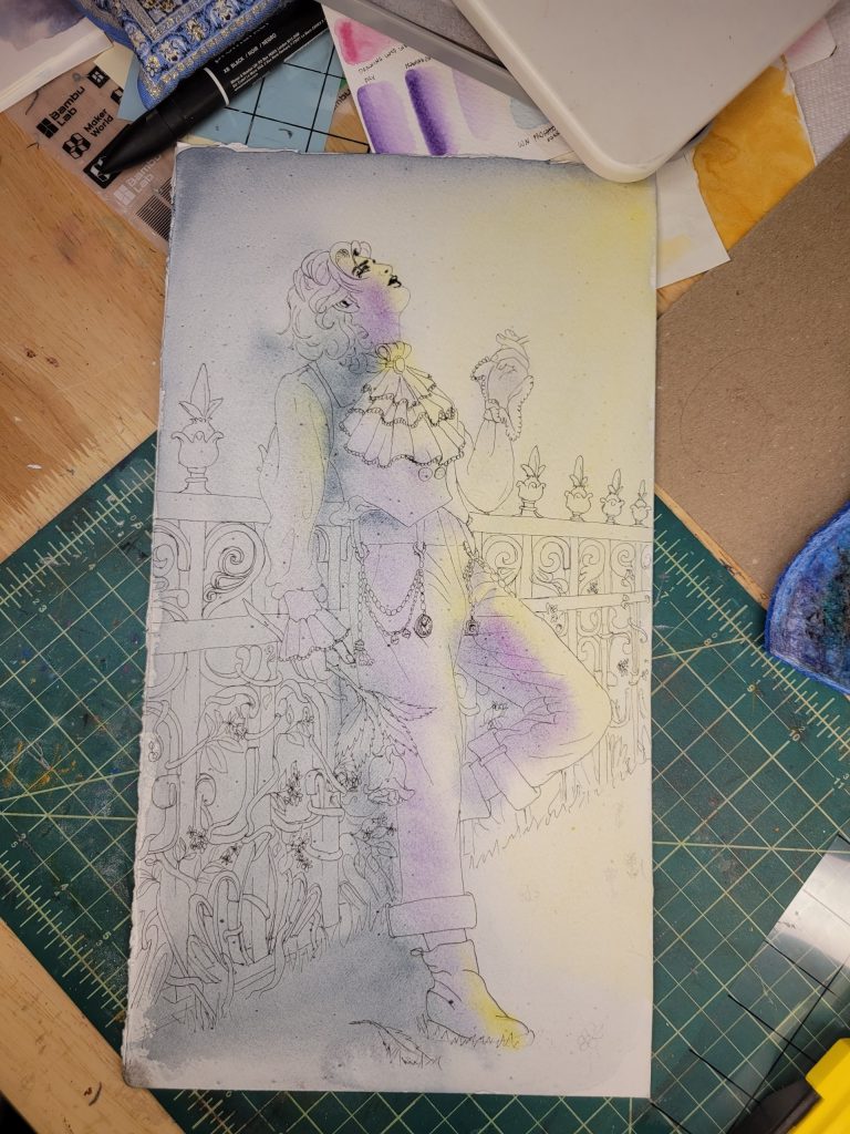
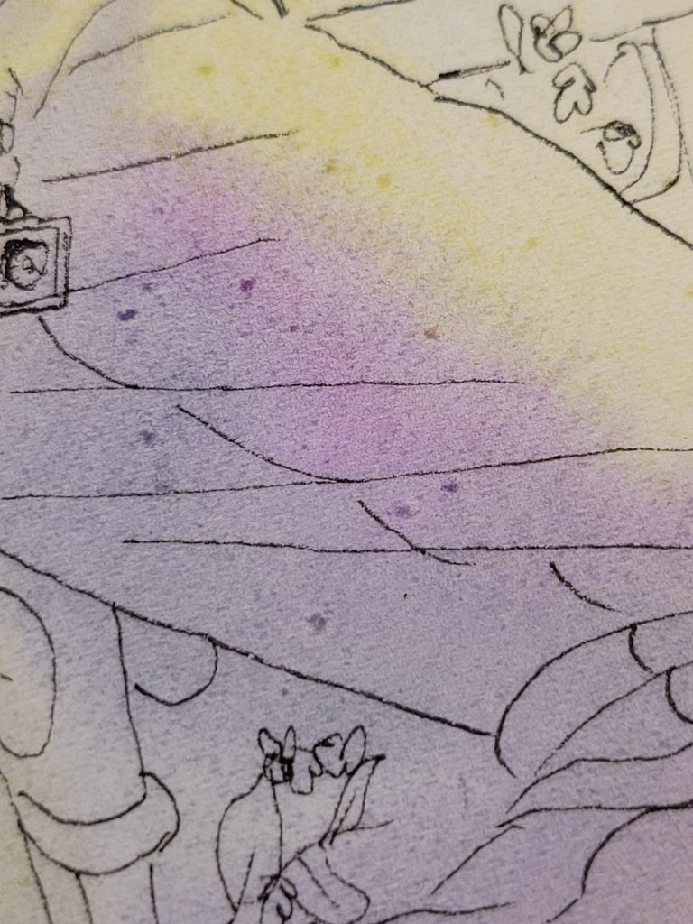
As far as the colours go, I chose to do this painting specifically with this palette because I wanted to really focus on the different possible shades of black. Since six out of the twelve colours have PW6 in them, it’s seemingly impossible to get something that isn’t grey. However, if you simply make grey your darkest colour, then everything else will have to follow along. It involves shifting everything to a more saturated place, and not looking for chiaroscuro contrast. This entire piece is very ‘pastel’ in the sense that there is no heavy contrast, but once I stopped trying to fight that, I like what I got. It helps with the spring sunrise mood I was going for.
I used four different shades of “black” in this. The trousers and hair are Dayflower and Vermilion, The vest is Seedling and Bellflower, The shirt is Bellflower, Kerria Japonica, and Vermilion (the jabot is more Bellflower than the rest and we can easily argue that neither are black, one is green and one is purple, but they are both potential blacks), and the fence is Seedling, Light Ochre, and Vermillion. I added Silver Grey into each of these mixes in places, but it made everything much to light.


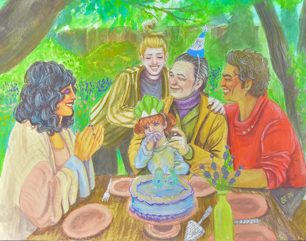
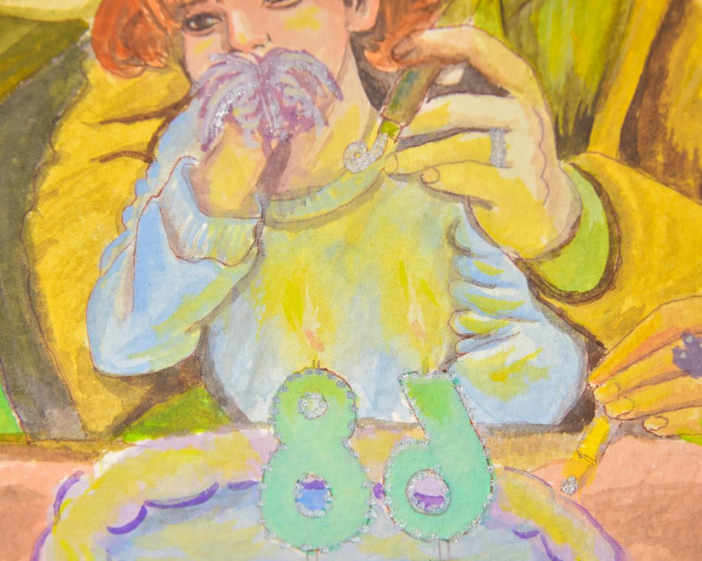
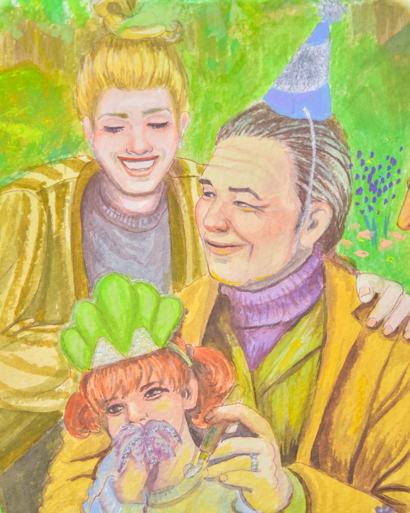
Appa’s 68th Birthday
I loved this one at first, but the more I look at it the less I like it. It’s also on 640gsm paper, but this time it’s Hahnemühle and the sizing isn’t off.
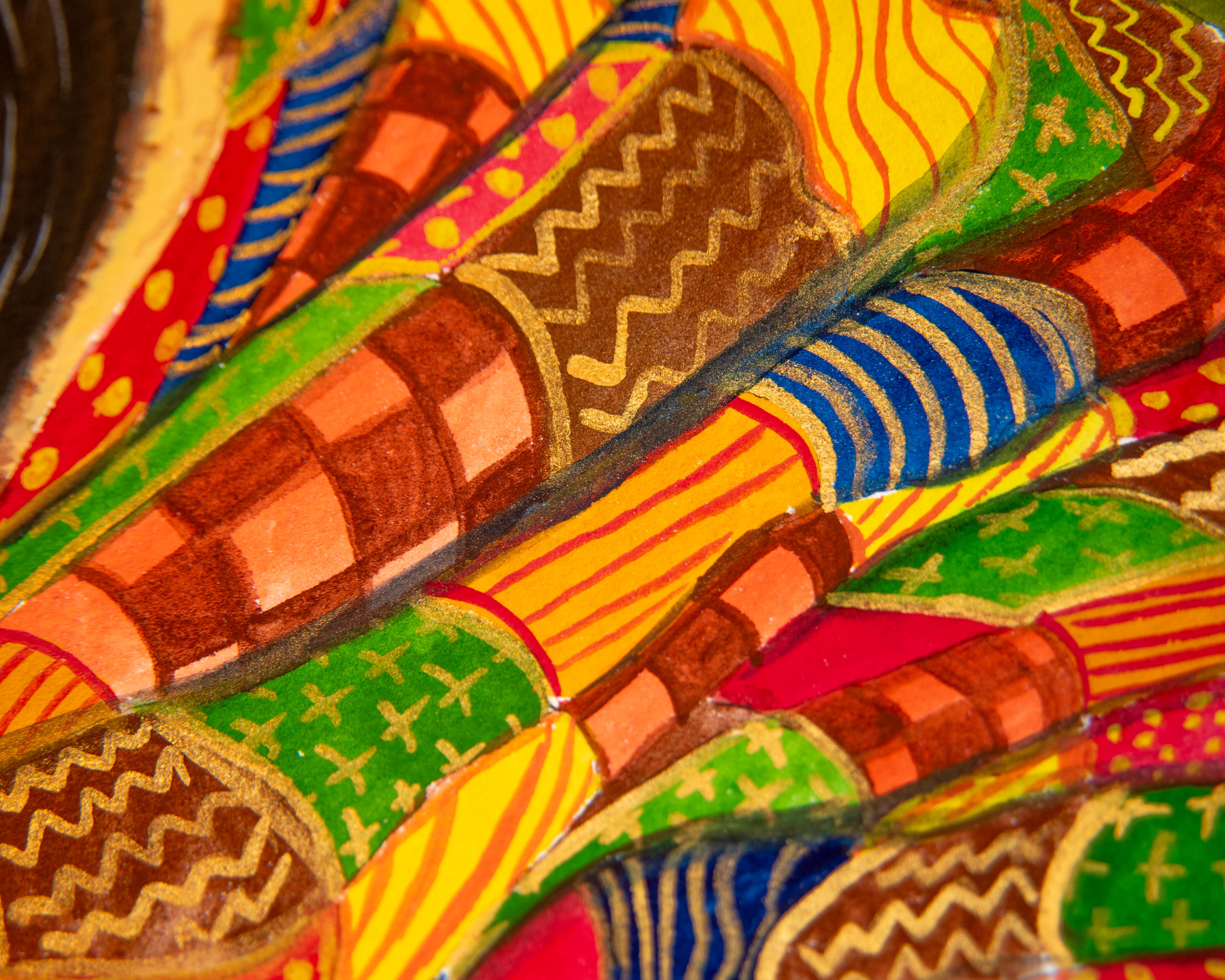
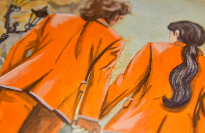
It is the most successful in really showing all the colours, though, and using many of them pure and unmixed. The pink is all Pale Coral, the red shirt is Vermilion, The vase is Lemon, the bits of sky peeking through are Pale Patina, the brightest greens, and the dino crown are Seedling, and the purple of the lavender both in the background and in the vase is Bellflower. The party hat is Dayflower, the blue in the sweater sleeves is Myosotis, as well as the blue of the little one’s shirt. The sweater is Light Ochre as a base with darker mixed stripes, there are yellow flowers in the background with are Kerria Japonica.
The mixes are mostly for the skin, hair, and shades of brown/black. I was pleased that I could get vaying shades of brown as well as black. Black hair was Dayflower and Vermilion (perhaps my favourite ‘black’), and the browns are from mixes of grey into Seedling+Vermilion as well as Light Ochre mixed with Bellflower.
The colour usage I’m proud of, and the yellow glow of the candles, I like.
To Conclude
I thought this was going to be one of my favourites and very easy to use, but it turned out to be an odd sort of desaturated challenge. I think I should have leant heavier into the floral motifs as well as the brightness of sunrise after the spring rain. Even so, colour is still the most fascinating thing in the world to me and I think I’m learning a lot about what works and what doesn’t. The fact that I could get black and brown out of this palette really impresses me, and I think one day I’ll return to this with even more knowledge and use it with a new perspective. Next up is the Summer Palette. It’s got black right in the set, so what will go wrong?


4 thoughts on “Holbein Irodori Gouache – Spring Set”