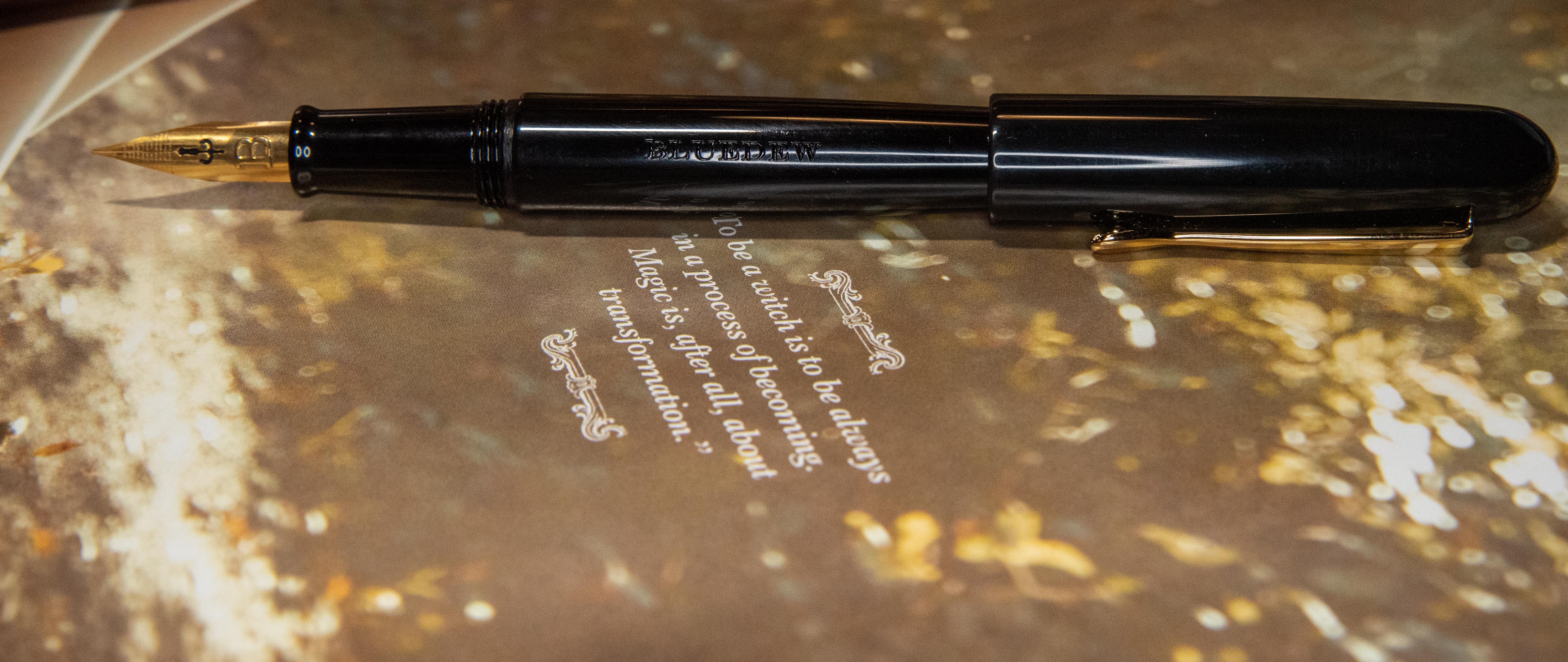
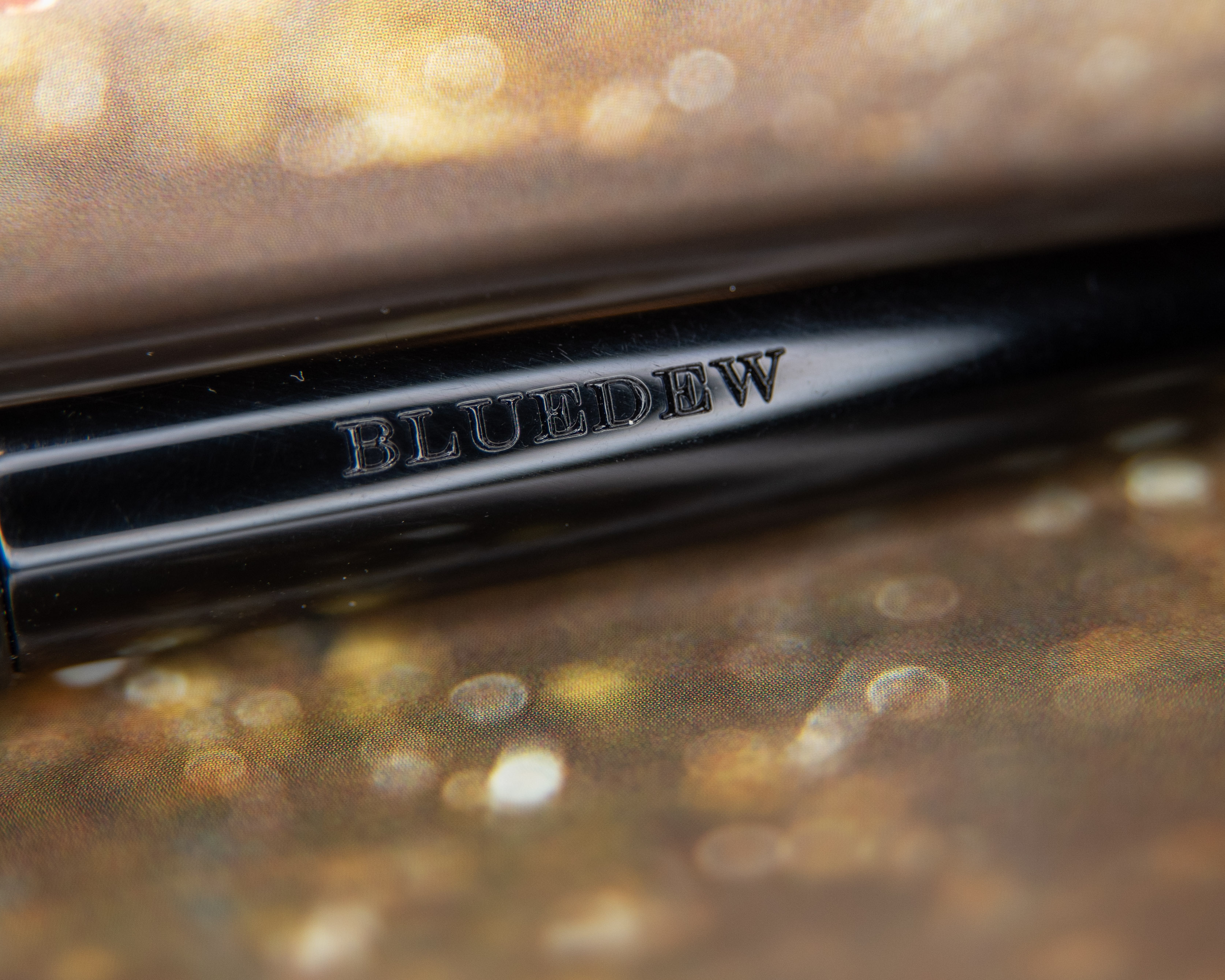
BlueDew Flex
Overview
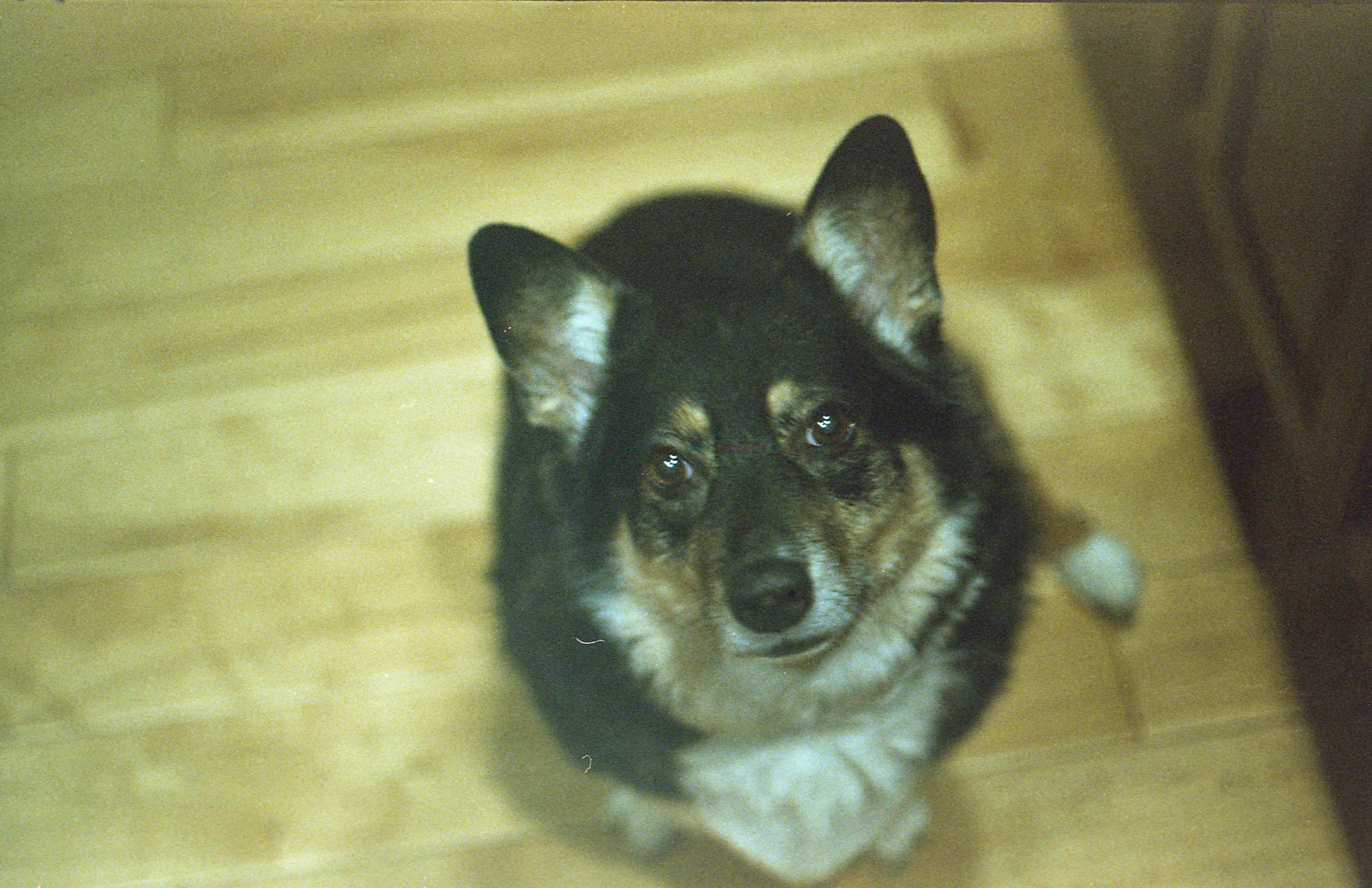
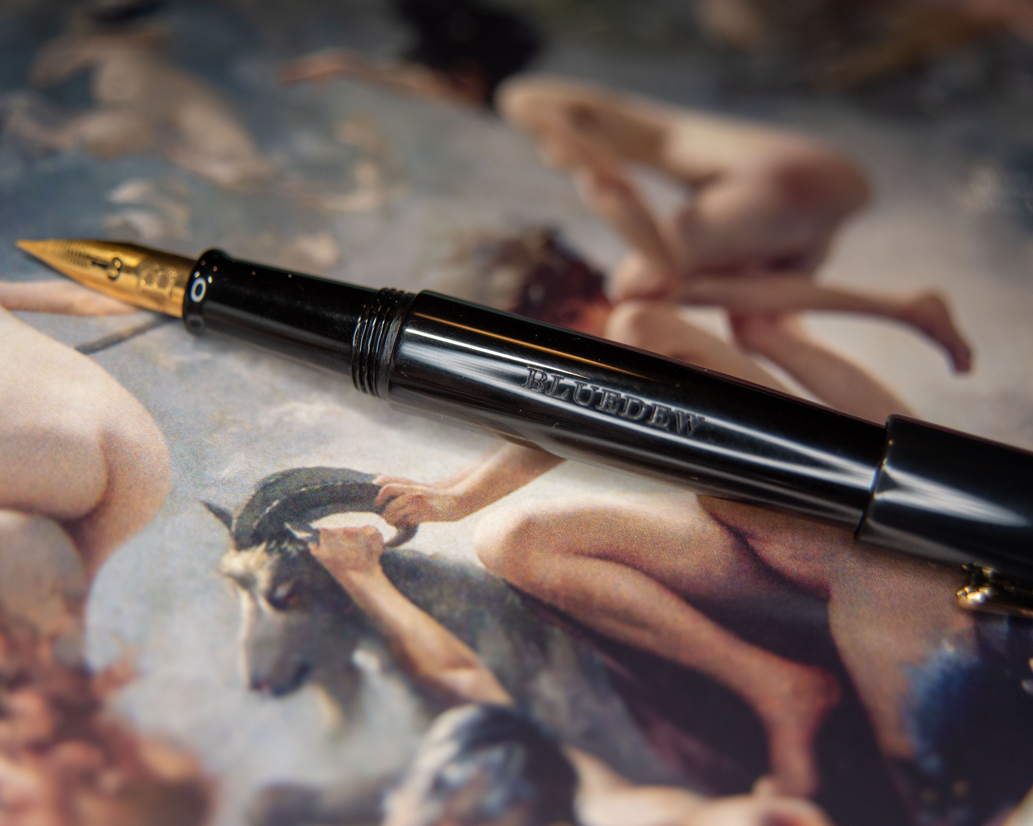
BlueDew pens are designed by a fella in Singapore named Jeffrey. He is someone who understands the joy of flex nibs; the art of calligraphy; the woes of dip nibs needing to be dipped and eventually rusting away; and fountain pens never achieving those great line variations that start with hairlines. So he designed a nib that can do dip pen work in rustproof steel on a fountain pen body. All of us artists should be impressed by this person’s ability to blend art and engineering here, I know I am.
The pens themselves are quite pretty, and very simple, and the nib is just the greatest. I can’t complain because it’s exactly as advertised. This nib can do dip pen hairlines and line variation. Honestly, it’s just a great pen and I’m so happy to be able to say that because I am always worried when I’m getting something flexible. Flex is something no one can agree on, it seems. And I’ve had some disappointments lately.
Things of Note
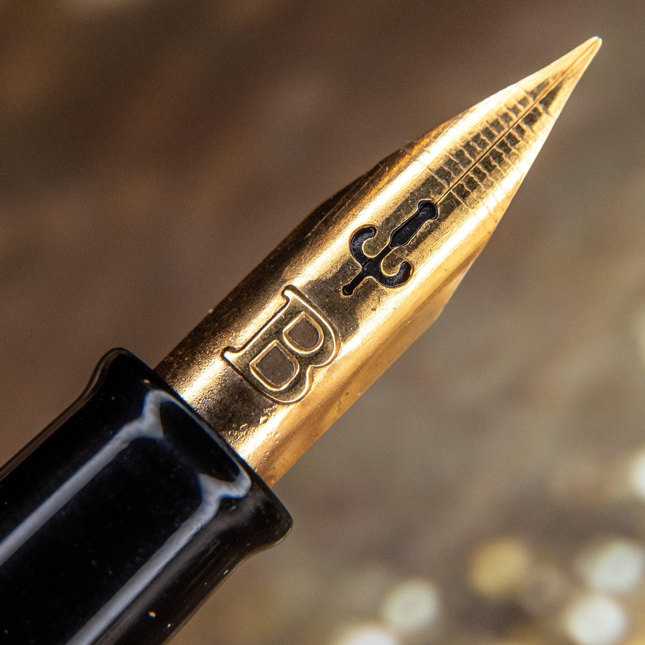
This nib is untipped, just as a dip nib would be, and it is sharp. So, this is a calligraphy tool and won’t do well for quick writing (and that warning is legitimate this time, unlike with the Santini Italia ‘superflexy’). That is important to note, but also so welcome, because that’s exactly what I was looking for.
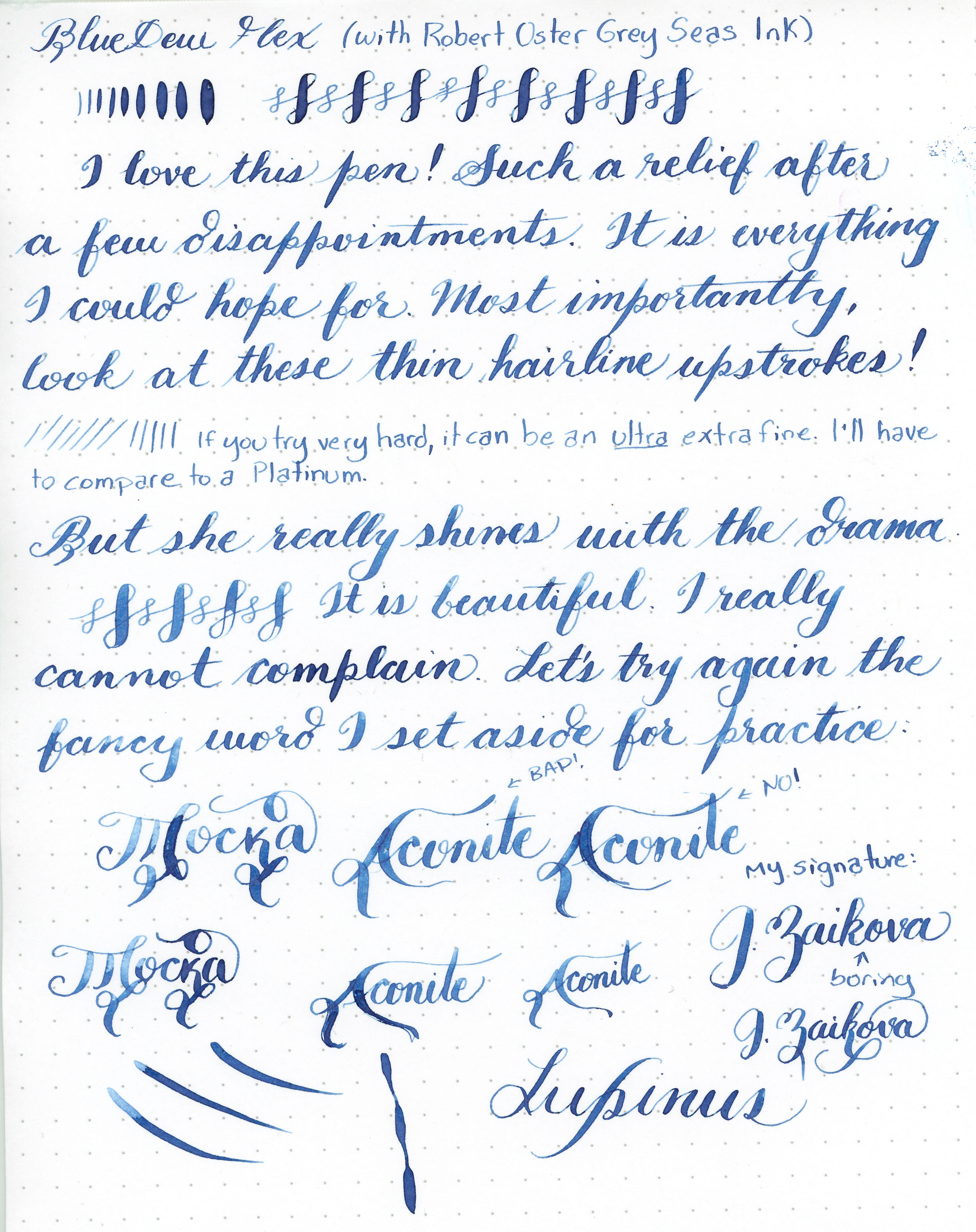
It’s used through deliberate strokes: thin going upwards with very little pressure and thick coming down with pressure. It flexes easily and has not strained my hand at all (like a JoWo omniflex or a Kanwrite flexible will).
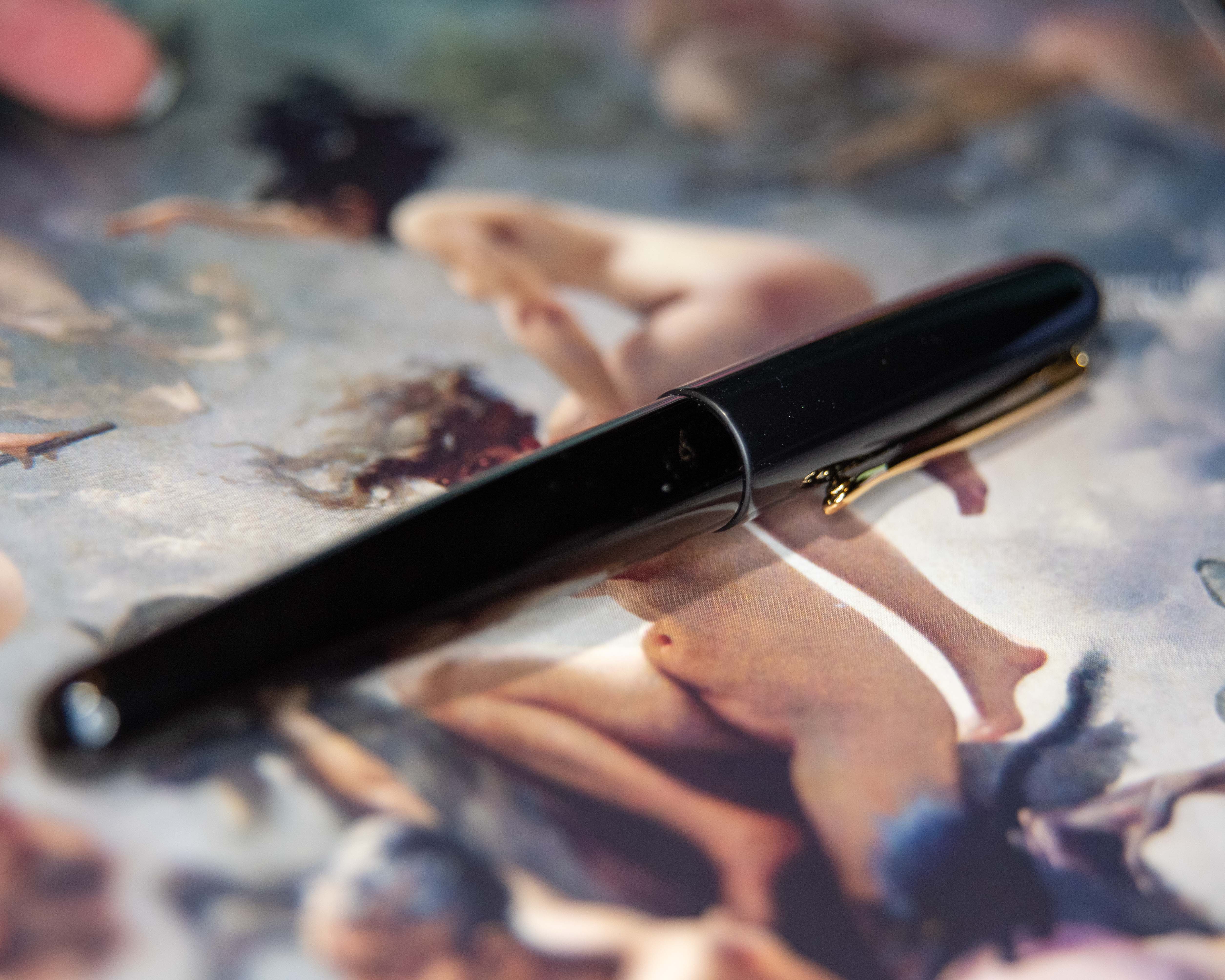
There is a bump between grip and nib which is my only problem with the body design. My ring finger isn’t always so pleased. This is a common problem for me with fountain pens and I’ve never heard anyone else mention it, but I wish all pens were smooth like a Lamy 2000 or Waterman Carene.
The nib is easy to remove, but replacing it seems to be tricky because it’s a tight fit. I never seemed able to get it in the right position when putting it back in after cleaning. The “B” was never as close to the grip as it is on the spare nibs I got.
I was given some wonderful advice by the lovely Artful Mom Pam to clean this pen before using it. I did so, and have had no flow issues at all. So if that’s been a problem for you, I’m passing on this advice (and her review).
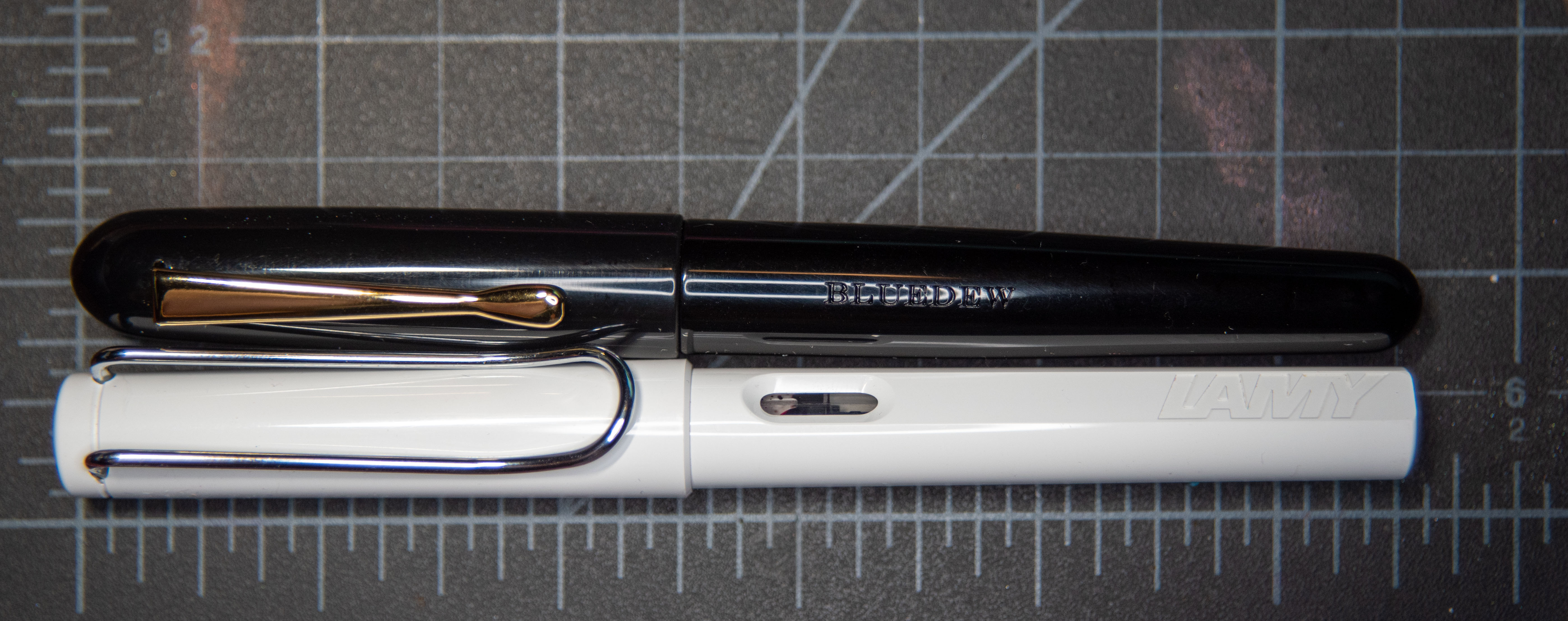
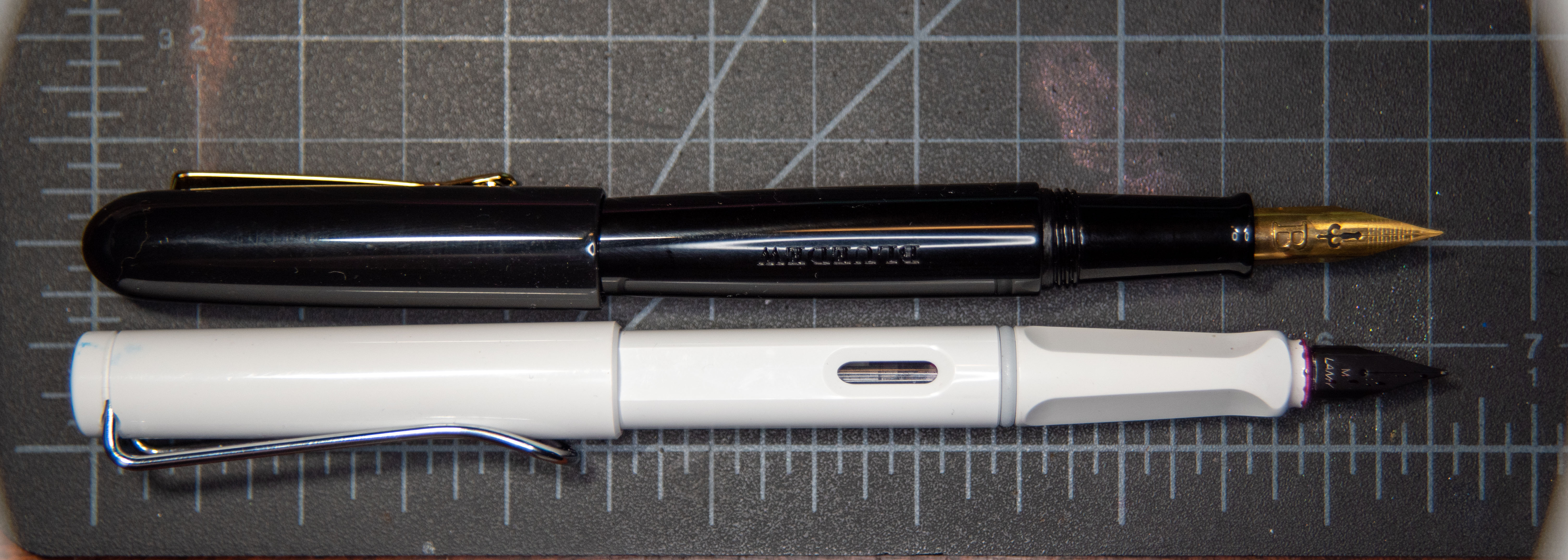
Size
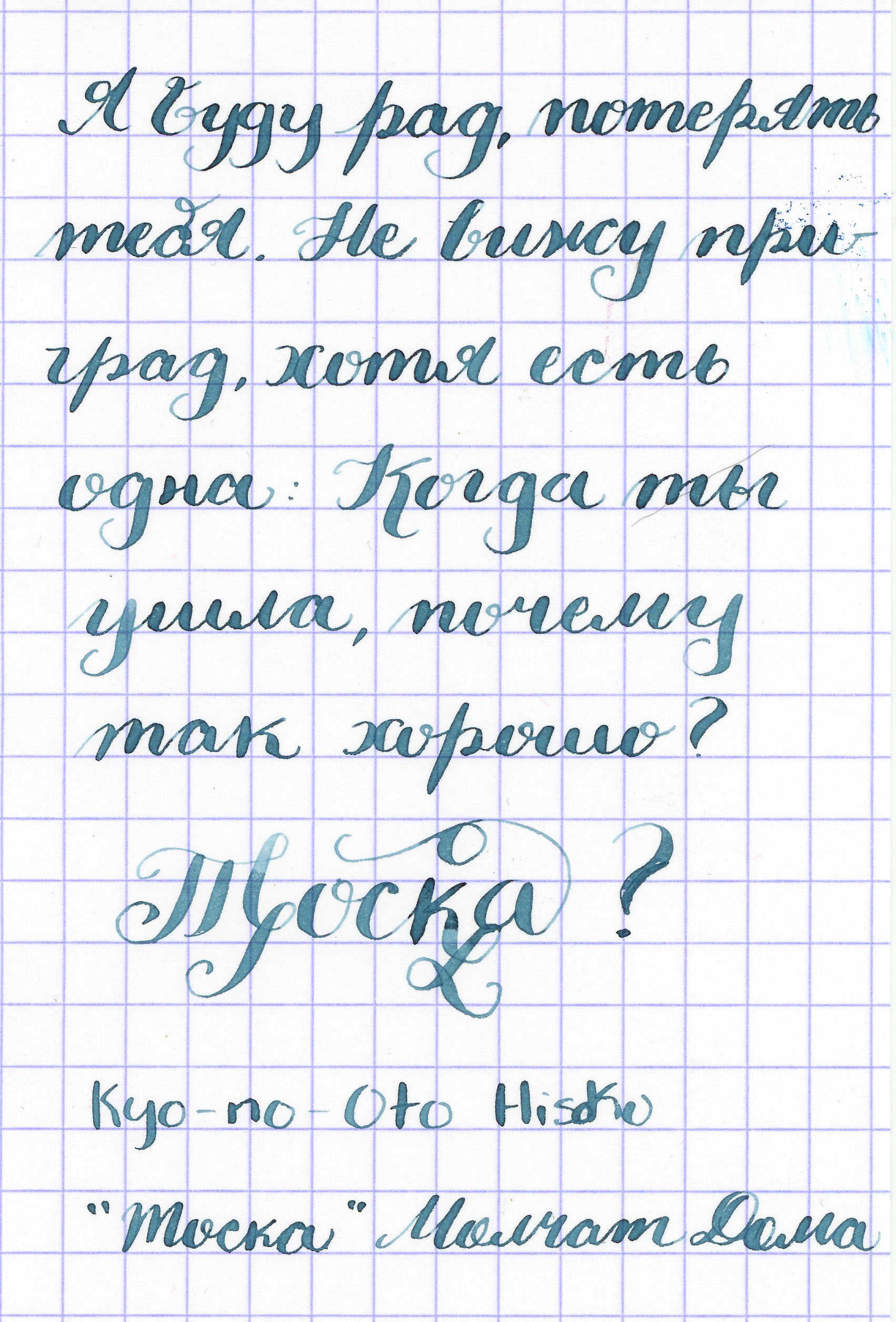
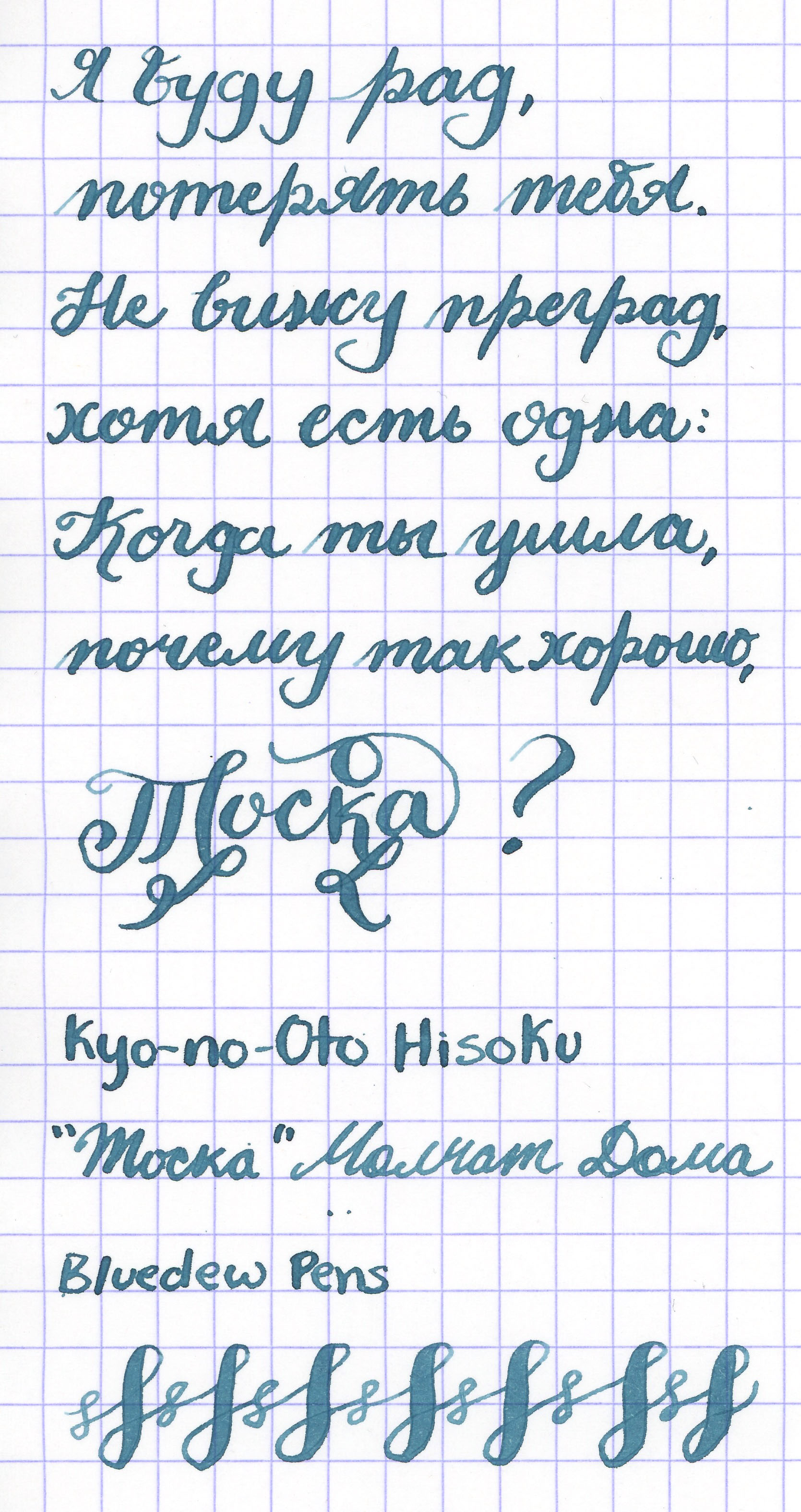
Writing Sample
The first sample was done with no modifications, and the second was after I added some flowing ink additive to the ink to make it wetter. I was not doing this specifically for this pen, because it can keep up with ink flow delightfully well, I just wanted to see what would happen. So now we all know. It flowed a bit too much with the additive if you ask me.
Verdict
I love it and I will probably (definitely) be buying more. “Why do you need more than one of any pen?” I am often asked. It’s because I need to have multiple ink colour choices, my friends. My eye is on the pink Writer variety.
I did purchase an extra pair of nib units which I am going to try and fit in to another pen. The possibilities are nearly endless. I adore this one. A+ work!
P.S. I am not sponsored at all, I just think these pens deserve lots of praise.