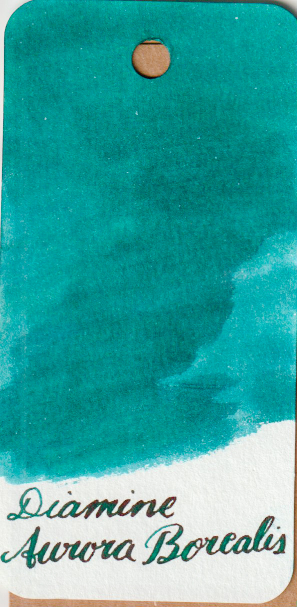
Diamine Aurora Borealis
- Colour: Teal. Seems to be a very even teal.
- Special Attributes:
- Shade: Quite a nice amount
- Sheen: Yes, a red sheen that is visible even with an EF nib in my experience.
- Shimmer: No.
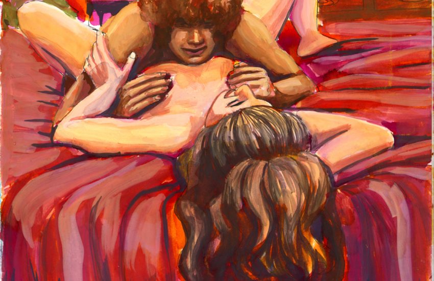
- Watercolour Usage: Works great with water. It blends out in to a nice sky blue as you can see at the bottom of my example drawing.
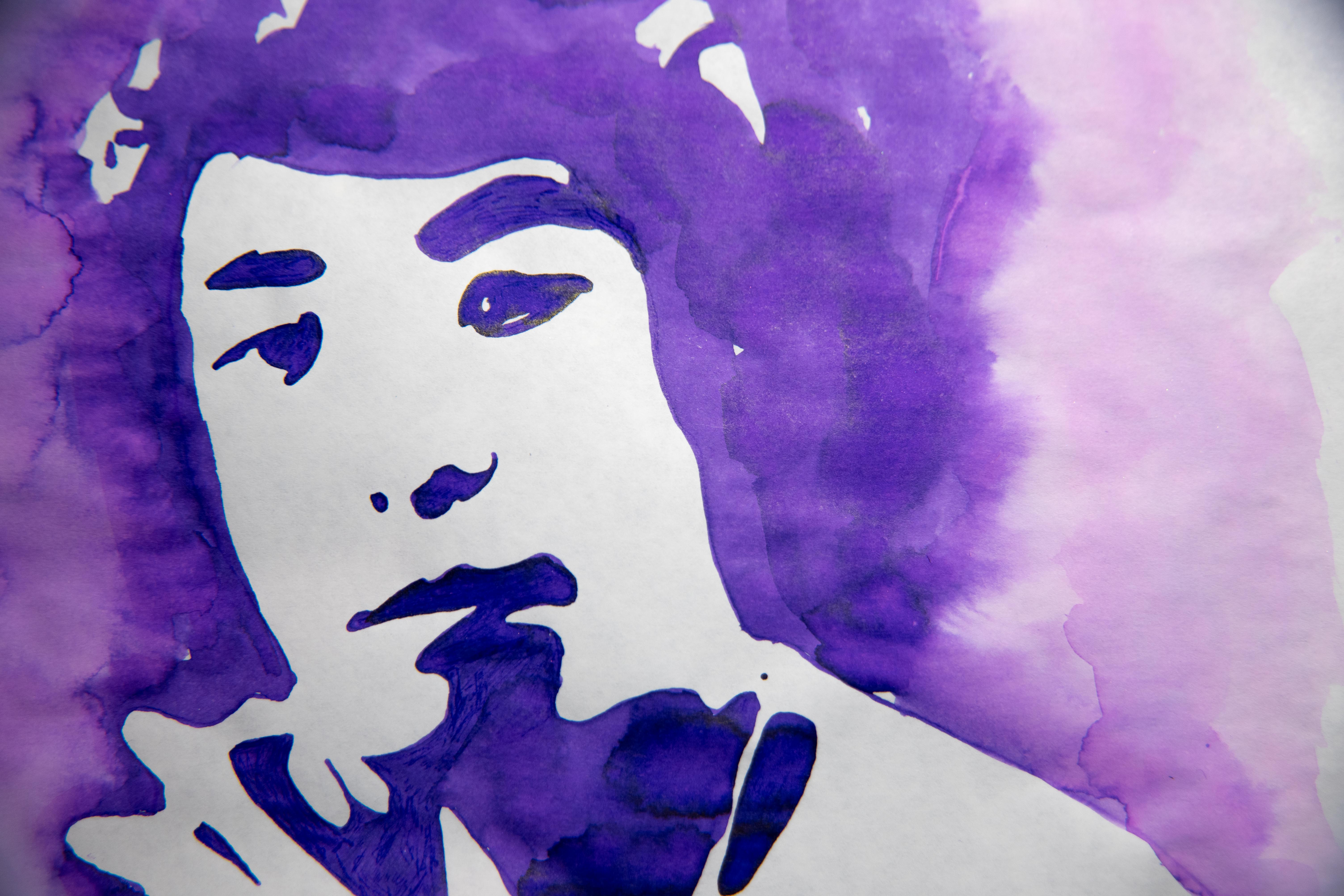
- Harkens to mind: The ocean; juniper berries; overcast days on the beach; The Cure’s Disintegration.
- Similar to: It’s a lie to say that teal inks are all special and different. This ink is pretty much indistinguishable from Diamine’s Eau de Nil and Season’s Greetings and Yuletide; and Noodler’s Polar Green, and Dostoyevsky. Yes, some of those are slightly more green, but, I mean, they’re all very close. I’m a sucker for teal, though, so here I am with all of them.
- Expense (USD): $7.50/30ml, but £2.25/30ml in the UK.
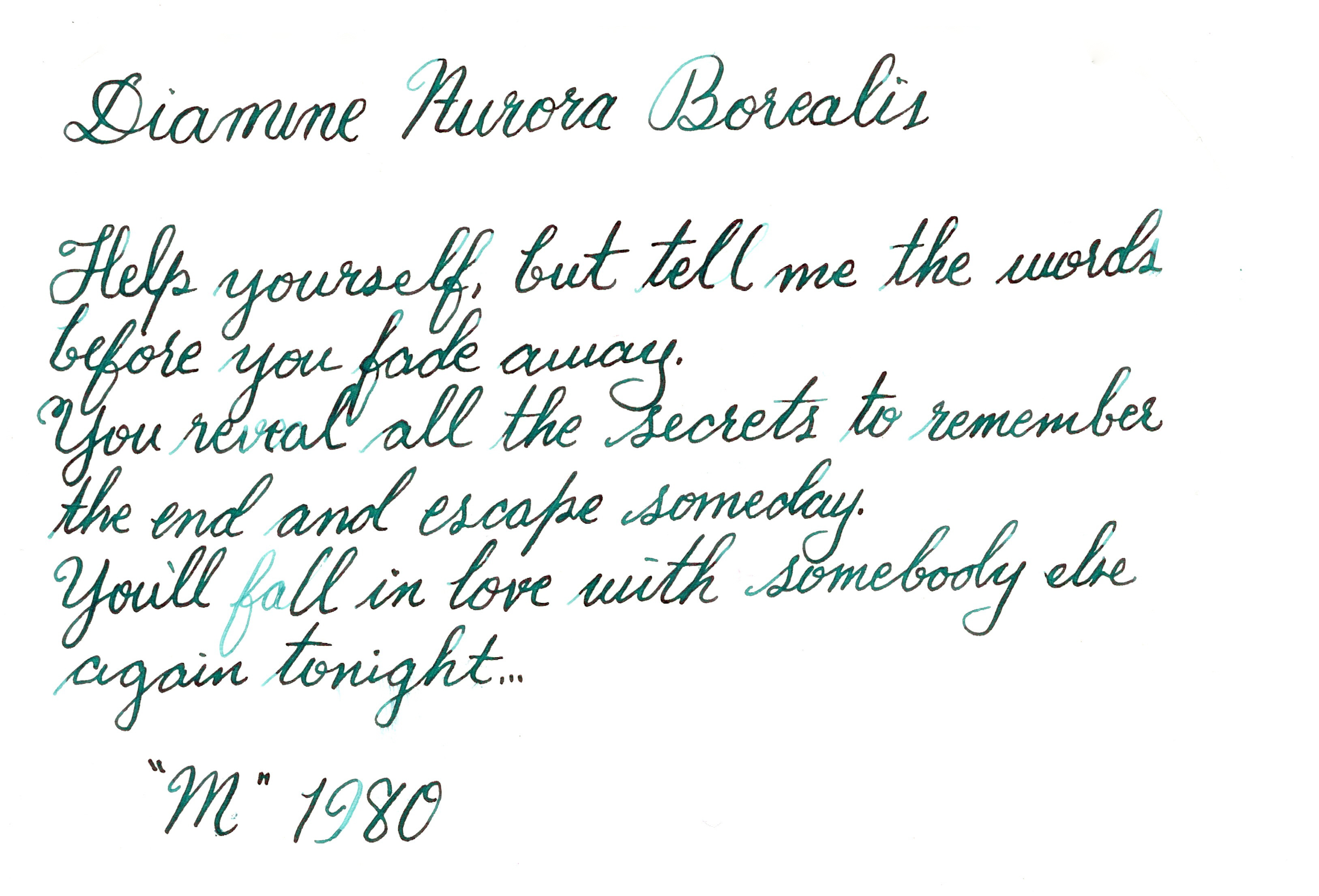
- Example: I asked my husband what colour he thought of when he thought of Robert Smith and he said “The colour of Disintegration.” So here we are.


The Verdict
I can’t say bad things about teal, but my favourite teal is not this one. (My favourite is Diamine Marine because it is lighter and lacks the red sheen.). Once this has sat in a pen for a while, it comes out pretty dark and that red sheen makes it look a bit too much like ballpoint for my taste. For painting it’s a winner, though.