Colorverse Hubble
- Colour: A very serious cool red colour with a gold sheen sometimes.
- Special attributes:
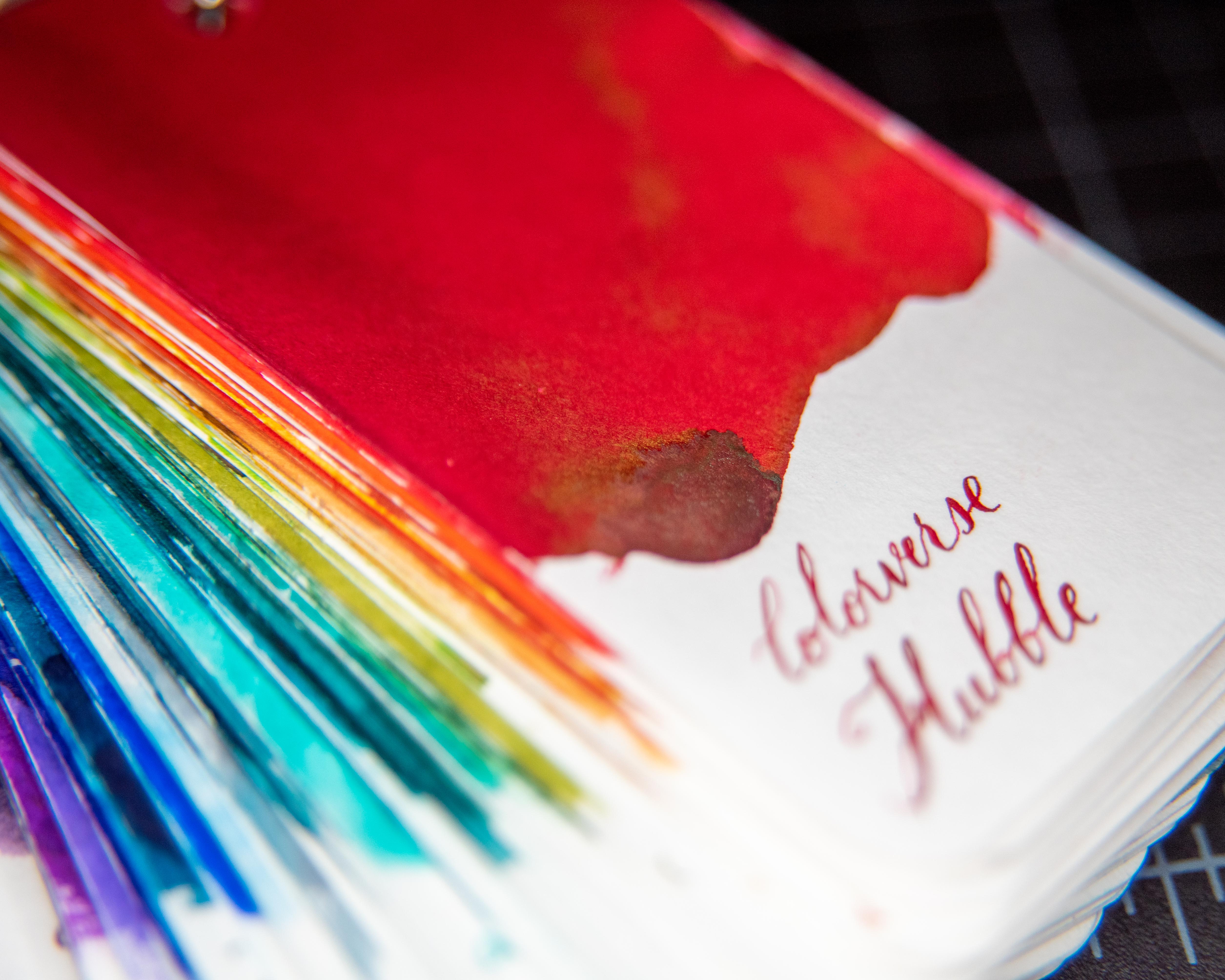
- Shade: Yes, as is easy to see in my example picture, I put layer upon layer there trying to get that gold sheen to show up.
- Sheen: Yes! Sometimes and with a lot of ink piled up.
- Shimmer: No.
- Harkens to mind: Poppies; all my previous cars, the walls of my teenage bedroom, and favourite lipstick (okay, this was exactly my favourite colour for most of my ‘cool’ years); fresh blood.
- Similar to: The closest ink I have is Rohrer&Klingner Morinda. They are quite similar in writing, but that gold sheen (I promise it’s real) is special.
- Expense (USD): $38/65ml as of 2022, and comes with a 15ml bottle of the greeny-tealy-grey-y colour HST.
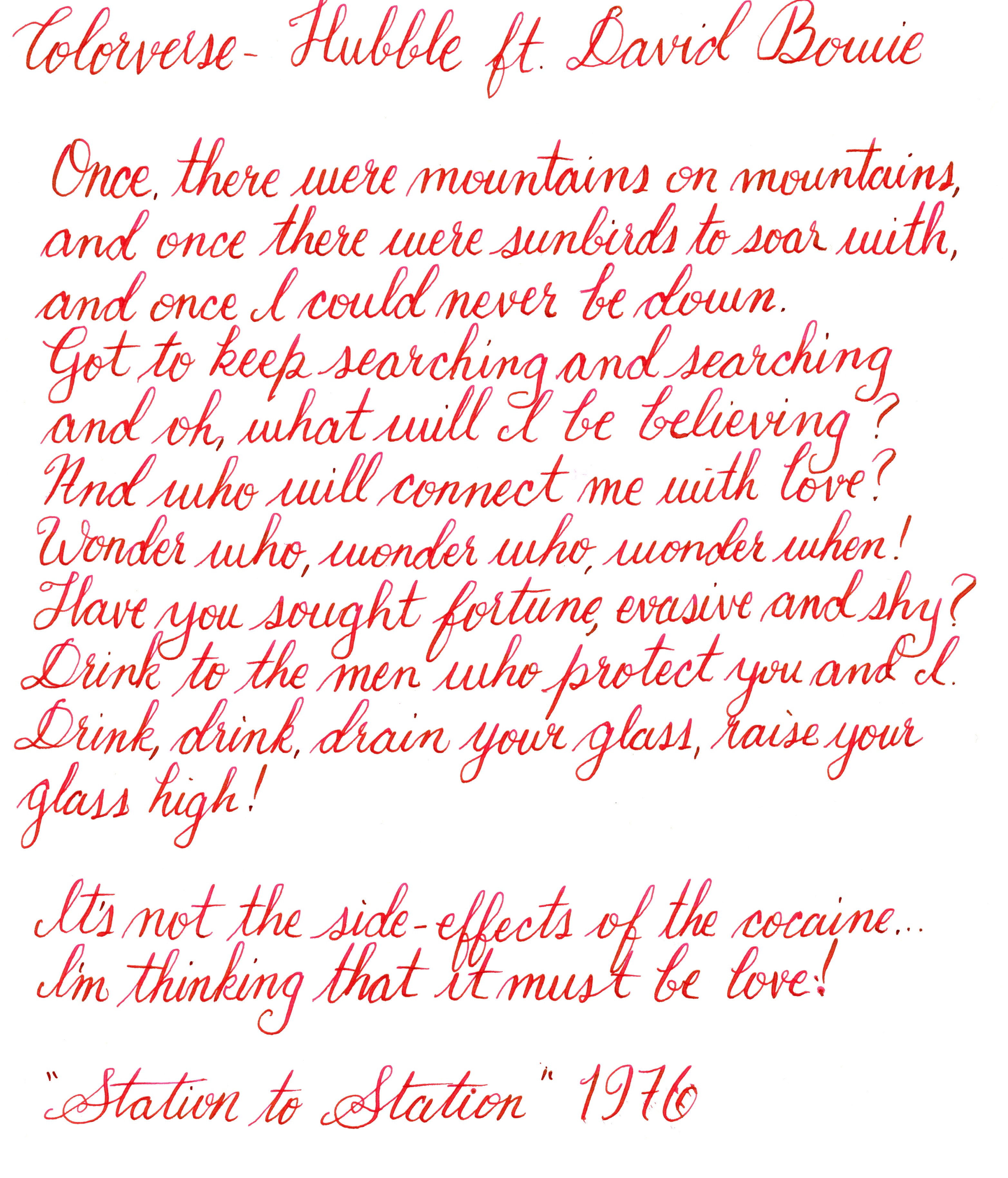
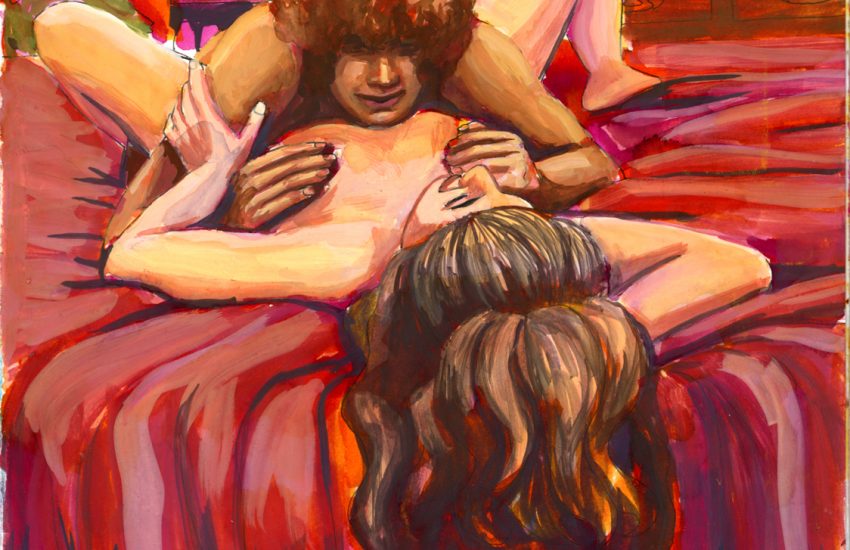
- Example: David Bowie, listening to his band practice in Cracked Actor. Sometimes you see something so beautiful, you just must draw it.


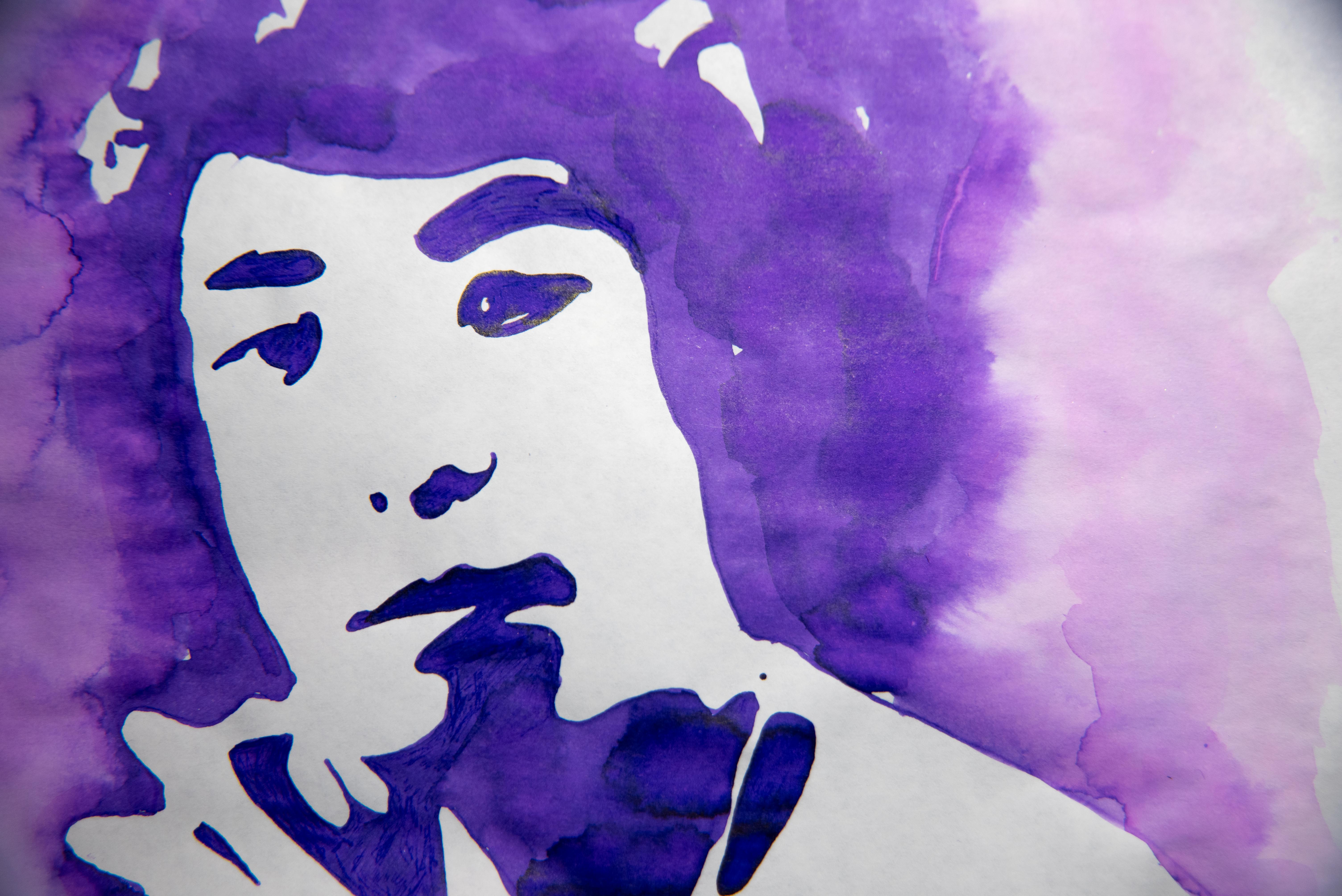
Each of the above pictures is me trying to show that sheen. Also, as is the constant frustration with all things I do involving ink: It looks so much warmer when scanned than it actually is. Trust the above photos, you can see that it’s a cool red, not an orange-red.


It’s inked up in my Pilot Falcon, so there are writing examples there, but here is some more:
Verdict
This one’s easy: this is a perfect red ink. Hasn’t clogged anything or dried funny or anything that would make me say it’s awful. I just wish I could get more of that gold sheen to come out in everything that I do with this ink. I must find a proper gold-sheen red ink, I believe.


One thought on “Colorverse Hubble”